January 11, 2024

I’m on a mission to change that and I want my first video of the year to do that. Most photographers don’t realize that photographic tone is the secret skill that makes them understand every shot. Today we learn it…

But videos like this did not exist when I was starting out. These are the 3 keys of tone in photography so you can master them fast regardless of your experience level. And they will change how you create photos.

MORE TIPS: Get free ticket to my next Shadow Hackers LIVE workshop to take this further. Also in the video, I mentioned Filmist film presets, Silver 5, Natural HDR, and Lumist Actions.

The unabashed flaring of the sun gives a natural haze to this morning street that can’t be done with a single slider. It was processed gold using GoldChrome

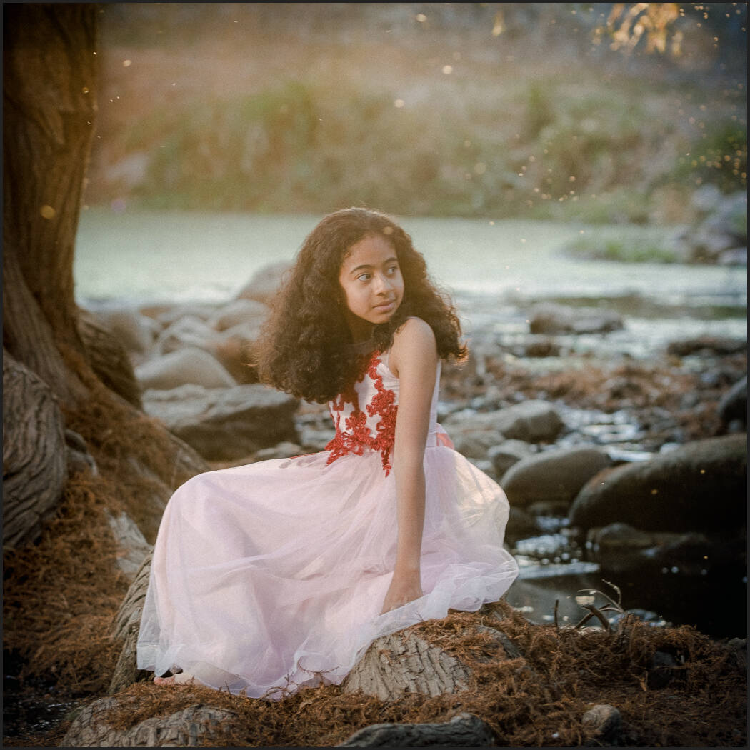
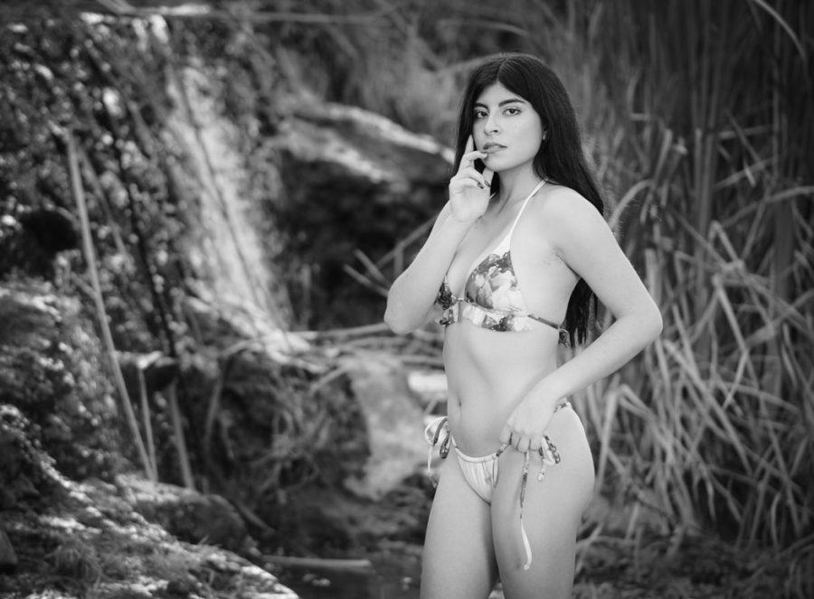
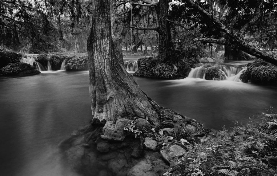
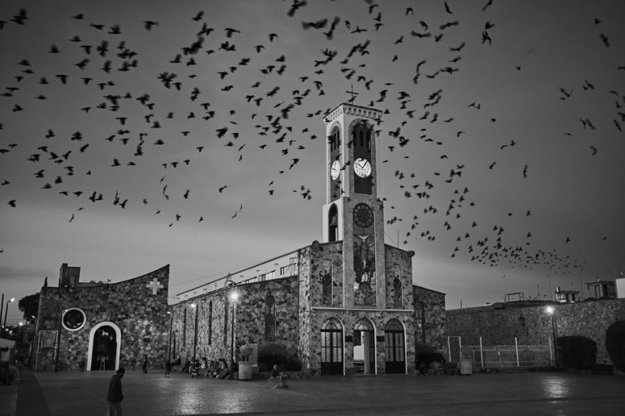
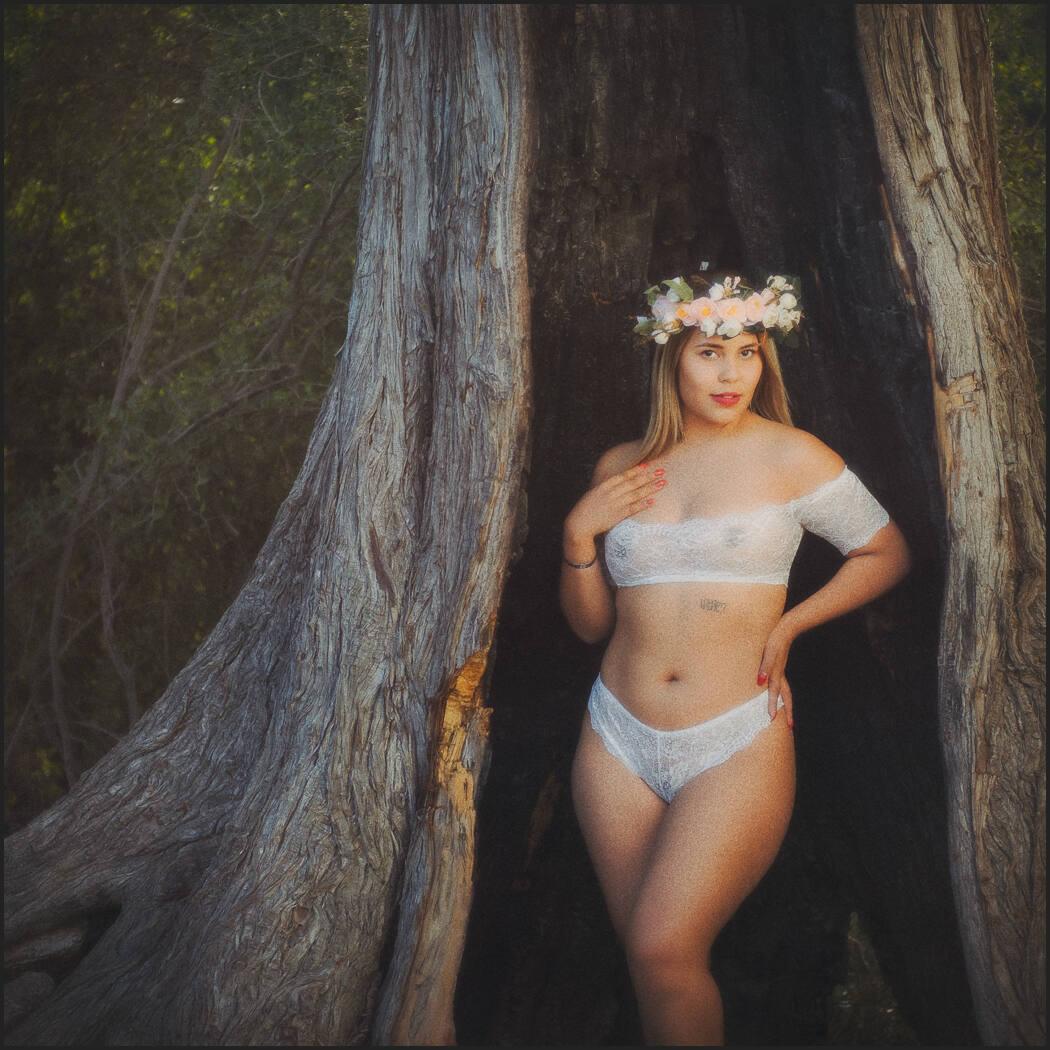
The photographic tone is the foundation of great photos. But the tone is a wide-ranging one that comes from the painters and the way they learned to understand shadow and contrast long before cameras.

This is the lost skill in Photography that I go on deeper in my workshops and today I’m sharing the keys to unlock this door in the simplest way I know how. IN consists of 3 elements that lead us to what tone does for us and why it is important.
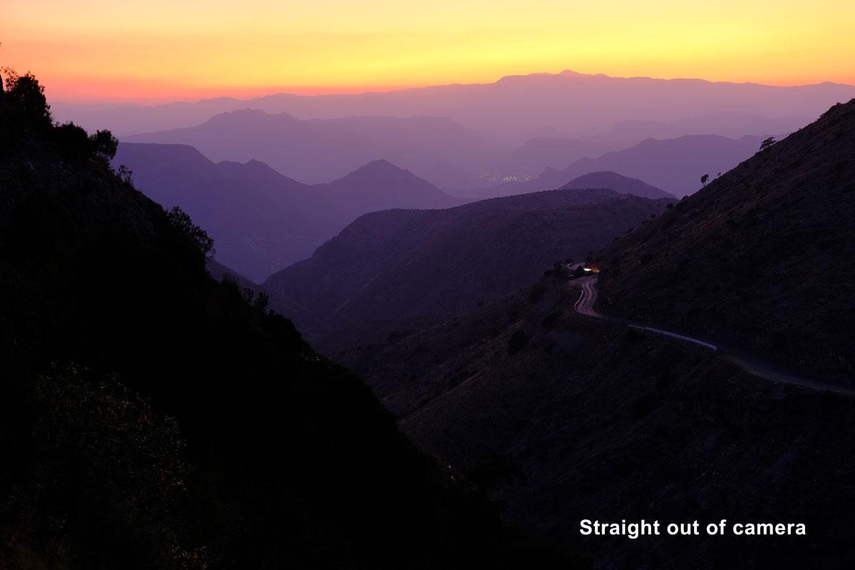
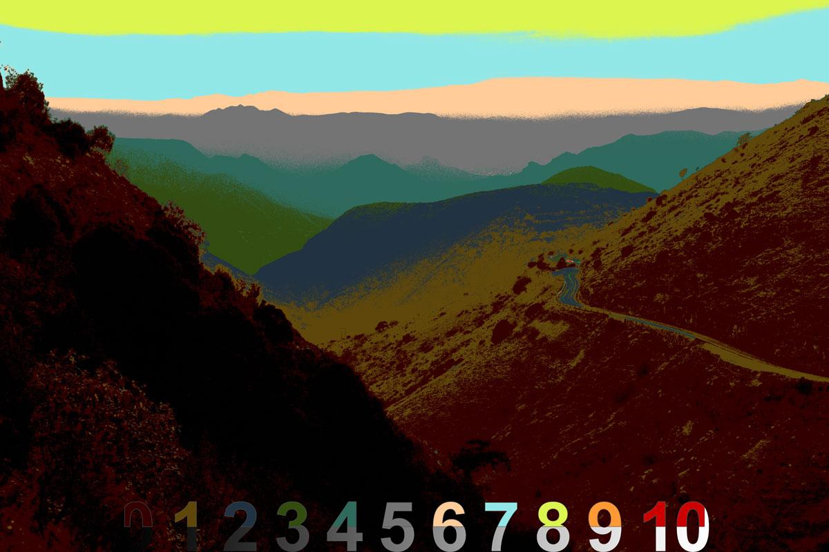
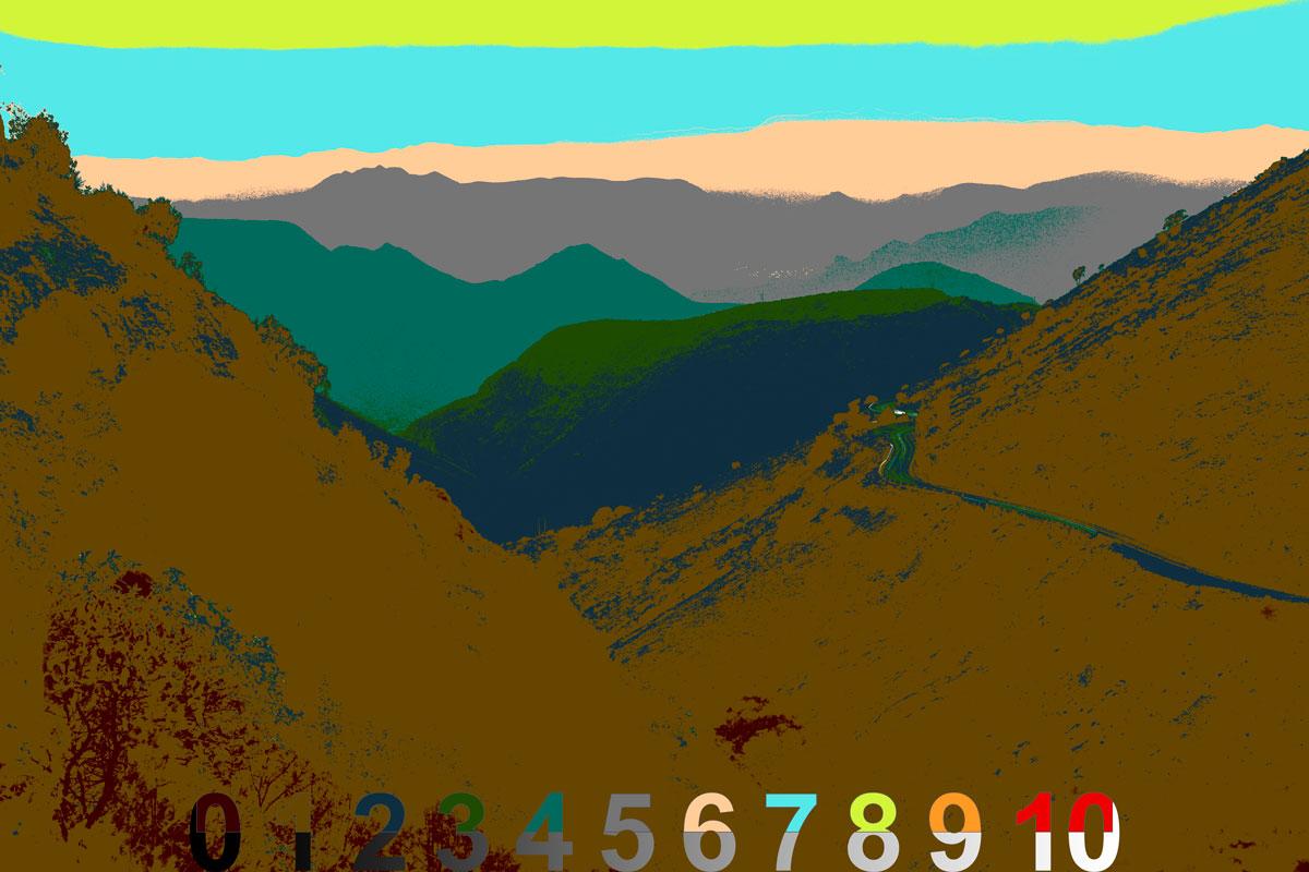
  1. Shadows create contrast
  2. Contrast reveals tone
  3. Tone creates atmosphere

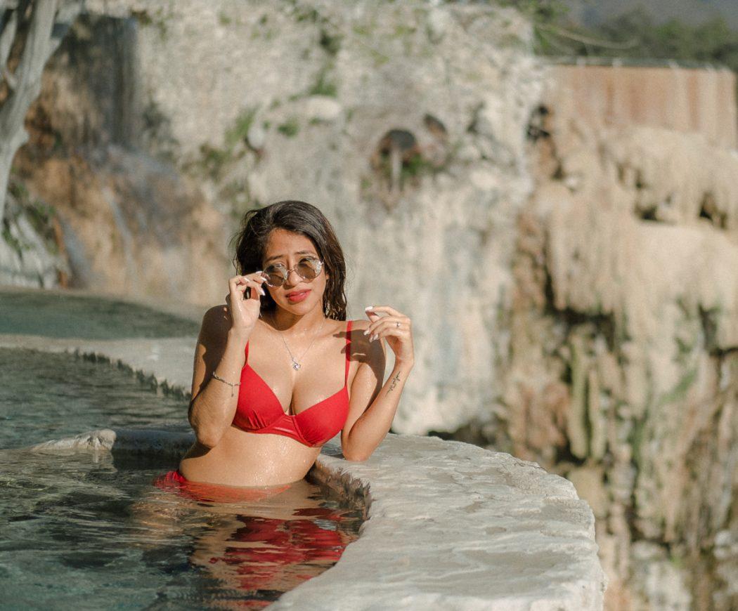
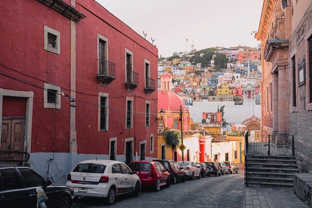
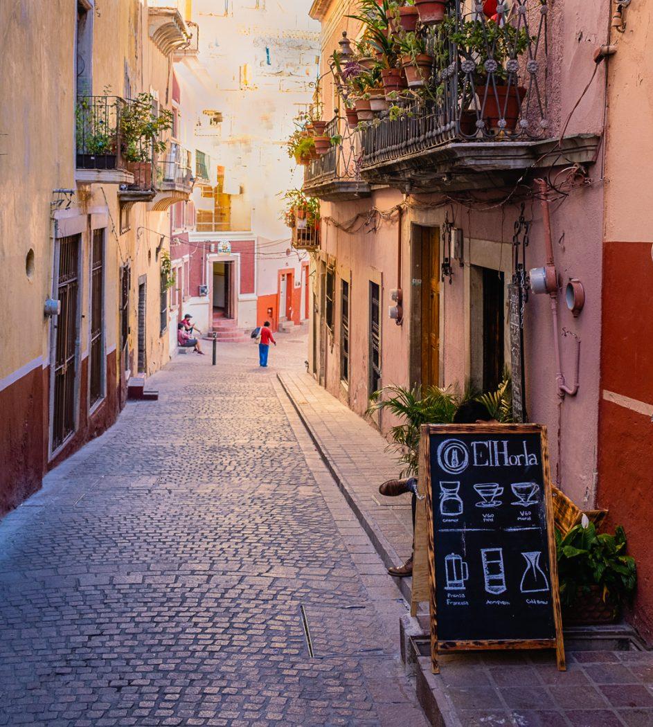
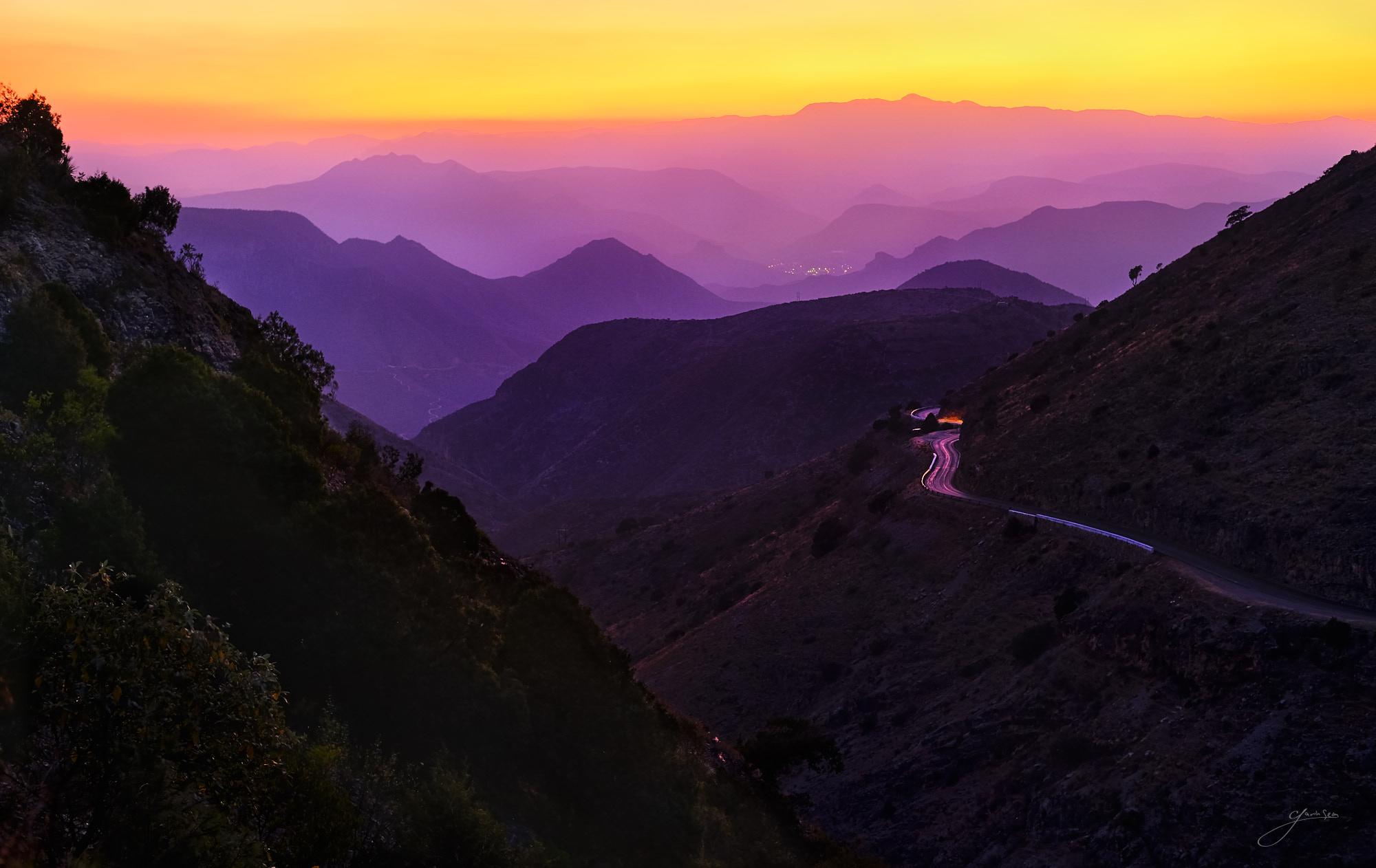
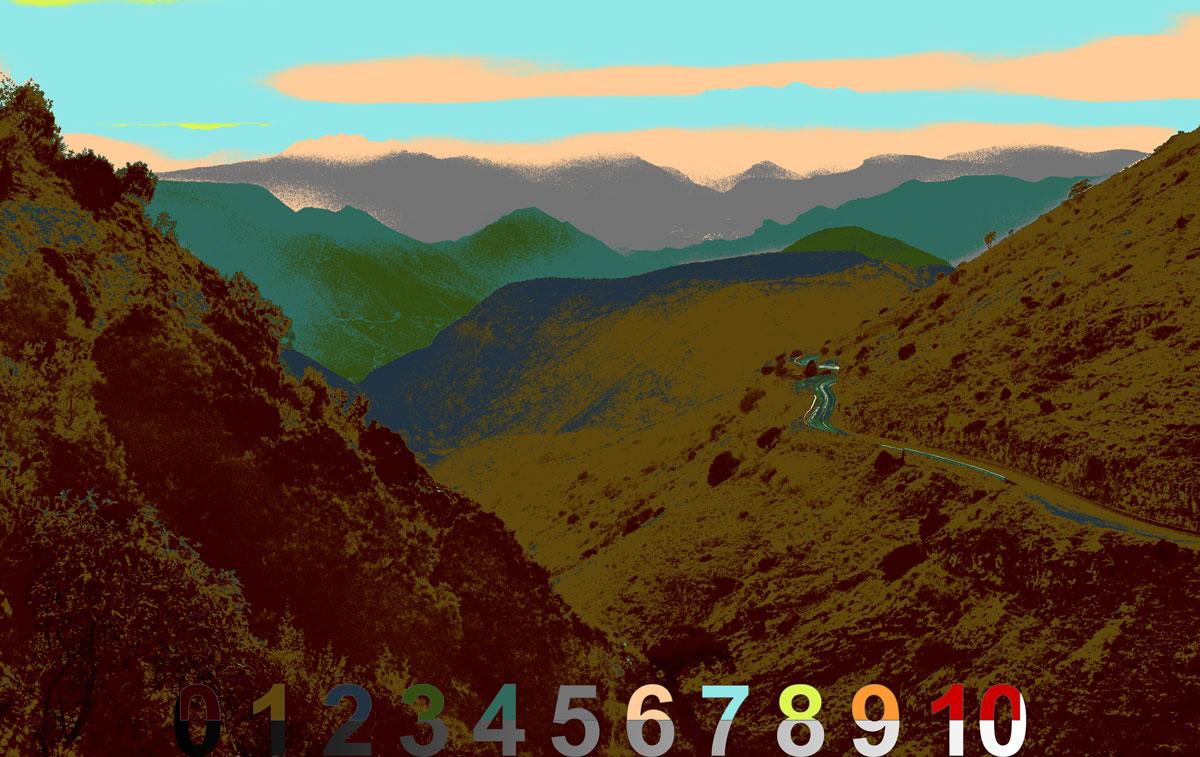
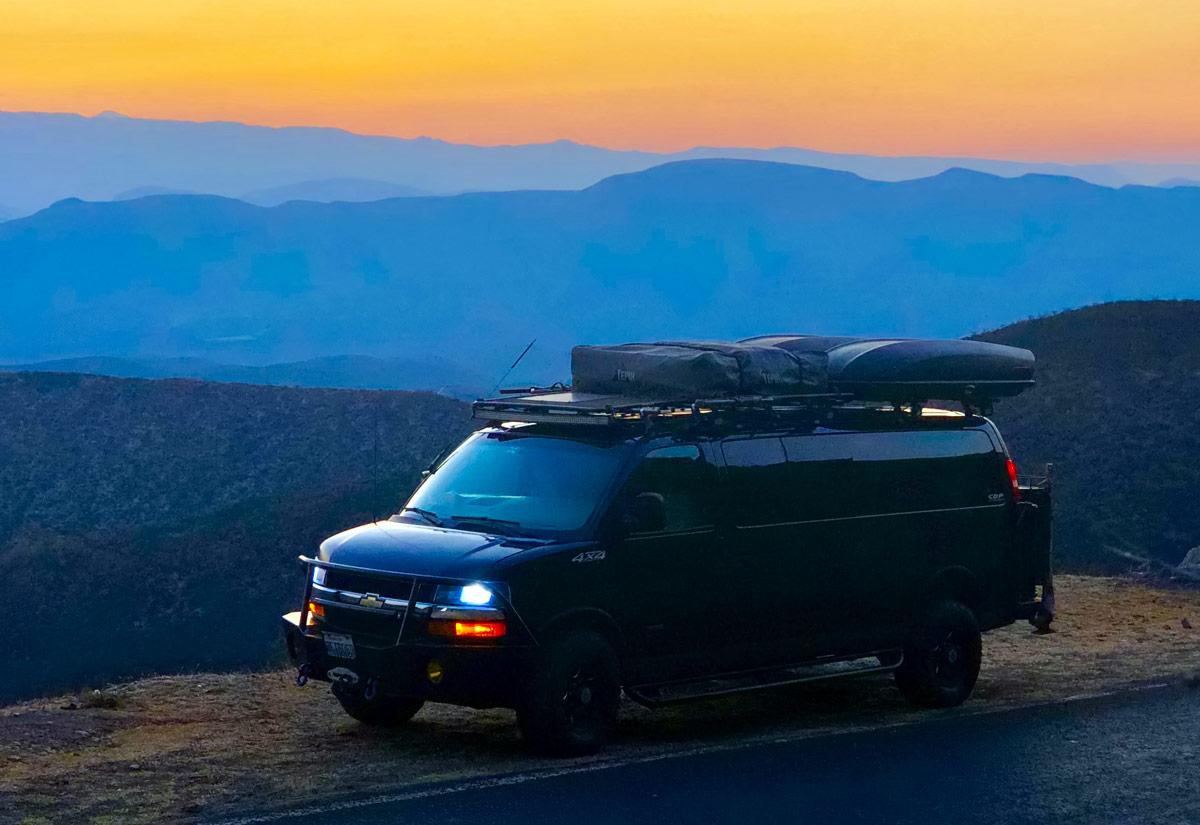
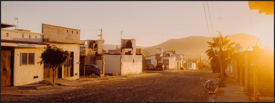
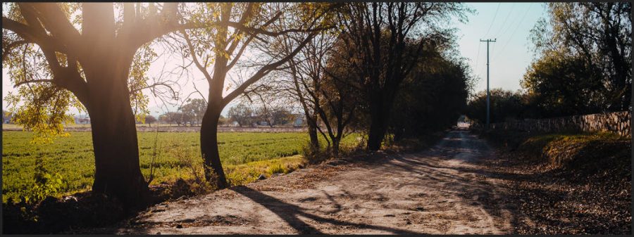
These 1,2,3 lists mean little to your photographic tone without context. So in the video, we’re comparing different photos to see how not only edits but how shadow contrast and ambiance in each will define our result.

IN another Xpan style crop we see light creating bloom and reducing contrast. The net result is that tone is more subtle and more contrast is created in the overall image. Edited with Street’ist.

In my Exposed Master class, we learn everything about exposure and zones. Those are the technical aspects. But if you’ve been to Shadow Hackers or seen the Photo Perfect workshop you know that combining those with the artist’s aesthetic is what makes a great photo.

In the end, the tone is pretty simple and yet subjective. But if you constantly remind yourself of the three factors. Shadow, contrast, and tone, which is the combination of all the light and dark and mist and color. All of them combined create a tone in your own style.

We see the contrast between the burned tree and the tone of the model. Then edited with a David Hamilton-inspired process to create softness with contrast and balanced photographic tone.
We see the contrast between the burned tree and the tone of the model. Then edited with a David Hamilton-inspired process to create softness with contrast and a balanced photographic tone.

As much as I use sliders and settings and layers inside and out in my tool packs. Tone-like shadow is not created by the slider it’s just moved around.

When we use contrast to just create hard lines we lose tonal nuance and atmosphere. In the end, the contrast of the overall scenes is less, and viewers don’t see the nuance you wanted to show.

If you missed my video on why you should STOP using contrast sliders go check it out and also read my post about how to use the Zone system in digital to hack shadows. You’ll find more on my channel.

As I keep building these free resources and simplifying the process of understanding tone I help myself learn more and hopefully, you as I realize a dream that’s spanned 20 years to make a simple process for those of us who want to truly master our style in photography.

We compare two of these in the video. Note how the tone of this one is softened but less distracting than what might be called the contrast image.
We compare two of these in the video. Note how the tone of this one is softened but less distracting than what might be called the contrast image. Edited with Filmist.
Read More

August 12, 2022

Should you use Capture One or Lightroom for your black and white edits? PLUS where does Photoshop for black and white fit in?

We’re going to test that in today’s video with direct comparisons. Taking the sale filed and editing them in each to see what gives us the best black and white in the least time. I’ll give you tips for all of them along the way.

Also, see my Lightroom vs Capture on 2022 video here for a general overview of these two great apps. For now, let’s watch today’s video and do some black and white tests.

Since I started digital photography 20 years I’ve seen just about every technique for Black and White in digital Some needless complex. some are just ugly. Simplifying that process led me to bypass plugins and create tools Like Silver 4 presets and Blackroom BW Actions.

Pure Capture One. While there are fewer BW sliders, you can make up for it with the more advanced color tools and get a stunning result.

Honestly we B&W lovers occasionally get a little snobby, so this question can be complex. But since we no longer have the chemicals we used to use in the darkroom the traditional color filters do not have the same effect. Today to take the same principle and make it work digital.

The best black and white conversions usually start for a color photo because with those color channels we can convert and extract the colors, much like we did with filters in the film days but with more detail. Darkroom like green filter, lighter reds, etc. If you bake black and white in camera, you lose all that power. That’s not to say your BW photos are wrong. Just that they are not as flexible.

So I usually convert on the raw file. In LR or C1. I use my SIlver 4 presets if Filmist. But whether you use creative presets to go further, or all manual. You don’t want to supply desaturate. Use those channels and the power of your RAW.

Watch today’s video above, because we’re looking at Lightroom VS Capture ON in a side-by-side level. Does one give you a better black and white conversion than the other and what are the advantages between Lightroom and C1.

After that, you can go deeper into your black and white edits..

If I’m going to edit my best work. I go beyond RAW. I’ll restore the color channels before going into Photoshop, leaving my other edits in place. Then I can go deeper with my black and white edits. But they are also more complex in Photoshop.

Sometimes it’s not even clear how you can make a better black and white in Photoshop. I use Blackroom to convert to a more complex BW because it always helps me find a way to improve the edit without stumbling around. That’s what it was built for.

More about how I do those more advanced edits in this video and on the Blackroom page.

Lightroom is a little more user-friendly compares to Capture One. But with Styles or presets, you can get your look fast in both.

In conclusion. Which is best? LR, C1 or PS

When it comes to Lightroom VS Capture One for black and white. I think Lightroom has the edge for ease of use and results that just work. Capture One with its other available tools can perhaps give you more options but with more work. Both are going to work great if you save presets or styles or Have a pack like Silver 4 or Filmsist on hand.

In the end, both are good and the results will be good.

But comparing both to Photoshop. Photoshop offers more options, but with a lot more time spent. Even if you use Photoshop actions to vastly speed up these more advanced edits, Photoshop should probably not be where you start.

Edit normally in Lightroom or in Capture one or another RAW-type editor. Then take the very best images you want to showcase to Photoshop to give them that edge that makes them win.

Lastly, plugins for black and white are heavily hyped. I used them when I all this starting out but native tools have improved a LOT since those days. As I mentioned in the video, a plugin adds another step and takes away control.

Yes, using presets and styles and actions help a lot because they make hard tasks fast. But they use the native app tools in Lightroom, Capture One, and Photoshop. So instead of a new file or a flat image. You just highly refined sliders, adjustable layers, and a totally transparent process. To be that’s a huger win.

Let me know if the comments what you think is the best black and white tool.

Gavin Seim

The detail in Photoshop is almost impossible to beat. Layers and details equal more refinement. So I still take by best photos here in the end after using a RAW style editor.
Don’t be afraid to edit your black and white a little more. Whatever app you use. In the end, it’s all about shadow and contrast.
Read More

April 8, 2022

In today’s video, I’m going to show you how to un-clip any photo.

Fixing a photo at this level may seem difficult at a glance but it’s actually not hard and we’re going to make short work of this. I’m going to show you what to do when NON of that is enough and you have an image so clipped that it seems like it’s useless. This is how you can fix ANY clipped photo.

If you expose well you can usually get rid of clipping and have stunning dynamic range using simple sliders, presets like Natural HDR or Filmist presets with a few of its dynamic chemical mods.

So for me there are 3 levels of clipping. Here’s why it happens and how to fix it every time.


You can also DOWNLOAD the RAW file I use in this to follow along.

You can also watch this directly on my YouTube channel.


Level 1 light clipping resolved with simple presets and adjustments like Natural HDR.


Level 2 resolved with presets and local adjustment mask


Level 3, resolved with painting back detail on PS , Affinity etc. This requires some time depending on the retail you need but it always works.

Read More

February 8, 2019


“Mexico is forgiving, JPEG is not”

I always shoot RAW because JPEG means data is thrown out and the more data you have the more dynamic range and color gradients and detail you get. In post that’s important. Don’t ever let someone tell you that JPEG is the same as RAW.  Mexico is forgiving, JPEG is not. It has it’s place, but no software or wishing will restore information that has been thrown away.

This week we took a drive in the van up into the high mountains of  La Huasteca Mexico. It’s a magical place in many ways but this time we headed up Hwy 120 towards the tree-line and the jungle of Pinal de Amoles, which sits at about 8000 ft. I took my new Fuji XT3 and a few compact prime lenses. In this case the 35mm f2. We headed up the San Juan side of the mountain which is a but dry dusty side this time of year leading to some dusty long distance views. But when the sun sets behind those, it’s impressive.

That sun was setting as we wound up the hairpins toward the jungle treeline and looking back over the valley above a small town called Carmango was the purest high gradient color sunset I could hope for. It actually reminded me a bit of the smokies back in the USA, but the color was stunning and alive. Just like Mexico.

I got the shot, but I found out after returning home that I accidentally switched the menus of my Fuji XT3  to JPEG. My editing flexibility was now limited and I was kicking myself. Sure the built in profiles from the Fuji look good, but it’s still a JPEG and especially in high dynamic range scenes like this, I want every ounce. With subtle smooth color gradients like this you have to be careful or you will get artifacts. The more you edit the more that can be a problem. Especially if you’re not in 16 bit.

So I started with the original untouched JPEG filer in Capture 1 (LR would also have worked fine). If you look at my our of camera file it’s nice but check out the tonal map from Lumist. It’s already pure clipping. Before anything else I did some brushing to recover a bit of shadow detail on the left foreground. Fully black there will be too much negative tone. After that I opened the file as a 16 bit TIFF in Photoshop. I can’t create more range out of nothing but by switching to 16 bit we get smoother colors and less artifacts as we edit. Here’s what I has our of camera. Not bad. But can we edit it.

The good thing was that I had a few image to choose from. I had taken a few frames and then realized it was beautiful and I should NOT be hand-holding at a higher ISO to make it fast. So I got the tripod and ended up at 1/2 sec, ISO400 f4. I did a bit of bracketing since I had little time to micro analyze the tone. This yielded me a sharp image in with balances zones. Even though I thought I was shooting RAW I kept the highlights down on this, not to compensate, I expose where I want. But because it was more about the color and contrast in the hills. I did not want a washed out sky. That paid off because had I needed to recover highlight from the JPEG, it would have been tough.

Here’s the tone values of that I took into PS and you can see those shadows really were lifted after that first shadow edit  keeping some detail in my black. I didn’t want a lot of detail there so even on the JPEG, this did not introduce a lot of artifacts.

Looks decent. Now into Photoshop.

I used Lumist to examine the tones and see what to change. I wanted to boost thing a little but keep editing to a minimum. The next thing I did was some sky work using selection from Lumist, including a fire paint overlay. I enhanced the natural purple and the oranges of the sky and mountains a little using these. I finished by watching my tones and doing some burn and dodge. A little shadow burning in particulate helped me define the lines between the mountains.

Below you can see the tonal map of the fished image that’s at the top. I kept my sky fiery but with no tones above Zone 8, which is pretty dark for a sunset sky, at least for me. But because the shadows of the image go all the way to Zone 1, we still have rich contrast and a full 8 stops being in the tonal range of the image from Z0-Z8. No muddy crushing of everything into mid tones here.

So Can JPEG Work?

Yes the JPEG worked out and I have a printable image, this time. But this is a good lesson in paying attention. Images minutes before were in RAW and tinkering around in menus I switched over and din’t realize it. I exposed well, but had I shot like this all day at an important event I would have lost images due to highlight and shadows being thrown out. Even here a raw would have given me a tad more subtle quality and that does matter when printing.

Always shoot RAW for art images. The fact that the image was exposed well in camera  like we talk about in the EXposed Workshop and processed carefully in post kept it looking good. JPEG’S can look great, but they can also fall apart when you push them hard and while I don’t always push a file hard. I always recommend the extra latitude of a RAW.

Let me know what you think of the result. — Gav

Read More

October 25, 2018

It’s too busy, it’s too flat and that’s not the color I saw!

Light does not always work the way we expect, especially in the season of color. In today’s video, we head to the autumn woods of Washington and talk about how to get better images of fall color.

In the end, knowing the tactics of good light like we talk about in Exposed and taking the time to just experiment and study your scene will make all the difference. Then comes the processing. If you crave great color don’t miss this month’s Photo Kit workshop on fall color science that’s coming out in a few days. If you’re not a member you can join for free here.

Also check out my new Harvest presets for amazing color mixes in LR and if you enjoyed this sub my YouTube channel here. Enjoy — Gav

Read More