I’m on a mission to change that and I want my first video of the year to do that. Most photographers don’t realize that photographic tone is the secret skill that makes them understand every shot. Today we learn it…
This video on photographic tone would have saved me years.
But videos like this did not exist when I was starting out. These are the 3 keys of tone in photography so you can master them fast regardless of your experience level. And they will change how you create photos.
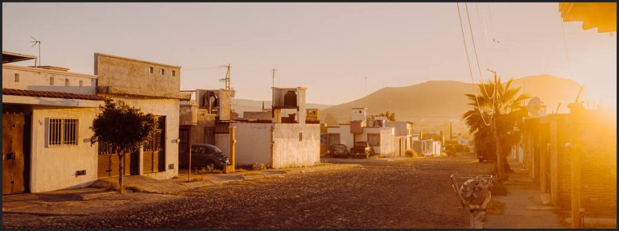
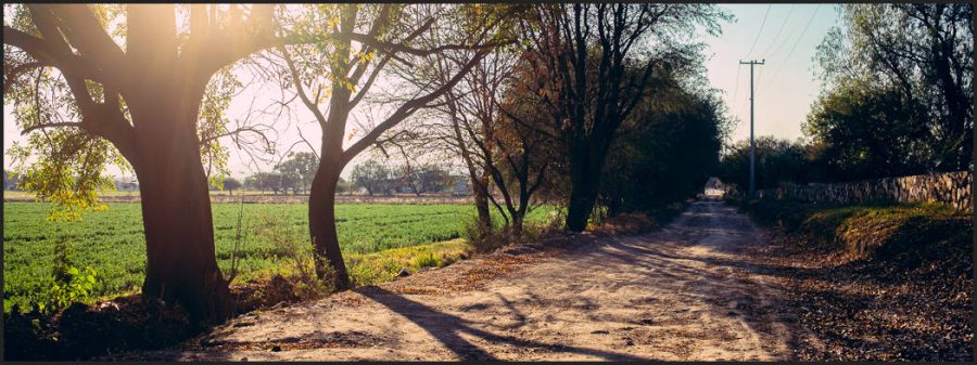
The unabashed flaring of the sun gives a natural haze to this morning street that can’t be done with a single slider. It was processed gold using GoldChrome
The stuff that great photos are made of.
The photographic tone is the foundation of great photos. But the tone is a wide-ranging one that comes from the painters and the way they learned to understand shadow and contrast long before cameras.
This is the lost skill in Photography that I go on deeper in my workshops and today I’m sharing the keys to unlock this door in the simplest way I know how. IN consists of 3 elements that lead us to what tone does for us and why it is important.
Here’s how I explain photographic tone. But it’s more important to show!
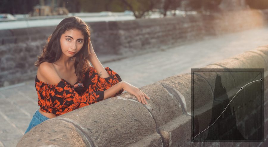
Shadows create contrast
Contrast reveals tone
Tone creates atmosphere
These 1,2,3 lists mean little to your photographic tone without context. So in the video, we’re comparing different photos to see how not only edits but how shadow contrast and ambiance in each will define our result.
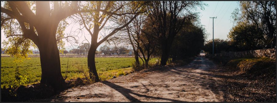
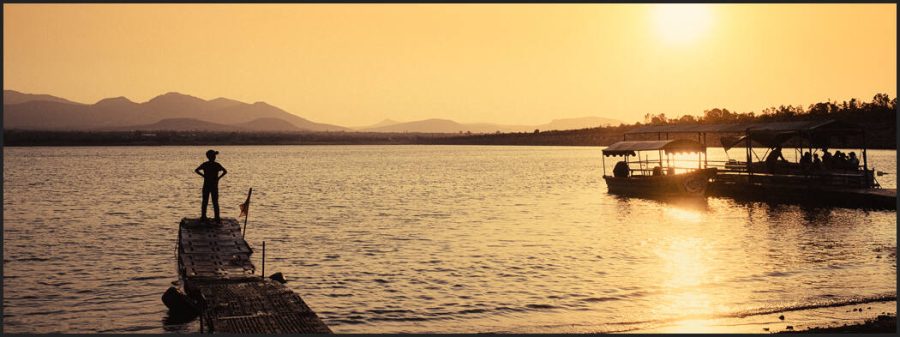
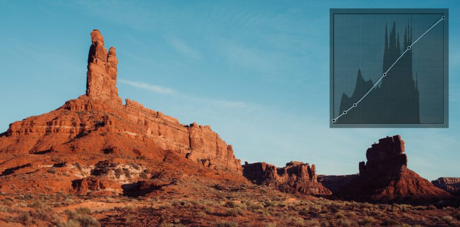
IN another Xpan style crop we see light creating bloom and reducing contrast. The net result is that tone is more subtle and more contrast is created in the overall image. Edited with Street’ist.
Most photographers don’t even know what it is
In my Exposed Master class, we learn everything about exposure and zones. Those are the technical aspects. But if you’ve been to Shadow Hackers or seen the Photo Perfect workshop you know that combining those with the artist’s aesthetic is what makes a great photo.
In the end, the tone is pretty simple and yet subjective. But if you constantly remind yourself of the three factors. Shadow, contrast, and tone, which is the combination of all the light and dark and mist and color. All of them combined create a tone in your own style.
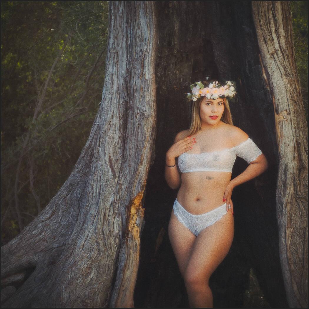
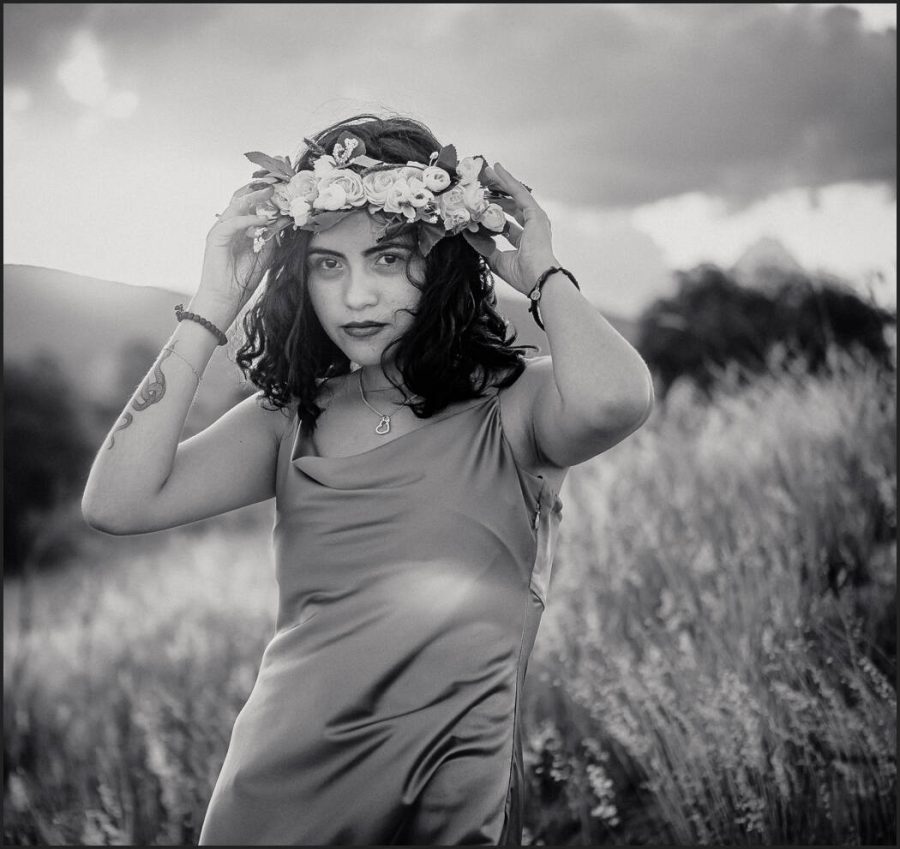
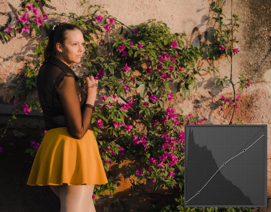
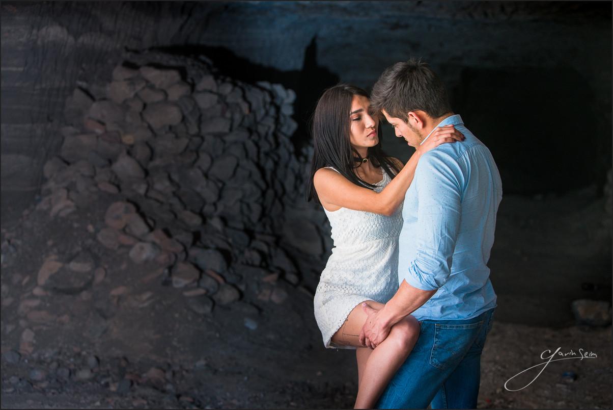
We see the contrast between the burned tree and the tone of the model. Then edited with a David Hamilton-inspired process to create softness with contrast and a balanced photographic tone.
Less contrast is often more contrasty!
As much as I use sliders and settings and layers inside and out in my tool packs. Tone-like shadow is not created by the slider it’s just moved around.
When we use contrast to just create hard lines we lose tonal nuance and atmosphere. In the end, the contrast of the overall scenes is less, and viewers don’t see the nuance you wanted to show.
As I keep building these free resources and simplifying the process of understanding tone I help myself learn more and hopefully, you as I realize a dream that’s spanned 20 years to make a simple process for those of us who want to truly master our style in photography.
We compare two of these in the video. Note how the tone of this one is softened but less distracting than what might be called the contrast image. Edited with Filmist.
It took me years to learn that consistency, style, and editing speed are directly linked. Many new photographers think editing slower means a better edit. In general, the opposite is true!
1. Why Speed_Mods improve your photography style and speed.
I’ve shown you how editing mods create a better editing result and speed in Lightroom and Capture One. Today I will break down how they are made and how to use them better.
Like Speed-Masking in Lightroom, Speed_Mods are included in my preset packs and you can make your own. They let you take any recipe and make it your own but without wasting a second. So, lets not waste any seconds and jump right into todays video.
2. Your style starts with consistency!
I know firsthand that finding a style can take time and that you sometimes can’t seem to decide. Part of the issue is that we have SO MANY EDITING OPTIONS that we lose focus.
It’s not wrong to have various flavors in your photos. But your style can be defined not only by how you shoot, but also by the nuance of your edit. Most overthink this, so they are always searching. But your recipes combined with Speed_Mods will help you stay the course, and your style will shine through every time.
When you create or use presets in Lightroom, the goal is not to create the same photo as everyone else. Just like when you shot Portra 160, it did not mean your photos were meant to look like the rest of the world.
Things like this Xpan 65×24 crop can help you define your style. And film edits and mods do the same.
3. Recipes are like your Film, Mods are like your chemicals.
If you use Filmist and add Porta or Ekrar or Classic Negative, those looks are a base recipe that has been proven to work millions of times.
Buy using a recipe (like choosing a film) you create a aesthetic, but just like in the darkroom we could then shift shadows, tones and details by how we developed, not you can adjust that recipe to your liking.
Of course going straight to granular sliders is fine. But say I apply Silver 5 wet plate look like I did in the video and I want a more HDR feel. I can go and play with sliders of I can simply apply the HDR mod from mod-kit presets. The speed-Mod gives me a refined process based on testing and I am done in a moment.
Professional software is about being able to find your creative edge and your style. Just like for 20 years we’ve used Actions in Photoshop, the RAW editing apps made for pros will always have tools like presets and styles to let us create more and faster.
In the viddeo we see how this photo started as a bit of a dud. But we found the style in it that fit with my theme by having the right mods recipes.
4. Photographers who know their own style!
I can’t tell you the amount of times I’ve seen people say. Don’t use presets, don’t buy presets, make your own style. It’s like saying, find a harder way and use that instead. Pros want all the tools at their command.
There’s nothing wrong with making your own presets and styles like I show you in this video how to plan your own Speed_mod presets. Just don’t put up walls to your creality.
I’ve spent hundreds of hours refining packs like Silver, Natural HDR and Filmist. (all of these have free packs) Why? Because once a work is built, it can be used again and again and I don’t have to waste those hours to maintain the creative style I use with those presets and a few mods.
Recipes and mods combined like this will elevate your editing speed and style, and I hope you’ll give it a try and tell me in the comments what you think.
Gavin Seim
Mods like Speed Masks that I use in Elegance 4 let me use advanced tools fast and try them, that means I try more things to get the look I was going for. Speed, recipes and good mods means a more focused edit, not a generic edit.Many mods can work. By finding a recipe I like this bold warm Gold-Chrome look, I can then mod to make the style fit my visualization . Staying consistent and strong in my shadows and presentation.
Curves are how most pros and quality presets control the detailed tones in a photo. But in today’s short video, I’ll show you a better way to use your curves. We’ve been using S Curve in photography since the dawn of digital. But this is the F Curve!
Why did I stop using the S Curve in my Photography?
Because after years of editing, and studying dynamic range. Creating popular editing packs like Natural HDR and Silver black and white. I realized the S curve was often overdriving on our edits.
So I started creating the F curve in my recipes. It gives contrast control, without giving you a crunchy, overly processed look. It does this because it’s based on chemical film processing and is more flexible.
In this video, I’ll show you how to use the F Curve!
If you want Lightroom presets or Capture One Styles you’ll find great examples of the F curve in the free sampler packs of Filmist Film presets and Silver 5 presets.
It’s easier to add fine control to an F curve because we’re not always looking for that S shape. A film-like curve is useful not only for recipes that require a film-like feel. It simply works on nearly everything.
It might feel like an S curve when you start. But don’t stop there. Pull down the highlights and then lift a little in the middle, pull the shadow area a bit down and the black a bit up. You can vatu this any way you want. Just keep the curve smooth and maintain that highlight drop as needed.
I didn’t have a name for this, I just knew this simple course was giving me results that felt better in most situations, and I started using it a lot. It was only after years of applying this that I realized how simple it was and started calling it the Filmic Curve, or the “F” curve.
Gradually, I started using the normal photography S Curve less and applying variants that merged it into F curve. I watched as my own presets and edits got smoother, with better highlights and even better shadows and contrast.
It’s a simple tweak that transforms your edits.
An F curve can start like an S curve. But the way it drops on top is the key factor in the result. You can then mix shadow lift and drop.
But without Shadow, your curves mean nothing!
When I started developing Filmist film presets years ago, I realized that Film has a softer highlight roll-off than digital has a hard sensor. Contrasting lenses and easy-to-move editing soldiers were getting over-curved. especially with the traditional digital photography s curve.
A curve can add or remove your shadow. The S-curve in photography can quickly pop highlights or put some punch into shadows, and often it works well. The problem is that it tends to do the same thing to every photo, and while it boosts contrast in the edit, you lose fidelity in the roll-off details.
Tone roll-off is a big deal. And what most don’t realize is that you don’t always need to push up highlights because they are actually very perception based.
That highlight will seem BRIGHT depending on the tone of the shadows that surround them. To learn more about shadows watch this video on my channel. In short, combining smooth highlight roll-off with organic feeling shadow gives you a rich result.
In this Ektar recipe from Filmsit the F curve is already part of the process giving a subtle highlight rolloff like film.
The F Curve will replace your S curve crutch!
So instead of the S Curve in your photography, us the F curve because you better control the shadow dimension and how that relates to your highlights as they roll off perfectly, just as they did with Film!
You also won’t always feel like you have to create that S shape will open up how you use the tones in each photo.
I hope you found this useful and will spread it around because the F curve really is better than the S Curve. Please spread this around and let me know what you think in the comments.
Gavin Seim
A strong double drop at the top of this F curve softens the specular highlights that were a problem in the portrait processed with a Portra look.
Expose to the right (ETTR) has been preached relentlessly for years in digital photography. But does it actually help?
I think now. In my recent shadow hackers workshops (join the next class here) this has come up and it made me think about how prolific this dated technique still is. Tell me what you think in the comments.
In the video, I’ll show you why ETTR is not usually right. It’s not always wrong to be Expose To The Right to achieve something. But using this as a general exposure tool in photography will lead to worse images.
How did ETTR happen and should you actually use it?
When I made the Exposed workshop covering nearly possible approaches to exposure, we didn’t focus on ETTR because when you know what exposure or that light meter is telling you, you rarely need to expose to the right.
Like every idea or rule, it’s not really a rule. So in the end, if you get great exposures you win. But I think if you start hunting the shadows and exposing “right”, rather than TO the right you’ll see a transformation in how well you expose and edit.
It does not matter what you are shooting!
If you know the principles of exposure, your histogram, zones, and settings. They will soon become automatic. You’ll see yourself start to create naturally, knowing the light and the shadow like an old friend.
Ever said to yourself… “What is the bleep wrong with my details.” — I sure have. So here’s what 20 years as a photographer has taught me about how to fix that annoying feeling of failure.
Detail comes in different ways; often combining sharpness and softness to get an image that brings everyone’s eyes to your subject. I trained in large wall prints and which meant people will see every detail when I screw up. I’ve written about image quality in articles like 5 Tips to Razor Sharp Images and the 6 Keys to Great Image Quality. Today we’re going a little deeper down this rabbit hole and look at what makes detail perfect.
1: 5 Detail Essentials: When neglected, these produce terrible results for even the most experienced photographers. They sometimes haunt me more when I’m in a hurry because of a hectic session, or light that is running away. But the more I think about what went wrong, the less I repeat those mistakes. My first 5 rules are Camera Stability, Optical Quality, Aperture, Sensor and Post Production. These always will be critical. A camera on a tripod, a stabilized lens, a firm hold when you make the shot.
Lens quality, many new photographers get images with fuzzy detail not realizing that they need better glass. Ditto for aperture. Too shallow and your scene and things you want sharp get blurry. Stop down too much however and diffraction will reduce the quality of your glass. Sensor settings and knowing what your gear can handle, how you post process and manage those details. All of these things are important. But there’s more.
Let’s go deeper.
2: Motion or Not: Stability is always critical. Movement ties directly into shutter speed in order to overcome that movement. But sometimes we want the movement. Blurred water, a running horse or amber waves of grain streaking across the frame. The key is to remember that we need zero motion on subjects we want sharp. I know you’re thinking, “hey captain obvious, we know.” But consider this. In traditional images, you want the whole frame frozen. A tripod offers the most freeze, Camera or lens image stabilization can help a lot. Even pressing the camera against your cheek. It’s a question of shutter speed vs motion. If the shutter is fast enough, it freezes everything.
There’s more too this. If you handhold a landscape at 100mm the rule of them says you should be at least 1/100 of a second (a tripod still gives you a better result). But what if that’s a portrait? I can end up with more blur because of the micro-movements of a living subject. Sexy people waving in the breeze as they pose or a wild kid who can’t hold still. Not only might my camera be moving, but so is my subject as they shift weight, change poses or their hair blows. I see that extra blur in portraits a lot because of body movement. We’re talking deep details, sharp eyes, beautiful skin and in focus parts. In reality, I should double my shutter for a living subject. I tripod eliminates one movement, but my subject is alive and the most natural poses don’t come from telling them to stand stiff. So in a lot of cases by doubling the ISO, I can double the shutter speed and the pay off is more detail.
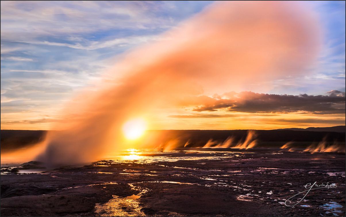
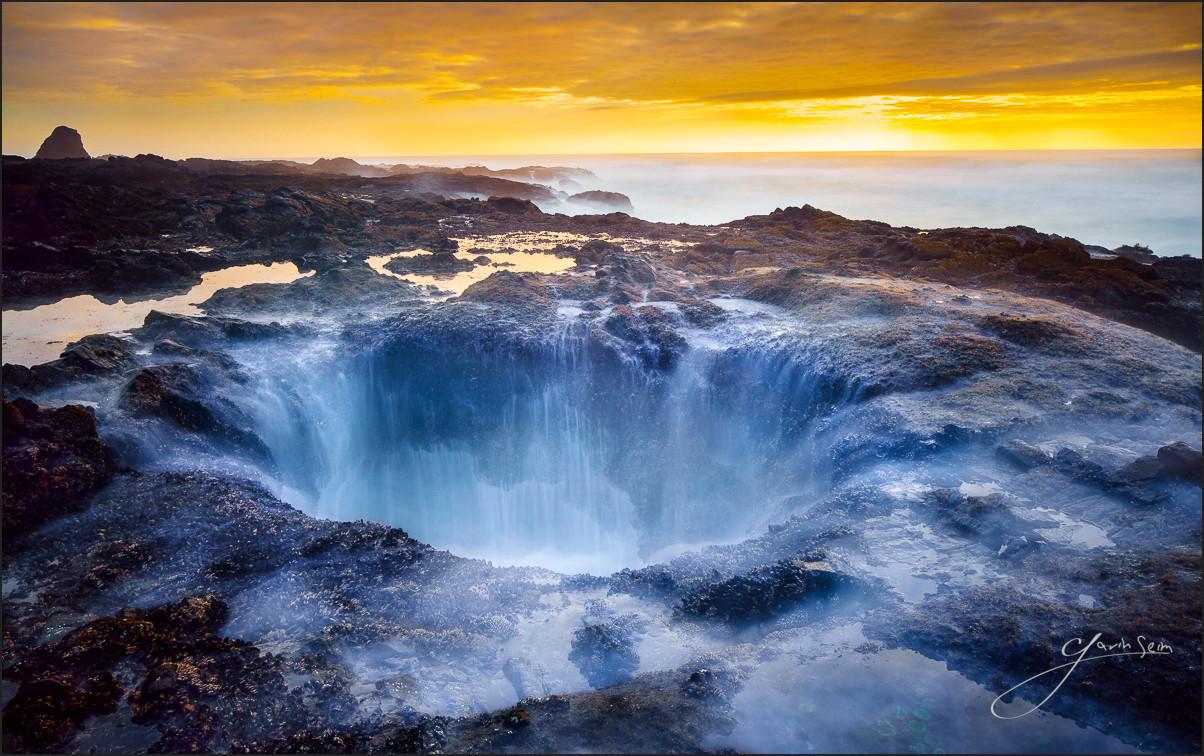
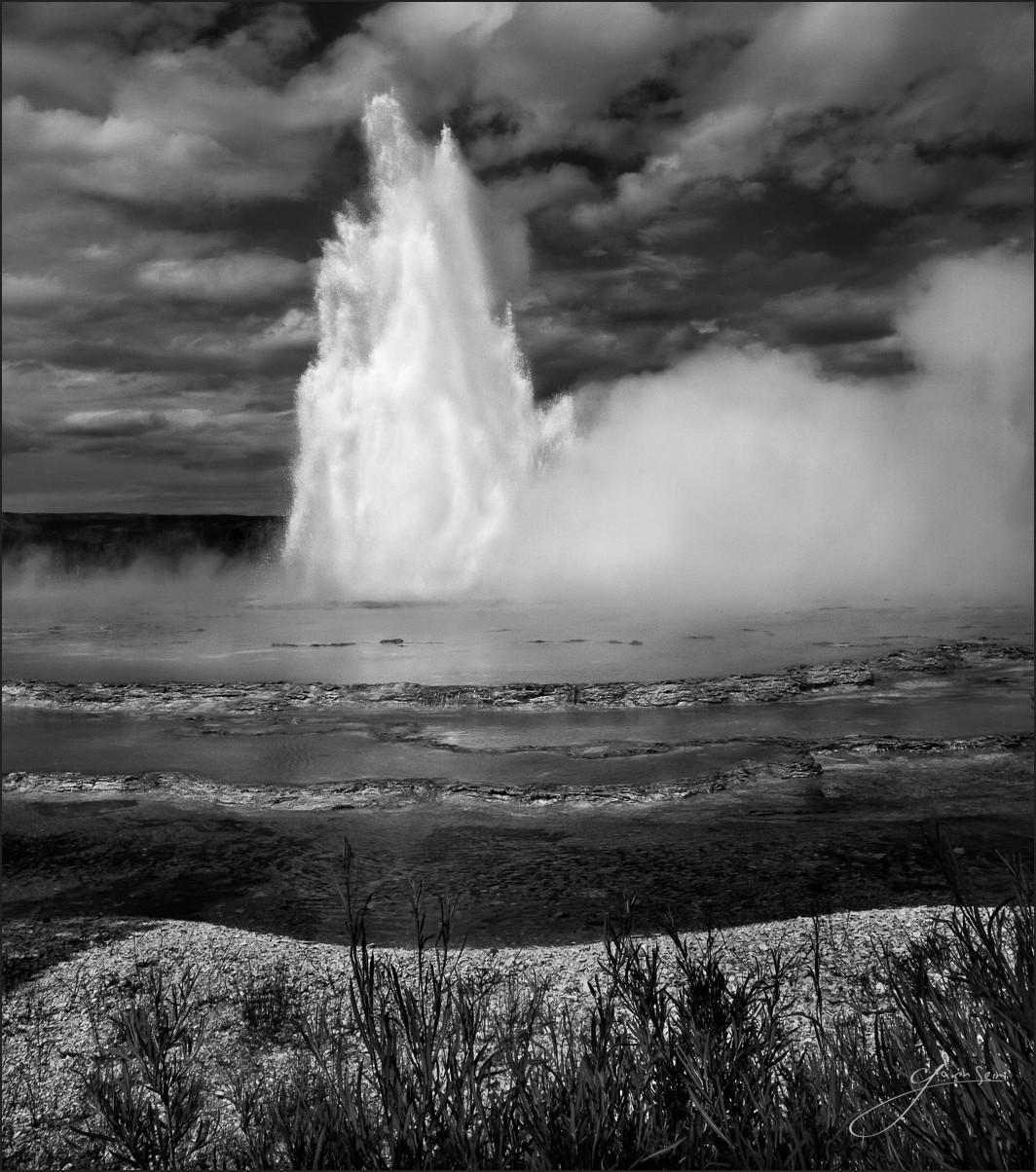
I also want detailed motion. The slow shutter is amazing but tricky and tripod is the key to winning here. Maybe I want blurry water like in this image of Thors Well on Oregon. Slow shutter does not excuse poor detail so if I’m hand holding, those barnacles will be soft. If I make my camera rock solid, my the water is detailed even in motion and the rest is as if we used fast shutter speed. Look at the geysers in my image Yellowstone and detail front to back while the steam turns to silk in the 10-second exposure. Motion is a kind of detail and how much motion is now a question of me using as slow a shutter as I need, using ND filters if needed to slow it further. I’ve done exposures over 2 hours this way and still had sharp details in the stationary objects of the scene.
3: Light and lens: A quality lens is a give. But that does not always mean sharpness. There are many factors affecting how much detail a lens can capture and you want to know them. The depth of field is important and that means knowing aperture you need to keep everything you want in focus. But don’t hop on a tripod go down to f22 and think everything will be sharp. Each lens has ideal settings. For most 35mm lenses the sharpest point will be f8 to f11. That’s not to say you can’t go past that, but doing so will often start to cost you detail. Take your favorite lens and shoot a photo at F8. Then do the same at f22 and compare the detail. The same goes the other way. Most lenses are not quite as sharp wide open as they are stopped down. Everything is a trade-off. Don’t push the limit just because you can. Learn the limits and use only what you need.
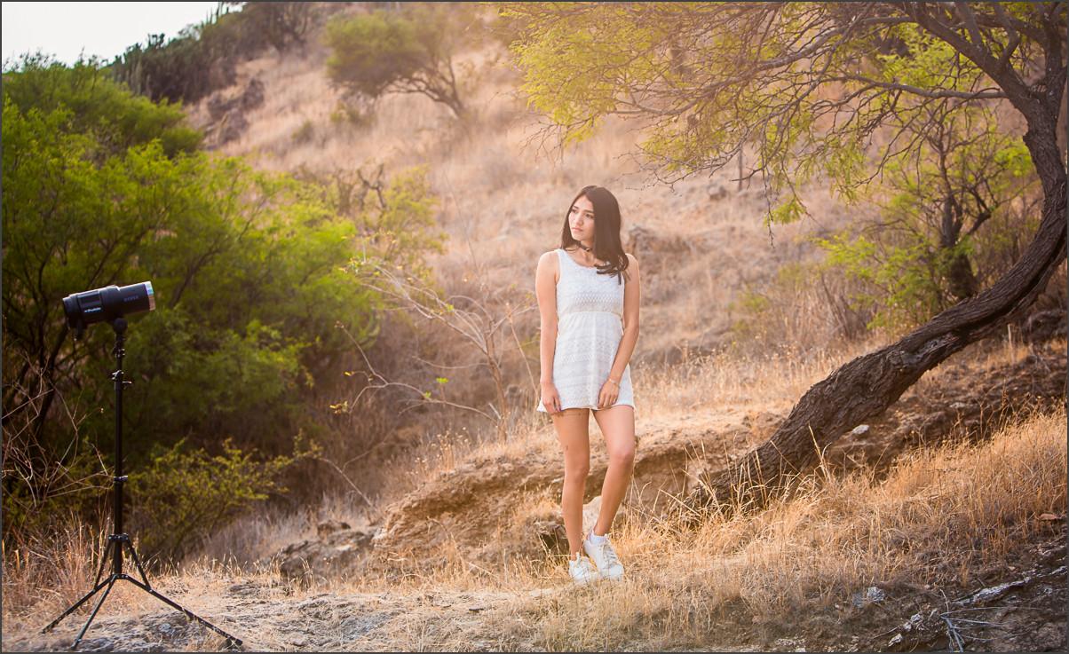
The same goes for how light is hitting our lens. If you’re getting a flare or haze fee, that means a loss of detail in that area. Sometimes is beautiful and it can look great; just remember you can’t restore detail that was never there. If you don’t want a hazey flare, then use your hood, your hand or change positions relative to incoming light. How the light strike the lens effects how an image passes thru it. In this portrait, we see a natural haze created by the light hitting the lens. Notice how the detail is softened. It works great here, but not everywhere.
4: Getting Perfect Focus: AF has become amazing in recent years, but only you can truly know what your focus is. Sime camera focus on eyes, this is usually good for portrait. But what about that wide open aperture for a great bokeh. This means SHALLOW depth of field. So who’s eye is in focus. Say I you a couples portrait or a family, even an inch or two can change your focus. I just had this happen recently at the bus stop shoot. 90mm, f3.5, autofocus. It looks like our focus gravitated towards the overhang on the bus stop. On the left, our man still has usable detail, though not perfect. Notice how his head is further forward. Our lady is a tad further back and that’s all it took. The lack of detail on her face makes the image trash for any serious presentation.
I should have watched closer what I was focusing on. It was dark, I was losing light, I didn’t stop to examine it. Thankfully I nailed other great images for this session. How do we avoid this?
I love switching to manual focus and zooming in the live view to check that my focus is just right. I usually do this with landscapes and sometimes with portraits. But the bottom line is we have to watch for what could go wrong. It does not take much to throw the eyes or face our of focus or to have the camera see the rock instead of the tree in our landscape. Take as much time as you can to check every detail and take a few test frames to review on the screen at full zoom before you walk away. That’s the beauty of digital. It prompts us to rush, but it’s amazing if we slow down.
5: Framing Details: In the end detail is more than pixels. You can get all the above right and still have a bad photo. Great detail also tells a story. Its sharpness is mixed with bokeh or how tones are used to highlight or subdue parts of the image. It’s whether you frame the shot with the foliage sharp in the foreground os bowing in the breeze. It’s whether you took the time to move the dead cat from the frame and straight a girls hair. It’s the art of details that’s the hardest. Detail and sharpness are not simply about focus and noise. When you think about detail, think about what you want in the photo and what you don’t. Think about how using details (or lack of them) can draw your viewers eye and tell a story. Make the technical aspects a natural response so that the artistic concepts can drive your image making. See my recent video about where the frame stops.
6: Process more Detail: You can’t restore information that was never there, but you can use your tools better. All digital images have noise, this changes from camera to camera and with different settings. Most RAW processors remove some noise by default. Sometimes your camera removes noise as well and has settings you can play with. Defaults usually work well but don’t be afraid to experiment. Think about when you apply settings too. If I have a RAW file I’ll start with a basic noise reduction as needed; just don’t turn it into pasty smoothness.
I usually leave sharpness low or default on a RAW file if going into Photoshop. Too much can grow into messy artifacts. Process your details in a balanced way and then apply more at as the last step if needed. That way you’re not creating detail artifacts as you apply other looks, layers, actions etc. At the end I’ll usually apply a final sharpening and a little grain for a natural filmic look. We have some presets for this in PW6 and as well as actions for more advanced retouching and sharpening.
Let me know in the comments what you think.
A great image is about balance and it’s freaking hard sometimes. But that’s what makes it so fun. These more advanced tips go beyond the fundamentals we talked about in step one and are here to make us think harder about what’s in our image and visualize how we want it to look so we can nail it in the camera. I hope this gives you some things to think about. The more our skills become second nature, the less of a burden they become. Exercise yourself in the details and soon you will apply them easily.
Never stop asking yourself. How can this be better?
Here are some things we make to help you master what we talked about today…