Film and darkroom processes do make you think more about your photographer. But are they the right tools for improving especially for beginners? Probably not! But there’s a viable alternative.
I shoot film. But is it worth it for you?
You can also get the free Filmist presets here to see real film tones in your edits. Also actions like Emulsion were created based on darkroom processes.
Yes, the film is worth it sometimes.
Film has made a big comeback in the past few years as people tire of fakery and Ai and want more organic real experiences. But it’s also very expensive.
Whether it’s the magic of Instax or POloroids or whether it’s the subtle shadow and color theories you understand better using film. It does pay off. I just don’t think it’s the secret sauce for newer photography for the reasons I mention in the video.
Look at how film affects your digital edits.
Someone recently told me they liked my LIghtroom presets because they were not gaudy and pointless. A lot of that is that I’ve been making pro-grade presets longer than anyone on the market. But what I immediately thought of is film.
My film and shadow hacking studies have shaped the way I create tools and it’s a big reason why they are different from the others on the market. The way film helps you understand subtlety and tone and color versus just pushing a slider increases the more you use it. If you spend any time on analog I think you’ll understand what I mean.
My conclusion.
If I plied film is not worth it that’s not what I mean. What I mean is that film is a tough tool to start on. It’s more something to work with once you are at that intermediate or advanced level where it’s nuance will mean more to you.
So yes, everyone. Get some vintage lenses. Shoot some film on the cameras that often come with them. But don’t think you need film to improve your photography. Slow down and let the shadow lead you.
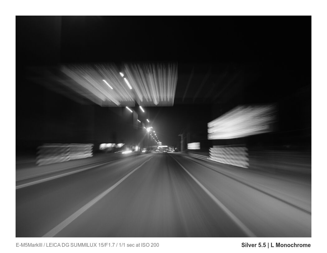
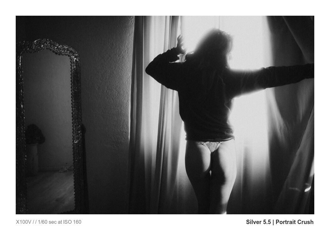
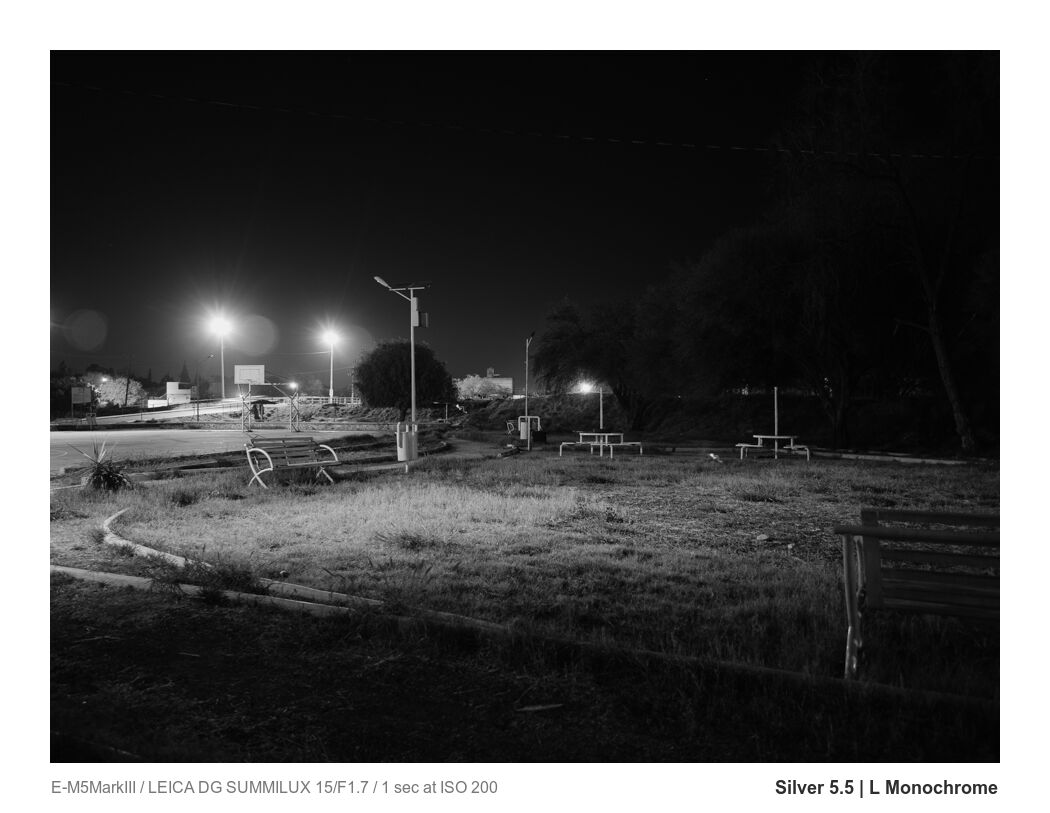
Monochrome cameras let you shoot in ONLY black and white. But they are not what makes your photos jaw-dropping. I dug into this as I worked on the new Silver 5.5 preset update and the new L Monochrome preset I crafted for it.
Last night I was shooting a roll of Delta 3200 and thinking about what makes a black-and-white photo work and why many color photos converted to black-and-white fail. The problem is not the camera. It’s the tone. Like we talk about in Shadow Hackers.
Customers using a Mohchrome camera often ask me if my black and white tools like Silver and BlackRoom will work on these files. The answer of course is yes, it still lets you edit tone you just don’t get the color channel info. The process is still the same.
If you take a color Leica VS a Moncrhome for example and simply switch the color to BW mode there is very little difference. Monochrome does not make you better just because you paid more.
Use the camera that inspires you…
Just don’t think a cool camera will make you a great photographer.
In today’s video, I’ll show you the best secrets to amazing black-and-white images and it’s not the monochrome camera. But if that’s what makes you shoot and lobe your work, use that.
If you love this camera use them by all means.s Monochrome camera due to being made only for black and white has a unique feel and is also amazing at high ISO being less vulnerable to noise. Here’s a good video on that.
While the low grain of a monochrome camera is great it does not mean “better” photos or more authentic. True black and white film has grain and it’s one of its artistic characteristics. Neither choice is wrong.
Even that does not make a good monochrome photo
The gear is not what matters the tone is. Stay to the end of the video because I will close with some valuable tips to test and see if your tone is special or boring.
In studying how monochrome cameras render and making the new L Monochrome and S monochrome presets for Lightroom and Capture One I was struck by how flat and even monochrome fields were. They rely on you finding that contrast in the camera and challenge you.
People are sick of subscriptions and hate Adobe right now (they really deserve it). Subscriptions were never for us. So today I compare Lightroom vs DXO Photo Lab.
LR vs DXO Photo – An alternative to Lightroom and C1?
Maybe, but it’s complicated. Quality tools like Capture One (that I reviewed here) are also turning against their users by going virtually subscription only. So I am going to start testing. Today we look at DXO Photo Lab vs Lightroom.
I mentioned Filmist which includes LUTS you can use right now in DXO! For my LR and C1 users, I used Silver 5, Natural HDR, and my Speed Masks.
Last year I compared Lightroom to Lumiar Neo.
It was not there at a pro level. Luminar Neo got a D in terms of pro-level ability in my review. Lets hope in improves but in the last year much has changed.
It’s a fun tool. But not a serious choice for a pro. We need better integrations and better process quality. But with Lightroom vs DXO Photo Lab 7, there’s a smaller gap.
Lightroom vs DXO Photo Lab – Speed
DXO also has some unique tools and it’s snappy. Something you can’t say for LIghtroom and barely for Capture One. Both are resource-intensive apps.
It’s DXO Photo Lab is not without faults.
The 20 minutes of the video is worth it because I’ll cover the important things that make a pro-level app usable for actual pros. Not just cool features that look good in a sponsored review.
Zero sponsors. This is my honest DXO Photo Lab Review
None of these apps sponsor me and I have no affiliate links here at this time. This is just an honest comparison from 20 years of professional experience doing real sessions. No shilling.
Rather than write the results of DXO nouse reduction vs Lightroom and extra tests like how it handles processing against Neo, Capture One, etc. It’s all in the video.
If you want more hard tests of these apps let me know and I will not hold back. DXO Photo Lab Vs Lightroom seems to be a real option. But with limitations that I hope they can improve.
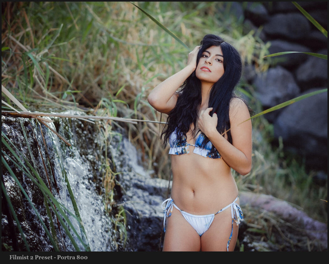
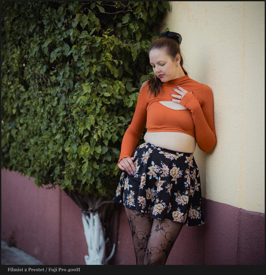
There are lots of free Lightroom presets around my site like Silver and Natural HDR. But my most popular ones are my free film presets and I’ve updated them today for Filmist V2.
In the FIlmist free film presets and styles pack you get the next-gen Portra 160, Fuji Classic Negative, and Agfa RSX 100 film styles.
Just using these film presets will give you edits that feel true to the film. Photographers are learning that real photos are what matters in this new Ai world. For more on this check out my post and grounding your edits with film styles.
Below is a hands-on video from my channel on how to use Filmist 2. If you need help installing the free LIghtroom presets or Capture One Styles, check out the videos on the help page.
Here are the improved film styles in the free film pack.
The latest refinements of these film styles are like true film. I’ve shot more film, done more side-by-side testing, and made every film recipe in Filmist 2 better.
I hope you love these and buy the entire Filmist film presets pack. It’s years of work and it is the best lightroom and capture one film presets I know of. But for now, at least grab my free film presets pack and enjoy.
Oh, and you also get free film LUTS in the free and complete pack so you can get the true film look in video editors like Premiere Pro, Resolve, and other photo apps like OnOne and Luminar.
Portra 160 Gen.3 Film Preset
Portra 160 free film preset is a classic and the latest Gen3 version is even more refined. Portra 400 and 800 are also included in Filmist Complete.
How do I decide what presets to use? The power of REAL Photos.
I’ve been making high-grade Lightroom presets and free Capture One styles for many years. So why am I obsessed with getting perfect film looks? It comes back to maintaining that natural real look that the film created and that I’ve managed to duplicate in Filmist 2.
I use the balance I learn in creating film presets to improve my other presets. That’s why they all play together well.
Some photos need a different look. I normally use films as a starting point. But depending on my photo I’ll also use Natural HDR, Streetist, and my other packs.
Each of these packs also has mods. So while I love the ChemKit2 mods in Filmist I don’t hesitate to go to ModKit from Silver 5 black and white presets or maybe GoldChrome for a rich color warm look.
Fuji Classic Negative updated in Filmist 2 Free Presets Pack
The Classic negative look is inspired by Superia 200. One of my most requested presets and the new Filmist 2 version is even better and more accurate than what you get on a Fuji camera.
The film looks for digital is more powerful and moddable.
The thing with film presets is that you won’t edit this way manually. Digital sliders are designed to let us push hard and the nuance of good film styles can take weeks to refine.
In a real darkroom, we could manipulate how we develop and print. So I put a ton of time into the ChemKit2 mods in Filmist. They let you use a film look and then adjust it instantly with darkroom-inspired processes. I included of of these for tone in the free pack. Turn it up and down and see what happens.
The beauty of using Lightroom presets and Capture One style packs is that with well-made film styles, you get edits that take hours in seconds. Once you get used to the milder grounding look of film it becomes a go-to. But if you have a photo that is not working with film, don’t hesitate to branch out.
Agfa RSX 100 II Free Capture One Style and LR Preset
Agfa series films are rare as digital film styles very much but they will soon be one of your favorites. I included Afga RSX 100 with stunning color and fine grain in the free film presets pack.
I hope you enjoy the Filmist 2 free film Lightroom presets and styles pack and that these filmic styles let you see digital in a new light and use the rest of your presets, actions, and tools better.
We’re going to talk about the 3 Lightroom and Capture One presence sliders today, but I’m not going to teach them the way Adobe does! We’re going to reverse things!
Presence – Clarity VS Texture VS and De-Haze are important!
These all affect the atmosphere. I make use of them in nearly every edit. You’ll also see them used in subtly different ways when I make Lightroom Presets and Capture One Styles pack like Filmist, and Versus when I make tools like Natural HDR.
You’ll also see me use all 3 of these deeply in Lightrooms Ai presets that I include in Silver 5 and Elegance Speed Masks.
I simplify Clarity, Texture and De-Haze in the video. But here’s an overview of what the presence sliders do.
You know about the presence sliders in Lightroom or their equivalents in Capture One. But do you know that these sliders are often used really badly? I’ve taught Lightroom since version 1, but I’ve rarely seen these sliders taught well. Today I’ll show to use them for near-magical results!
The clarity in Lightroom and Capture One allows you to adjust the midtone contrast of an image. By increasing clarity, you can add depth and mid edge definition to your photos, making them appear more detailed in a gritty vs softness sense. Clarity can soften the appearance of an image and give it a more ethereal or dreamy look.
Mixing them up for more presense. Here Elegance Ai masks are used to bit globally we lowered Clarity while increasing Texture. This combination can give a perfect mix of detail and softness.
The texture is a newer but more important feature in both Lightroom and Capture One. It allows you to adjust the amount of detail and texture in an image, which can be particularly useful for enhancing the appearance of skin, fabrics, and other fine details in a photo without the ultra-fine lines and artifacts that come from heavy sharpening.
By increasing the texture, you can make these elements of your image appear more detailed and realistic. Conversely, decreasing the texture can smooth out rough or bumpy surfaces, giving your images a softer look. This can be magic in portrait edits.
All the presence sliders are up a bit here because it brings our richness and texture. But don’t assume that just because it’s food or streets you always want to turn them up. Go down also and watch good things happen.
The De-haze is a useful feature in both Lightroom and Capture One also. It allows you to remove hazey feeling from images. By using the de-haze feature, you can remove this haze and restore the detail of your images in a broader contract sense that’s almost like combining Blacks and Whites. BUT… Don’t always turn this up…
Reversing De-Haze is really taught and VERY powerful. I’ll show that!
I turn Dep-Haze down as much as I turn it up. Maybe more. Because when creating authentic films, organic feeling portraits, and gentle tones, photography ten to use these contrast and presence sliders altogether too much.
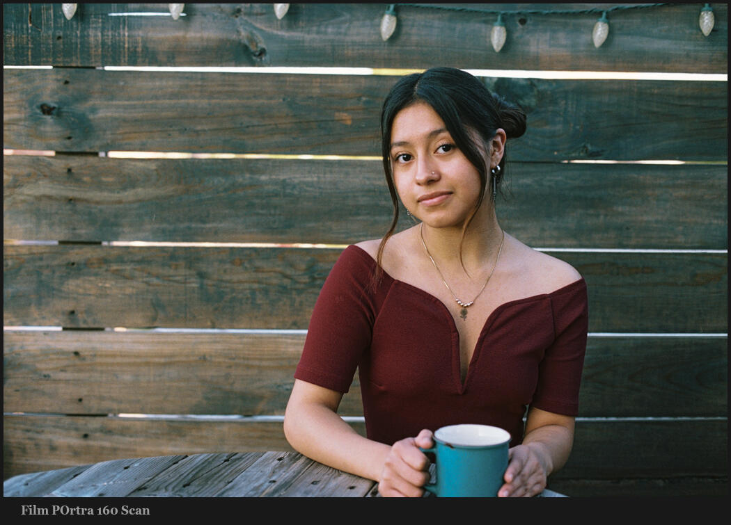
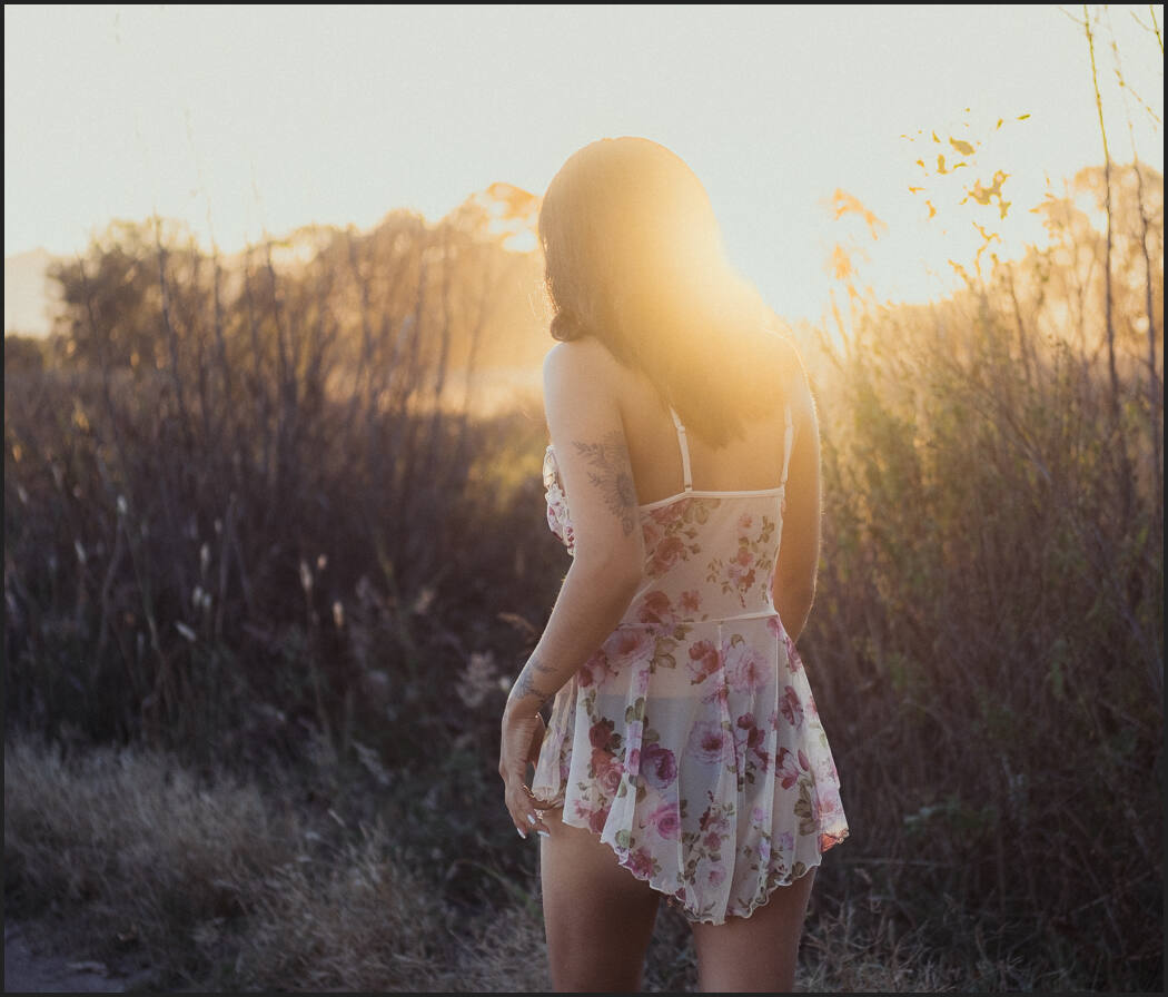
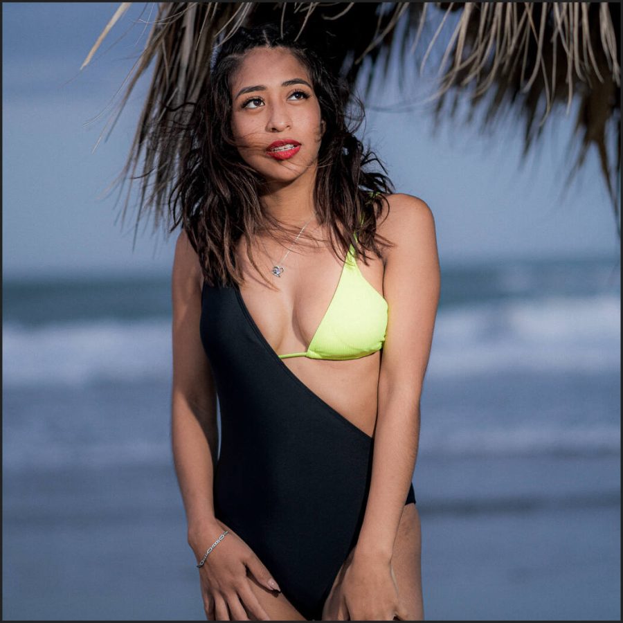
IN this POrtrait I used the FIlmist Portra 160 preset and then pulled down Clarity, Texture, and De-Haze a bit to give a natural organic lens feel that reminds me of how we used portrait filter on the lens all the time in the film days.
Clarity, texture, and de-haze are powerful tools in Lightroom and Capture One that allow you to fine-tune the surface of your photos.
I hope you enjoy and share this because if you know what these sliders can do for your photos, you will improve your ability to edit with them. If you use my presets, pay attention to how I apply these 3 sliders. A little can go a long way and really perfected looks can be created using these settings.
Gavin Seim
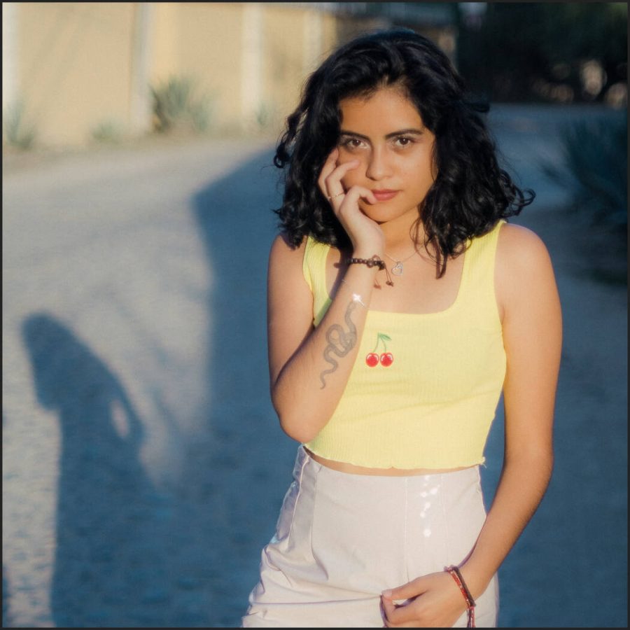
People often confuse clarity for HDR. But as I show in Natural HDR presets, they are not related. This is too much clarity for this portrait. There are times for a gritty high-pass style portrait. Or maybe you are creating a theme that;’s intense. But unless it’s for a solar reason, avoid too much.