February 22, 2025

In my recent Filmist 2.4 update I improved various Lightroom presets and Capture One styles. But one of the biggest was the Velvia 100. Here’s what I found and what we can learn from Velvia 100.

The other films in my latest Filmist Update may have been overshadowed a bit by the new Kodachrome 64 update and the video I did on it that you can watch here.

If you missed last week’s in-depth video on Kodachrome 64 go check it out.

But I want to do a follow-up because I did a lot of Velvia testing and thought we should compare these Kodak and Fuji positive films. Because Velvia is the contrast beast.

If film presets that are true to the film have a subtlety that can help us understand tone and color. Kodachrome 64 and Velvia are both color-positive films but each is unique. And while you can’t get Kodachrome anymore you can still get Velvia 100, in fact, I just shot a roll!
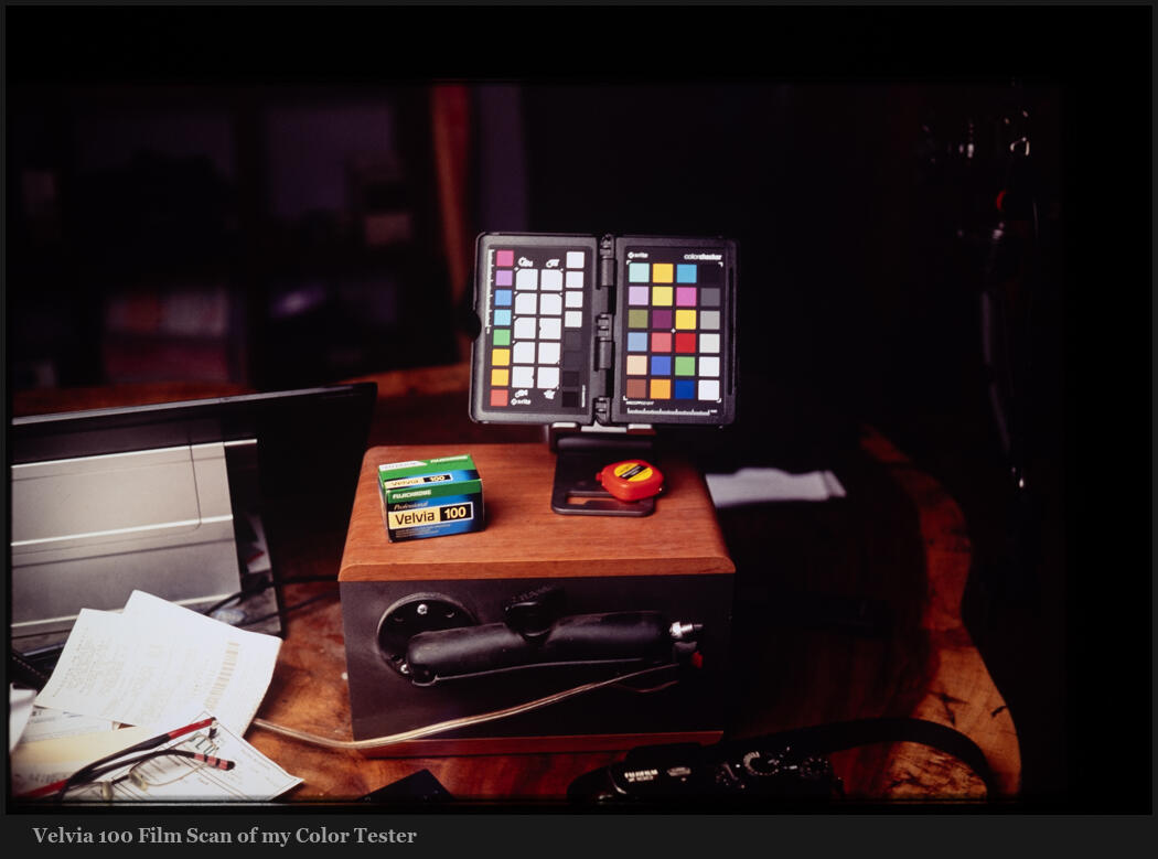
There had to be a lot of work on the red mix curve and midtones here. But they should not be as red as people imagine them. When you see really red in fil;m. It’s often because it was processed wrong.

In the same way in digital; when a process feels a little too magenta or yellow. Often a simple White Balance hack with fill it. See my recent video about color science.

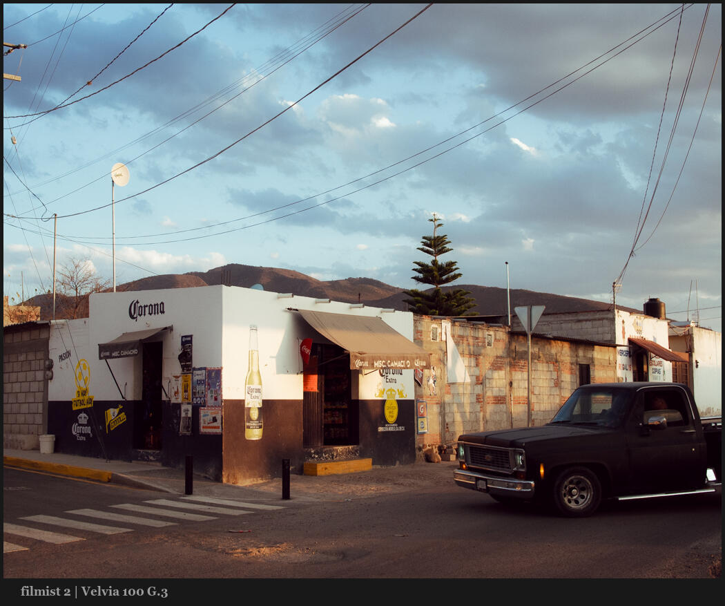
Velvia 50 is more red, but in Velvia 100 there’s more yellow and green. People also think Velvia is extra saturated. But in truth, it’s not that crazy. It does have a lot of contrast, however.

Real contrast is the most important thing we can learn from Velvia. That it’s not always about pushing shadows and having “dynamic range”. This film blows out easily and while it’s not ideal, it makes you think a lot about tonality. This contrast idea is talked about in my video, Stop Using Contrast.
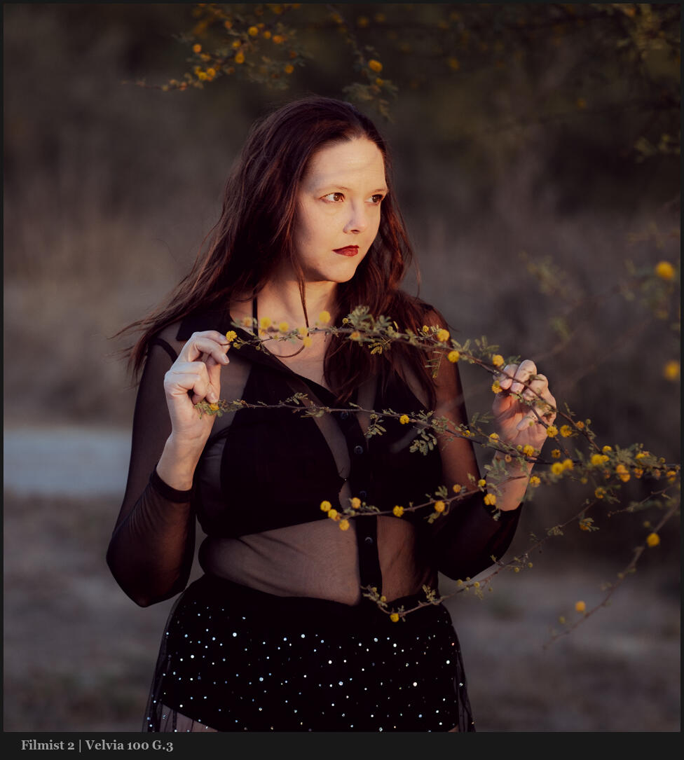
Velvia is the opposite of edits like I made in Natural HDR or even negative films. Notice how it’s more contrasty with popping blacks and whites. This is true to the filmstrips I got back from the lab. That does not mean it’s not stunning for portraits or anything else.

Look at how the Velvia 100 preset stacks up against the Portra 400 preset. This file was shot on Micro Four Thirds and both of these presets are solid to the look of their respective films.

Next to Portra 400 Velvia feels a bit Red. But it’s mostly because they are side by. Portra is warm,. Velvia is contrasty and punchy. Velvia 100 is pretty versatile but not so versatile Portra 400. No surprise.

You don’t always want HDR or even film negative level dynamic range. They can be amawszing but in essence, are lower contrast.

In Filmist we can of course increase the dynamic range by adding ChemKit mods or pushing slider. But remember low dynamic range means punchy contrast and often it’s amazing.

Velvia is famous for its rich colors and while it may seem subdued by today’s oversaturated digital norms, it’s more versatile than people think.

If you’ve ever used most so-called Velvia presets they have way overdone color on digital because most film presets are not at all like the film. There just is the name and go all kinds of crazy things.

If you look at the actual strips and scans you see this contrast. You also see this reddish undertone but the greens and yellow from the film curve stand out more. It’s the way this combines that makes the film so punchy.
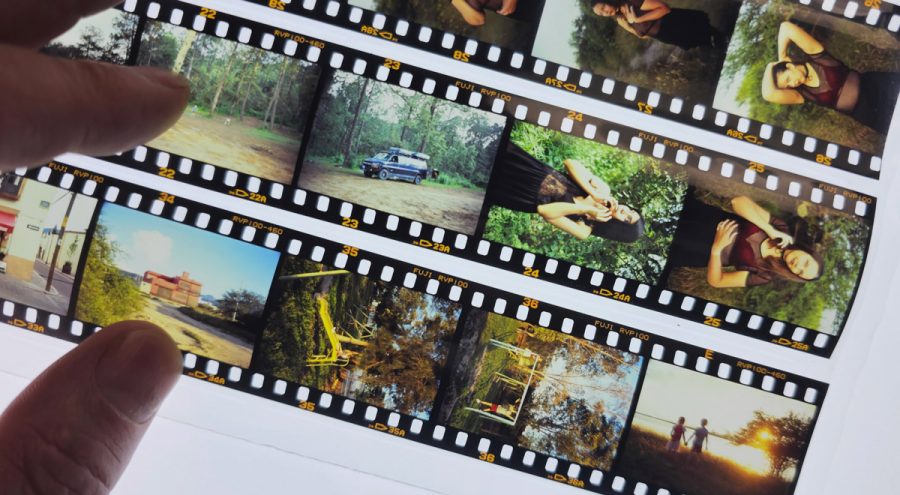
I use Fuji cameras also, though I don’t worry about color profiles and just add the presets after. In fact my Classic Neg preset which is free in the Filmist sampler pack is very popular because many want that Classic Neg look on non-Fuji files.

But sometimes people use Velvia on their Fuji camera and then my Velvia preset and they are nothing alike. I noticed this in the excellent review of Filmist and NHDR5 from Matt at the Turning Gate.

The truth is the Fuji Velvia profile is nothing like Velvia. They just made a highly saturated profile that name that is more loosey inspired by how people feel about Velvia. There’s nothing wrong with that profile (though I rarely want that much saturation) but understand that it has no relation to the film as we see here.
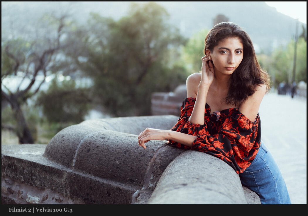
Whatever i am editing. I’ll start with a film look. Even if I end up on Natural HDR, Silver 5 etc. This is because the real color of films is a baseline you can always come back to and each time you get more confident in your process because you have that baseline.

I immediately know what’s up with a file when lets say I use Portra, Ahfa or Velvia or Kodachrome. These are iconic standards and in using them I can quickly see the way colors and light are responding and guide where I need to go from there.

You can see in my recent photo on Velvia below that the preset was applied to a Fuji RAW file. There are differences, especially in the film’s shadow range. I maintained that punch but you still still see that Velvia film falls off faster on 35mm.
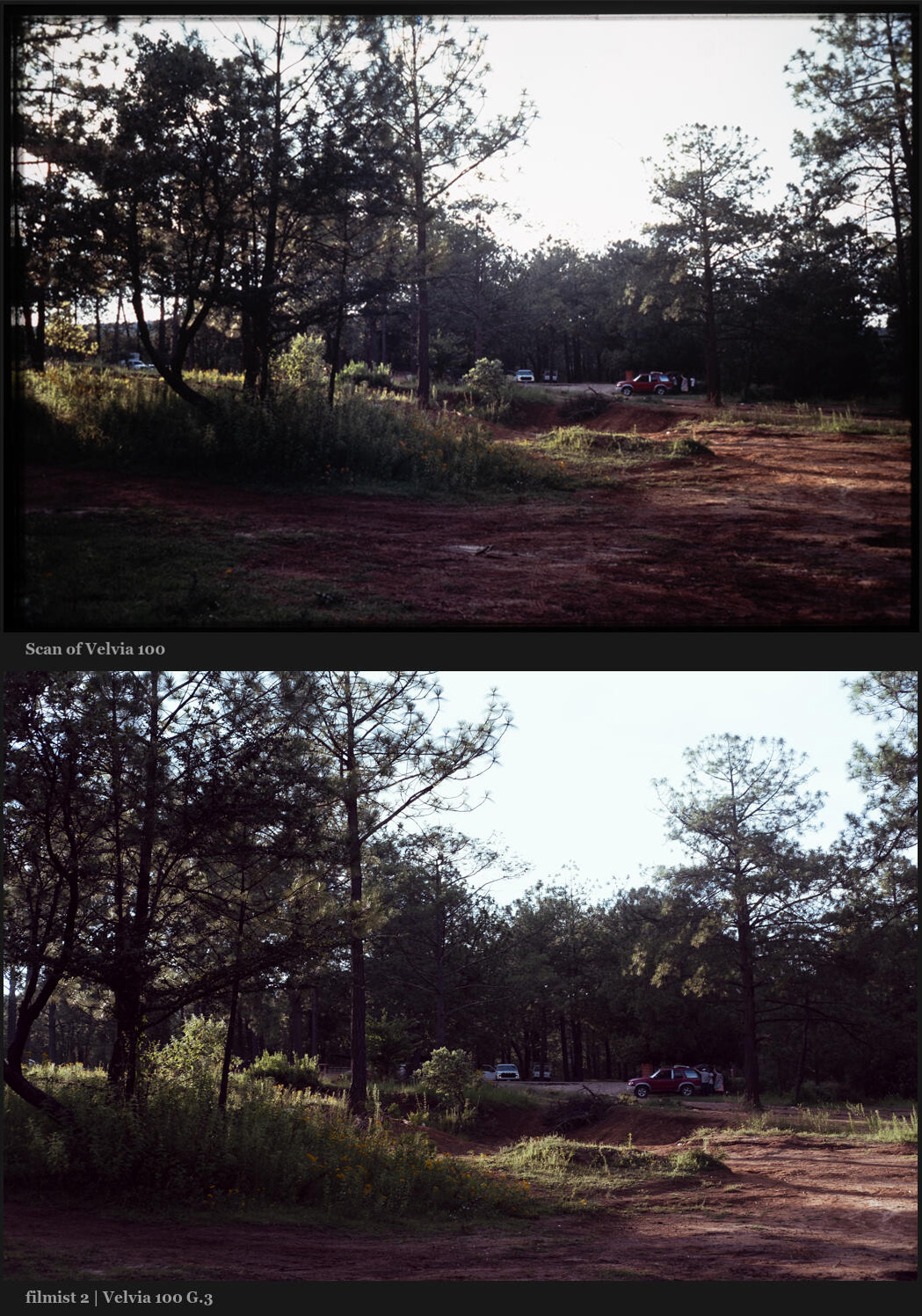
Editing with film real film looks makes all my other editing better and more grounded. It helps prevent me from over editing and it lets me find more creative ideas faster.

I hope you’ll play around with the new pack and even if you don’t have Filmist 2 you can grab the free sampler and get started with film-grade edits. You can get the Velvia 100 in Filmist 2,4 right here.

The takeaway here is that we can use tone and contrast naturally in camera and in post. Like we talk about in my Shadow Hackers class. Today we push a slider for contrast. But when you start being guided by the organic nature of things, you start to see your contrast in a new light.

Have fun and try this yourself – Gavin Seim

Read More

October 17, 2022

There are a lot of Lightroom Film Presets and Capture One Styles. But today I’ll show the films that keep me coming back for clean edits.

I did some street shooting and casual portraits over the weekend and it got me thinking about how my film edits get me shooting more and help me think creatively.

When things feel authentic, you want more of them. So I want to share with you how I use film looks for digital. These are my go-to Lightroom film presets and Capture one Styles for 2022.

I’ll share favorites emulsions from the Filmist presets project in no particular order. These inspire me to create better edits and shoot better in the camera. I encourage you to buy the actual films where possible and shoot a roll or two. It’s an amazing teaching tool. Classics Like Porta and Delta black and white can still be purchased. Others like Kodachrome, Fuji 400H, and Agfa are left to our digital edits which I’ll show you today.

Get Filmist presets here: You can get my complete Filmist pack which includes all these and a lot more. You can also go download the Filmist FREE sampler pack which has Portra 160 and a couple others to get you started and how good film edits actually are.

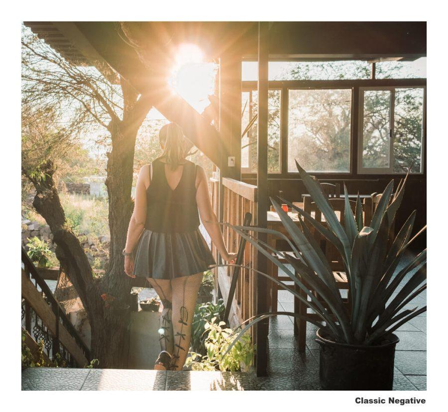
Classic Negative

This one is super popular in Fuji cameras. The look is actually based on Superia 200 film. It’s softer colored and moody and people love it for that. This preset lets me use the recipe on any camera or file and it’s actually one of the free ones in my film presets sampler.

I shoot better in the camera because of film presets.

Film has a special quality. The nuance of tone and colors. And even when doing that on digital, I find myself more confident in shooting and focusing on emotions. Knowing that I can choose my film after and get that atmosphere and mood makes me charge in. Maybe I’m crazy and that’s just me.

I created the Filmist pack a few years ago with one idea. To be the most complete and authentic film emulsion preset pack for Lightroom, Capture one and LUTS for video. I had tried others and they were not bad, but as the photographer who made professional presets since the very beginning of LR, I knew I could do better and make a film preset pack that was not just one or two films, but a complete chemical-inspired system The FIlmist project was born.

Let’s look at more film types…

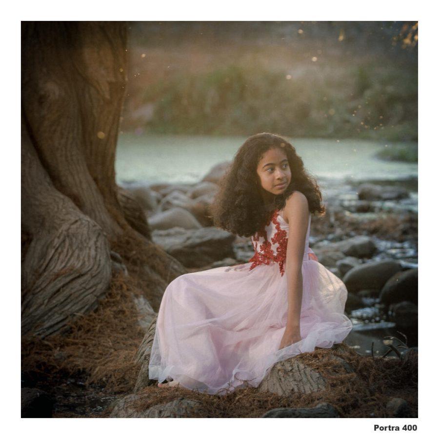
Porta 400

Maybe the ultimate film classic and one that we film shooters can still get and always come back to. So I put a lot of time into getting all the Portra looks right. And I always come back to it.

It does not matter what Camera!

I was a film lover before I ever bought a Fuji Camera. And while their built-in color profiles are nice, they are locked to the camera. I see no need to bake in a recipe and throw away the rest.

When I create Filmist I, test on Fuji, Sony, Canon, Nikon, and others to make the looks as authentic as possible. Hundreds of hours go into this to make these film presets balanced on all images, not just a demo.

But even when shooting my Fuji X100V for example, I still shoot the Raw and add the preset from Filmist, not from the camera profile or a JPEG. This us all the control.

Why film for digital?

If you follow me you know I make various focused and refined preset and style packs. Sometimes I go straight to Silver black and white Presets or Natural HDR or PowerFlow for large groups of files.

But I know Filmist will work on everything. Film colors and tones had creative twists and unique characters. But they give something that’s organic and make you want to shoot more and edit cleaner.

Agfaflex 45

It’s based on the early color film. So it’s a bit dark and faded almost lo-fi feel. I don’t use it on everything but when it works it’s amazing because the lights pop and the shadow and color are low. You’ll see what I mean when you try it.

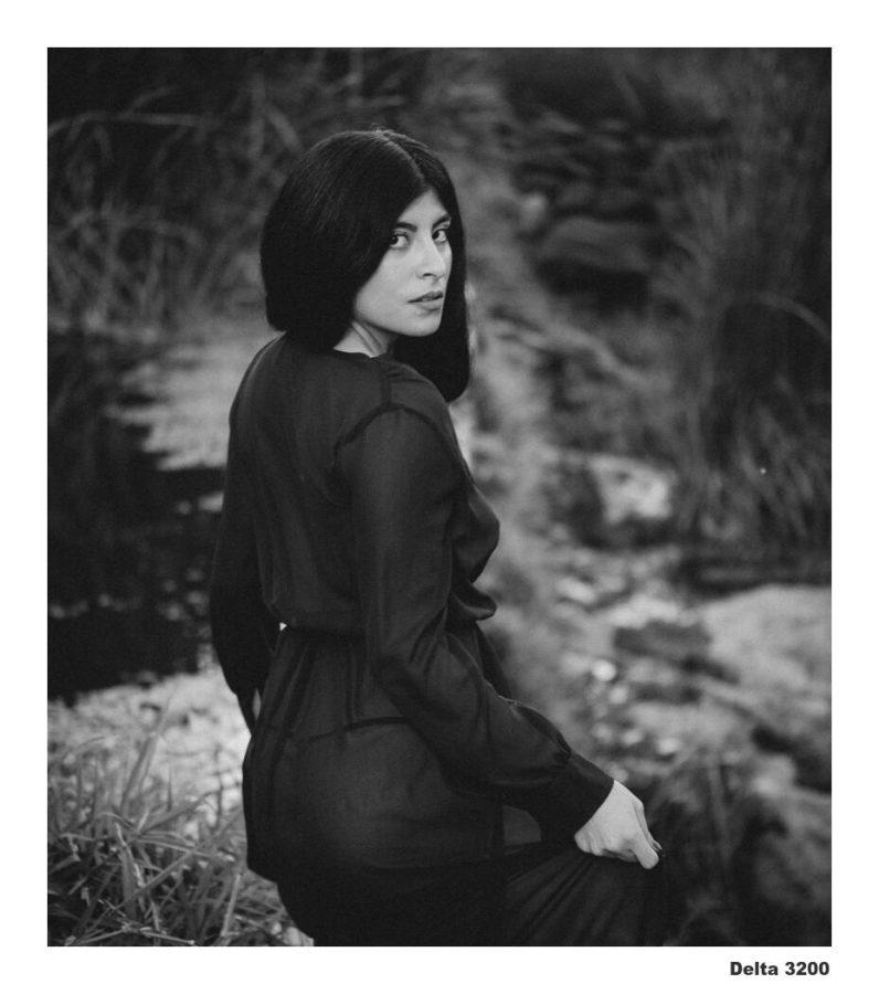
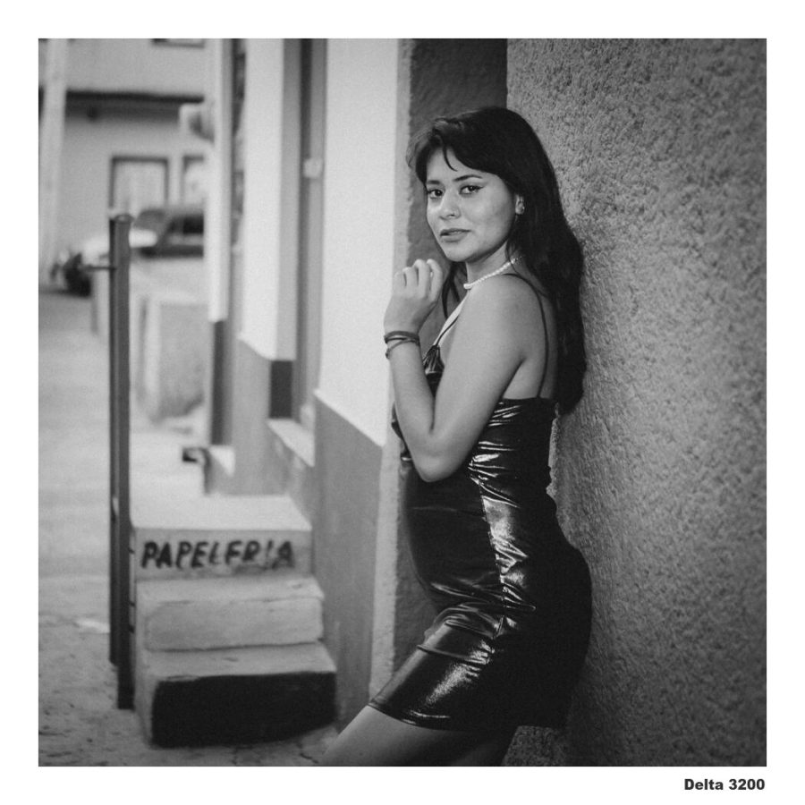
Delta 3200

Another I always come back to. There are lots of other black and white films like HP5 and more in Filmist. But the Delta preset really does something rich with those shadows and tones and if the grain is too much I can just use one of the chem-kit mods to lower it. But honestly, I usually leave it grainy just like the real thing. I love it for portraits.

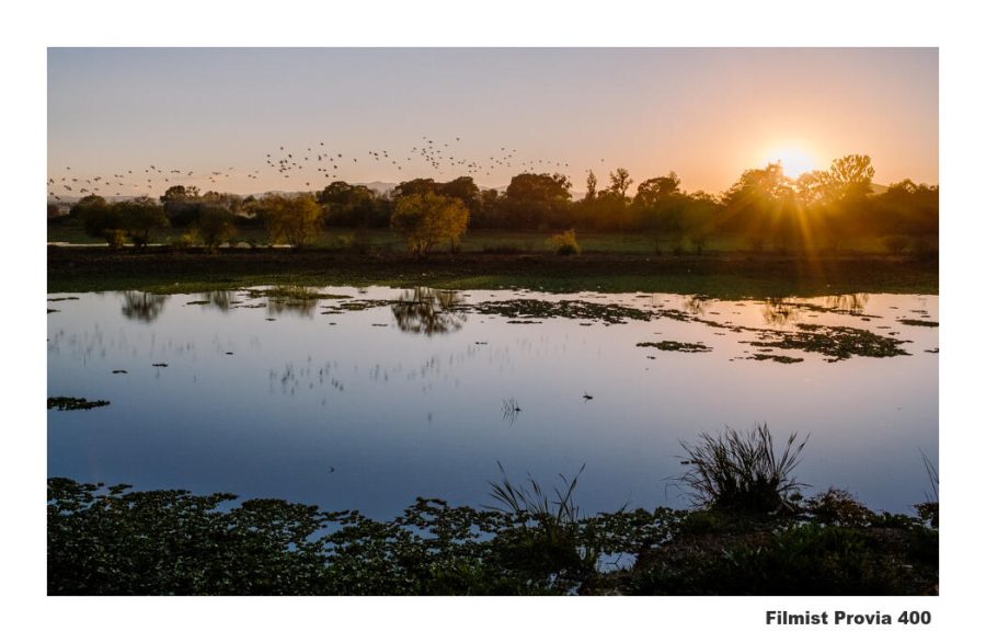
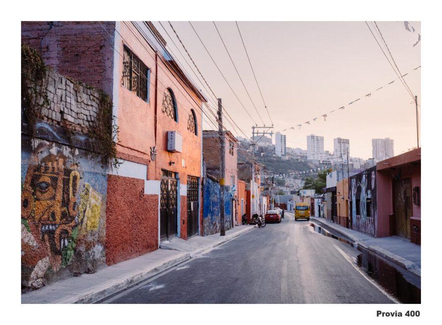
Fuji Provia 400

This classic was really versatile. While I will use it for portraits and especially streets if a want a bolder color than Portra, it works especially well in landscape photos giving a naturally rich color that feels straight out of the darkroom whether I’m using Lightroom or Capture One.

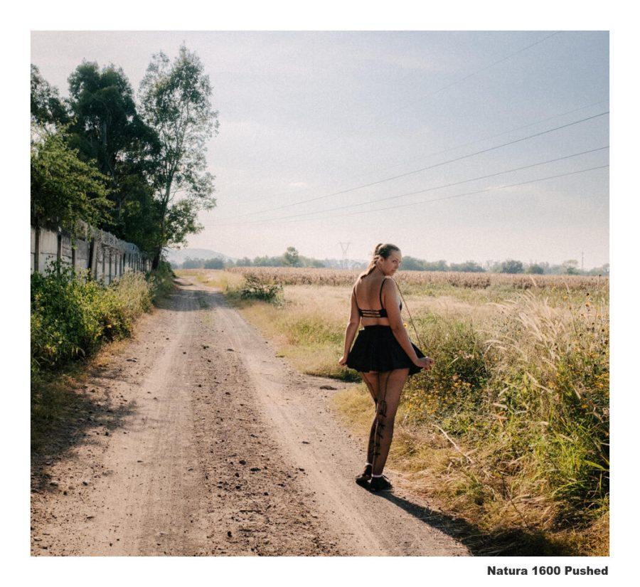
Natura 1600

This was one of the recent gen.2 updates. Natura is warm and grainy, but you can easily remove the grain. I like it myself and it really produces those on-the-go type street and portrait scenes that have raw emotion.

Fujifilm 400H

To be this was Fujis Portra. But its greens and tones are different. Like Portra however, it’s a wonderful go-to for when you want a clean organic feel without anything over-cooked.

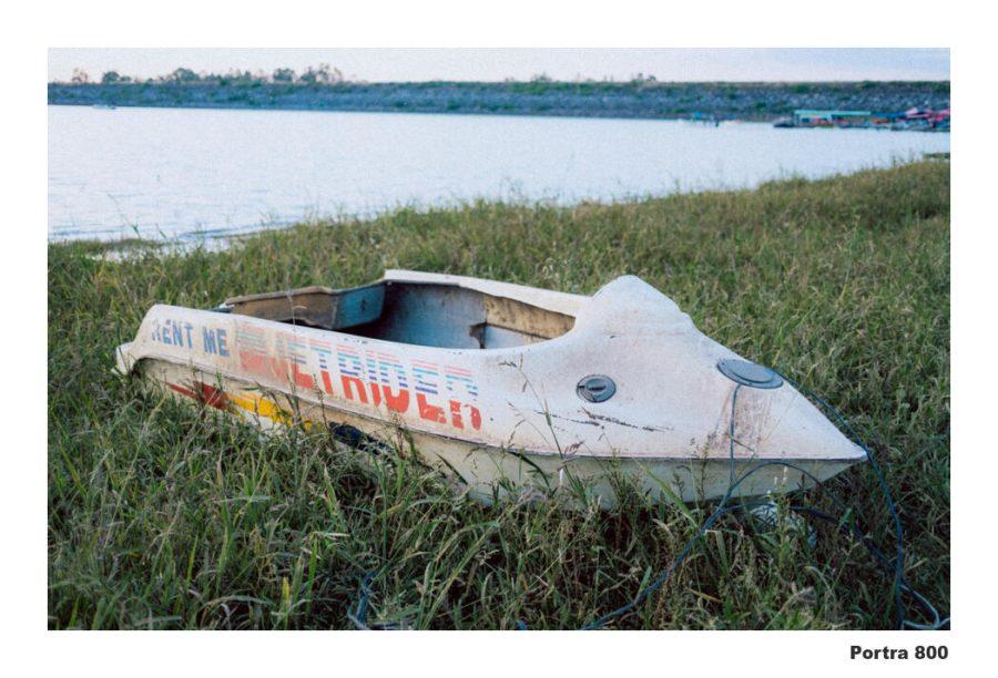
Porta 800

All POrtra is good. I remember buying 800 in roll for weddings when I was starting out. It’s distinct from 160 and 400 and the presets and style is also. It works great on many portraits but it’s a tad more intense and greener also making and great street and journalists film.

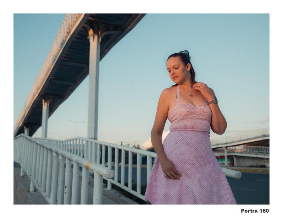
Portra 160

All the Portra’s are in here for good reason. They are all amazing. !60 is a touch less warm than 400 with a softer grain. I would say I favor The 400 presets, but I will often use the 160 style as I did here, especially when I want a touch less warmth due to light conditions.

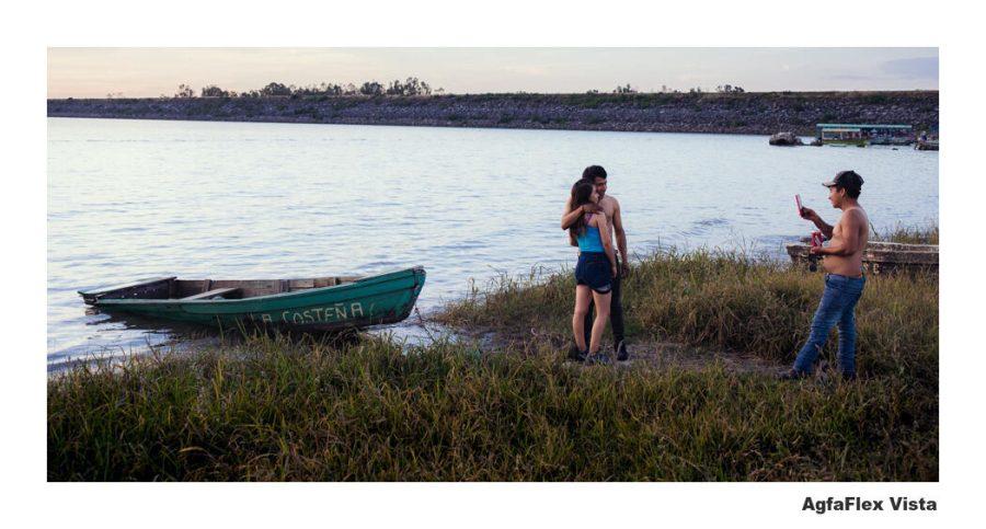
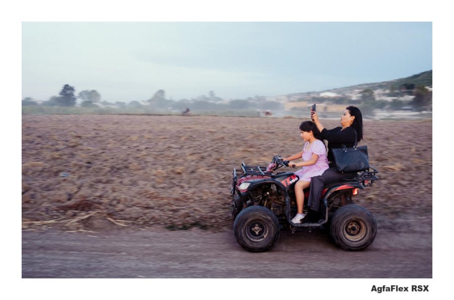
Agfa Vista

Based on Agfa vista and I love the way it uses greens give you a unique color mix without feeling over-processed. I use this everywhere, portraits landscapes, and streets, and also use the RSX variant quite a lot.

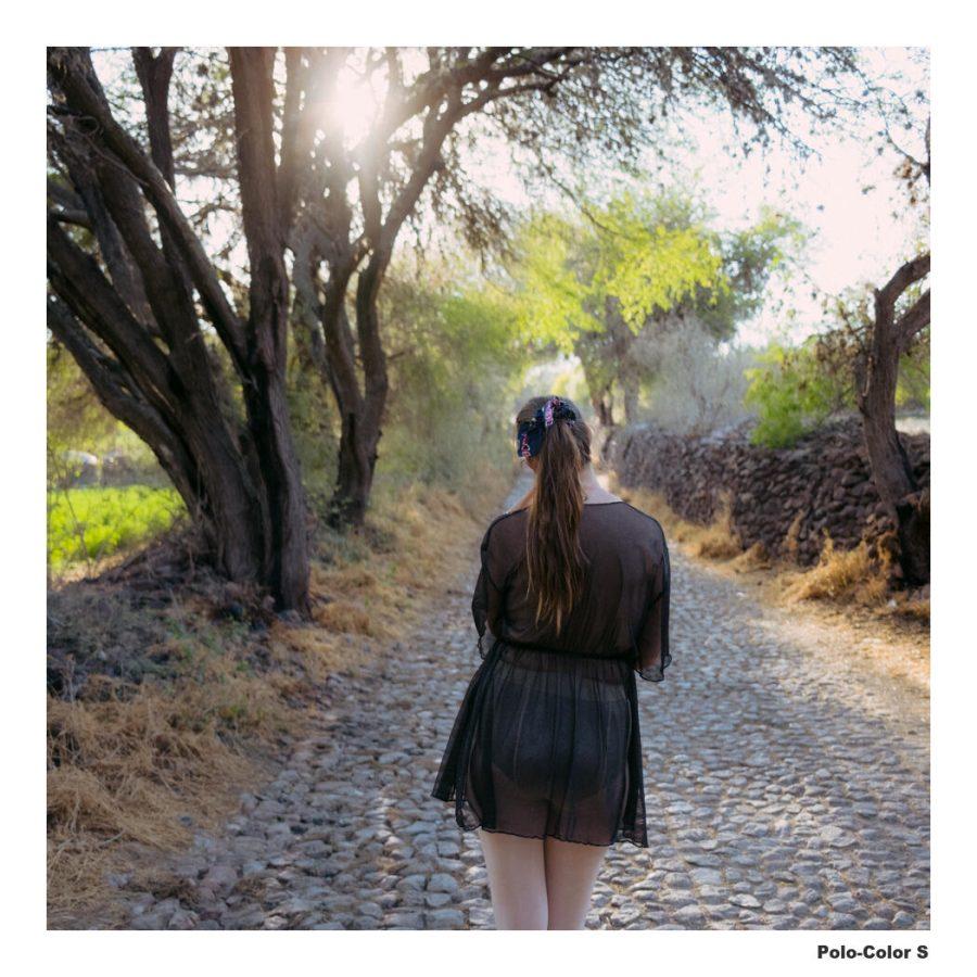
PoloColor S

Polaroid films vary because they are organic and their process can be altered by how chemicals are used. But polaroids can be all over the place and we still love them. So I have 3 Poloroud inspired looks to cover variables and the S variety is just soft warm goodness that works on a lot of things

Classic Chrome

Like the Classic Negative preset above, classic Chrome is another Fuji camera look but in creating it was a Lightroom Presets and Capture One Style we can use it on any file, not just Fuji. It’s very gentle so you can use it in batches and on anything for a clean look.

Classic Chrome is not actually based on Fuji films but on Kodachrome. Though it’s a loose interpretation. Filmist also has Kodachrome and that emulsion is a lot bolder. But at the right time, it’s amazing.

It’s not about faking it. It’s about growing your potential!

There are many ways to edit and refine a great photo. Using authentic film presets and tiles, lots for video, etc. It’s not about any sort of pretending. It’s about using the atmosphere and color our industry spent 100 years creating. You don’t throw out what works just because you have something new. And film works, the kind that comes on rolls and the looks that come inside Filmist.

I hope you found this useful and get some inspiration of your own. You can learn more about Filmist or download it here.

Gavin Seim

Read More