 by Gavin Seim: Today we’ll dig deep into using signatures and branding on images. Both on the web and in print. We’re going to address nearly every aspect representing years of trial and error for me. Everything from using your digital logo and signature to what pens to use on your prints for hand signing. lets start with a question?
How often do you go into a gallery and see a masterpiece not signed?
How often does that same piece have a HUGE watermark across the front?
If your name is not on your images, you lose. The truth is, selling images is not simply having passion, it’s about business. Is your work a piece of paper, or is it a piece if art? Many people who don’t brand their images do so because they lack branding experience, or don’t consider their images of enough value to hang equally next to other art. Some on the other hand some take things too far, ruining their presentation by going overkill. Petapixel did a fun satirical article on this awhile back.
Remember, classy branding on an image generally adds value. How often do you buy a book without the authors name on the front? Even our cars have branding on them. If you bought a Ferrari would you want it without the emblem? I think not. Why then should the art we sell be unmarked! Are there exceptions? Sure, but not many. For example a commercial client may require unbranded images, but they should also expect to pay a premium for that. Artists have been branding their work for centuries and so should you. Lets examine different approaches that I have discovered over years by trial and error.

What To Do?
This whole topic is fraught with debate. No doubt some will disagree with me. That’s fine. Though I’ve probably slaved more than most in the industry on this. I’ve come to a place where I have an understanding of my brand and my presentation. This is not my random inexperienced opinion. I have gone to galleries, looked at the works of master painters and studied the techniques of others. I sell all my portraits and my fine art using the approaches I’m about to share. I’m always refining however and will update this study accordingly in the future.
If the branding you use distracts from the image, you’ve already failed. A case in point is big watermarks plastered across images. People often use these thinking they will protect their copyrights better. In reality it just makes them look unprofessional and distracts the viewers from actually enjoying the image.
Worse yet, if someone really wants to remove the watermark they still can. As a rule large watermarks across image should not be used. There are a few exceptions to this, but not many. Some might argue that proof galleries for a wedding need watermarks. This is understandable. Just weigh the costs and consider how it effects your presentation. I would never splash proof across images on my website or portfolio.
For Websites and Social Media:
My preference is always to have people come to my studio gallery, viewing my large format hand signed wall portraits in person. But I can’t always have that. For web I generally post images 700-1000px wide. I don’t want huge files, but this is not 1995 and we should have images large enough to be seen and look amazing on a screen. If you want to see this in practice, you can see my sites via my homepage.
Web images can be more heavily branded than prints. But I still keep them classy. I can’t expect people to fall in love with a great image if I distract them with clutter. Often times I simply add my signature for web images. It shows my name and looks clean. Alternately you could put your name in print or with your logo on the corner. It’s not about how big your name is. It’s about presenting it well combined with building your brand.
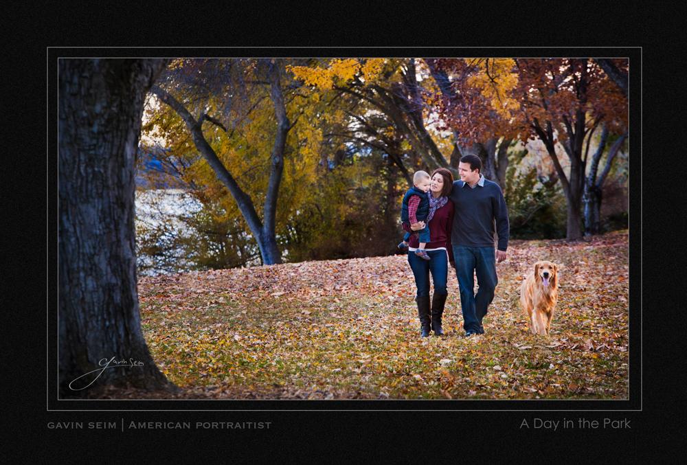
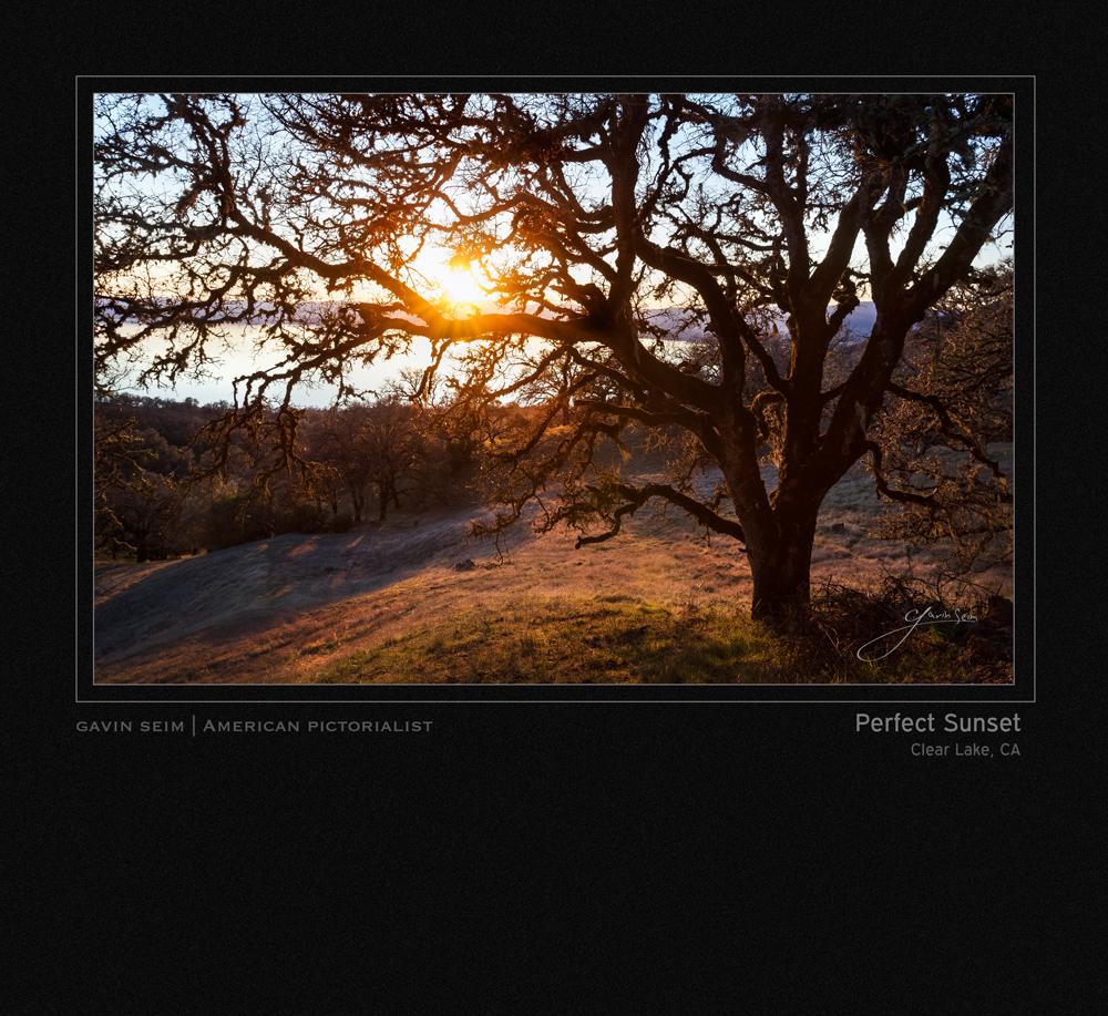
The Matted Image:
I want the portfolio galleries on my own site to be clean and classy. Instead of placing a big logo, I keep it subtle without ignoring my brand. An image matted like these looks great and shares well, while still offering a high end presentation. Many top photographers use presentation like this. I use a square template and build each one in Photoshop rather than my norm of exporting an image and a logo from Lightroom. It takes a bit longer, but this control allows me to have a very specific presentation. I also build these layouts in high res so I can make portfolio prints from them as well. Here’s a few different versions. Play around with your own template and see what feel good for your look.

Like what you see? You’ll love Gavin’s award winning cinematic workshop, EXposed.Watch the trailer.

Other web presentations I’ve used…


Infringement Concerns:
Some artists want to eliminate the possibility of someone cropping their name off of an image and it being passed around with no branding. To combat this they sometimes plaster their name right across the middle of the image (like we mentioned above). This makes it hard (but not impossible) to remove the name, it also looks stupid, particularly if it’s in your primary portfolio.
Again, this is not 1994. When you add a logo or watermark to the middle of your presentation it distracts from your work. Paranoia of infringement can be taken so far as to do harm to your brand. Remember these are low res files and there’s only so much someone could do with them.
Balance is again best approach. To avoid crop concerns I’ve tried using a double corner branding (shown below). There’s various ways it could be applied, but the idea is to get your brand in two opposite corners, without it being overbearing. It helps keep your name be clearly in view without totally distracting us from the image. I’ve also modified this method for FB images sometimes. Signature in the corner, FB Page URL top left. Generally in a soft grey tone to reduce distraction. Still, these days I generally just use my signature or a simple logo. If my brand looks good, people generally don’t have any desire to remove it.
High Resolution Files & Disks:
My wedding and portrait clients can get a disk at certain package levels (usually after an album or wall portrait). It’s meant for them to make their own prints up to 8×12 , not just given away as the main product. It’s an expensive add on ($600-1000). Or more often, a perk I use to get client to purchase my large packages that already include wall portraits or albums.
The files are 2000px wide and yes I absolutely brand these. I have seen large groups of them appear on FB and clients may print and send them to friends. I’m not ashamed of my work and people should know who made it. How do I keep it classy? I overlay my signature in the corner of each image rather than placing a logo. I feel a signature is more timeless than a logo. It’s subtle and gives the image class while still letting people know who made it. I’ve never had a complaint about it… Ever.

Marking and Signing Prints:
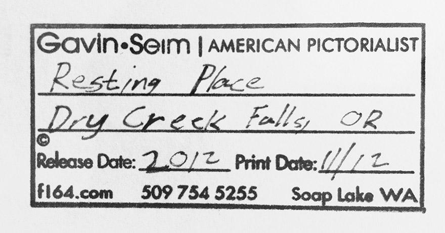
Small Print Markings: These are made similar to the way I do high res files. Hand signing is reserved for my large signature wall prints. On small prints my signature is overlaid in the corner as I export from LR for printing. Not annoying, but easily readable. As long as you don’t overdo it, a client is not likely to complain about your name in the corner of your images. In fact in my experience clients usually appreciate some identification. It’s basic professionalism for an artist to sign their work in some way. Work does not leave the studio without my name on it.
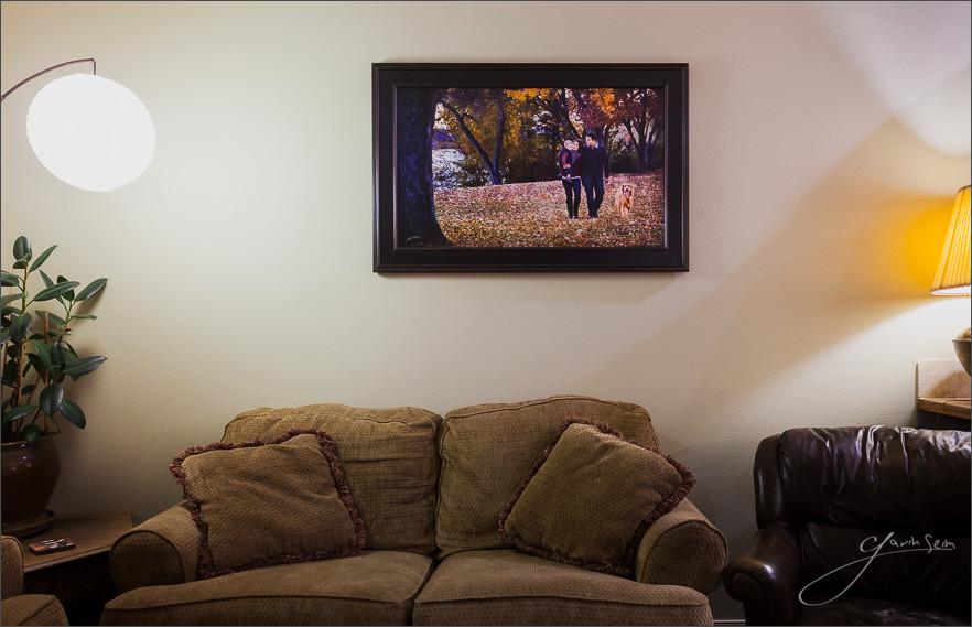
Wall Print Markings: The focus of my work. These pieces are often on canvas, metal or at least dry mounted. High quality prints that start at 24in wide and are priced from about $600. I look to place at least a 24in wall print for every portrait client (and I usually do). I’m fine with them getting the disk and making their own 5×7’s, as long as the real art is prepared by me and hanging on their wall with my signature on it. I go all out on quality and clients love them. For more on how I do wall portraits see this article.
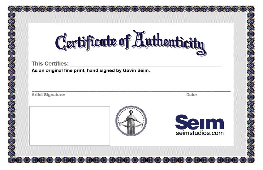
I treat custom wall portraits and limited edition pictorials much like a painter would treat an original work. They go out the door hand signed, with a certificate of authenticity (I got a template here). They have a official title and come with a lifetime guarantee. Not placing my signature on these would be to devalue them. Like an original painting that had no artist signature.
For my open edition pictorials, prints which cost much less, I only initial them. This is a value thing. My open edition are quality mounted prints about 24in wide that sell for around a hundred dollars. They are quality pieces and I want that finishing touch that shows I’ve inspected and approved them. But as a rule my full signature is placed only on custom work or limited edition prints. You can read more about my open editions here.

Size & position of Markings:
Size matters when you want your name seen. Still, you don’t want to look like a narcissistic jerk. As you can see, I generally place markings in a corner. Just use common sense when it comes to size. You want it visible and clear, but not the first thing the eye is drawn too, or it will distract from the art.
Also for disks from which prints will be made, move your signature in a bit as it leaves a bit extra for when printers trim. It’s tacky to have a signature partly cut off. In the end I generally mark the bottom right and set the signature in enough to stay clear of a frame, but not so far that it feels like it’s disrupting the image.
Not Branding at all:
I don’t consider this an option for most work. Whether images are on your blog or prints on clients wall. Not branding is like giving up free advertising so you can pay for less effective advertising elsewhere. We are building a business here and our name and brand are critical to that.
As I’ve said, there are exceptions. I’m speaking mainly of portraiture and fine art here. If you’re shooting commercial work the client will often require unmarked images. That’s fair, but they should be paying accordingly. That means a LOT more, and those images should still be branded when in your portfolio.

Marking & Signature Tools:
Batch Marking: Nearly all my digital logos and branding are batch applied from Lightroom using Mogrify, a LR export plugin. It’s fast,

flexible and effective, allowing me place overlays on any file as I export, while giving me total control over size and position. I can mark hundreds of images without so much as a sore index finger.
It’s also possible to use the “Place” command and make Photoshop actions that will overlay image, but that’s the old way and it’s not nearly as fast as using LR. Lr3+ also has built in watermark tools that will overlay a signature nicely, but Mogrify does more, allowing multiple overlays, borders on images etc.
Also, I got my signature to digital using Adobe Illustrator and my tablet. It smooths out the jaggy lines we often get when drawing on a computer, making them feel natural. Between that and a tablet I was able to get my perfect signature. My real signature is not this flawless, but this one is great for online images and more because it’s clean, fairly readable and versatile. You could get a great copy of your signature on paper and scan it in, then remove the white in Photoshop so it can be transparent.
Hand Signature Tools: Everyone should have a good signature for their art. If you are not happy with yours, change it. Practice with it and get it looking like an artist.
I’ve tried loads of pens. In the end I usually stick with silver or gold metallic paint pens because they overlay a heavy opaque stroke and the metallic stands out, while still looking professional. Gel and ballpoint ink pens can work, but often are too thin to see clearly. They also don’t well work on all paper surfaces and sometimes fizzle out in the middle of a signing (not good).
Currently my favorite for signing photos is the Sakura Pen Touch .7mm extra fine point paint pens. You can find them on Amazon or from Blick Art Supply. They work on raw paper, canvas and metal prints alike and seem to maintain a smooth bold line on everything. Alternately I like the Y&C (Yasumoto) Extra Fine Metallic Marker. While I generally use the Sakura, the Y&C is a close second. I find the Y&C lays on a bit more ink, which can be good on some surfaces (such as un-coated luster paper) or for people who want a bit bolder signature. Their a bit harder to find, but I found them on the company’s website. There’s also the Pilot Silver Marker Extra Fine Point and that works pretty well.
Watch for spatters with paint pens. I have yet to find one that is completely free from them. Before you sign shake it up and get it flowing. If it seems drippy dab the tip gently with a paper towel. Run a few practice signatures to warm up your pen and your hand before signing the corner of a valuable print.
Don’t over stress when signing. Practice so you can consistently make a good signature, but remember it’s a real signature and does not have to be perfect. When ready, place your image on a solid surface where you can get a comfortable hand position. If you mess it up a little, it’s usually better to leave it unique, then try to remove or add to it. This usually leads to a big mess that might end up with you buying a new print.
Other things I’ve tried:
I’m not kidding when I say I’ve slaved over this topic. I’ve tried so many things. Some were awful, some just didn’t suit me. Here’s a few of the things I tried and then retired. Maybe you can avoid the same mistakes.

I’m not the final word on this, but my experiences have taught me a lot. My ideas may change in the future as I’m always analyzing, listening and trying things. What does not change however is that branding and name recognition is important. If you ignore it, you’re just wasting precious opportunity in this saturated market. Finding your brand takes time, so don’t panic. Just start thinking it thru and find the way that works for you.
Finally. I sell all my work as art. An 8×10 does not compete with a beautiful painting. But master that amazing image on a 30×40 canvas and the whole game changes. A great wall print is in a whole other league and yes, clients will buy them. You can learn more about wall portrait selling and concepts in this article.
A Final Recap…
- You CAN overdo it. Stay balanced.
- Not knowing what to do is no excuse. Work it out.
- Keep is classy (simple is always a good place to start).
- Think like a client buying art (what do they see?).
- So as a rule do not put a logo on fine prints. These can be a large distraction and they change over time. If you use a logo on a quality print. You’ll probably regret it later.
- Logo’s are OK for web images, but try not to make it to distracting. Still, you can always change it later if you like. That said, I generally use my digital signature these days. Not my logo.
- For prints I always use my signature, either digitally or by hand. A signature is not a logo. It’s my written name. I keep it in the corner with a bit of space. Viewers can easily find who made the print and it has a art quality to it.
- Keep asking questions. Keep experimenting. But always make sure it’s about the image, not the markings.
That’s all for today. Good luck… Gavin
Thank you for posting. As a photographer and a photo teacher I’m always looking for new and relevent material to share with my students. This will be very useful. Thanks again.
This is very helpful, Gavin. Thanks for keeping this current and sharing the methods and thought behind your various applications for signing. Could you sometime add what pens you find best to use when signing physical prints? As a lefty, I sometime wonder, even if wearing white gloves, if it would be better to sign in the lower left corner. Currently, I place a digital signature in the lower right, as you do, but hand writing on larger prints makes me a little nervous if I can’t place my hand/arm comfortably.