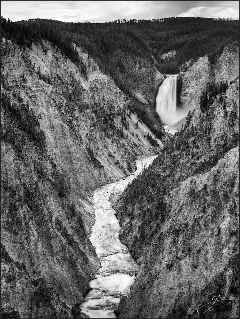
It was a softly lit morning in Yellowstone on this day in mid September. I came in thru the west entrance before sunrise to explore the landscape before the increasing light started getting harsh. I love waterfalls and while the lower falls area is not a hard place to reach, the various lookouts up the valley are magnificent.
I think I planted myself at Lookout Point for this one. I was inspired at the awesome beauty of this place. I know hundreds of people photograph these falls every day and I wanted to take my time to try for something special. I was careful in planning the composition and went for a silver process from the start to focus the eyes on the water and tone in this landscape. I’ll let you be the judge of how well I did.
For photographers. How it was made… Canon 5D2, 24-70L, f11, ISO200. Bracketed 3, 11 and 40 seconds.
I really like this photograph. I find it even more interesting when I stare deeply into it for a few moments. My eye starts wandering down to the bottom of the frame and back up, somehow perplexed by the shape, tone and angles in the rocky crags from this seemingly aerial view. Some might think that’s bad, but I rather like the way it makes my eyes dance.
This was planned as a B&W from the start. I really put a focus on the stone walls and tone throughout the scene, rather than color, which was a bit plain in this soft semi flat light. After setting the tripod and some minutes of analysis, I used the B&W 110 filter to get the long exposures and make the water silky.
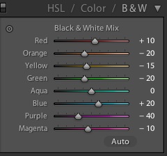
Taking the bracket into Photomatix I made a gently processed HDR so I could have plenty of range to work with. Once I had my file I worked on the file in LR. I generally start using my silver presets, then tweak the channels to refine the detail exactly the way I want. In this case I wanted the stone too maintain good separation and texture from the dark pine trees and the water to flow smooth and silkly. There’s more to it than this, but to give you an idea I’m posting a screen shot of the channels used for the B&W.
Once I felt things were looking fashionable, I moved into PS. It was actually going really well so I did not need any fancy layer blending or manipulation. I took care in the details and used 16bit to maintain range and keep the blacks clean. In PS I added a bit of subtle tone and detail alteration using my Orton’s Spice PS action along with a little from my Angel action.
I wrapped up with some detailed cleanup and then a bit of burning and dodging to keep the tones strong where I wanted the eyes to wander. Saving the file back into LR, I did just a tad bit of final work using curves and the like to make it feel perfect.
Your thoughts welcome… Gav

 Taking the bracket into
Great work Gavin… I’ve really enjoyed and learned from your last few podcasts and the blog here on f164…
Thanks
Gavin nice image! I just found your podcast and from there found f164 and your other sites. Great insight into developing the skills we need to apply to our craft to better understand the rules of the craft and acheve better images from what we have learned. Also just used the promo code and purchased Photomatix Pro…. Thanks man!!
Thanks everyone.
Hey Gavin. I met these guys, (http://www.digitalsilverimaging.com/) at the Photo Plus show in New York and was wondering if you ever tried them out.
Looks like this image is a perfect fit for what they were showing.
Looks like they may do nice work Elliot, but only sizes to 20×30. A can’t go too far with a print house that can only make smaller prints. Thanks for thinking of me though. Been using HH for my true BW prints and they do well. Cannot print as large as I sometimes like, but they do go pretty big… Gav
Would like to see the original. I’m sure you used a tripod but the rocks look blurry, or maybe the resolution is low in this image. Doing a full zone system HDR bracketing 4 fstops up and down from zone 5, then condensing the images would still give you blurred water.
Digital still does not impress me, as always, the highlights are blown out and shadowdetail limited. Give me some old school T-max100 high diluted agitation Zone System style. Would be cool if you started to shoot film and do some real *silver printing in a darkroom and less lightroom *)
Honestly not sure what you’re talking about Marco. The details are solid. I have this printed at 30 and would feel very comfortable going larger. These rocks are light, as intended, but the highlights are not blown and the shadows are solid.
Bear in mind I’m a detail fanatic. I understand that film can give richer shadows, especially when the digital is not processed carefully. Though the main issue digital has for me is resolution. I want to print very large and I often put digital to it’s limits. Lately I’ve been starting to play with 4×5 film.