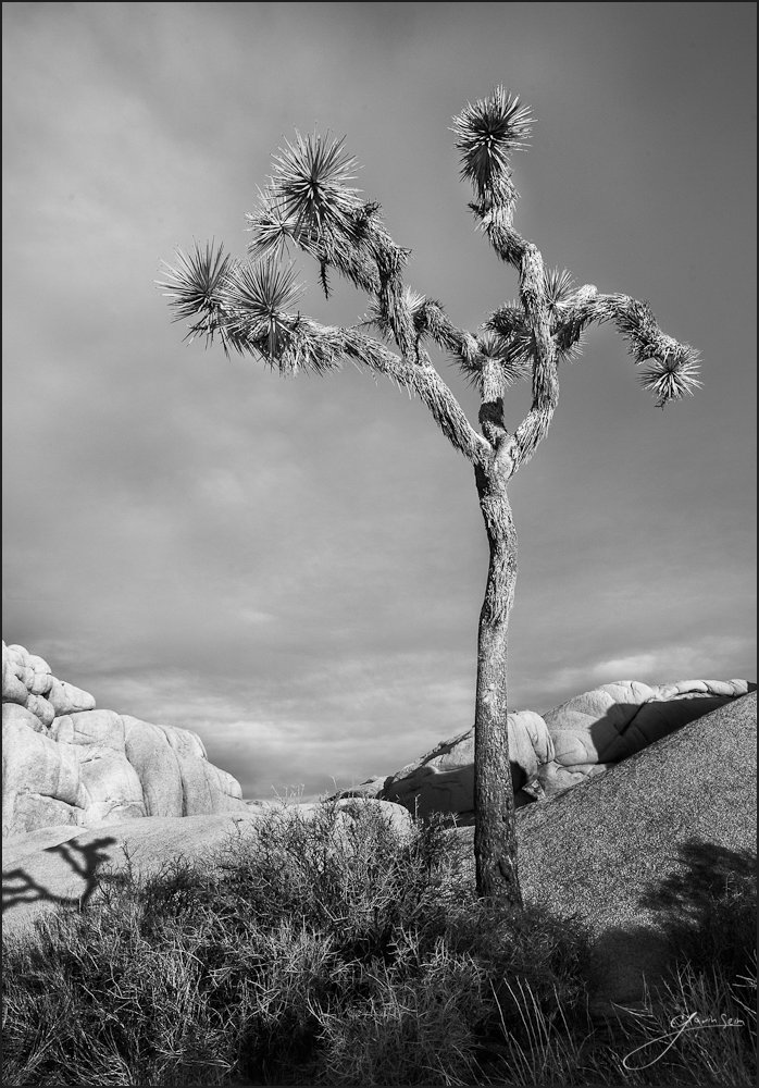
The family and I camped down on the flatland’s and took a nice drive into Joshua Tree that day. It was warm, but got cooler in the highlands and the choice to wear shorts turned out less than ideal. So the family was back in the car warming up after hiking and I ventured out near Skull Rock, finding this skinny little Joshua Tree standing alone, everyone ignoring it’s simplicity.
The Skinny Kid grew on me and soon I was experimenting with angles and ideas for how to best showcase what he had to offer. In the end this simple black and white scene struck me. A starkness of line. A cast shadow showing that his reach extends beyond his size. This tree has a perfect vantage. He gets to watch over this rocky landscape without distraction and reign as King of it’s trees.
Release details: Prints available. Contact the gallery. Learn more about prices. Available prints…
- 40 inch Master Original on Metal – Limited edition of, 1
- 36 inch Signature Metal – Limited Edition of, 25
- 32 inch Signature Art Print – Limited Edition of, 60
- 24 inch open edition mounted print
For Photographers. How it was made…
Canon MK2, 17-40L @21mm f11, 1/80sec, ISO160
This is a channel blended HDR. It sounds fancy but it’s fairly simple. I had spent some time refining the composition and details in the field, switching over to B&W mode on the camera to help me visualize, even though those settings didn’t carry over directly to the imported RAW file.
Once in Lightroom, I used the Hidden Valley and Dynamic Silver II presets from Silver Shadows2 as a solid base. Then I did a channel HDR. Controlling tones on two variations of the image by tweaking the color channels. This made elements lighter or darker as needed. I could then blend those tonal variants of the same image in Photoshop as required to achieve my final visualization.
The biggest challenge and one of the reasons I needed the channel merge approach was the rocks to the left. They were light in color and stood out in an almost white fashion. I wanted to keep them toned down around Zone 4-5, with the highlights on the tree around Zone 6-7. In doing this it was easy to muddle the tones. The solution was a combination of the channel process, combined with tonal brushing (ala burn and dodge). The result is what you see. It should print well and I’m eager to make the first run.
I will point out the crop. I spent a good deal of time deciding where the shadow from the tree would be. I really like what it adds to the scene, but did not want it to distract. To simplify I made it the stop point of the frame, rather than including the entire shadow. I felt this kept it relevant without making it too dominant.

