Pre Order Now and and save $$ on the download, DVD or Blu-Ray.
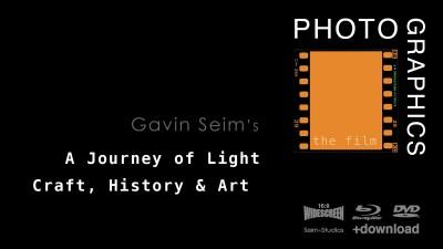
So what have we been up to over here at Seim Studios – We just returned from 3 months on the road and a lot of work on a brand new project. A film called PHOTOGRAPHICS that takes on the artistic aspects of photography and what makes a great photograph. A journey through history and art techniques in a way that has never been done before.
We’ve already filmed a lot, but there’s more to come. We got the film accepted as a Kickstarter Project where backers put us over the top and more than made our funding goal. We’re really excited about where PHOTOGRAPHICS is going and are eager for it’s November release. The Kickstarter backings have helped pay the bills and we’ll be working hard over the summer as we plan the the wrap up of this completely unique film. I hope you join in. It’s going to be good.
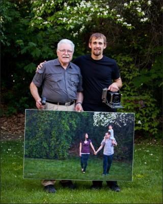
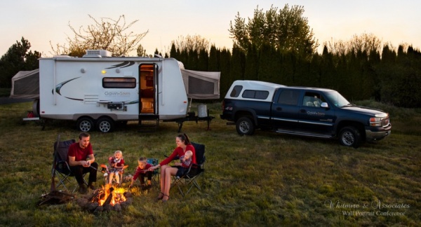
Gavin with Ken Whitmire, the Ansel Adams of wall portraits at WPC 2013.
– This video was initially posted for our newsletter subscribers. It is now public. You can get future goodies by subscribing to the newsletter below –
Are You Selling Better?
Here’s our special Seim Effects video for May 2013. I just returned from a week at Wall Portrait Conference. It’s my 5th year and the principles I learned here changed my entire career. I wanted to record a quick overview of ideas while it”s fresh in my mind. To share a bit of what I have learned and what I plan to apply further this year as I sell more wall prints.
These ideas come from hundreds of years of combined experience. I am not the master of marketing, but I have seen these principles work when applied correctly. I barley scratch the surface here, but here’s hoping this video will get you inspired to raise the bar and go further. I hope to see you at a future Wall Portrait Conference.
Gavin Seim
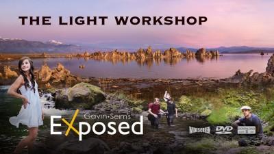
Want to learn more about using light and making images for walls? Check out my complete films including EXposed, a workshop about all things light and exposure. Also take a look at PHOTOGRAPHICS. My new film on Art, History and Photographic Craft. You can pre-order it now and save.
It’s bittersweet as I drive down the hill towards familiar grassy slopes and familiar cities on the map. We watch a Spring sunset and flowers spattering green hills. Three full months on the road we’ve been. An adventure of that won’t be forgotten. Yet a part of me feels somehow less for it coming to an end. Like my spirit of adventure is fading because I long for that slow hot shower, a bed where my toes do not hang over the edge and where my wonderful wife’s elbows do not hit me in the side every time she rolls over.
The last few days lacked the grand adventure you look for at the end of a long trip. The kids got a stomach bug and did what you do when you have that. Sometimes we had two going at once – The miles were long and we needed to get home soon for Wall Portrait Conference. We drove hard that final day. Perhaps longer than we’ve ever done. Over five hundred miles from Twin Idaho to Ephrata WA. It took us about twelve hours between breaks, gas and pauses to clean up the mess from sick kids in the back seat.
“What a lousy way to end such a grand adventure” I thought – But somewhere along the road I stepped into the sunlight and realized it was not. Sometimes we get sick, but it passes. Sometimes things go wrong, we have to make repairs, or we come in late. All of those things happened on this trip. More than once. But they’re part of the memories, part of the adventure. They’re surrounded by moments of laughs and wide eyes glistening at the wounder of creation.
The moment I pull in I’m starting a new vacation. We worked hard on this trip. We played hard. It was a gamble too, but our new film PHOTOGRAPHICS is already showing in the black and the trip is all but profitable both emotionally and fiscally. All that time on the road, but so happy to have a place to call home.
We walk in after 91 days on the road and switch on the lights. The house is still here, warm, waiting. Nearly as we left it but for a few extra cobwebs. A bed, a shower, a late night movie with my wife after the kids are finally asleep. We really are home. Next it’s time to process the film, repair the gear, make the prints and get organized.
On Sunday we’re off for a week again to learn and teach at Wall Portrait Conference. But really we’re home right now. It’s only a couple hours away and among people we know. That home feeling is back. It’s odd. Truly surreal to walk down the isle at the store and for once in so long see people you know. Get a hug from your mom when you walk thru a door, or see neighbors wave as you drive down the street. I honestly feel strange not being the stranger here. But that passes and fades into tales of the adventure and silent longing for more.
As the sun shines on our first day home, a breeze blowing, spring flowers popping out, I realize that the world is still alive and that both home and away are something grand. Appreciating your adventure is how you look at it. There’s nothing like a place to call home, but there’s also nothing like the open road, your wife riding shotgun and kids kicking the back of your seat as the road rolls by. This is living, all of it.
Until the next trip, Gavin Seim.
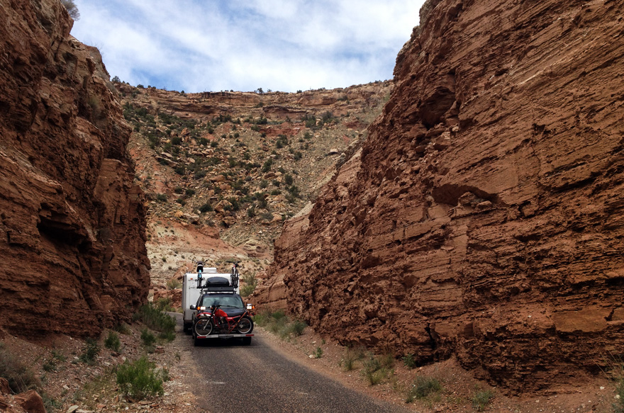
Coming down from the Death Road new Zion. Amazing views.
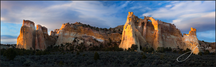
Sunset at the Celestial City – Grand Staircase National Monument Utah, Grosvenor Arch. Spring 2013, Gavin Seim
Grand Staircase is a secret hideaway of Utah – A grand place beyond most National Parks in beauty, in remoteness and in a wild hauntingly beautiful atmosphere. There is another wonder to behold with each new curve of it’s bumpy roads.
It’s not one of those parks you simply drive into on paved thoroughfares, hot dog carts lining the byways. We came in off HWY 89 and camped two nights within the park before we exited the other side. It was a slow winding gravel road with lots of hikes, pullouts and things to see, but no civilization except perhaps a bathroom here and there.
We made it up to the Arch late on our second day and waited for the sunset. The feature here was the double arch, but what struck me about this place was the way the entire structure stands alone out here. Columns of colorful rock sprouting from the ground in stunning display, set in a minimal non-dictating scene. It was a beautiful thing. It made me think of the distant view of the Celestial City from the classic novel, Pilgrim’s Progress.
As the sun set and the light danced on the rocks I knew I needed a panorama of this one. This was the last image I made as the light softened and fell behind the hill. It peeked from the clouds just before disappearing fully behind the horizon and left me in awe of creation.
Release details: Prints Available.. Order Open Edition originals above.. Master prints and Signature Limited Editions are listed below and can be ordered by contacting gallery.
Released prints:
112 inch Master Original on Canvas – Limited edition of, 1 (contact the gallery)
86 inch Signature Canvas – Limited Edition of, 25 (contact the gallery)
74 inch Signature Metal – Limited Edition of, 25 (contact the gallery)
43 inch Signature Canvas – Limited Edition of, 100 (contact the gallery)
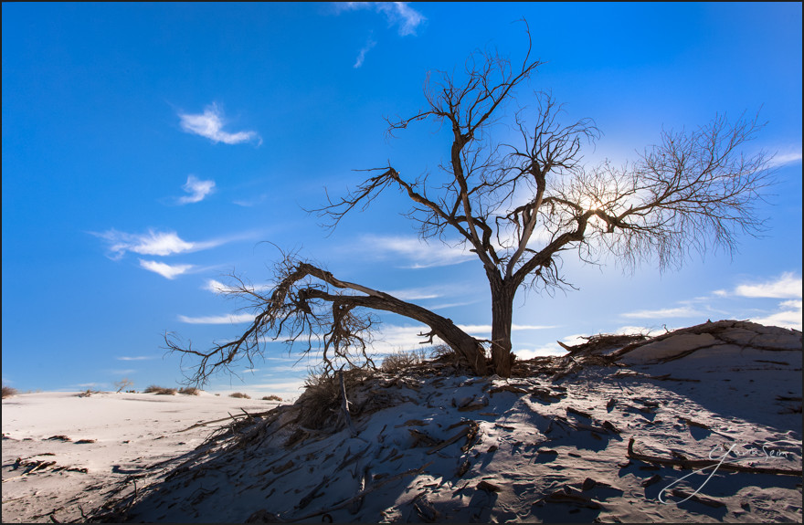
The sun rising in White Sands NM, Spring 2013, Gavin Seim
Out here in white sands there’s not much for water or trees. So when you stand this tall, alone in the white, snow-like drifts of sand, you get to look down on the landscape. King of the shrubs, thistles and tiny creatures. Usurpers fallen at your feet.
The sun comes up each day throwing pastel beauty across this landscape, soon followed by harsh glaring light and waterless heat. But if you can stay standing, you might just become King of the Thistles.
Release details: Prints Available.. Order Open Edition originals above.. Master prints and Signature Limited Editions are listed below and can be ordered by contacting gallery.
Available Prints….
53 inch Master Original on Canvas – Limited edition of, 1 (contact the gallery)
44 inch Signature Canvas – Limited Edition of, 50 (contact the gallery)
42 inch Signature Metal – Limited Edition of, 50 (contact the gallery)
 So what have we been up to over here at Seim Studios – We just returned from 3 months on the road and a lot of work on a brand new project. A film called PHOTOGRAPHICS that takes on the artistic aspects of photography and what makes a great photograph. A journey through history and art techniques in a way that has never been done before.