Two colors change everything in your photography and that is way overdone in digital. Today I’ll show you how to fix them easily in any app. Take 7 minutes and watch the whole video.
Two main colors that Digital gets wrong.
This is because on digital nearly all colors are equal in value, causing them to be over-driven in post. In today’s video, I show a little-known fix ever for colors in digital photos.
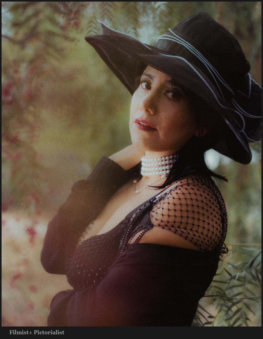
You can do this in any app and you will also see it applied in most of my presets and can try it in its perfect form in the FIlmist Free or Complete presets pack.
The first time you do this it might seem extreme. Until you drop!
This is especially true if you have been editing wrong for a long time.
I know, wrong is relative to your style. But remember the goal is always to bring focus to our main subject. Overcooked colors distract from that. Once you understand this, your process will be simple and you will control color separation so much easier.
It’s easy yes, but took me years until the days I started developing Filmist to truly understand.
Never overdrive both of these. Drop color!
At times you might want to push one of these two colors. But it’s rare, even on a sunset. It’s even more rare that I push both. They nearly always compete with each other. Skin, foliage, etc.
Dial both of these to start. Or use a film or other high-level preset like I create for you guys. You’ll see that soon your baseline edit corrects itself and you no longer are looking for this overcome color.
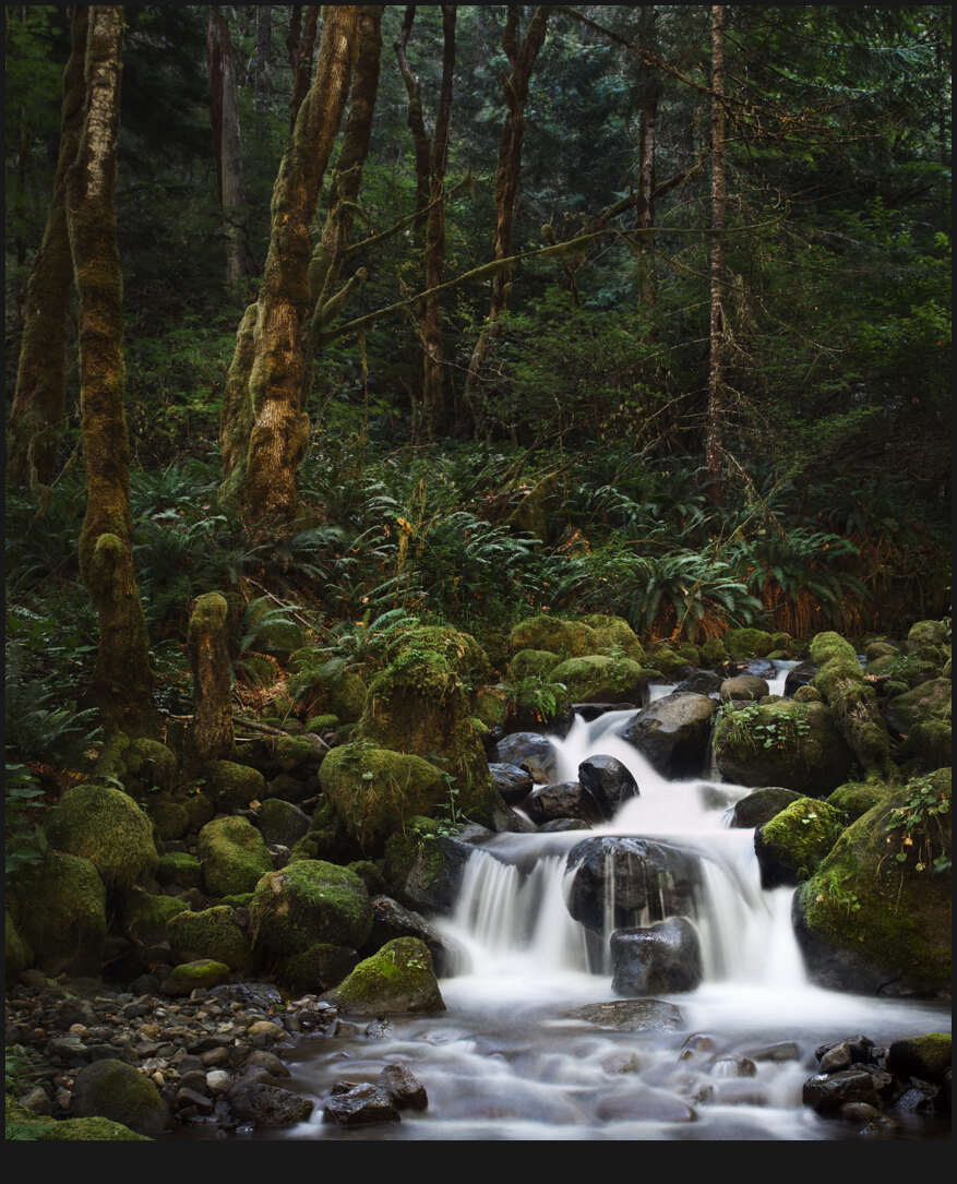
Even on landscapes you fill this method creates more balanced tones and beautiful roll-offs.
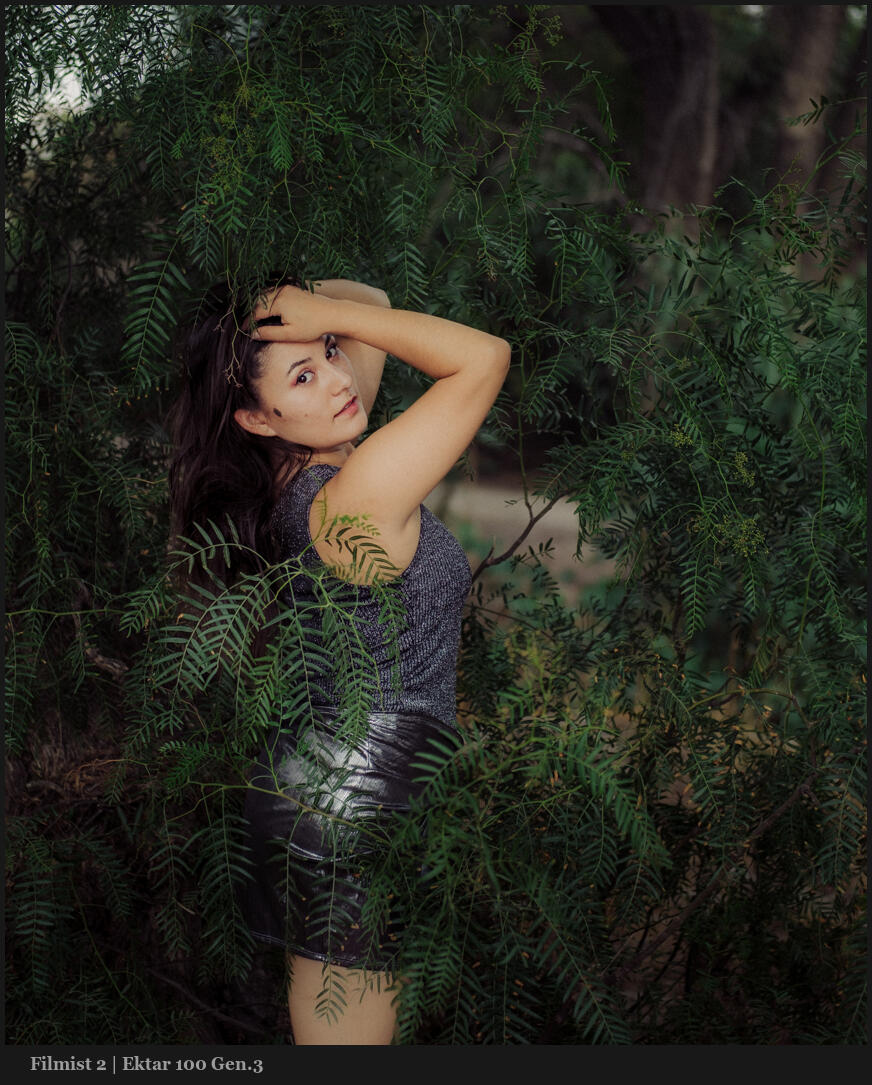
Obviously, if you have ever tried my FIlmist 2 pack you have seen this in action. But it may sup[ise you that even in tools like Natural HDR 4 I am using it. HDR needs balance eve more and even in a rich scene I still apply drop color to create the balance that that pack is so famous for.
Yes, you can use this method on other colors.
Take this further by adjusting the hue settings and try the same on blues, purples etc. The two colors here may be the most important to balanced edits, but the method O show can be used on both.
Digital drives colors too hard because no chemicals are getting in the way of making colors bold. So once you start pushing they all push too far too fast.
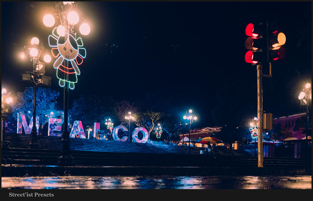
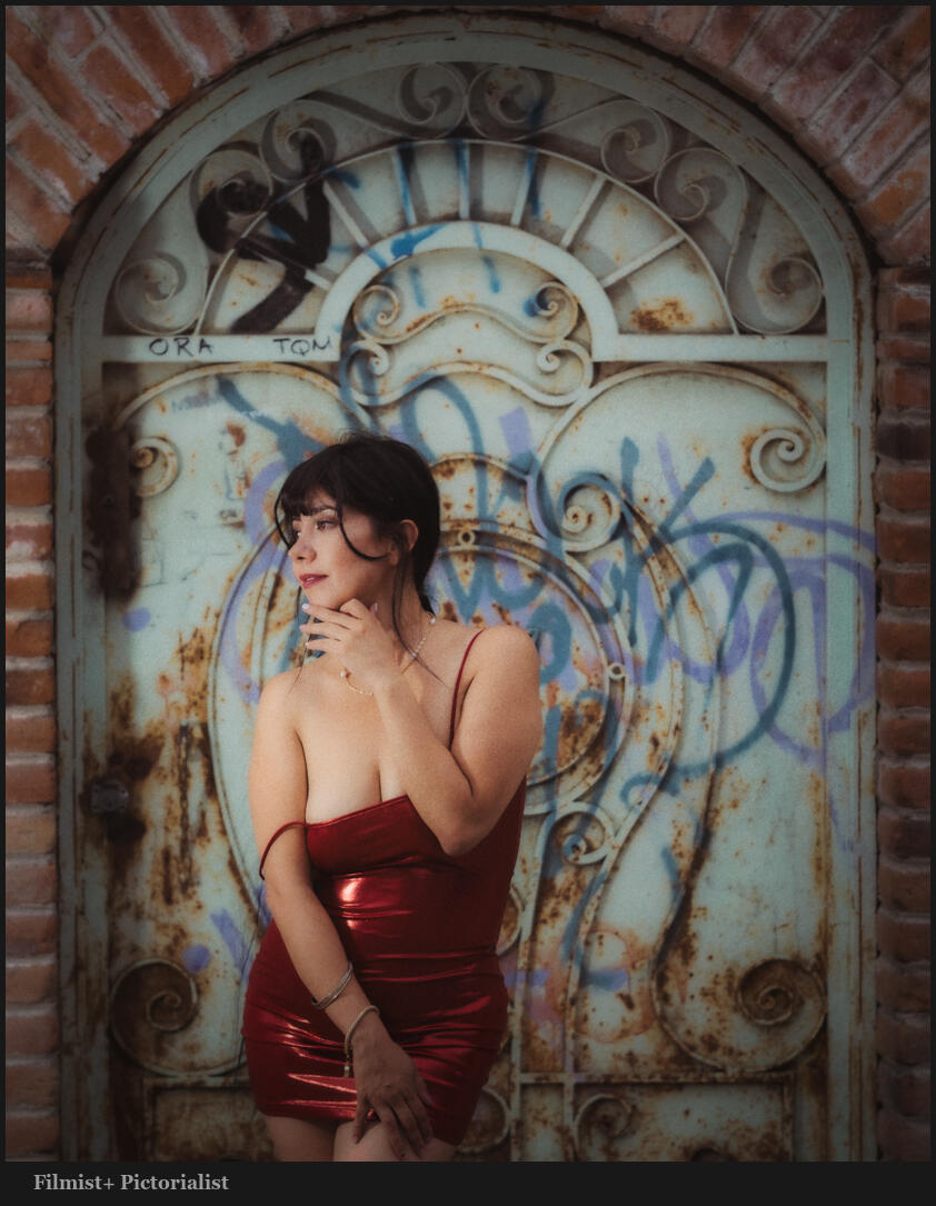
While the two primary colors should always be reviewed, you can see in this photo that moving colors like blue and red in a similar fashion as I edit this night scene with Street’ist styles.
HSL is a tool you should always use. Having a favorite preset or creating your own baseline with this will improve every session and give you a starting point that truly helps you be consistent and better understand how to make each photo balanced and amazing.
Gavin Seim