June 21, 2012

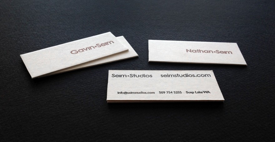
Custom business cards made using rubber stamps and heavy mount board. Cost is roughly seven cents each.

These are the new gallery cards I made up for Nathan and I. I’m always trying new card designs, but I’ve been wanting something with a hand made impact that can be produced easily and on demand here in the studio.

They’re made using a heavy 4 ply white mount board and self inking rubber stamps that cost about twenty dollars each. Using our straight mat cutter board, we cut slices about 3.5in x 1.5in from the 32×40 sheets of board that cost less than ten dollars each. The cards are them stamped, our names on the front in brown with lots of open space. The back is stamped with the studio details in black.

The neat thing is we can make thee on demand. They’re beautifully thick and we can change the look at any time with a fresh stamp. Making it far less expensive than order small batches of custom cards of this weight. They’re minimal, but based on the board price and the cost of the stamps, these cards come out costing about .07 each if the stamps are only used for about 1000 cards before being updated. They can be re-inked of course and be used for far larger quantities. Of coarse there’s some labor involved, but they don’t take long and it’s part of the fun.

Just one of the many ways to produce hand worked a card with a bit of impact. So far I’m enjoying them… Gav

Read More

March 8, 2012

Silver Shadows 2 presets are my complete black and white system for Lightroom. In the news in recent months, it launched late in 2011 and it’s also been given a free update recently to version 2.2, an update that includes new features and full Lightroom 4 compatibility. I’m thankful for our press agent who’s been helping spread the word and for my customers who’ve had nothing but good things to say about it.

Silver Shadows 2 was featured in Joe Farace’s Shutterbug column in the March issue as well as the gear section of Digital Photo in the April issue. They even featured a portrait example of my son Asher that I had added to the press kit.

It’s really exciting to see years of refinement and work getting some press. Click images for larger views. If want to learn more about the collection visit the product page.. Thanks, Gavin

Read More

March 14, 2009

by Gavin Seim Updated 11/09:

Images stuffed into mat pages, then an album covers is becoming less and less attractive to clients. If you’re designing wedding, event, or portrait albums you’ve probably played with making layouts in Photoshop or another program to then have printed as flush mount albums like Kiss or Asa Books, You might have also used press books like the ones from WHCC. Once you have a good design there’s loads of choices, but it’s the design that’s the challenge.

As many people know the service and support of Adobe has gone in the toilet in recent times and while they need some competition to slap them back on track, their software is still great. Today I want to talk about In Design CS4 and how it relates to album deisgn. I’ve tried various tools for album design, some of which worked really well. When it comes to crunch time however, I’m finding In Design is the king.

I learned the basics about using ID for albums from a video that Kevin Swan made. And now gives free on the Kiss books site. Not required but it was sure a great crash course and I use it often to hone up my knowledge. The bottom line is that it’s fast, easy and powerful. Once you get the hang of it.

In Design was not actually designed for photographers to make albums. Rather it’s the industry standard for designers doing layouts on magazines and other published material. It turns out however that it works a treat for doing albums. Bear in mind it’s not a photo editor. What ID rocks at, is laying out pages and doing it fast.

I cringe when I think of doing individual pages in Photoshop. It’s not a page design tool and it’s tedious to do layouts with. What I love about ID is that the entire project is contained in a single file. All images on the pages are referenced to the original files on your computer similar to when one makes a web page. You can edit and change you design in one place and when it’s finished just export the final file as a PDF of JPEG’s. Kinda like the way we use Lightroom.

indesign-3

Read More

September 9, 2008

SOny D900We know that Sony has been pushing hard towards the DSLR market that Canon and Nikon have pretty well cornered. They have now announced the D900, their first full frame pro level version.

Inside we find 25 megapixels, a 3 inch screen, 5fps, Minolta (as well as their own) lens support and built in steady shot. Some pretty solid specs, but it looks like Sony is still going to be a step behind the big boys in terms of at least high ISO shooting. Sony is coming against a tough crowd with this 3k SLR, and people won’t go easy. Still their looking to be a future contender in this space.

DPReview has a nice little hands on. This seems like a nice body, with some good things going for it. If Sony sticks with this, and doesn’t pull any stupid stunts akin to adding invasive DRM to our lenses or images (wink) they may really go somewhere in the pro market. We’ll keep and eye on them, and if any of you are using Sony bodies let us know what you think!

Read More