August 13, 2012

New download /DVD workshop takes photographers on a cinematic journey across America and passionately teaches how to see and photograph light like never before.

Soap Lake, WA (August 14, 2012) – Seim Effects Photo Tools announces today the release of the new workshop by award-winning photographer Gavin Seim – EXposed, a film about seeing and photographing light. Produced over months, while traveling across America. EXposed documents experience and techniques inspired by the masters and refined for the digital age.

DOWNLOAD PRESS KIT
Includes full release, image samples and review information.

EXposed teaches photographers how to not only photograph light, but how to truly see it. EXposed is an informative entertaining 4-hour journey following Gavin as he travels around the United States of America with a Camper and a passion for light, hunting perfection and showcasing the importance of understanding the quality, range and tones of light and its impact on our photography. Gavin has compiled 15 years of study into what has become a simple and breathtaking study of light.

Weddings, Portraits, Landscape, Digital, Film. It doesn’t matter. EXposed is not a workshop about the latest fads or gadgets. It’s a workshop about light. Because that’s what really counts. EXposed is a cinematic journey that will teach photographers how to make better exposures. A completely unique workshop about exposure, light, the power of the Zone System, dynamic range and perfect tone control.
“My heart went into creating this workshop and I can’t express how proud I am of the outcome. With all the discussions in photography today, it’s surprising how little we talk about the art and science of exposure and proper tone control,” said Gavin Seim, photographer and owner of Seim Effects. “Making great photographs involves more than just clicking, buying new software, or pushing buttons. It’s something that goes deeper and mastering it requires practice and understanding of light and tone in subtle ways.”

Through 4 hours of educational materials about using light contained in 14 organized chapters that photographers can view and review at their own pace, EXposed teaches:

  • Core concepts to understanding exposure
  • Using the Zone System
  • Visualizing: Really seeing light
  • Dynamic Range and what it means for every image
  • Long Exposure and the secrets to hidden beauty
  • Finishing images, Burning, Dodging
  • Metering and tone placement
  • Seeing and directing light
  • Ratios and lighting tools

EXposed is available now. And until August 31, 2012 the instant HD digital download price is just $89 (a $10 discount) and the DVD plus instant digital download price is just $99 (a $20 discount). For more information and the trailer please visit:  www.exposedworkshop.com.

About Seim Effects Photo Tools
Gavin Seim, owner of Seim Effects Photo Tools, is an internationally recognized photographer, renowned for his experience with creative workflow, the digital darkroom and time tested techniques. He has a passion for creating easy-to-use software tools and educating photographers of all skill levels to be more efficient, creative and profitable.

Gavin Seim’s software presets for Lightroom include the new Silver Shadows 2, Power Workflow 3, and Color Fantasies. His Photoshop tools include Hollywood Effects 2, Creative Essentials, and Naked Elements. Also available is LightFlow, a powerful Aperture Presets collection.

For more information on Seim Effects Photo Tools visit:  https://seimeffects.com

#   #  #

Note: Press materials and image samples can be downloaded from the Seim Effects website:  https://seimeffects.com/press . For editorial review copies please contact: effects@seimstudios.com

Contact:

Gavin Seim or Nathan Seim
Seim Studios LLC.
PH: 509-754-5255, Email: effects@seimstudios.com

Steve Rosenbaum or Leigh Nofi
S.I.R. Marketing Communications, Inc.
PH: 631-757-5665, Email: sir@sironline.com, leighnofi@sironline.com


Read More

July 10, 2012

With EXposed just around the corner I wanted to release a chapter to give you all something to chew on besides the promo teasers I’ve been posting on the EXposed page. This is part of the foundation chapters in EXposed that look at essential concepts for understanding light before we get into advanced things like the Zone System, editing and beyond.

You can order your full copy of EXposed right here, as a download or a DVD and get over 4 hours of concise training that will change the way you see light. For now lets watch this video. I’ve also added a bonus clip from the introduction video to give you a better view of what we’re doing in EXposed… Enjoy… Gavin


Read More

April 19, 2012

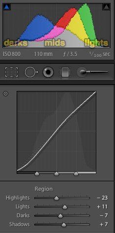
by Gavin Seim: Taking the time to watch the histogram is invaluable. Left is dark, right is light on a histogram. But beyond that you can better understand and work the highlight and shadow detail your way, before exporting to Photoshop, printing etc. And it’s not hard.

I recorded this video and hope to do more soon. In it we analyze what the histogram tells us about an image and how we can learn to better understand our images using it.

Starting with presets is a great way to get an image going, but don’t be afraid of those curves sliders to move things around. You can control tone and dynamic range beautifully on the RAW file without losing contrast. Just watch for artifacts or noise if you push things far (see the Six Keys).

Get comfortable with your histogram. It can tell you a lot, both in camera (trust your histogram more than what you see on the camera screen) and in post (just about everything you need to know). Powerful stuff indeed. Lets take a look…

Read More

March 21, 2012

I’m still out here recording footage for the new EXposed video series. I plan to keep on teasing until the series releases this summer, because it’s going to be that good. But I won’t waste time. Check out, “New Mexico Camp” below and then head over and save 50% on your pre-order of EXposed.


Read More

February 18, 2012

Presentation is as much part of a photo as the image itself. An image on a disk means little to the world. A well presented wall piece does. It’s part of the process that doesn’t get the attention it deserves…

By Gavin Seim: So how are you mounting and presenting your images? It’s something worth thinking about, just like How You Sign and Brand Your Images. While digital files certainly have their place, most won’t fully appreciate a work until it’s hanging in front of them. Which in my mind makes presentation a critical part of the whole editing and production process. I’ve learned it’s often a missing link in the art process in this digital soaked era.

Personally it took me years to get past the clutter and get really focused. It’s not just making a print. It’s a whole process. And lets be honest. It can tough to present on a wall. It forces you to make decisions, spend money and commit to a given edit. But when you do, there’s nothing quite so gratifying as seeing an appropriately sizes piece hanging on a wall. It makes you see your work an entirely different light.

The Chamberlains. 30x70 print on canvas. See below.

These days I try to present without glass as much as possible (a personal preference). I often use traditional (not inkjet) canvas prints mounted by Whitmire & Associates They’re like nothing else. I enjoy metal and sometimes classic mounted prints as well and I’m also doing some experiments with hand coated and polished fiber inkjet prints. I nearly always avoid making a loose wall print and sticking in in a frame. I find it just lacks the polish of a quality mounted print.

The image above is one of my 70in Heirloom Canvas prints. More about my canvas and mediums I use right here. It’s been framed and presented by itself on this large wall, keeping it as the main item on the focal plane. For some detailed thoughts about appropriate print sizes through history and my process for wall prints see this article.

Of course everyone does not need to see the same way I do. But part of our editing process is reducing images to that final finished piece and deciding how that piece can best be presented as art. For most works, the process has not been completed until an image is hanging on the wall. It’s often the true test of how good a photograph really is.

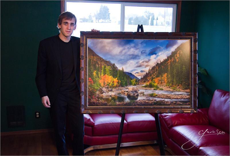
Gavin standing with a 30x46 print on canvas of his limited edition, Doorway to Winter.

So challenge yourself. No matter where you are with your presentation, start looking around. Find what’s being done and what has been done. Find a nych that fits YOU and make those prints sing. Photos on social networks are fun and good for promotion, but images on walls are like fine furniture. Done perfectly they never go out of style (ever been to an art museum). Aside from how good you’ll feel about a great print. They also sell for quite a bit more than a 5×7. Yet another perk 😉

Of course this all goes deeper. There’s printing mediums, how you light your images (critical to presentation) and more. But that’s for another day.

Do share your favorite presentation methods in the comments. And stay tuned, I plan to make a post soon detailing some of the best printing and presentation methods I’ve come across. There’s some really good ones… Gav

Read More