October 14, 2023

2024 may be a year of reckoning for Phase One. But there’s no doubt Lightroom took this feature from their playbook after many years. What we do know is C1 just lost an edge with the new Lightroom Spot Color tool and I’ll show you how to use it today.

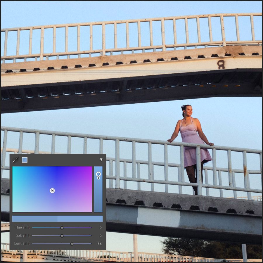
Lightroom Spot Color was only a Capture One feature before.

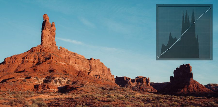
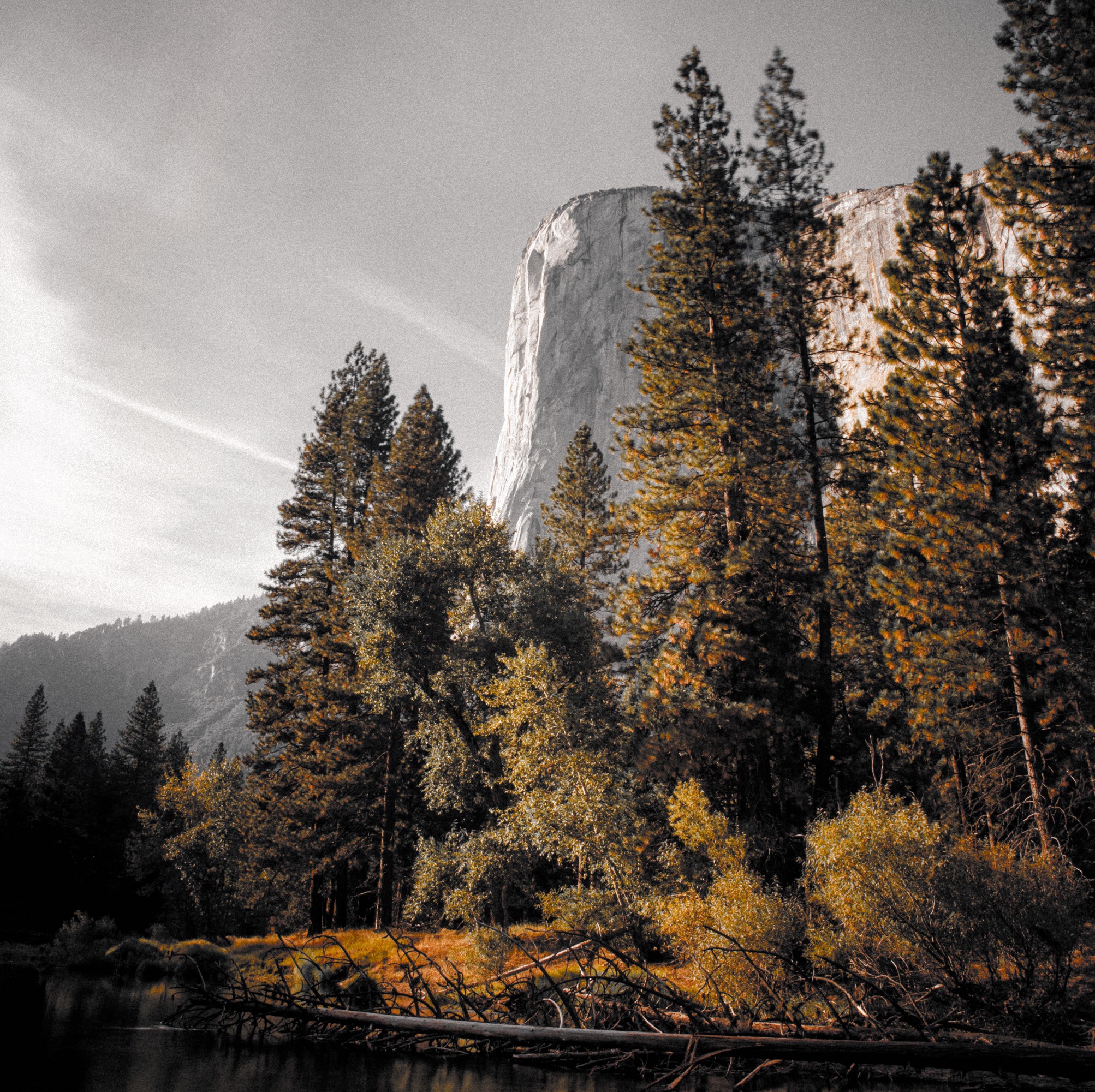
Play with Lightroom Spot Color. Grab the Free Filmist presets and play with spot color to enhance details. Also, check out the new Amber Presets pack as it does deep things with color and is a good example of the power of this.

Lens Blur is also cool, but do you need it like Lightroom Spot Color?

The new lens blur feature works pretty well and will doubtless get better. But do we need a mobile-style bokeh in Lightroom?

I can see this being good for enhancing existing bokeh. I would personally avoid it in images that have no bokeh as in our phones it does make mistakes. Unlike the new Lightroom Spot Color which is the game changer, lens blur in LR 24 is just a nice feature.

Blurs have long been limited in Lightroom and don’t really exist in Capture One. I think I’ll find myself using this as a general blut tool more than a bokeh tool. Sadly I don’t see a way to use this in presets thus far.

lightrooms new lens blur tool

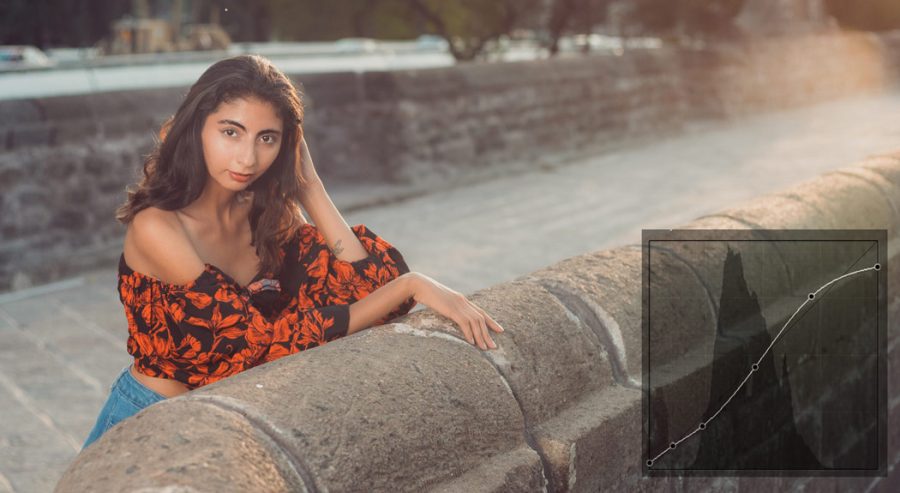
Don’t use Lightroom Spot color on everything.

As I explain in the video you don’t need to open this feature up with every color. Most times I apply a preset from Filmist or Amber and it’s formulated just fine. Stay tuned to my channel because I I’ll be making more videos about when and where this tool is amazing.

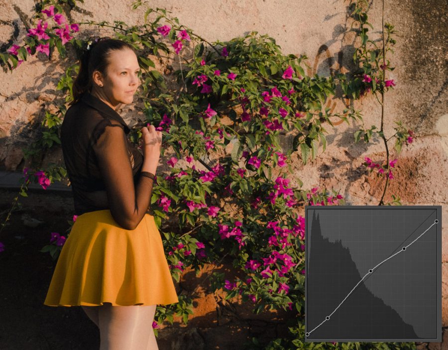
What this does allow is fine-tuning if you feel a color is just not quite right. It also allows deeper and easier fine-tuning when creating presets so you can be sure I will be implementing it in future updates to mine.

Advanced Color in Capture One is really good, but the visual manner in which Lightroom Spot Color works lets you select colors and see the output and I might like that better. We’ll compare the two in the 2024 LR vs C1 review soon.

Lightroom spot color with visualize
Here I used Amber presets but selected just the dark oranges to adjust them to my liking. By activating the Visualize range you can see only the selected color much like in Capture one.

Using this tool in Lightroom masks is even better.

Ai Masks are amazing in Lightroom and many of you use my Elegance Speed Mask presets to apply them in fast groups. But until now we have had no HSL-style controls in masks and I have always had to find clunky workaround when making presets.

You can bet you’ll be seeing updates to my Ai presets that take advantage of LIghtroom Spot color in specific details. I can say from much experience that it will empower our masking to a new level like me you’ve probably been wanting this for a long time.

Using Lightroom spot color in an Ai mask to balance the color of a blue sky
The power of Lightroom Spot color with a mask is evident. I’ll show you this example in the video.

It will be interesting to see what competition from the likes of Affinity, Capture One and others will bring and we will all benefit from it.

Make sure you sub the Pro Photography Podcast because we will be talking more about all of this.

Read More

January 16, 2023

Curves are how most pros and quality presets control the detailed tones in a photo. But in today’s short video, I’ll show you a better way to use your curves. We’ve been using S Curve in photography since the dawn of digital. But this is the F Curve!

Why did I stop using the S Curve in my Photography?

Because after years of editing, and studying dynamic range. Creating popular editing packs like Natural HDR and Silver black and white. I realized the S curve was often overdriving on our edits.

So I started creating the F curve in my recipes. It gives contrast control, without giving you a crunchy, overly processed look. It does this because it’s based on chemical film processing and is more flexible.

In this video, I’ll show you how to use the F Curve!

If you want Lightroom presets or Capture One Styles you’ll find great examples of the F curve in the free sampler packs of Filmist Film presets and Silver 5 presets.

Also sub my channel for more videos like this one.

How to use the S curve in Photography today!

It’s easier to add fine control to an F curve because we’re not always looking for that S shape. A film-like curve is useful not only for recipes that require a film-like feel. It simply works on nearly everything.

It might feel like an S curve when you start. But don’t stop there. Pull down the highlights and then lift a little in the middle, pull the shadow area a bit down and the black a bit up. You can vatu this any way you want. Just keep the curve smooth and maintain that highlight drop as needed.

I didn’t have a name for this, I just knew this simple course was giving me results that felt better in most situations, and I started using it a lot. It was only after years of applying this that I realized how simple it was and started calling it the Filmic Curve, or the “F” curve.

Gradually, I started using the normal photography S Curve less and applying variants that merged it into F curve. I watched as my own presets and edits got smoother, with better highlights and even better shadows and contrast.

It’s a simple tweak that transforms your edits.

Notice how the Filmic presets curve rolls off far more than a photography S Curve
An F curve can start like an S curve. But the way it drops on top is the key factor in the result. You can then mix shadow lift and drop.

But without Shadow, your curves mean nothing!

When I started developing Filmist film presets years ago, I realized that Film has a softer highlight roll-off than digital has a hard sensor. Contrasting lenses and easy-to-move editing soldiers were getting over-curved. especially with the traditional digital photography s curve.

A curve can add or remove your shadow. The S-curve in photography can quickly pop highlights or put some punch into shadows, and often it works well. The problem is that it tends to do the same thing to every photo, and while it boosts contrast in the edit, you lose fidelity in the roll-off details.

Tone roll-off is a big deal. And what most don’t realize is that you don’t always need to push up highlights because they are actually very perception based.

That highlight will seem BRIGHT depending on the tone of the shadows that surround them. To learn more about shadows watch this video on my channel. In short, combining smooth highlight roll-off with organic feeling shadow gives you a rich result.

A subtle Ektar based F curve is a lot like the S Curve in Photography but distinct
In this Ektar recipe from Filmsit the F curve is already part of the process giving a subtle highlight rolloff like film.

The F Curve will replace your S curve crutch!

So instead of the S Curve in your photography, us the F curve because you better control the shadow dimension and how that relates to your highlights as they roll off perfectly, just as they did with Film!

You also won’t always feel like you have to create that S shape will open up how you use the tones in each photo.

I hope you found this useful and will spread it around because the F curve really is better than the S Curve. Please spread this around and let me know what you think in the comments.

Gavin Seim

The s curve in photography works fine, but my changing to a filmic curve you improve everything like in this P\ortra look
A strong double drop at the top of this F curve softens the specular highlights that were a problem in the portrait processed with a Portra look.
Read More

December 31, 2017

I’m here in the jungles of epic central Mexico near Tamasopo and there’s line and light everywhere.

I filmed this  video to share my experience about where the frame begins and ends because it’s critically important to getting perfect composition. We’ll talk more about this location and it’s lines in the Dec Photo Kit and you can get the first month free here. In the meantime watch this and let me know how you judge your frame stop. — Gav

Read More

June 16, 2017

 A lot of you asked for more videos that show all the crazy stuff you can do with Lumist. This is the first of that video and there’s a couple more to come.

In this video we take a deep look at the Basics of Lumist that are easy but go way beyond basics. This is tone control technique here that people spend a lifetime learning as we dig into the Simple Toolbox module in Lumist and learn how much it can actually do. It the next video we’ll dig deeper into the effects modules of Lumist. If you don’t have Lumist yet you can download it HERE.

Enjoy — Gav

Read More

April 26, 2017

As photographers, we learn fast that harsh Sunny light is… hard!

But ultra flat light can be hard too so if you had to choose, which would you pick?

The perspective we have of “beautiful” light is often too narrow; soft sunsets or giant glowing softboxes from the heavens. Those are amazing. But to really master light I think we need to learn to value every type of light and find the unique beauty we can shape from it.

Flat light can be hard with landscapes and environmental scenes and if I’m struggling with that I’ll often try longer exposures to add interest and then do a bit of burn and dodge in post to bring out more subtle contrast points. With portraits, flat light is usually nice. But too flat light is reiterating and feels dull. Remember there’s always a direction with light, so you can use that on the face for a nice soft portrait. But if you need some extra pop juts add little artificial fill light in on the same side as the natural light, adding a bit more lighting ratio on your subject.

In this video, we go out and find some flat light, take some images and then head back to finish up with some post-production to see what we can do with it.

If you enjoy also sub my YouTube channel. — Gav

Read More