April 19, 2012

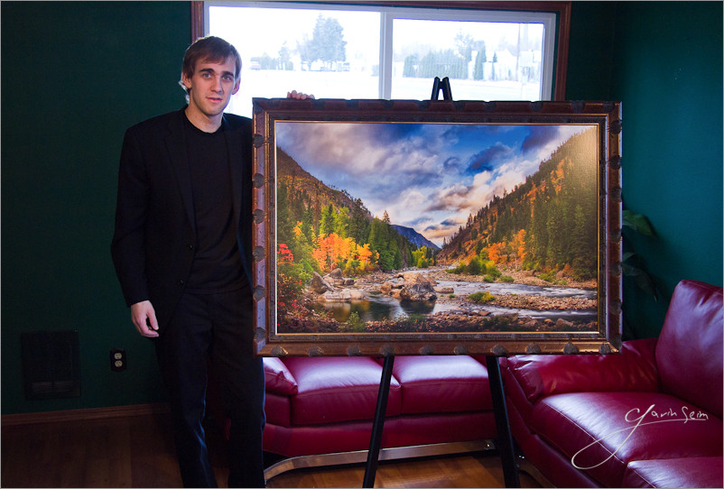
Me with a framed 30x46 limited edition on traditional canvas of Doorway to Winter. Just the start of a long study in how we can better present and display images.

by Gavin Seim: A lot of photos are being made these days. Some bad, some good, some amazing. But what gets me is how little we’re doing with them. Art seems to have become something that lives on Facebook. Most the worlds photographers seem to not even be selling prints to their clients. They just hand them digital file and the cycle of images that exist in nowhere but bits goes on. A few Facebook likes and comments later, the image disappears into the mists of digital bliss.

When we do make prints they tend to be small and cheaply presented. We find the cheapest company to make a gallery wrap that can be bought at WalMart. We buy a plain print, or whatever cheap new product the labs are kicking out in bulk. We take whatever is available. Often it seems we’re not selling heirlooms, we’re selling throw-aways. Has the beautiful art of printing and presentation been lost? Is this good enough?

I say no.. Most images mean nothing until their properly hanging on the wall.

I’m not trying to slam anyone here. I just think serious photographers should think more about the potential of their images and how well their using it. On the business side this is very relevant and wall prints can make a major diffence is sales and profits. Read, Wall Portraits. Why the 8×10 Is Stealing Your Impact & Profit. This stuff matters to our craft.

Sure there are commercials jobs and stock, there are a few projects where prints are not as relevant. But most of the time that’s not really the case. In truth I think we started doing all this because it was easier. It’s a lot of work to make and sell great prints. So we’ve lowered expectations.

Printers and paper options are getting less expensive and have countless choices of presentation and creativity. I bought a Canon 8300 wide format printer last year and just making my own prints has changed the way I think. I no longer just settle for what’s easy. I study mediums, mounting and presentation. I’m getting into mounting prints myself and looking at how I can stand out with unique offerings. While I still offer digital files if needed, my focus has shifted almost entirely to making and selling prints. And it feels so good.

So what does all this mean. Not that you need to go buy your own printer right now, or take your work in an entirely new direction. But you might find you want to do both. My bottom line is that we owe it to ourselves and our clients to start thinking about how we can be better presenting images, what sizes are appropriate. About how we can make more than a digital file and start producing furnishings for walls. Very few people are making really quality wall art. It’s about the only photo market that’s not over saturated right now.

It’s not easy and it’s not cheap to make and display great prints. But so few are doing it anymore that it’s not only satisfying, it’s become a great opportunity to set yourself apart and stand out in a crowded industry. Doing it well is more than just making an 11×14 and buying a frame at Target. It takes time, study and planning. But the reward is like nothing nothing else.

I hope to post an article soon looking in detail and at the mounting and presentation options I’ve been studying and working with. But what do you think? Am I crazy, have you found presentation ideas that are unique and working for you. Share your thoughts in the comments… Gav

Read More

February 18, 2012

Presentation is as much part of a photo as the image itself. An image on a disk means little to the world. A well presented wall piece does. It’s part of the process that doesn’t get the attention it deserves…

By Gavin Seim: So how are you mounting and presenting your images? It’s something worth thinking about, just like How You Sign and Brand Your Images. While digital files certainly have their place, most won’t fully appreciate a work until it’s hanging in front of them. Which in my mind makes presentation a critical part of the whole editing and production process. I’ve learned it’s often a missing link in the art process in this digital soaked era.

Personally it took me years to get past the clutter and get really focused. It’s not just making a print. It’s a whole process. And lets be honest. It can tough to present on a wall. It forces you to make decisions, spend money and commit to a given edit. But when you do, there’s nothing quite so gratifying as seeing an appropriately sizes piece hanging on a wall. It makes you see your work an entirely different light.

The Chamberlains. 30x70 print on canvas. See below.

These days I try to present without glass as much as possible (a personal preference). I often use traditional (not inkjet) canvas prints mounted by Whitmire & Associates They’re like nothing else. I enjoy metal and sometimes classic mounted prints as well and I’m also doing some experiments with hand coated and polished fiber inkjet prints. I nearly always avoid making a loose wall print and sticking in in a frame. I find it just lacks the polish of a quality mounted print.

The image above is one of my 70in Heirloom Canvas prints. More about my canvas and mediums I use right here. It’s been framed and presented by itself on this large wall, keeping it as the main item on the focal plane. For some detailed thoughts about appropriate print sizes through history and my process for wall prints see this article.

Of course everyone does not need to see the same way I do. But part of our editing process is reducing images to that final finished piece and deciding how that piece can best be presented as art. For most works, the process has not been completed until an image is hanging on the wall. It’s often the true test of how good a photograph really is.

Gavin standing with a 30x46 print on canvas of his limited edition, Doorway to Winter.

So challenge yourself. No matter where you are with your presentation, start looking around. Find what’s being done and what has been done. Find a nych that fits YOU and make those prints sing. Photos on social networks are fun and good for promotion, but images on walls are like fine furniture. Done perfectly they never go out of style (ever been to an art museum). Aside from how good you’ll feel about a great print. They also sell for quite a bit more than a 5×7. Yet another perk 😉

Of course this all goes deeper. There’s printing mediums, how you light your images (critical to presentation) and more. But that’s for another day.

Do share your favorite presentation methods in the comments. And stay tuned, I plan to make a post soon detailing some of the best printing and presentation methods I’ve come across. There’s some really good ones… Gav

Read More

August 8, 2010

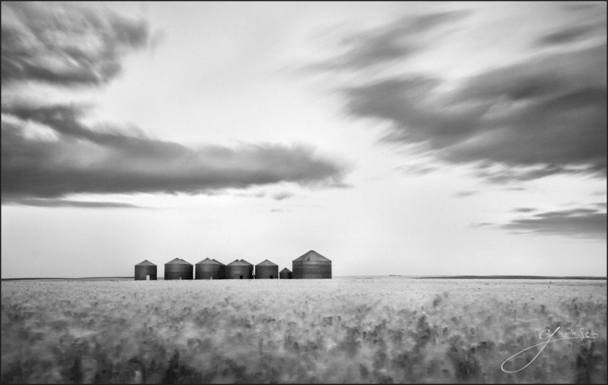
  • Silver Waves of Grain. | Near Moses Coulee in Central WA | This image is available in print.

Making landscapes comes with the privilege being able to focus on one subject. Unlike with a wedding, where I need capture a multitude of stunning images, the goal with fine art is a single frame. Lately I’ve been focusing on the idea of a large effort going towards the single frame. Sometimes the more work it takes, the more pride I feel for the piece.

I am satisfied with this and it will probably appear in my Signature Collection as a 30-40 inch piece. That does not happen every time I go out, so I’m happy. It’s a simple landscape, yet it embodies northwest farming without clutter or distraction and does so in a way that I think in unique, the sea of blurred grain surrounding the lone family of grain bins which will soon have their bellies filled with the very ocean that surrounds them.

For Photographers. How it was made…

Read More

August 1, 2009

by Gavin Seim: Updated 04/2012:

Have you ever admired classical art hanging in a museum? Maybe Sargent, Bierstadt, Rembrandt? It’s from the painters that we inherited this profession and every photographer should take time to look closer at what they did. You owe it to yourself and your clients to start placing appropriate sized pieces on walls. Photographers have missed much of the furniture quality appeal of their craft. Part of the problem is that they think of themselves as photographers. As camera operators.

We are in a saturated industry that’s in a rut of low grade commodities. But it’s time to change that. Hemingway was not a typist, he was an author. Those that have the skill to make quality wall portraits are not camera operators. They are artisans. Anyone can take pictures, but being a master of photographics is no easier than being a master painter. The mindset we have effects the product we produce. I Am Not a Photographer (see article).

Now it’s not only the fault of digital or too many people with cameras. We’ve trained ourselves and our clients to think small. It’s something that goes back to the early days of the wet plates and small contact prints that we’ve never quite escaped. People walk through our doors thinking in 8×10’s, 5×7’s and wallets. And we encourage them. It’s helping make photography a cheap commodity and it’s time to start changing all that.

Why should an 11×14 hang on the wall? It probably shouldn’t. Chances are the wall is much larger than that. But we’ve fallen into a rut of thinking small is all people want and need. Some tell me that “people won’t want these in my area”. But I’ll be blunt.. If people aren’t buying wall art, it’s because you don’t know how to make and or sell said wall portraits. I live in small town America and have discovered for myself that people love personalized wall art. You simply need to show them the quality and value of a beautiful appropriately sized piece. But first you have to understand the value yourself. Lets look.

120×72 – Among the Sierra Nevada Mountains. Albert Bierstadt, 1866. Birstadt is one of my favorite Husdon River School pictorialist’s. Amazing work at stunning sizes. Click this one for a large version. It’s amazing.

When you walk into a furniture store are they afraid to show you the larger dining set that fits your room? Do they act like it’s a stupid to buy the Italian leather instead of the cheap import? No. The only reason clients are asking for 8×10’s is because we’ve trained them to. Try showing them a thirty inch framed canvas of their beautiful family and see how they respond. If we do it well, we’re moving towards fine furnishings.

It’s been about 5 years since I first attended Wall Portrait Conference to really learn about all this. I know it can work, because nearly every client I have purchases at least a 24 inch heirloom quality print for their wall (I charge around $600 for those). That’s my smallest wall portrait size. I’ve sold up to 70 inch pieces using these same principles. Not because I’m a hard sell, but because I’m making and showing quality pieces that myself and my clients can really be proud to show.

But rather than simply making my own case, allow history to help. Below are some classical works, listed with their original sizes. We think of these as classics now, but when made, they were often commissions meant to hang on someones wall just like our photographs. Take a few moments to really look at them, then I’ll be back. And if you want to and get inspired in print form, check out some books like Sargent’s Portraits Of The 1890’s, Frederick Church, or J.W. Waterhouse. Or for the lover of pictorials like myself, here’s a stunning book on the Hudson River School era of painting.

46×34, Portrait of Nicolaes Ruts. Rembrandt, 1631. It seems that even 300+ years ago, a wall portrait was a thing of note. Look at the quality of this work. Click for a larger version. Even the catch lights look perfect.
Waterhouse-gather_ye_rosebud_39x32
38″x32″ – Gather Rosebuds While Ye May by Waterhouse 1909
The Voyage Of Life, Manhood
80″x52″ The Voyage Of Life, Manhood by Thomas Cole, 1842

Read More