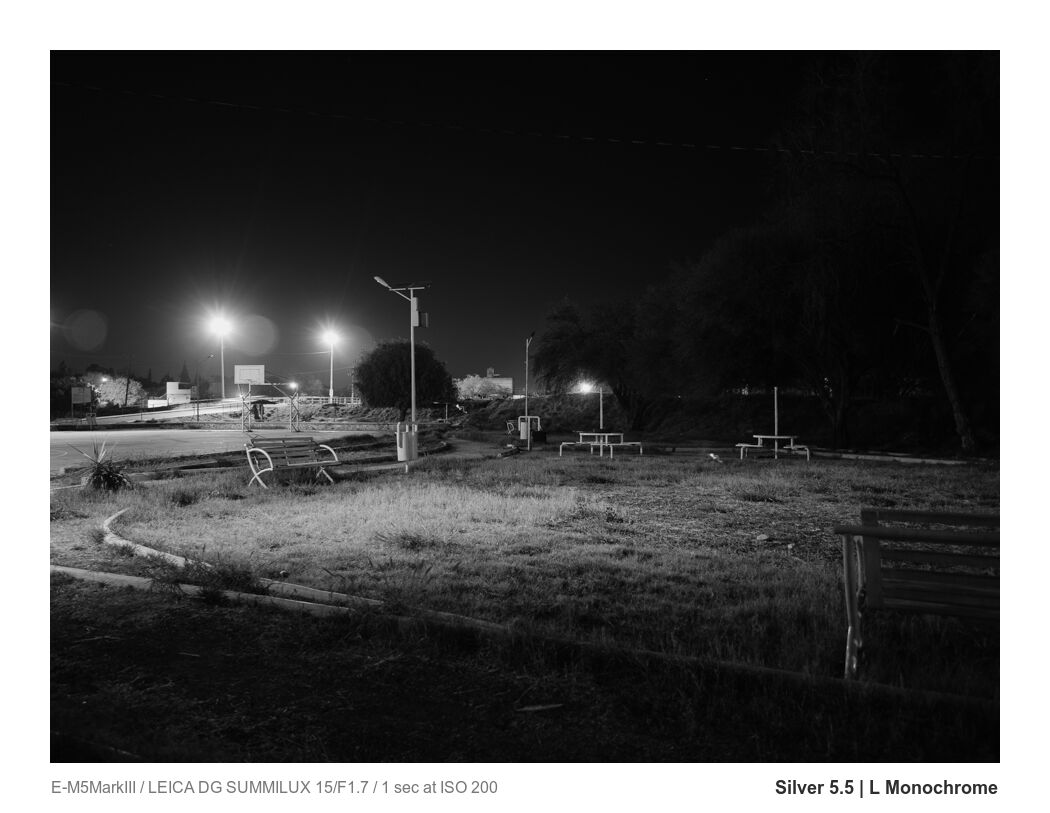
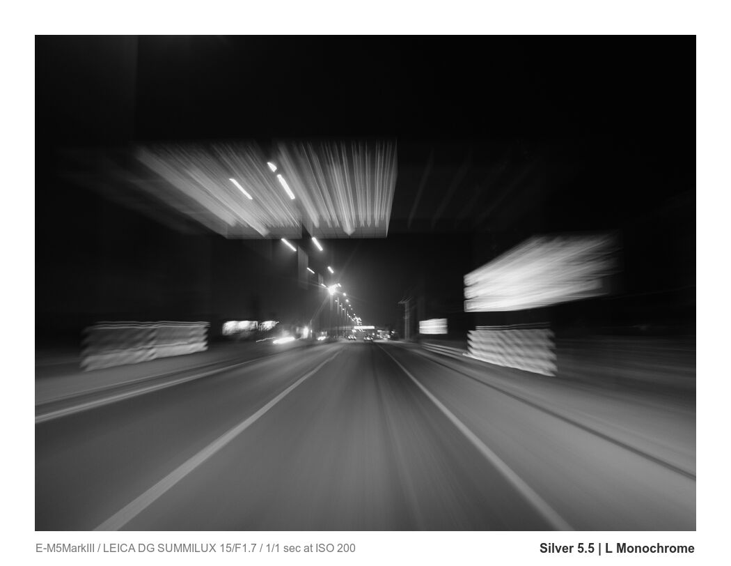
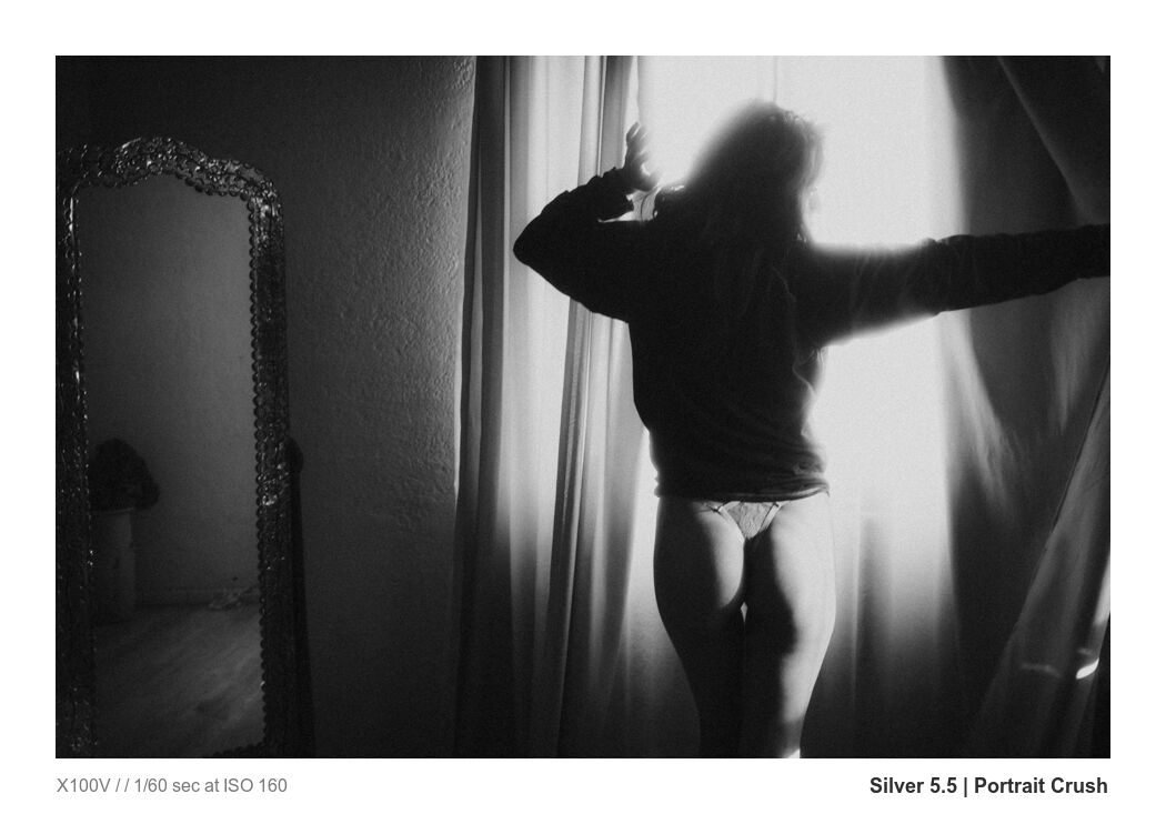
April 8, 2022

In today’s video, I’m going to show you how to un-clip any photo.

Fixing a photo at this level may seem difficult at a glance but it’s actually not hard and we’re going to make short work of this. I’m going to show you what to do when NON of that is enough and you have an image so clipped that it seems like it’s useless. This is how you can fix ANY clipped photo.

If you expose well you can usually get rid of clipping and have stunning dynamic range using simple sliders, presets like Natural HDR or Filmist presets with a few of its dynamic chemical mods.

So for me there are 3 levels of clipping. Here’s why it happens and how to fix it every time.


You can also DOWNLOAD the RAW file I use in this to follow along.

You can also watch this directly on my YouTube channel.


Level 1 light clipping resolved with simple presets and adjustments like Natural HDR.


Level 2 resolved with presets and local adjustment mask


Level 3, resolved with painting back detail on PS , Affinity etc. This requires some time depending on the retail you need but it always works.
Read More

December 21, 2021

What Should you use Capture One or Lightroom

I promised I would make a video about Lightroom VS Capture One because it’s been a while. The Capture One vs Lightroom workflow is similar, but not the same, and there’s a lot of debate.

UPDATE: There’s a new 2023 version of my Lightroom vs Capture One Review. Watch it here.

In 2022 both editing apps have advantages. So in today’s video, I’m going to get hands-on and show you Lightroom and Capture One, and how to get the most out of both so you can decide which one is better. Should I use Lightroom or Capture One Pro? Let’s find out.

Watch my video: Lightroom vs Capture One 2022


Get my Free Lightroom presets and free Capture One Styles.

Try my Natural HDR , as well as packs like Silver and Filmist film presets. Presets/styles make a huge the diffence in both apps if you usequality recipes. All my develop preset packs have Lightroom Presets and Capture One Styles inluded. Even the free preset packs you’ll find around the site.

Is Capture One or Lightroom more feature rich in 2022?

In the past, Adobe also tended to move slowly, but in the past year, they have started innovating with Lightroom. Probably because of competition from apps like C1, One One RAW, and others. So we all win here.

Lightroom and Capture One are powerful tools, and I’ve been using both for a long time. I develop editing packs for LR and for C1 side by side. I see their ups and downs. You’re here to compare Lightroom vs Capture One. So I will in my conclusion and in the video above.

While they both have advanced, I feel that Lightroom is edging out Capture One and I think it’s mostly happening because Phase One does not listen to customers. There are things in C1 2022 that are just finally improving after many years of customer requests and frustration.

Lightroom AI and auto mask tools are far ahead of Capture One. Capture One in turn has more panels and adjustments than Lightroom. This can be good, but also confusing to new users.

Capture One can be purchased. Lightroom on the other hand is all subscription based. Unless you go with the old Lightroom 6 version bought used. It’s a good app but getting very dated.

But Gavin, Capture One is better for Fuji files and WORMS!

Fuji files in Capture One are always said to be better. Are they really? If you use Fuji you’re in the right place. We’ll look and see if C1 still handles details better in the video, so you can make the best choice for your Fuji workflow in 2022.

The short answer is no. For more in-depth analysis on this, watch my other video here on worms on Fuji files in LR vs C1.

The results of both Lightroom vs Capture One are good, but they have distinct differences that may sway you to one or the other. There’s nothing wrong with switching back and forth, but I like to choose a main primary editor each year, and that’s how I manage most of my work.

capture one vs lightroom fuji files
Lightroom handles Fuji and any other files perfectly in 2022 and so does Capture One.

What about older versions? Like Capture One vs Lightroom 6

I don’t dig into this in the video. But if you’re holding out because you hate the cloud model and won’t subscribe to Adobe. I get it. and for you, it’s time to switch. LR6 is very dated, and the processing tools you can get in Capture vs Lightroom 6 are better, hands down. Stop clinging on and get upgraded to something better like Capture One, One One, or another RAW editor that does not demand a subscription.

Conclusion – Lightroom vs Capture One?

I’m noticing more people starting to switch back to Lightroom as the price of Capture One rises. though available as a standalone, it actually costs more than Lightroom and Photoshop combined in 2022. But at least you own it.

Capture One Pro has some more advanced tools that some of you will like, and Lightroom os more essential. Capture one has a Levels tool and a Curves tool, for example, while LR only has curves. In the end, both these tools do more or less the same thing, but having both can be handy,

Lightroom is improving at a faster pace. For years Lightroom was pretty stagnant, but people moved away from forcing Adobe to up its game. As of 2022, mask tools, particularly AI tools, are more powerful in LR. The layers in C1 are nice, but the interface is dated, and they have not had substantial feature updates to layers in years.

Don’t think you can avoid a real layer-based editor like Photoshop or Affinity by going with Capture One or Lightroom. It’s not a replacement. C! and LR are still RAW editors and if you try to replace Photoshop with it alone, your finished images will suffer.

Since this video, there have been a few interface updates as C1 tries to get more modern. But Phase One is very slow to listen to customers and make changes. Though Adobe is also guilty of this, you would think Phase One would want to be on top of it to gain market share. Sadly, they don’t seem, to care about customer happiness any more than Adobe does.

If I was asked right now… Capture One vs Lightroom Gavin? It will have to be Lightroom. But it’s a personal choice and this could change with an update. They are close. Get a trial of both and see for yourself.

Final Capture One VS LIghtroom Thoughts.

When I first started testing Lightroom vs Capture One years ago, I was impressed, and it seemed like a viable way to escape Adobe. But as time goes on and prices go up, Phase One seems to be ahead of itself.

In the end, these are both very good editing apps. Lightroom is easier to use and has more features overall. Capture One has more nuanced color control, but there’s little I can do there that I can’t find a way to do in Lightroom.

If someone tells you that Capture One gives you better images. I have not found that to be the case in 2022. Lightroom produces equal results. So try them both and use the one that feels best to you. they are both good. In the end, these are simply tools, and if Capture One takes a big leap, I will be right back here talking about it and not afraid to switch.

Meanwhile, Lightroom wins the overall Capture One vs. Lightroom battle, but both apps are good and produce excellent photo edits.

Make sure you check out my presets and styles store for great tools for both.

Gavin Seim

Capture one interface. Is it better than Lightroom

Read More

October 2, 2020

How to edit portraits better, stop over thinking.

Photographers keep under-editing their work. But just dragging the sliders won’t fix it. Heck, that was the theme of the Muse editing pack that we originally shot this session for. So lets edit portraits better with some simple techniques.

It’s always harder in real life I know. We are gonna dig into that today as we take on the cute photo session we did for the Muse launch and I’ll show you hands on how I edit with it.

How do I edit portraits better. How prevent myself from under-editing blues. I always use tools that push be to go past the basics. I stay sharp Lightroom presets or Styles for Capture on to edit fast, I use actions or watch videos like this one. BUT I also use those manual tweaks to get your look perfect. I’ll show you in this weeks video.  It’s time to edit portrait better. It’s time to to stop under-editing your photos, so let’s tale this bull by the horns.

Here’s some useful links related to the video as well.

There’s a couple more in depth training videos from this shoot for PhotoKit members where we dig more into the session and some more advanced edits.

The winning formula to get a better portrait edit here, was starting that edit in camera. Finding the light, getting a great look and then being unafraid to edit like we meant it. Even though we have not taken any of these into Photoshop, used actions or made detailed fashion or skin edits, they still look great and from here we can go wherever we like. Hope you enjoy, let me know if you want to see more like this.

Gav

Editing portraits better. Golden sunset shot edited with Muse Lightroom presets
Golden sunset shot edited with muse lightroom presets
cute bustier photo session with muse Lightroom presets
A soft edit from muse of this cute bustier. It’s all about editing portraits better.
Read More

July 25, 2020

Shot notes: On all 3 of these I used Silver Skin process from my Silver 3 presets collection for C1 and Lr on all three. I did some burn burn and dodge cleanup in Photoshop also. I used a Fuji XT3 with a 90mm f2.

Environmental portraits were a bit part of my training and my late mentor who was one of the finest portraitists in the past 100 years; he crafted environmental images for walls for an entire career.

So  I asked myself as I looked at these. Why do I need to remove set elements for this shot. Which tells a better story? I picked 3 poses but my favorite was the environmental scene and it looks great large. I decided to test it on the world of Facebook photo groups. By the way you can comment below or discuss this here on the Facebook post.

There was no grand plan here. Maybe that’s WHY I like it. The internet is full of confident critics who have no idea what they are talking about. I’ll never forget standing around the image salon at competition with Ken Whitmire and others and having strong opinions to this or that. Ken usually had a more objective view to offer. I guess what make me blog about this shot is that I realized I did’t care if they thought it was “wrong”, I knew it would probably not go loan in competition and that did not matter. I like the image and realized that that was good enough and that we often worry to much about what others say.

This caused some controversy.

More people liked my image that hated it. But I found it interesting that a lot of “experts” came to call and they decided that I sucked and if I would not heed their advice,  I should be disbarred from photography! I didn’t actually post the image asking for critique but I always consider critiques because mentally accepting or rejecting what people say about your image is useful.

I learned it’s fine to post your behind the scenes photo so people can peek on smartphones, but to post that image as art another matter. Digital has made us prone do doing whatever software tells us, small screens have taught us planning for print is less important than cropping for a four inch screen and social media has taught us to argue everything and insist we are right. It makes me feel we should go back and study the painters a bit more because often what’s being said by self proclaimed “experts” flies in the face of art history.

When I started entering international level PPA competitions in 2009 on the road to get my masters, I learned I was NOT as good as I thought. It was very humbling and I’ve been learning it ever since. I teach and study photography and I have for 20 years. So despite being called arrogant at times, I don’t just take every comment from  someone online with no portfolio or reputation and obey; neither should you!

Online, everyone is the smartest instructor in a class where only YOU are the student

Is there a rule that says we can’t have the lighting visible in a portrait? No, not if leads to the subject. So that’s what I told people, but some said they ONLY  see my strobe in this first image, or that the going  back and forth which disqualified this as a proper photo. They said my story was not clear and that I was arrogant for calling this a good shot and not admitting my mistake. Of course I have more traditional closeups also, the wide shot was made for fun and I ended up liking it!

A counterbalance like we see here forces the eye to go back and forth, it’s a powerful tool of composition that we study deeply Photo Perfect master class. Now that’s not to say you always have to have a strong counterbalance, only that it does work. The light value is about equal to the models face. Is there a rule that says it must be less. Of course not! The car is a bit odd, but we’re telling a story of a photo shoot out in the countryside. The car shows that we drove somewhere. The eye goes around, to the model to the light and repeats. To me it’s not that easy to leave this frame and I don’t care what object you see first because I know they will lead you to my subject.

The moral here to is  is not that this image is the award winning environmental shot of the season. There’s things to nitpick and I admit this wider shot was not the specific intent of the shoot. I picked it because it resonated to me. To you maybe  not and that’s OK. Here’s the bottom line.

The internet is not the final word!

In my experience most feedback on photo groups often comes from people with little experience. People that want to sound like experts because they are insecure. Listen for honest well intentioned feedback, but don’t let the insecurity of others be your own.
Sometimes an image sparking discussion is proof to me that I did something right. If someone trashes  it, the first thing I do is look to see if they have a portfolio  and how much actual experience they are speaking from.  I learn more from the accountability of real world competitions and qualified instructors than from ego driven comments where everyone dreams of being smartest instructor in a class where only I am the student. We should always be students, but not everyone is our instructor.

Photographers can be ego driven jerks and we can’t let that define us.

I have the experience and confidence to say this works. Of course, you can disagree and you can like the others better, or hate them all. I can even change my mind next week. But that’s not my point. The legendary Ken Whitmire. Ken taught me to use space and to print it unashamed as we fill-walls with the story we want to tell.

The main “crop” in image #1 is not it’s visual edge. The stops are the shadows and the objects to lead the eyes where I wanted. Sometimes these environmental shots get picked apart on small screens, while in wall prints their majesty shines and and people are amazed. Many “experts” in photo groups have never printed a wall print.  We we need to have enough vision to see the goal as well as hear the noise around us. Some images are meant to be seen larger and that’s a good thing. Light itself is rarely our subject, it’s merely our paint! Consider Arnold Newman’s iconic 1949 portrait of Danny Kaye, cluttered with elements of the set and glaring light yet so balanced.

Do you choose wide, thoughtful, safe; or trash them all?

#1 is a useful example of leading tones and counter balance.

The other images are nice portraits and perhaps more logical to some. But I would print the environmental, because it tells a story that I want to know more about rather than just showing a pretty model. Think about it.
If your objects. light and lines hold the eye in the frame and lead it back to the subject, there is no escape from the viewer seeing what you want them too see. I like this because it says something more and your eye gets to roam. It’s both the beauty and the challenge of an environmental portrait and I think most shoots should include one if nothing else for perspective and practice.

#2 feels thoughtful.

It’s not the safest but the pensive look and the hand lead me to the eyes. The pose is not the most sensual or classic, but I can’t stop coming back to those eyes.

#3 feels safe.

It’s got decent lighting, a nice smile and a pretty fair pose with good mends in fingers elbows and a wrist that’s maybe a tad too straight. It’s a nice client portrait and you will probably forget it soon.
People believe their eyes have a choice. In most cases, I don’t believe that’s true. When we use counter balances with tone and line, we can force the viewers eye go where we intend. Not everyone needs to know the story for the story to exist. The use here of the set environment gives us the chance to show a glimpse of the story that most never see and leave them asking questions.

The more experience I get, the less absolute I become about whether a photo is WRONG!!

I can always spot a ego driven feedback because its’ from people who think they know everything and the rule they read about once applies to your image 100% and if you don’t honor it, you are a bad photographer. I can always critique an image, and while there are “rules”  (guidelines) like lines, lighting or an image needing a main subject,I’be found the more I learn the less know.

If you reject feedback because you know all your images are amazing you will hurt myself. But If you filter feedback because it seems ego driven, some someone with something to prove, someone with little demonstrated credibility or experience, that just means you have enough confidence and experience to also critique yourself. Just be careful with confidence because it’s a sharp sword!

A perfectly lit portrait that has no soul, no question in it’s eyes, it’s photo of the light, not a portrait of a person. I think sometimes we need to be reminded of that.  — Gav
Read More

June 4, 2020

Last week I was working on the 1.2 update for our Filmist emulsion presets. We develop these for Lightroom Capture 1 and LUT. I needed some fresh test image so I took my model Sondra out for a quick natural light shoot on these quiet side street in central Mexico.

The soft light seems a bit flat but there’s direction to it and it’s perfect for portraits. The quiet greens made for a sublime contrast to the dress and the sunset light was filtered like a giant softbox. Then we started editing with FIlmist. No need to lose ourselves in over saturation. There’s a reason film color was refined for over 100 years.

I’ll with just some color grades and then do more detailed finish work on my top favorites. This first one is just the new 160V Pushed presets which gives a nice poppy push to the RAW file with this really soft light. We want to bring out the shape of the light. The reason good presets are so powerful is not because you can’t edit sliders manually. It’s because you cab quickly browse looks that are close and get the one that really fits the image you’re working on. You get to see things you would never see if you editing everything manually.

I start with the RAW file color grade. If it’s a 5 star image that I will edit in PS, I will take off the grain until after my final edit and then add it back to keep the image surface clean and free of artifacts. This one is just a preset and is now ready for some quick detail work in PS.

Ok lets go…

Shoot Notes:

  • Location; Querétaro mexico, May 2020
  • Time: Sunset, around 7PM, partly overcast
  • Gear: Fuji XT3 – 50mm f2 lens

Edited with: Filmist presets, Alchemist Actions, Lumist Actions and Sharpist Actions.
Get 20% off any of these with code: BlogFreinds


The key with great color in a portrait is to separate the object. To make your  subject pop and have that 3D feel. It’s starts with light but the way we mix colors is huge. That’s why it used to be so important to choose the right film, today we can do that with color grading or tools like  Filmist which are my go to because they give me the right mix.

After the presets I went into PS for quick skin and sharpness detail using Alchemist retouching actions and last but now least SHARPist actions to give it that final zing. Here’s the finished shots and I’ll mark the film look I used on each one of these.

It’s worth noting that while I speak of the tools I use to save me time, all these things can be done manually. Using color sliders to control the mix and get a filmic look, using frequency separation for gentle smoothing, eyes bags and more,. Using sharping for that final pop. These are all tools we have in nearly every photo editor. It’s just a question of how you apply them.

The anatomy of an edit. We started with a nice soft Raw out of camera, then use the Color Pro 400p preset for a nice filmic color grade. Then I spend 5 minutes in Photos. I used Alchemist for a very subtle frequency separation skin retouch, the eye bag brush to quickly soften the eyes, the Alchemy eyes brush to make them pop and finished with a bit of burn and dodge and the Rocket Sharp action from Sharpist. Boom, bang, boom.


These are just fun shots and I don’t even need Photoshop. This super warm sunset light looks great but I don’t want top over saturate so I’m using a nice soft Concept film like 400 ES that keeps the color soft.


After the presets I did a little work Alchemist using tools like the eye bag brush and then a sharpening using Sharpist. Not too much, just a little final clean up.


The final edit


Full length for the legs for days look. I mixed presets for a soft color blend and then spent a few minutes without Lumist as tone control is key in longer shots.


Used PolaColor S here and the light dark sharp from Sharpist actions to make her pop. That’s all.


These are B type shots that are great for Instagram. Sometimes I’ll just to a color grade and leave it at that. No Photoshop or extra retouching needed.


Read More