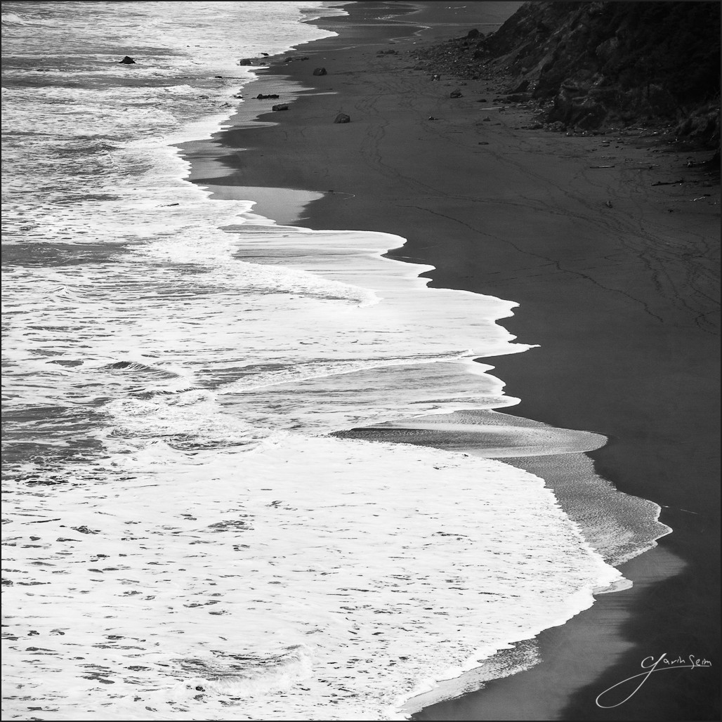
One thing I love about the sea is the way it displays natural art with such simplicity. We traveled the 101 for a few hundred miles early on in our winter tour. With that came some bad weather and some moments of sweeping coastal beauty.
The line of beauty is something most experienced artists are familiar with. If not in name, then in practice. It’s that sort of sweeping S curve that comes from nature itself and is nearly always pleasing to the eye. That’s what really stuck me here. The entire coast with it’s waves rolling, is a series of sweeping curving lines. One has to wounder if Hogarth, the man recognized with making the line of beauty a known artistic element, looked out over these very shores.
The result of this days work is a square that showcases details of the ocean. Leaving much to imagination, but leading me thru the scene, reminding me how beautiful and powerful the water is. The passage of man means nothing to the sea. It simply moves on, rolling over the footprints and awaiting another day.
Release details: Prints available. Contact the studio. Learn more about prices. Available prints…
- 36 inch Signature Canvas – Limited Edition of, 25
- 30 inch Signature Art Print – Limited Edition of, 50
- 24 inch open edition mounted print – $99
For Photographers. How it was made…
Canon MK2, 70-200L @145mm f16, 60sec, ISO400.
This was a fairly grey day here. Those ones where you’re not sure if there’s anything good. But there always is, if you look close. I’m always sucked in my the coastal waves and looking at this I realized that my approach was not a wide scene with dramatic skies, because there were no dramatic skies and it only would have come out plain.
The subject was the beauty of these waves. The lines they made were almost perfect. And so I focused on those alone. The lines of the waves, blocked on the right by the shore and few rocks. Simplicity became the focus and I feel it worked. I essentially did one setup, but I captured a good amount of frames, so I could get this one with the water lines just the way I wanted.
I processed in LR with Silver Shadows and, then worked details carefully, both in LR and Photoshop. Some burn and dodging and working with tonal values. Mainly with a focus on the water being white and the sand dark. I wanted a stark contrast and I went beyond the presets base settings, pushing the whites until they nearly clipped. But there is no clipping.
Finally I added one of my textures. Not much, in fact you may not even notice. But it just imparted a few nuances to the scene and a bit more texture to the sand.
I spent a good deal on time on the crop and finally opted for the square. It’s not something I do often, but by going square I feel I took the emphasis away from the frame shape and left it completely on the lines and tones in the scene.
It seems simplicity wins again…. Gav

