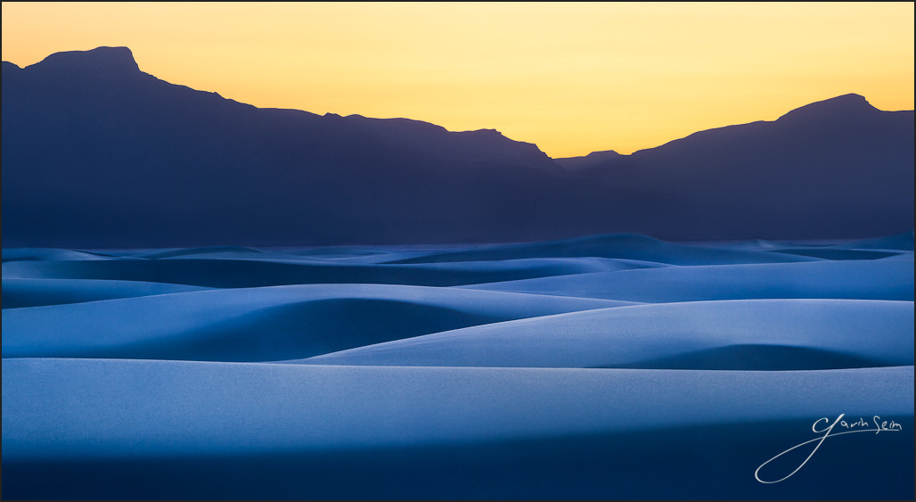
Just after sunset these rolling dunes take on a subtle cast. Like an ocean of sand dancing in with a tides. Subtle shadows and perfectly arcing curves sweeping in waves across the landscape for miles into the distance.
White Sands is a rather remarkable place. Not only for it’s giant dunes that seem by themselves in the desert, but for the way it plays with light, the way you can take the kids and sled down it’s swooping slopes, the way it’s like standing in summer snow in the heat of the day.
It was a memorable visit all around and I’m thankful I was able to make a memorable image. It should be stunning on canvas.
Release details: Prints Available.. Order Open Edition originals above.. Master prints and Signature Limited Editions are listed below and can be ordered by contacting gallery.. Learn about Limited Edition values here.
Released prints….
- 53 inch Master Original on Canvas – Limited edition of, 1 (contact the gallery)
- 40 inch Signature Canvas – Limited Edition of, 40 (contact the gallery)
- 36 inch Signature Metal – Limited Edition of, 60 (contact the gallery)
- 24 inch open edition mounted print (order above)
For Photographers. How it was made…
Technical Notes: Canon MK2, 70-200L @200mm f16. Frame1, 1/13 sec. Frame2, 1/6 sec.
This place it nuts. Beautiful sweeping dunes that are quite a challenge to photograph in any sort of broad scope. My wife actually helped me visualize this scene. She had taken a quick photo of me working with the 4×5 the night before and looking at it helped me see how I could take better advantage of the lines by compressing the scene into simple terms using a long lens.
There’s space in between dunes and by using 200mm I was able to compress the rolling details into simple lines of light and shadow. But that was also a challenge. The light is remarkably flat here. You don’t realize because the place is so bright. But each dune is a giant reflector bouncing light onto it’s neighbor. Even during the longest shadows of sunset I found a diffence of only around 1/3 of a stop. Hard to believe as the eye sees the lines and shadows distinctly. But the meter does not lie.
I visualized around Zone 6, but ended up exposing a but dark to bring the shadows of the dunes where I wanted at around zone 3 or 4. I did some bracketing so I would have lighter frames to work with as needed. I was a little concerned about detail and depth of field, but stopping down too far costs detail due to diffraction. I stayed a good distance from the nearest dune in the frame and used the compression of the long lens to make things feel close.
So I had my images. Next was the edit. And it was a whopper. Not really to change the overall beauty of the scene. It was there to begin with. The dunes were cool, the sky was orange and the lines were delicate. But it was flat. Flat because that seems to be the way light works out here. But I had a visualization and I tried to keep my eye on the ball.
I took my time on the initial LR edit, working the contrast and tonal details as much as possible with the raw file along with careful working of the sky. It had this color naturally but if I worked it too much it felt unnatural. I was also bit bothered by how much noise was in the deep blues (a problem I’ve seen in digital fairly often). I tried to be delicate in processing and not push thing too far. I also added contrast which had a darkening effect and added to the pastel blues and rolling lines.
Next I had to correct for how dark the dune highlights were to accent the natural shadow. I took the lighter exposed frame and layered them in PS. Then I carefully blended details, in particular, masking down to the lighter image for the highlights which brightened the sand a bit and helped define the natural lines of the dunes.
I carefully burned, dodge and cleaned up the resulting image, finishing with some manual brushwork to even out the hazy mountains and smooth out some details. I think this is going to make a beautiful print and I’m excited to finish a few details and start working with prints when I get home.
Hope you enjoyed… Gav


Gavin, this has to be one of my favorite photos….ever. The clashing colors and the deep shadows give a sense of depth and of coming change. Very nice.
Hey Jason. Thank you so much. Looking forward to printing it… Gav