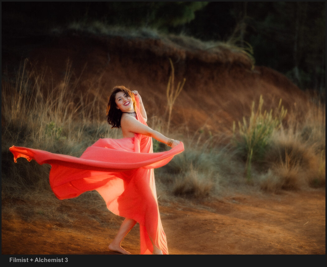
I’ve never seen anyone else talk about this, and it bears repeating. These two colors change everything in your digital photos. I’ll show you, and in this updated for 2026 post, give more examples.
The Two main colors that Digital gets wrong are…
To digital, most colors are pretty equal in value. It’s trying to be neutral. But when edited, they often get over-driven in post. In today’s video, I show a little-known fix for digital photos.
You can do this in any app and you will also see it applied in most of my presets and can try it used in a great film like wat in the FIlmist Free or Complete presets pack.
The first time you drop, it might seem extreme.
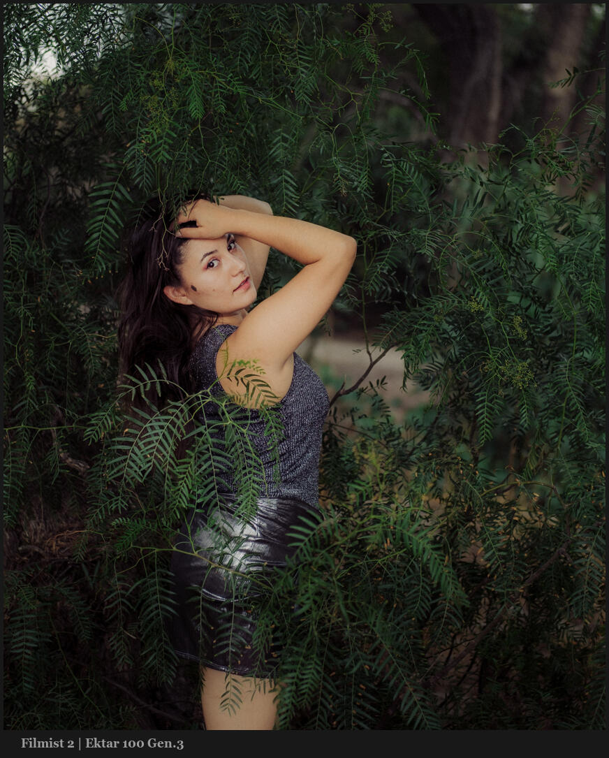
Green and Orange are where you start in this method. \
I know, right or wrong is relative to what you want to create. But the goal is always to bring focus to our main subject. Overcooked colors distract from that. Digital and cell phone photographs have gotten us used to this.
You can drop greens on luma and saturation. Drop the orange satisfaction also. But usually in Luma, I push it up as I show in the video.
Once you get this, your process will be simple, and you will control color separation. It’s easy, yes, but it took me years until the days I started comparing digital to film to create Filmist2, and I got it. But I’ve never seen anyone else talk about this.
Don’t overdrive both of these.
At times, you might want to push up a color. But it’s rarer than you think, even on a sunset. It’s even more rare that I push both. They nearly always COMPLETE with each other. Skin, foliage, etc.
I start with both a little subdued. Usually, I make this easy with a film preset like Portra 400 or Kodachrome 64. You’ll see that soon, your baseline edit is done, and you will see the details differently.
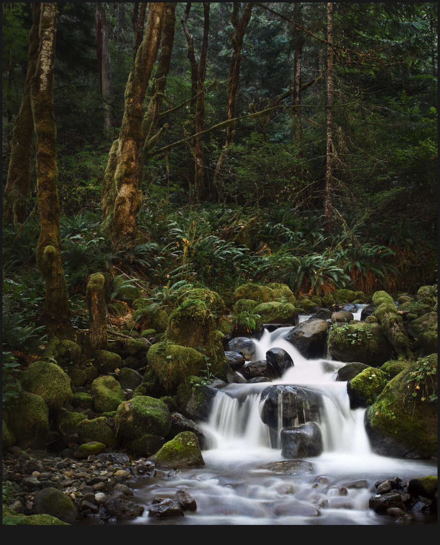
Even on landscapes, this method creates more balanced tones and beautiful roll-offs.
But it’s not all a film look thing. Even in tools like Natural HDR I am using it. In fact, HDR needs balance even more because there’s so much dynamic range. As tone pushes on digital, colors push up as well. Then things can start to compete. You’ve probably seen a lot of HDR that has greens or oranges that are just WAY too much.
Use DROP on other colors like BLUE.
Take this further by adjusting the settings and try the same on blues, purples etc. Green and Orange are often he most important to balanced edits, but the method can be extended.
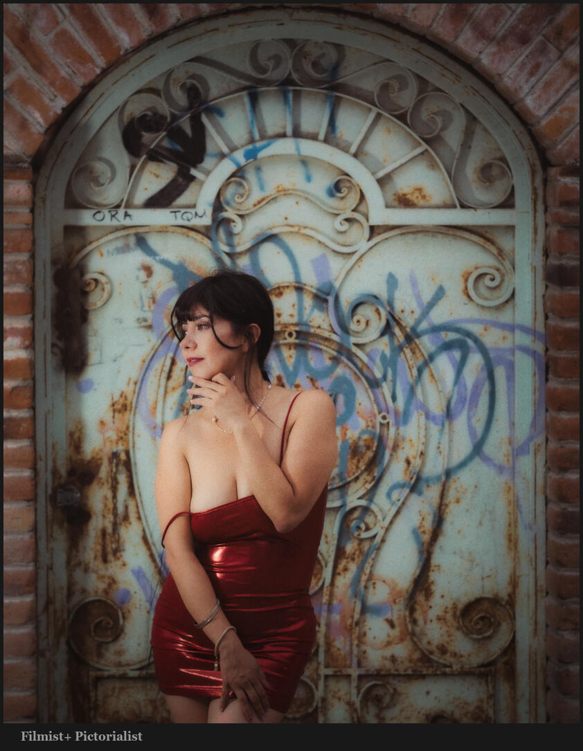
Digital drives colors hard because no chemicals are getting in the way. So once you start pushing, they all push too far. While the two primary colors should always be reviewed, you can see in this photo that moving colors like blue and red in a similar fashion as I edit this night scene with Street’ist styles.
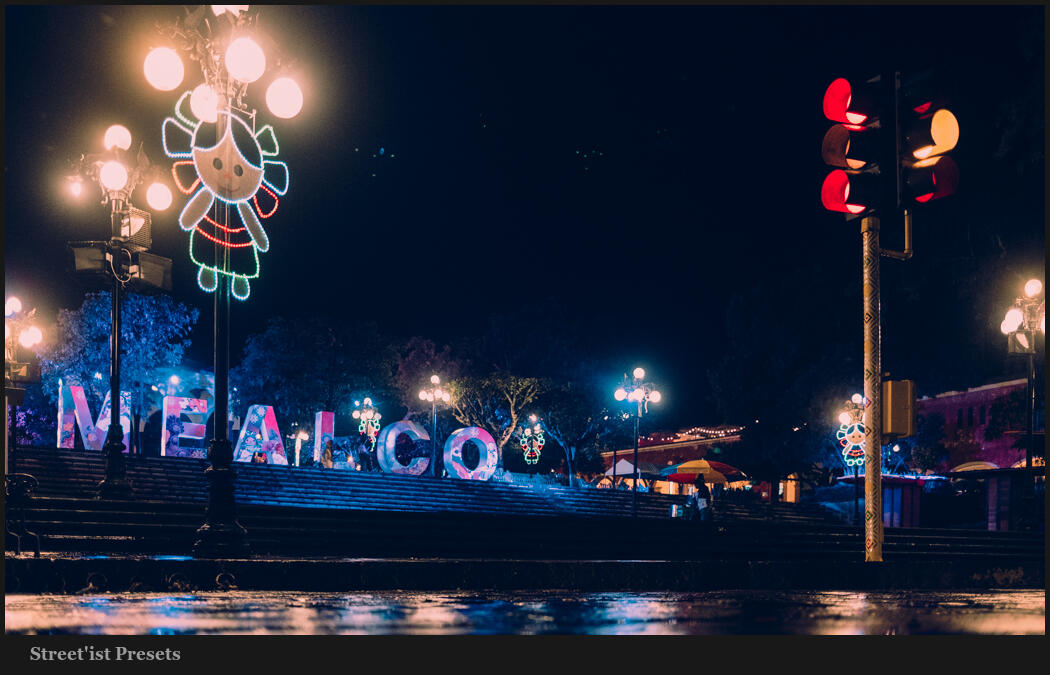
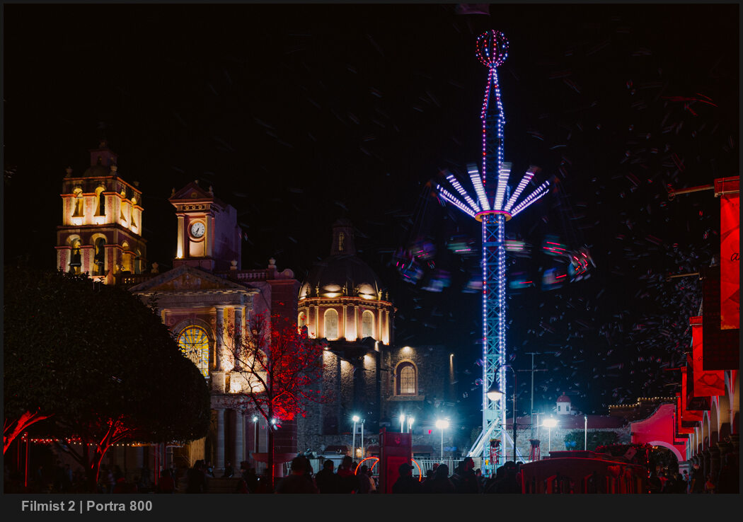
Above, the blue is strong. This can be a look of its own and worked here. But often it goes the other way. Look at the image below. Here, blues are dropped by -37 in LR. Not because blue is bad, but because the reds and warm colors are dominant here. Too much blue competes.
HSL is a tool you should always be using. Having a favorite preset or creating your own baseline with this will improve every edit and give you a starting point. But play around. Sometimes you want more, sometimes less. It’s knowing when and where that will be your superpower.
Gavin Seim