January 18, 2025

The main goal of camera makers is to lock you in maker is to sell new products. That’s why every year they pretend they have revolutionized everything.

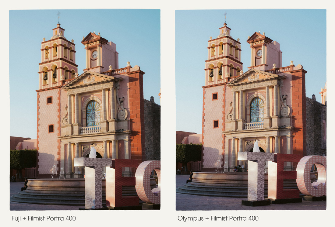
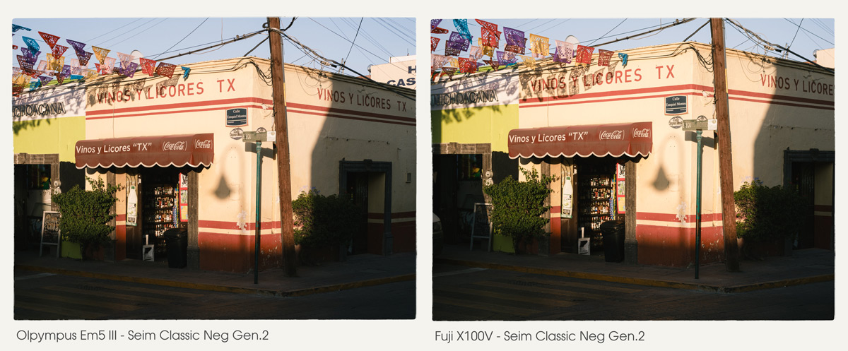
You can try some of the film presets I was using including Classic negative here in the free film sampler pack. Also watch my video on white balance and the Drop Color method.

It’s not that we should be lazy about color. But notice in the video how the differences are not always that huge,. The more you stop stressing about color and use the tools, presets, filters and setting to get the look YOU want, the easier color becomes.

The science of color is real. The color science we’re being sol is a marketing lie.

In the end you can apply any look you want and then adjust the Color-Science of it a bit with a very small adjustment. So Sure I might use Classic Negative or Portra. they are great. But I’ll do it as a preset or profile after on the RAW. Usually as a preset because I can us that on any camera.

I know pros always say this and while the things I show here can be done on JPEGS, shooting RAw will always get you better color control. JPEG bakes in a camera profile and not always the best one for your scene. So then you edit again and it’s like baking a cake twice.

In camera profiles are fun. But in the end they are simply a preset that you have a lot less control over and pay over and pay a lot more for than the packs I make here on Seim Effects.

Taking time to dial in perfect color and save it is great. But Don’t get stuck on one look.

That newest camera wont make your color better.

And there’s no one right color for sunsets, skin or landscapes.

Tale Canon who gets you ins their system then over charges for lens and prevents third part lenses from being sold. It’s a bait and switch. But you don’t need to be loyal to a camera brand. They all do the same thing.

Did you notice how much color changes in my video, with even small directional changes. That’s why you don’t want to be locked in. Any camera can be good on any of the situations. You just nee to know how to nudge your color like I showed you here.

If you want more videos on this topic let me know – Gavin Seim

Read More

July 13, 2024

I’ve never seen anyone else talk about this, and it bears repeating. These two colors change everything in your digital photos. I’ll show you, and in this updated for 2026 post, give more examples.

To digital, most colors are pretty equal in value. It’s trying to be neutral. But when edited, they often get over-driven in post. In today’s video, I show a little-known fix for digital photos.

You can do this in any app and you will also see it applied in most of my presets and can try it used in a great film like wat in the FIlmist Free or Complete presets pack.

Green and Orange are where you start in this method. \

I know, right or wrong is relative to what you want to create. But the goal is always to bring focus to our main subject. Overcooked colors distract from that. Digital and cell phone photographs have gotten us used to this.

You can drop greens on luma and saturation. Drop the orange satisfaction also. But usually in Luma, I push it up as I show in the video.

Once you get this, your process will be simple, and you will control color separation. It’s easy, yes, but it took me years until the days I started comparing digital to film to create Filmist2, and I got it. But I’ve never seen anyone else talk about this.

At times, you might want to push up a color. But it’s rarer than you think, even on a sunset. It’s even more rare that I push both. They nearly always COMPLETE with each other. Skin, foliage, etc.

I start with both a little subdued. Usually, I make this easy with a film preset like Portra 400 or Kodachrome 64. You’ll see that soon, your baseline edit is done, and you will see the details differently.

Even on landscapes, this method creates more balanced tones and beautiful roll-offs.

But it’s not all a film look thing. Even in tools like Natural HDR I am using it. In fact, HDR needs balance even more because there’s so much dynamic range. As tone pushes on digital, colors push up as well. Then things can start to compete. You’ve probably seen a lot of HDR that has greens or oranges that are just WAY too much.

Take this further by adjusting the settings and try the same on blues, purples etc. Green and Orange are often he most important to balanced edits, but the method can be extended.

Digital drives colors hard because no chemicals are getting in the way. So once you start pushing, they all push too far. While the two primary colors should always be reviewed, you can see in this photo that moving colors like blue and red in a similar fashion as I edit this night scene with Street’ist styles.

Above, the blue is strong. This can be a look of its own and worked here. But often it goes the other way. Look at the image below. Here, blues are dropped by -37 in LR. Not because blue is bad, but because the reds and warm colors are dominant here. Too much blue competes.

HSL is a tool you should always be using. Having a favorite preset or creating your own baseline with this will improve every edit and give you a starting point. But play around. Sometimes you want more, sometimes less. It’s knowing when and where that will be your superpower.

Gavin Seim

Read More

October 11, 2019

Get started with the stunning look of film!

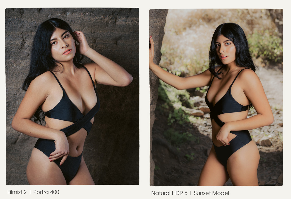
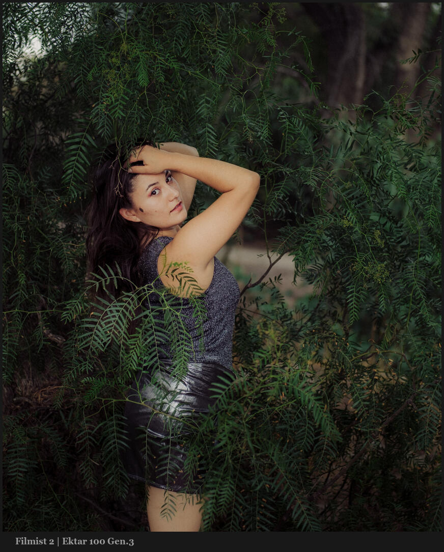
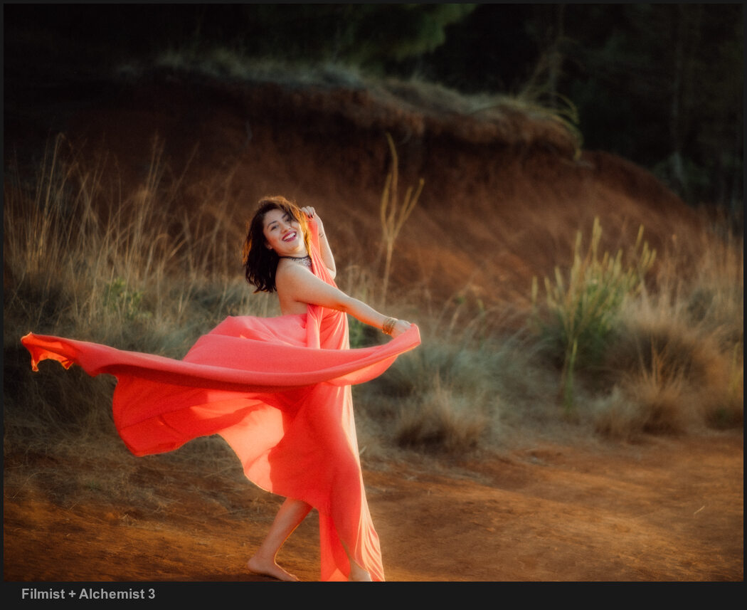
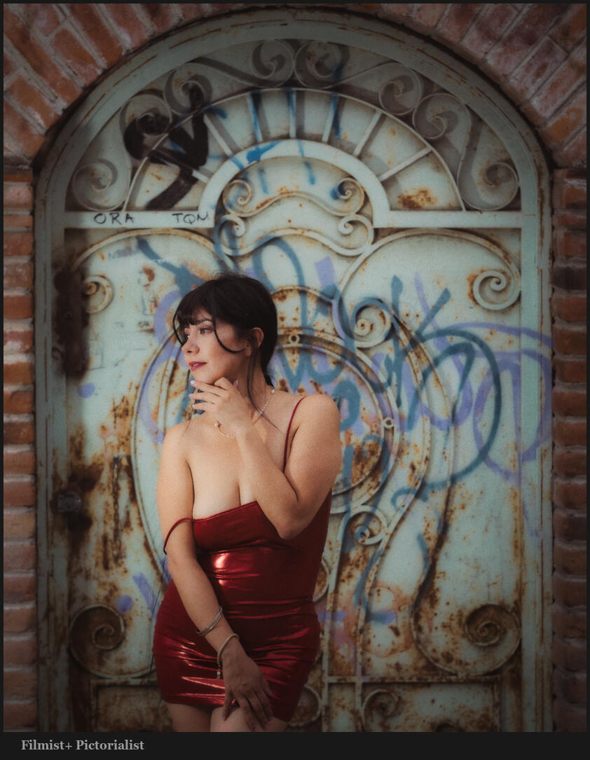
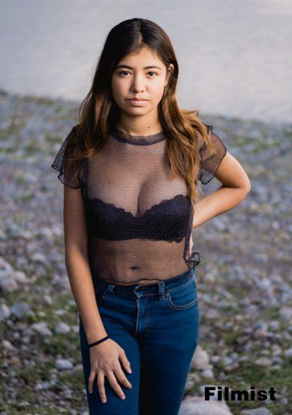
Filmist beings the look of real film to digital. You be thinking you’re not interested in buying the the complete pack. So we made this Filmist Lite collection so you can get started with the beauty of film in your edits. These 8 presets are just the start of what Filmist can, but they a lot.

  • AgfaFlex RSX
  • ColorPro P400
  • EternaFlex A
  • FUJIPRO 400 H
  • KODAChrome 1964
  • Natura e400
  • PORTRA 160
  • Silvex DELTA 100

Download Filmist Light!


If you like what you see check out Filmist Complete with over 50 emulsions. You can also learn how to use Filmist by watching the training videos for Lightroom here and for Capture 1 here. Aldo if you have any questions just email us, effects@seimstudios.com enjoy!

Gav and Nate


Read More

April 25, 2013

Grosvenor Arch - Utah - Gavin Seim_4
Sunset at the Celestial City – Grand Staircase National Monument Utah, Grosvenor Arch. Spring 2013, Gavin Seim

Grand Staircase is a secret hideaway of Utah – A grand place beyond most National Parks in beauty, in remoteness and in a wild hauntingly beautiful atmosphere. There is another wonder to behold with each new curve of it’s bumpy roads.

It’s not one of those parks you simply drive into on paved thoroughfares, hot dog carts lining the byways. We came in off HWY 89 and camped two nights within the park before we exited the other side. It was a slow winding gravel road with lots of hikes, pullouts and things to see, but no civilization except perhaps a bathroom here and there.

We made it up to the Arch late on our second day and waited for the sunset. The feature here was the double arch, but what struck me about this place was the way the entire structure stands alone out here. Columns of colorful rock sprouting from the ground in stunning display, set in a minimal non-dictating scene. It was a beautiful thing. It made me think of the distant view of the Celestial City from the classic novel, Pilgrim’s Progress.

As the sun set and the light danced on the rocks I knew I needed a panorama of this one. This was the last image I made as the light softened and fell behind the hill. It peeked from the clouds just before disappearing fully behind the horizon and left me in awe of creation.

Release details: Prints Available.. Order Open Edition originals above.. Master prints and Signature Limited Editions are listed below and can be ordered by contacting gallery.

Released prints:

For Photographers. How it was made…

Read More

March 27, 2013

3. cfl logo image

ColorFlow has arrived. The most complete color presets toolkit available for Aperture users and a perfect complement to LightFlow for Aperture. You can learn more and watch the video here. Below is the official press details and media kit available for download.

___

Seim Effects Introduces ColorFlow – Offers More Than Sixty Color Effect Presets for Photographers Using Apple Aperture

Color Alchemy for Aperture – ColorFlow is a presets collection dedicated to flexible beautiful color. Designed to help photographers deliver outstanding work by allowing them to focus more on creativity and less on the science of color.

Soap Lake, WA (March 27, 2013) – Seim Effects Photo Tools has introduced ColorFlow, its newest creative preset collection engineered by Award-winning photographer Gavin Seim. These new color-only presets have been created specifically for photographers who use Apple® Aperture® software in their digital photography workflow.

For maximum flexibility, the ColorFlow presets collection organizes more than sixty presets across 5 categories of color tools: Essential Color, Color Story, Film Inspired, Hollywood Cinema and Color Toners. The ColorFlow collection allows photographers to deliver very subtle or bold image variations. For even greater control, users can mix and blend color effects for desired mood or visual theme, all while leveraging the power of Apple Aperture software.

Download Media Sample Kit and Full Press Release ZIP

Read More