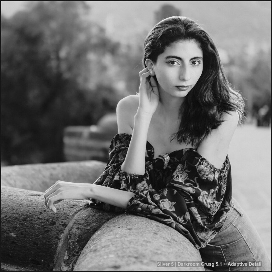
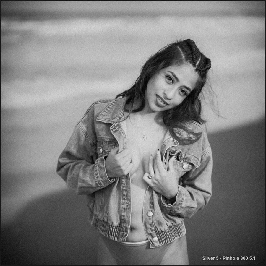
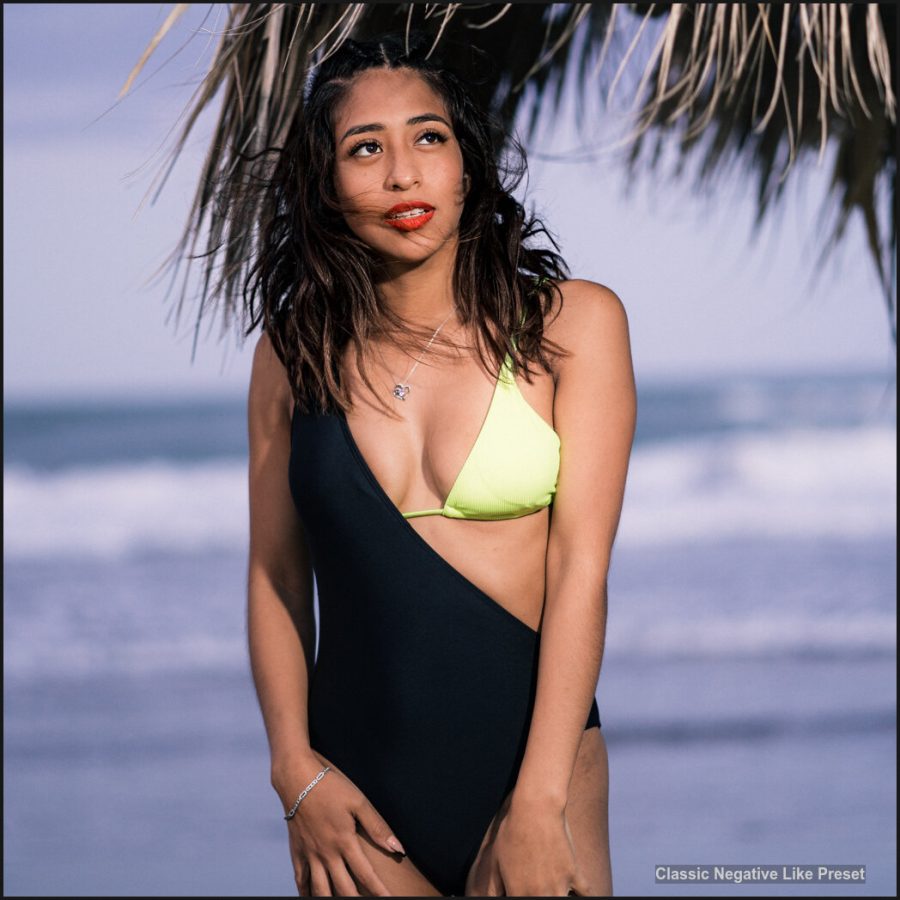
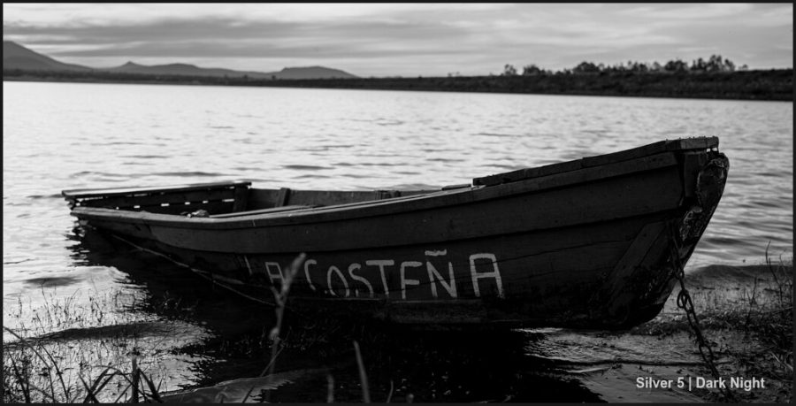
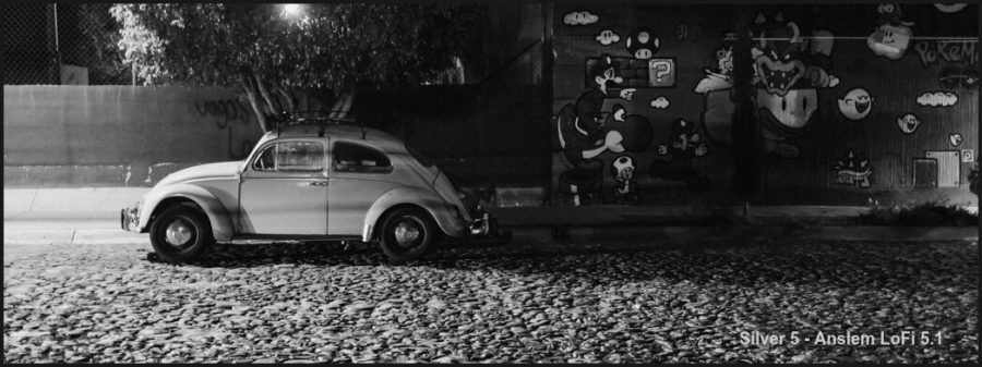
Silver, black, and white presets are one of my longest-running products, and for a good reason. There are many black-and-white tools and plugins, but most add another step when you don’t need it.
Silver 5 makes black-and-white edits more controlled and faster. And this version even brings the F curve in a more intelligent way.
Just Like the more recent BlackRoom black and white actions make super advanced black and white edits fast and easy, Silver 5 carries on the tradition of native tools in our RAw editors to create superb black and white conversion and instantly experiment with the vision we had in the camera.
What’s new in Silver 5.1
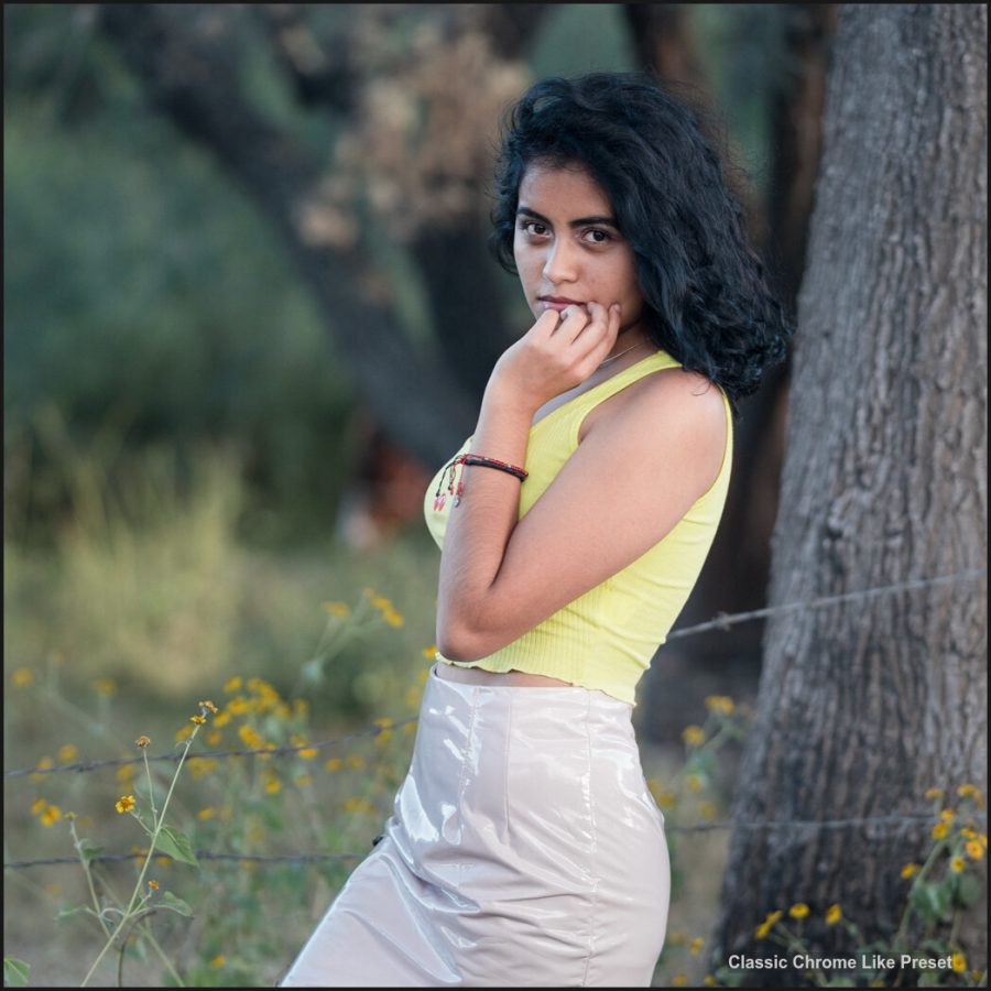
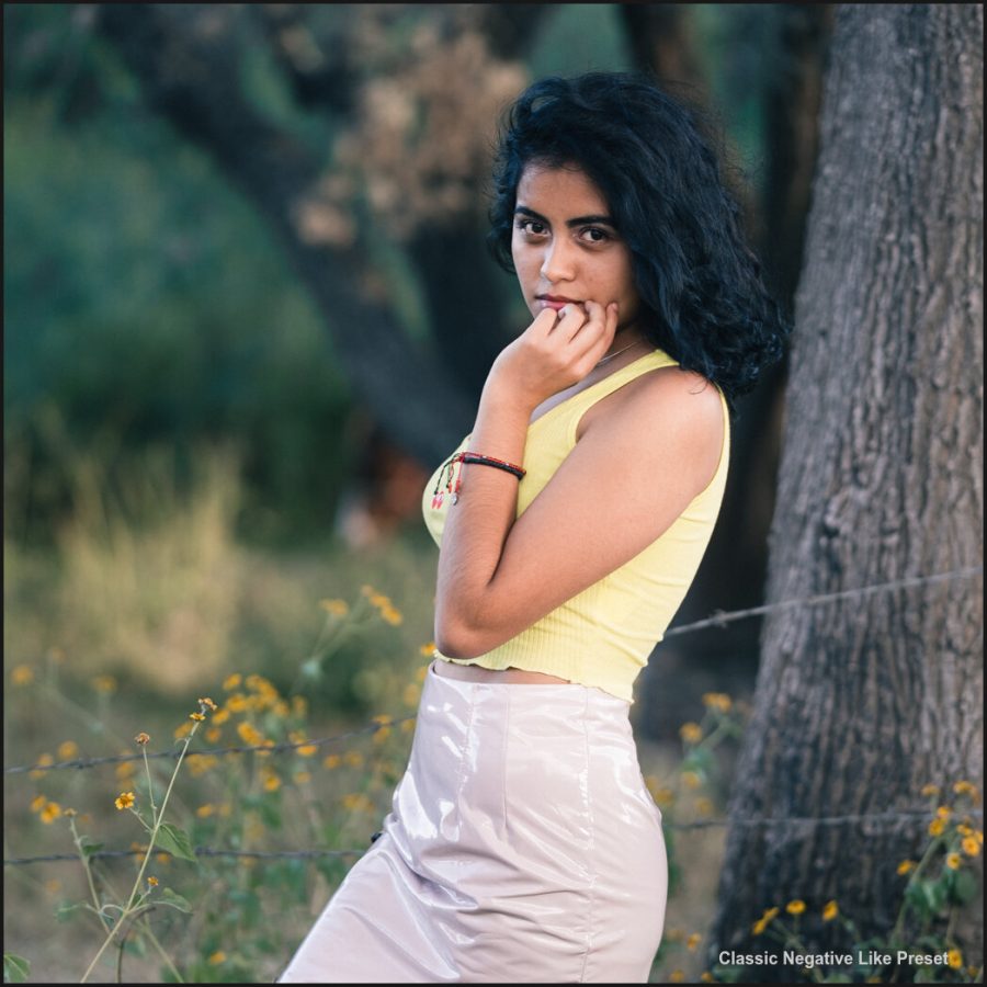
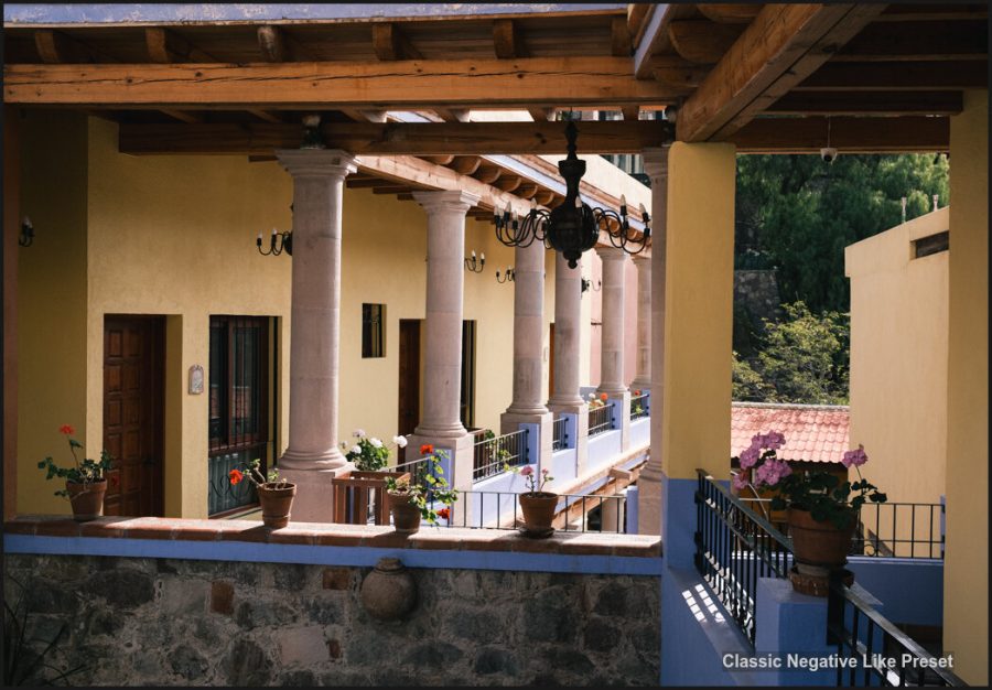
V5.1 improves various presets throughout Silver 5 in Lightroom and Capture One. You’ll find the most notable refinements noted with the (5.1) mark in the preset name.
Like the recent Filmist Film presets update, it’s the little details that count. I also updated Mod-Kit, with a few new tweaks, so you’ll want to install the latest Mod-kit version. You can use these to mod any image, of course, not just your Silver 5 conversions. Play with them.
Get Silver 5 Here, Or Login to Update.
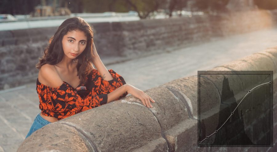
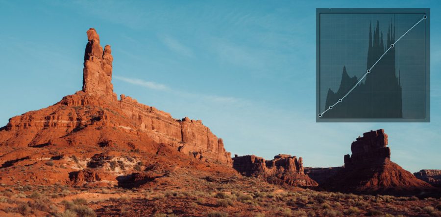
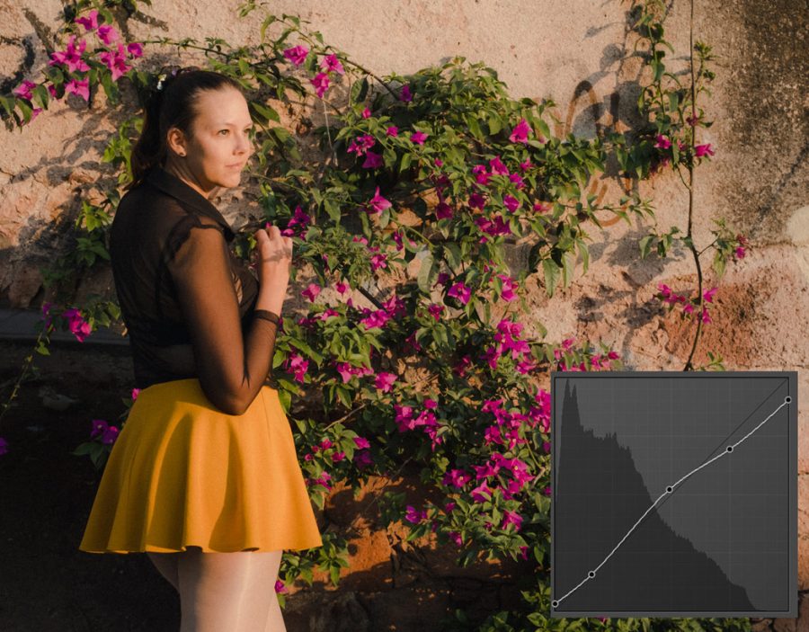
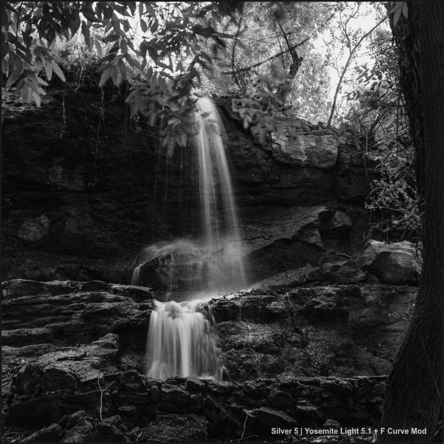
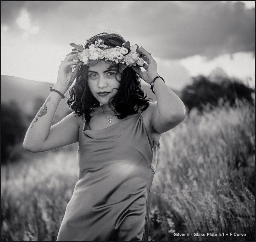
The new Intelligent F Curve mod preset.
This is the most important thing in the Mod-Kit update. The Intela F-Curve preset. This magical curve is based on many years of study, which I talked about in my last video.
This mod can be added to any process, even if it’s not black and white. You’ll find it more useful and powerful than the traditional S Curve.
But theres more in this little curve. I manually coded this to only affect the main curve, which Lightroom and Capture One do not allow you to do in a preset or style by default.
This means you can apply ANY development process. Then apply this F Curve as a mod and it will leave alone all other curve settings like parametric sliders or color curve adjustments, say from Film preset.
You can not only be faster if you have the F Curve preset. But in Lightroom, you can increase it or decrease it to control its effect dynamically. You can also do this in the latest version of C1 as I created the style to auto-apply as an auto Mod layer at 50%. Apply it and then easily increase or decrease the curve.
Installing the new presets and styles.
You can find install instructions for Lightroom, Capture One and Photoshop on the help page.
BUT if you are in Lightroom Classic or CC you need to make sure you delete the old versions first. Only then install the latest 5.1 black and white presets and Mod-Kit pack. The new versions have made a mess when it comes to duplicates. So save yourself the hassle. If you have any issues updating your Lightroom presets I made a video about it here.
Capture One Styles in Silver 5.1
Capture One has a lot of things under the hood. While this is good it can make things more complex. So this update is VERY IMPORTANT as it brings refinements that were needed after launch and improved a lot of formulas as I often have to do with continued deep testing on the Capture One styles.
You won’t find a more refined black and white Styles pack for Capture One that includes the pro Styles sold by C1 themselves. So make sure you delete any old version and install 5.1.
What makes paid presets worth your time?
Any preset I make, you could do yourself given enough hours of tinkering. And that’s the point. I never stop refining so that that refinement can be perfected and used by each of my shadow tribe.
There’s nothing wrong with making your own or downloading free presets.
But what makes a tool great is that it’s engineered to make you work better and more creatively. I’ve put a huge emphasis on refining packs in recent years. We have a market filled with countless mediocre, or even bad presets that just make you hunt around for your edit.
Every pack I sell now is focused and refined, and I welcome your feedback on improving future versions. They may only be presets, but they actually represent experience and efficiency.
Silver, black and white presets were first launched in 2009. Many of you were there. Each new version is a passionate refinement to the idea that black-and-white edits should be amazing and that you should have control.
Please play around, add mods and mix things up and you will see your black and white styles come to life with these presets that are nearing 15 years of ongoing refinement. I hope you enjoy Silver 5.1
Gavin Seim