And How it Can Change Your Life in 15 Minutes.
by Gavin Seim: Original article from Gavin’s f164 journal. (updated 11/15/11).
This may be the most valuable piece I’ve written on photography. In the last year, I’ve started working with 4×5 film and digital side by side. I’ve also explored extensive exercises in tonal control, truly learned to visualize, and implemented key parts of the Zone System that was developed by Ansel Adams and Fred Archer, both in my film and my digital work, in color and black and white.
The idea of visualizing and using Zones is not promoted heavily today. It seems much of the industry, including many of its educators, arrived at digital and decided that the past 150 years of photographic knowledge were somewhat irrelevant. What I’m about to show you is not taught much, but understanding it WILL change your photography forever. I’m not kidding; once you get this, you’ll never see light the same way again. And I hope you’ll share it with others.

I’m going to stay simple because these concepts are essentially simple. I have not come up with a new digital based zone system, a stripped down version, or an article full of nerdy equations, white papers, or complex systems. This is not hard, and you can start putting it to use TODAY for film or digital. Since most of us are in the digital world, I’ll focus on that. I’m going to show you how to use the core of the Zone System to make you a vastly better photographer. I’ve also brought along some examples for analyzing the Zones.
To those of you who already know this, kudos. But I challenge you to review and analyze whether you’re really using it, or just buzzing along in digital bliss and fixing things later. Excuse my bluntness, but this is happening to the best of us. We need to get back to basics, visualize, control tone, dynamic range, and image quality.
Originally, the Zone System was a complete approach that included everything from the initial exposure to the final print. Now we don’t use darkrooms much these days, so I’ll focus on the pivot point of the Zone System: the Zones themselves. That said, I would encourage you to study the whole process even if you don’t use film. It will help you gain a better understanding of light and photography. Not only that, but old books like Fred Picker’s Zone VI workshop, deal with it quickly and effectively and can often be had for mere pennies.
1. The Zone Scale.
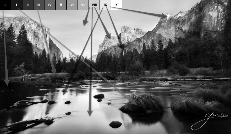
The Zone Scale lies at the core of the Zone System. It consists of eleven squares that span from clipped black (Zone 0) to clipped white (Zone X). Each square represents a change of one stop. The first part of using Zones starts before you release the shutter. Truly visualizing your image is like nothing else. Once you master it, you see the image you plan to make, including your edits and refinements, in your mind before you ever take the photo. It changes everything about how you photograph and how refined the resulting images become.

To begin, look at your scene. What’s outside your window right now? Visualize what zones in which the things around you fall. Then imagine you’re taking a photo. Imagine where the zones would be if the image came out exactly as you wanted. It does not have to be what you “see” but what you “visualize” for the finished image. How do YOU want to make it?
Think about what Zone levels on various objects in this scene would most complement your main subject as well as your supporting cast of elements. Sometimes it helps to begin by trying to visualize a scene in black and white, even if your final image is going to be color. Thinking in terms of only tones can be helpful, especially early on in the process.


 CPPOTW = The Digital Grey Kard