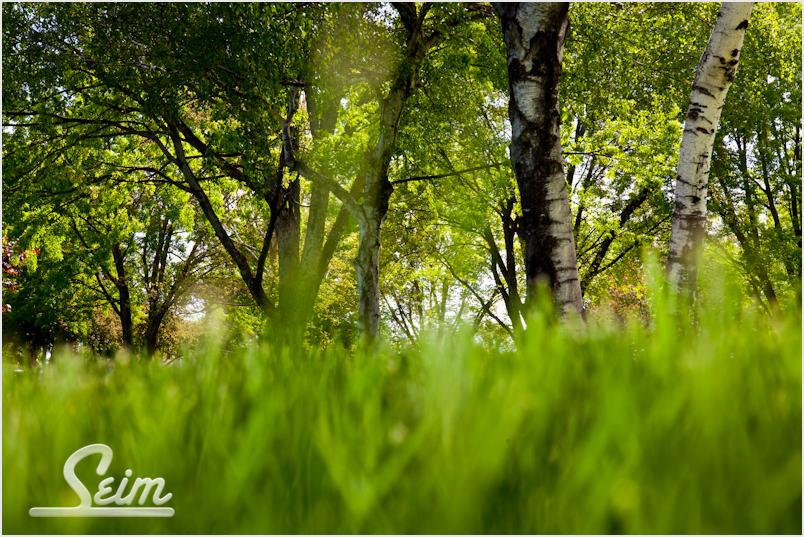
by Gavin Seim: Today I’m going to kick off the new analyze inspiration series I promised a few weeks ago. In a nutshell, I take an image that get’s me thinking in some way. I talk about what I see (or don’t see) in it and invite readers to chime in with their own ideas and inspiration.
Pretty straightforward random thoughts about what was done and why it’s good, or bad. Here’s today’s photograph. Let’s start by just looking at it…
I was experimenting with composition and lighting yesterday in the park when I took this. I actually had my face and camera down in the grass giving me this soft foreground perspective that covered a big area of the frame. I shot it on my 5D MK2 at 1/125, f11, ISO400, 58mm and I think I had a little off camera flash on the foreground grass. I did some quick post in Lightroom using the Nature Boy preset from my PW2 collection and darkened the foreground a little using a gradient.
- Good: The composition is different which draws in my eye.
- Bad: There’s no main focal point. The grass may lead me in but then I don’t know which element I’m supposed to be seeing.
- Good: It feel like there’s something hidden here. My eye scans wanting to solve the mystery.
- Bad: It feels a bit crooked which annoys me.
- Good: I like the bold greens.
- Bad: I don’t want it on my wall.
In my opinion this shot only gets 64/100. That’s a FAIL and I would not hang it on my wall. The fact that it lacks a MAIN subject pretty much kills it. That doesn’t mean it’s useless however. The reality is that I was not expecting a great shot. I was exercising my skills by trying things.
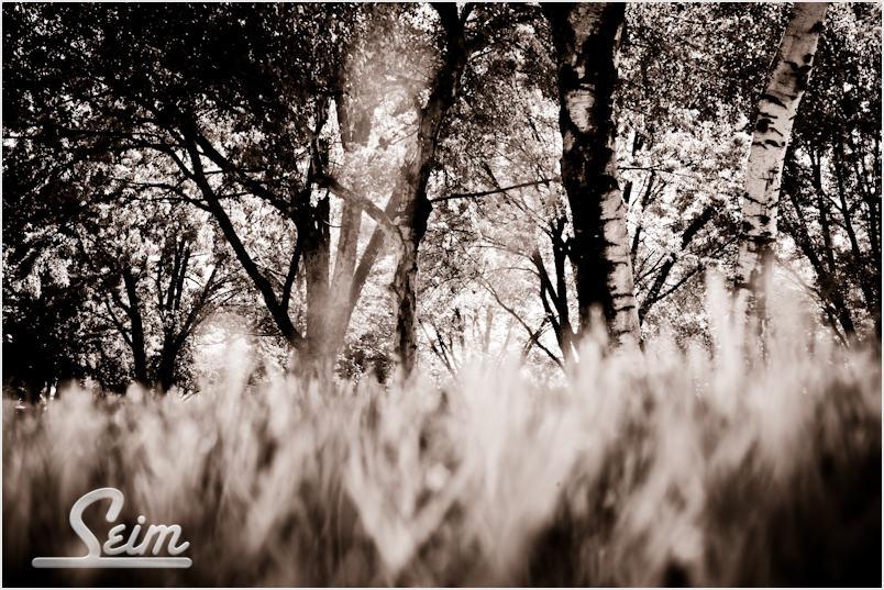
Below I approached it differently. Same image, but in LR I applied a warm infrared from Monochromatix. This changes the whole mood. I also like it this way. In many ways it’s more simple, but the key problem remains. I don’t have a main subject and without one, this shot does not fulfill my eye’s desires to fin something amazing at it scans.
Thinking out loud. I got something from this shot even though it’s not great. It has me thiking about perspective, lighting and patterns. What if there was a HUGE bull Elk in walking between those two tree’s just right of center. That would change everything. If I’m ever laying in the grass watching a huge elf, you can bet this exercise will come to mind.
This was fun. I’ve got myself thinking about new ideas by looking close at this image and talking about it. I think I’m going to like this series. This is the kind of thing KungFu Photo is all about. Now I’m ready for your thoughts and ideas.


Hi Gavin,
I’ve recently begun listening to your pro photo show over here in ireland. I came across it on itunes. It’s great by the way.
I’ll give you my view. Firstly, I like this excercise…:-)… But seriously.
For the colour image… I like the composition the low perspective is nice.. I feel like an animal stalking prey but then were’s the prey..? As you say there isn’t really a subject I can focus on and the centre light is a little off putting. I actually don’t mind the crooked feel to the image life isn’t always straight and dead level so it lends some realisim to the image.
I do prefer the image in mono although the greens are really rich I think the mono tones give the image a little more interest then the colour version. Overall i would agree about 50 or 60% for this one but definately a composition you’ll think of again when you find the right subject.
Good stuff…!
Paul
Hey Gavin,
I like the color image much better than the infrared simply because the there’s more for the eye to take in. Like you said, without a main focal point the eye kind of wanders. The angled grass-line does give it an awkward feel, but that may lend itself with the angles of the tree trunks that veer off to the left and to the right.
One thing that did annoy me was that single out of focus blade of grass that’s just left of center. My eye kept jumping back to that … maybe in hopes of identifying a main character.
Thanks for the platform to opine!
Cheers,
–Chris
Gavin:
Sometimes the composition needs to follow the strong lines, in this case the birch trees. I would have tried this in portrait mode and used the canopy of the trees to balance the grass. The tree trunks may have given you the focal point to draw your eye from the grass to the leaves. Just a thought.
Cheers
Eric