September 2, 2022

Selenium toning was an important part of the darkroom that nearly every photographer had used. It also translates well to digital and that’s what I’ll show you today. It’s great because it’s easy to make understated. So I created it as part of Emulsion 4, next to Platinum, Wet, and Cyanotype.

Even if you don’t use my Emulsion actions you can recreate this yourself using tone layers. First let’s talk about you should discover this magical chemical. I’ll add a bonus Emulsion 4 video at the bottom of this post to show more about how I’m doing these advanced tones that shift with tone value as they did in the darkroom.

The magical Selenium chemical on digital…

For topdays examples I used Emulsion 4 actions. You can get Emulsion 4 actions here. This look also works well with the borders and textures of Naked Darkroom.

Selenium was one of the most popular chemical baths for a darkroom. But it’s little known to the digital world.

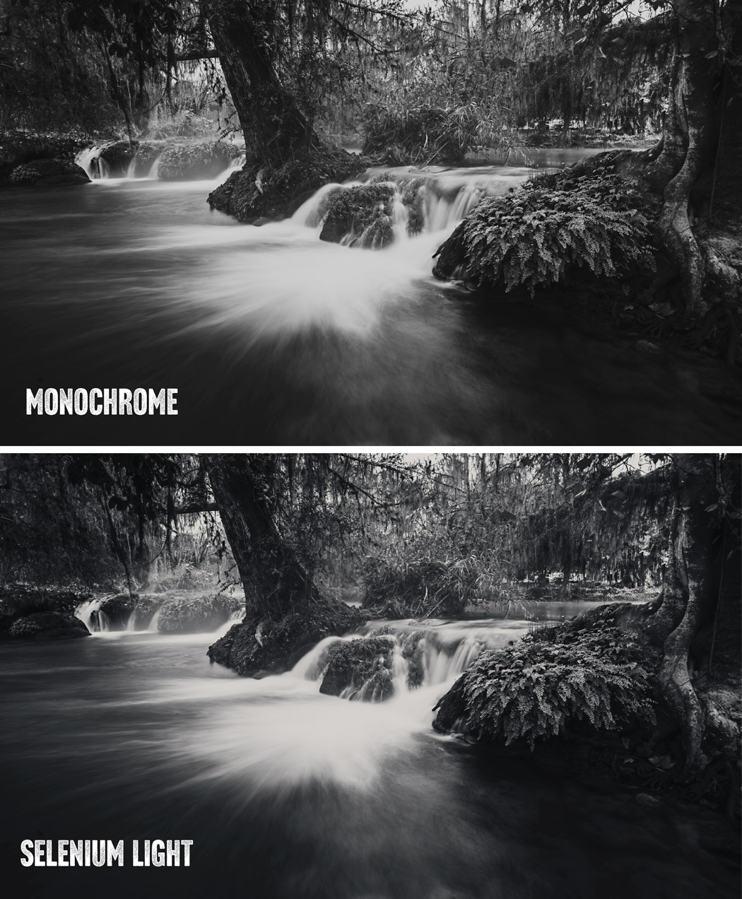
Unlike early-era processes, such as Collodion Wet Plate or Platinum. Darkroom Selenium toning is a little more subtle. Of course, you can push it harder. But in a low state, it tends to make black-and-white photos seem more black-and-white with a natural coolness that feels less like an effect and like like a perfect print.

When to use Selenium on digital

In Selenium Toning you bathe a black and white print in a Selenium bath after the main print is made to balance color casts and make it richer. A chemical print often has a slight cast depending on how it’s processed. That’s often balanced out with Selenium.

Yes, we can use true neutral monochrome prints on digital prints. But adding light selenium can actually make your digital prints feel more like a darkroom print because it’s such a classic look from the darkroom.

Selenium works great in artsy kind of projects as well as in classic clean black and white prints. This is a mild application with a slight warm shift selected from the options in the Emulsion 4 easy layer stack.

Make your own selenium look.

My Emulsion actions make an easy-to-mix layer stack that makes it easy, But you can make your own too. Study what color tones you want to use like I did in my actions and use a tone-limited layer or a gradient map so you are getting a gradual application of color tints that changes acres your tonal range like it did in the darkroom.

Bear in mind that the color grading tools of a raw processor like Lightroom can get this general look. I included a Selenium tone for example in my Silver 5 presets. But what I’m showing you here with layers in Photoshop gives a more refined and rich result.

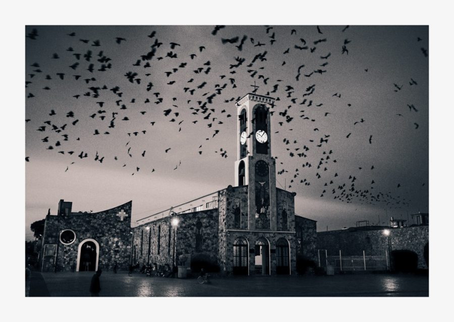
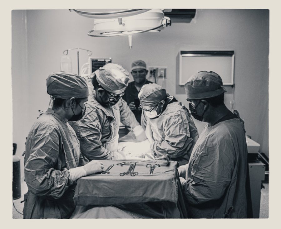
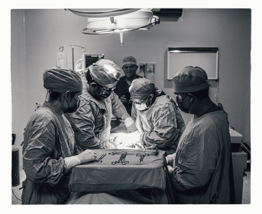
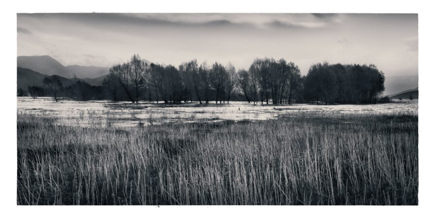
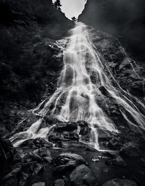
I’ll show you various examples here of harder and softer applications of selenium toning on digital files. Don’t be afraid to add your tones AFTER you add the border, as I did above in the bird’s photo. Since we print on pure white paper most of the time, this can add a more authentic, classic feel to the final image as in the darkroom bath the entire paper is involved.

Here I pushed harder in the master tint, with the Gold Bath option is added to simulate adding real gold to the process in the darkroom.

These photos can be silent or bold depending on you!

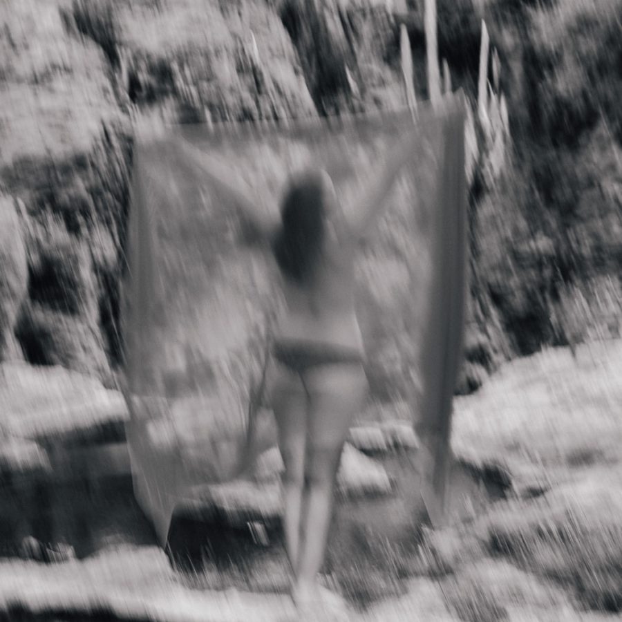
What’s cool is that the tone from it can be so light that it may not even be seen as a color effect, like in the photo below. You know it’s there only because it’s side by side. Selenium can be used as a color effect, or as a simple final process like this that still feels like a monochrome process.

Cooler, warmer, neutral. It’s all there with Selenium.

The top image seems slightly toned, but it is monochrome. The bottom is a light application of Selenium tone from Emulsion 4 emulating around a 1:20 bath ratio. The slight natural blue almost makes it feel more like a true B&W.
Surgery room, Mexico. The warmer selenium 1:5 option provides a more noticeable tint without being overpowering. You can see here I added the tint after the border was applied from Naked Darkroom

It can make your black and white feel more real.

Some darkroom photographers use Selenium on every print as aside from its toning benefits it gives longevity to the print when used in the darkroom. It’s common in the darkroom, so when you see a Selenium black and white print, it might feel more like a real black and white because for many years it’s been a staple in the finishing process.

At a glance, the bath in Emulsion 4 may just seem like a light blue tone. In reality, it goes much deeper. That’s why I thought it deserved its own post here. I wanted to show why the Selenium bath is so useful to improve your black-and-white photography.

The same photo from the Surgery but with a classic process that does not warm. It’s just there and you don’t really think about why.

How I do Selenium tone edits with Emulsion like I show in the video.

The ability to print a true monochrome from a digital file is great. It can also be a little sterile. So when I had users of my products asking about Selenium Toning in Emulsion, I did my research to get it right for Version 4. It’s a process that changes based on the type of bath, and the ratio, and that has options often used in the darkroom like mixing the Selenium with other chemicals to get different hues and looks.

Selenium affects the shadows first and less in the highlights but these things can vary depending on how you process the print. So in Emulsion 4, I tried to stay true to that. The ability to quickly alter settings of the Selenium digital effect allows us to replicate that look and adjust it as low or high as we need using the master tinting tool in Emulsion 4 actions.

Here I used the 1:5% ratio mod. You see this brings tones more into highlights as it represents a stronger bath. I added a natural border from the Naked Darkroom texture to finish the presentation.
A light clean bath in this portrait with the main tone layer at about 40% and the paper softness option turned up a little giving a natural Selenium tone that still feels black and white. Many love Selenium for this reason.

Selenium toning can also be a tinting effect in its own right.

Selenium is also popular in adding contrast. In EMuslion 4 actions you can even add a tone thinner which adds contrast and pushed highlights more as we get in a darkroom.

The layers in the main Selenium effect of Emulsion 4

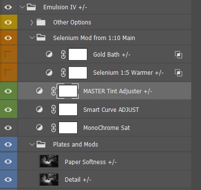
Using the tone tool can quickly adjust the layers to like in other effects make the Selenium process lighter or heavier, emulating darkroom mixes and times. Paper softness lets me emulate a more matte vs contrasty process to infer an older paper.

I can also run the texture action to get paper-type looks. Of course, I can disable these for a more neutral print and retain a pure tone if I want to use a specific digital pepper for a certain look.

At times Selenium effects can be almost imperceptible, only used for the smallest tone or to add contrast while maintaining a pure black-and-white feel. Like in the darkroom, you can push in up or down using the options and mods in Emilsuon 3 and quickly get anything from a tiny adjustment to a bold Selenium that’s bluer or even mixed with other hues that replicate for example a stronger ratio or even gold mixed with the print during the process.

Don’t skip the toning that most people don’t even know is there.

Another light process of the base tone. It just looks black and white but the natural cool tone brings out the contrast.

As always the goal of Emulsion 4 actions is not to forget about the rich darkroom processes but to learn from them in how we create digital prints and images and honor the legacy that we have from the darkroom.

I hope you enjoy the new Selenium process and please let me know if you think it’s lacking in any way. Like all the looks in Emulsion from Platinum to Wet plate, I am always improving the tool. There’s a good article on Darkroom selenium tone prints and some of their variations here.

However you apply selenium whether it’s the slightest touch or a heavier warm tone, I think you’ll find this addiction to be not only authentic but very versatile for our black-and-white photography.

Keep making stuff and here’s another video of how I use Emulsion 4 to get various platinum and darkroom chemical looks. You can get my Emulsion pack here for Photoshop.

Gavin Seim

Read More

April 19, 2012

Me with a framed 30x46 limited edition on traditional canvas of Doorway to Winter. Just the start of a long study in how we can better present and display images.

by Gavin Seim: A lot of photos are being made these days. Some bad, some good, some amazing. But what gets me is how little we’re doing with them. Art seems to have become something that lives on Facebook. Most the worlds photographers seem to not even be selling prints to their clients. They just hand them digital file and the cycle of images that exist in nowhere but bits goes on. A few Facebook likes and comments later, the image disappears into the mists of digital bliss.

When we do make prints they tend to be small and cheaply presented. We find the cheapest company to make a gallery wrap that can be bought at WalMart. We buy a plain print, or whatever cheap new product the labs are kicking out in bulk. We take whatever is available. Often it seems we’re not selling heirlooms, we’re selling throw-aways. Has the beautiful art of printing and presentation been lost? Is this good enough?

I say no.. Most images mean nothing until their properly hanging on the wall.

I’m not trying to slam anyone here. I just think serious photographers should think more about the potential of their images and how well their using it. On the business side this is very relevant and wall prints can make a major diffence is sales and profits. Read, Wall Portraits. Why the 8×10 Is Stealing Your Impact & Profit. This stuff matters to our craft.

Sure there are commercials jobs and stock, there are a few projects where prints are not as relevant. But most of the time that’s not really the case. In truth I think we started doing all this because it was easier. It’s a lot of work to make and sell great prints. So we’ve lowered expectations.

Printers and paper options are getting less expensive and have countless choices of presentation and creativity. I bought a Canon 8300 wide format printer last year and just making my own prints has changed the way I think. I no longer just settle for what’s easy. I study mediums, mounting and presentation. I’m getting into mounting prints myself and looking at how I can stand out with unique offerings. While I still offer digital files if needed, my focus has shifted almost entirely to making and selling prints. And it feels so good.

So what does all this mean. Not that you need to go buy your own printer right now, or take your work in an entirely new direction. But you might find you want to do both. My bottom line is that we owe it to ourselves and our clients to start thinking about how we can be better presenting images, what sizes are appropriate. About how we can make more than a digital file and start producing furnishings for walls. Very few people are making really quality wall art. It’s about the only photo market that’s not over saturated right now.

It’s not easy and it’s not cheap to make and display great prints. But so few are doing it anymore that it’s not only satisfying, it’s become a great opportunity to set yourself apart and stand out in a crowded industry. Doing it well is more than just making an 11×14 and buying a frame at Target. It takes time, study and planning. But the reward is like nothing nothing else.

I hope to post an article soon looking in detail and at the mounting and presentation options I’ve been studying and working with. But what do you think? Am I crazy, have you found presentation ideas that are unique and working for you. Share your thoughts in the comments… Gav

Read More

February 18, 2012

Presentation is as much part of a photo as the image itself. An image on a disk means little to the world. A well presented wall piece does. It’s part of the process that doesn’t get the attention it deserves…

By Gavin Seim: So how are you mounting and presenting your images? It’s something worth thinking about, just like How You Sign and Brand Your Images. While digital files certainly have their place, most won’t fully appreciate a work until it’s hanging in front of them. Which in my mind makes presentation a critical part of the whole editing and production process. I’ve learned it’s often a missing link in the art process in this digital soaked era.

Personally it took me years to get past the clutter and get really focused. It’s not just making a print. It’s a whole process. And lets be honest. It can tough to present on a wall. It forces you to make decisions, spend money and commit to a given edit. But when you do, there’s nothing quite so gratifying as seeing an appropriately sizes piece hanging on a wall. It makes you see your work an entirely different light.

The Chamberlains. 30x70 print on canvas. See below.

These days I try to present without glass as much as possible (a personal preference). I often use traditional (not inkjet) canvas prints mounted by Whitmire & Associates They’re like nothing else. I enjoy metal and sometimes classic mounted prints as well and I’m also doing some experiments with hand coated and polished fiber inkjet prints. I nearly always avoid making a loose wall print and sticking in in a frame. I find it just lacks the polish of a quality mounted print.

The image above is one of my 70in Heirloom Canvas prints. More about my canvas and mediums I use right here. It’s been framed and presented by itself on this large wall, keeping it as the main item on the focal plane. For some detailed thoughts about appropriate print sizes through history and my process for wall prints see this article.

Of course everyone does not need to see the same way I do. But part of our editing process is reducing images to that final finished piece and deciding how that piece can best be presented as art. For most works, the process has not been completed until an image is hanging on the wall. It’s often the true test of how good a photograph really is.

Gavin standing with a 30x46 print on canvas of his limited edition, Doorway to Winter.

So challenge yourself. No matter where you are with your presentation, start looking around. Find what’s being done and what has been done. Find a nych that fits YOU and make those prints sing. Photos on social networks are fun and good for promotion, but images on walls are like fine furniture. Done perfectly they never go out of style (ever been to an art museum). Aside from how good you’ll feel about a great print. They also sell for quite a bit more than a 5×7. Yet another perk 😉

Of course this all goes deeper. There’s printing mediums, how you light your images (critical to presentation) and more. But that’s for another day.

Do share your favorite presentation methods in the comments. And stay tuned, I plan to make a post soon detailing some of the best printing and presentation methods I’ve come across. There’s some really good ones… Gav

Read More

February 25, 2011

by Gavin Seim: Updated 11/22/12. There’s a lot of confusion out there about resolution as it relates to making prints, so I want to help clear it up. I make mostly large prints and spend quite a bit of time studying factors that effect my image quality. Often I use a 5D MK II, which is 21MP. I also use 4×5 film because of it’;s vastly higher resolution. It scans in at closer to 200MP. But to start with lets use an average 18MP file as our example.

First let me say that digital has a long way to go in terms of resolution. Today’s camera’s are amazing, but lets get a perspective. Ansel Adams did much of his work on 8×10 sheet film. It’s hard to compare film to digital exactly, but using a good film he probably would have had a rough equivalent of around 400 million (mega) pixels. This makes our digital cameras look pretty paltry at times and it’s one of the reasons I’ve started working with 4×5 film for some of my projects, as it can give me  200+ effective megapixels when scanned (more of that on my pictorials website).

Say we have a full size file from a Canon 7D. The resolution of that file would be 5184×3456 pixels. About 18 mega pixels (roughly 22x less than that 8×10 film). Our file comes in at just over 11 x 17 at 300 PPI. Note that PPI and DPI refers to Pixels Per Inch or Dots Per Inch (a printing term). For today’s purpose I’ll refer to it as PPI as it’s becoming the more common term.

First and foremost, PPI and actual file resolution (or pixels) are not always the same. For example I could take our file in Photoshop and set the size to 30×20. Unless I told PS to Resample (or increase the resolution) of the file, the computer would now see this file as a 20×30. Only now it would show as being just over 172 PPI instead of 300 because the pixels have not changed or increased, which means there must be less pixel per inch when printed at that size – It’s still an 18MP file. I’ve just told the computer it’s larger in physical print size. What really matter however is if you have enough overall resolution. Here a screen capture to show how I was changing PPI. The PPI on each is different, but the pixel quantity is the same.

So what if I printed this file as a 4×6. I’m not sure why I would want a print that small (see the wall portrait article), but bear with me. At 4×6 our 18MP file would print out at just over 860PPI if we left it at full resolution. That’s a lot since most human eyes can’t see any difference above 300PPI. Bottom line, my file has more than enough pixels. Printing with that extra PPI won’t hurt anything. Though depending on the printer, all that information may not be used.

Why does all this matter. Well mainly so you don’t get confused. PPI has relevance in sizing and printing because it can quickly tell us something about how good our print will be. That brings us to larger prints and how this all relates.

Click for larger view – Gavin’s 30 inch canvas, Bull of the Mist. This a medium sized print. Taken in early morning at ISO 3200 made the detail on this slightly less, but it was needed for shutter speed. As you can see, the detail is good, but not flawless. The canvas helps give it an organic art feel. This was made from a file that was 5464 x 2732 pixels. It was up converted to 9000px wide before print. More about this image here.

Resolution VS Large prints.
This is where things get subjective. I’ll speak from my own experience as I regularly produce prints 40 inches and beyond. With our 18MP file we know we have plenty of information for a baby print. What about a serious print meant for the wall. Lets look at that 20×30 again. Lets go into the “Image Size” box of Photoshop and changing the file dimensions to 20×30, without altering the resolution as I did above. I left Resample un-checked which means I changed the print size but not the amount of pixels in the file. We’ll now have 172PPI at a print size of 30×20. Are you getting it? This is telling us how much information we have to lay on paper in terms of real life printed pixels – 172PPI is not bad. Most peoples eyes can probably see a bit more detail than that, but the print should still be good.

Read More