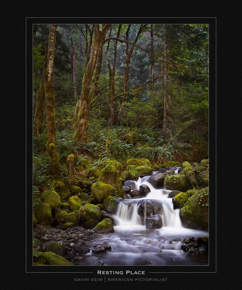
Resting Place – Dry Creek, Oregon, 2012 by Gavin Seim – PPA 2013 Loan Collection.
The forests of the Pacific Northwest are almost primeval in beauty. Tinkling water and gently blowing ferns make an almost unrivaled tranquility. A scene so stunning that in a story, it would be require a giant beast or a sinister wizard to balance the scales. But the tranquility is real and there are no monsters lurking in the shadows. At least, not today.
Forest light is like seasoning on a platter of summer vegetables. It tickles the palette and pleases the senses, but only if used in the right proportions. That happened here. We camped down in the forest and I started early in the morning, having scouted this Dry Creek Oregon location the day before with Nathan, as we filmed for the EXposed Workshop. In truth I did not realize how breathtaking it was until I stood there the following morning. I made my images and then wandered up to the waterfall just a few hundred yards upstream, poking around and peacefully musing about the forest light. I like to muse.
Awhile later I was about to leave when I saw the light. It was beautiful before, but suddenly the sun moved to just the right position when the radiance glimmered and danced through the foliage. Not to harsh, as often happens from high sun over a forest. Just that perfect glow. I quickly setup again and made this image, thankful that I had not rushed away to breakfast, or assumed that the first light was the best I could get. The reward for my patience was Resting Place. Perhaps the best pictorial I have ever made, and certainly one I’m very proud of.
Resting Place – Dry Creek, Oregon.
Release details: Prints Available Now. Order Open Edition originals above. Master prints and Signature Limited Editions can be ordered by contacting gallery.
Currently Released prints….
- 60 inch Master Original on Canvas – Limited edition of, 1 (contact the gallery)
- 47 inch Signature Canvas – Limited Edition of, 50 (contact the gallery)
- 36 inch Signature Canvas – Limited Edition of, 150 (contact the gallery)
- 24 inch open edition mounted print (order above)
For Photographers. How it was made…
Technical Notes: Canon MK2, 17-40mm 4.0, 40mm @ f16, 4sec, ISO1o0, Induro Tripod
Processing: Lightroom 4, Photoshop, Seim Effects tools.
There’s a sad side to this story too. This image was supposed to be made on 4×5 film. My best ever exposure. When the light came, I quickly photographed it with digital, then did two more frames of 4×5 color film. I knew I had the digital in the bag, but the 4×5 was what I was really after, as I could have printed this over 100 inches had it come out as planned.
When I got home and finally developed my film I had every exposure I expected. Except the one I needed – It seems that somehow I had failed to release the shutter properly and my film was blank. I was pretty crushed and felt pretty silly. A 4×5 of this would have been a feather in my cap and a print like nothing else. And yet, I still had the digital and it came out stunning. I’ll just have to print a touch smaller.
I’m not kidding when I say this is one of the most perfect exposures I have ever made. In terms of getting it in camera, it sings. In fact you can see the original and the main editing in the EXposed Series. I was thrilled with to how perfect it was out of camera as it offered further validation for how important good exposure really is. It was made right about here in a little visited area of the forest up Dry Creek (which was not dry at all).
I placed water areas just over Zone 7 using the Zone System principles I prescribe in EXposed. The image straight out of camera came out so well that I was a bit shocked at how little it needed. I knew it was good, but I still sat on it for some weeks thinking about how I could finish it to perfection. The main work was simple tonal control using burns and dodges in Photoshop. The tones were naturally appealing, but just like in the darkroom days, I lightened and darkened things a bit to bring out the scene and lead the eye through it in the way you see here. The hot points of the water are dodged up near Zone 8-9 in the final, strengthening the focal point. But the main water values were not changed much from the original.
After that I worked a bit with the rest. I did not want a supersaturated unnatural feel. The color was stunning as it was and I just needed to keep it rich and dimensional like when I stood next to the creek. Toward the end I used an effect called Vinta from my actions, which helped give me a natural subtle richness to the color. Then I overlaid a texture from Naked Elements. Nothing bold, just a bit of natural foliage that helped showcase the depth of scene. Finally I worked with a few final details before calling it a day.
In truth I did not alter the image that much. Most of what you see was out of camera. There was no need to go overboard. Only to bring out the natural beauty of the place. I wondered if I should do something daring or edgy. But I realized that the scene was edgy in it’s own timeless beauty and that that beauty did not need bold alterations. In the end I am so proud of this image. It looks great on-screen, even better in print and has validated so many of the image making principles I write about in one place that it makes me smile… Gavin Seim


