Shot notes: On all 3 of these I used Silver Skin process from my Silver 3 presets collection for C1 and Lr on all three. I did some burn burn and dodge cleanup in Photoshop also. I used a Fuji XT3 with a 90mm f2.
Environmental portraits were a bit part of my training and my late mentor who was one of the finest portraitists in the past 100 years; he crafted environmental images for walls for an entire career.
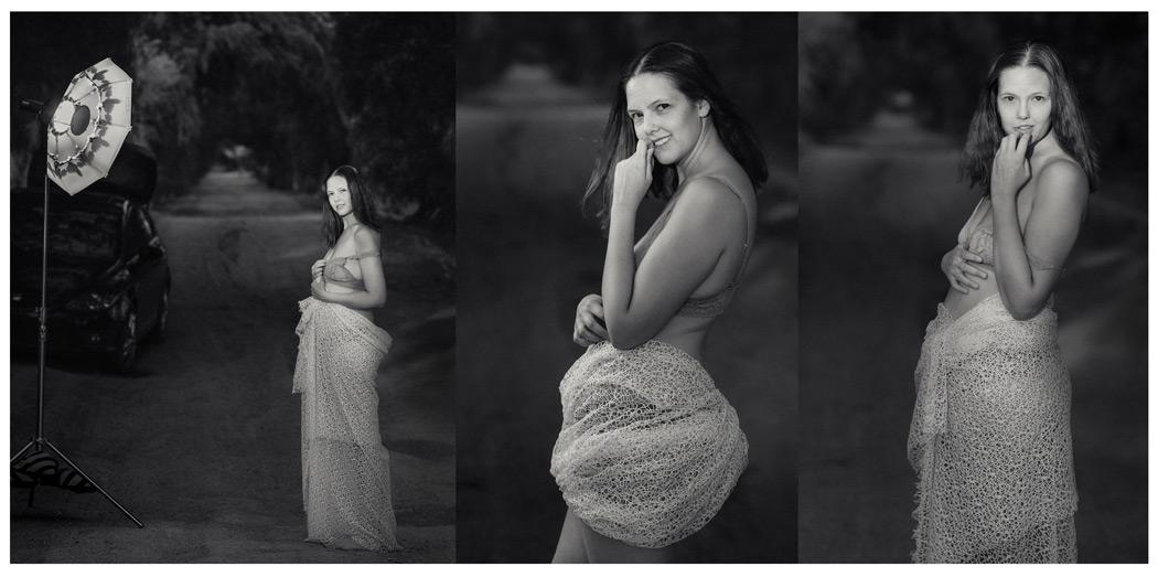
So I asked myself as I looked at these. Why do I need to remove set elements for this shot. Which tells a better story? I picked 3 poses but my favorite was the environmental scene and it looks great large. I decided to test it on the world of Facebook photo groups. By the way you can comment below or discuss this here on the Facebook post.
This caused some controversy.
More people liked my image that hated it. But I found it interesting that a lot of “experts” came to call and they decided that I sucked and if I would not heed their advice, I should be disbarred from photography! I didn’t actually post the image asking for critique but I always consider critiques because mentally accepting or rejecting what people say about your image is useful.
I learned it’s fine to post your behind the scenes photo so people can peek on smartphones, but to post that image as art another matter. Digital has made us prone do doing whatever software tells us, small screens have taught us planning for print is less important than cropping for a four inch screen and social media has taught us to argue everything and insist we are right. It makes me feel we should go back and study the painters a bit more because often what’s being said by self proclaimed “experts” flies in the face of art history.
When I started entering international level PPA competitions in 2009 on the road to get my masters, I learned I was NOT as good as I thought. It was very humbling and I’ve been learning it ever since. I teach and study photography and I have for 20 years. So despite being called arrogant at times, I don’t just take every comment from someone online with no portfolio or reputation and obey; neither should you!
Online, everyone is the smartest instructor in a class where only YOU are the student
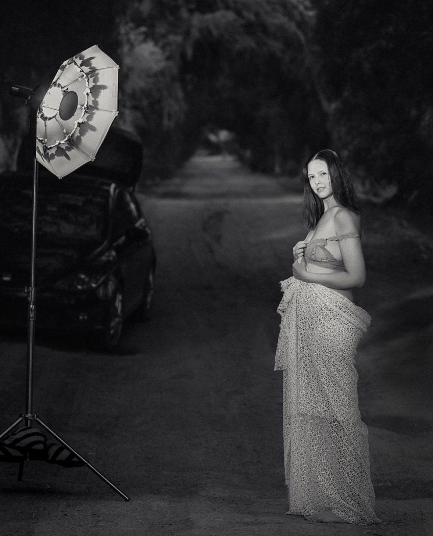
Is there a rule that says we can’t have the lighting visible in a portrait? No, not if leads to the subject. So that’s what I told people, but some said they ONLY see my strobe in this first image, or that the going back and forth which disqualified this as a proper photo. They said my story was not clear and that I was arrogant for calling this a good shot and not admitting my mistake. Of course I have more traditional closeups also, the wide shot was made for fun and I ended up liking it!
A counterbalance like we see here forces the eye to go back and forth, it’s a powerful tool of composition that we study deeply Photo Perfect master class. Now that’s not to say you always have to have a strong counterbalance, only that it does work. The light value is about equal to the models face. Is there a rule that says it must be less. Of course not! The car is a bit odd, but we’re telling a story of a photo shoot out in the countryside. The car shows that we drove somewhere. The eye goes around, to the model to the light and repeats. To me it’s not that easy to leave this frame and I don’t care what object you see first because I know they will lead you to my subject.
The internet is not the final word!
Photographers can be ego driven jerks and we can’t let that define us.
I have the experience and confidence to say this works. Of course, you can disagree and you can like the others better, or hate them all. I can even change my mind next week. But that’s not my point. The legendary Ken Whitmire. Ken taught me to use space and to print it unashamed as we fill-walls with the story we want to tell.
The main “crop” in image #1 is not it’s visual edge. The stops are the shadows and the objects to lead the eyes where I wanted. Sometimes these environmental shots get picked apart on small screens, while in wall prints their majesty shines and and people are amazed. Many “experts” in photo groups have never printed a wall print. We we need to have enough vision to see the goal as well as hear the noise around us. Some images are meant to be seen larger and that’s a good thing. Light itself is rarely our subject, it’s merely our paint! Consider Arnold Newman’s iconic 1949 portrait of Danny Kaye, cluttered with elements of the set and glaring light yet so balanced.
Do you choose wide, thoughtful, safe; or trash them all?
#1 is a useful example of leading tones and counter balance.
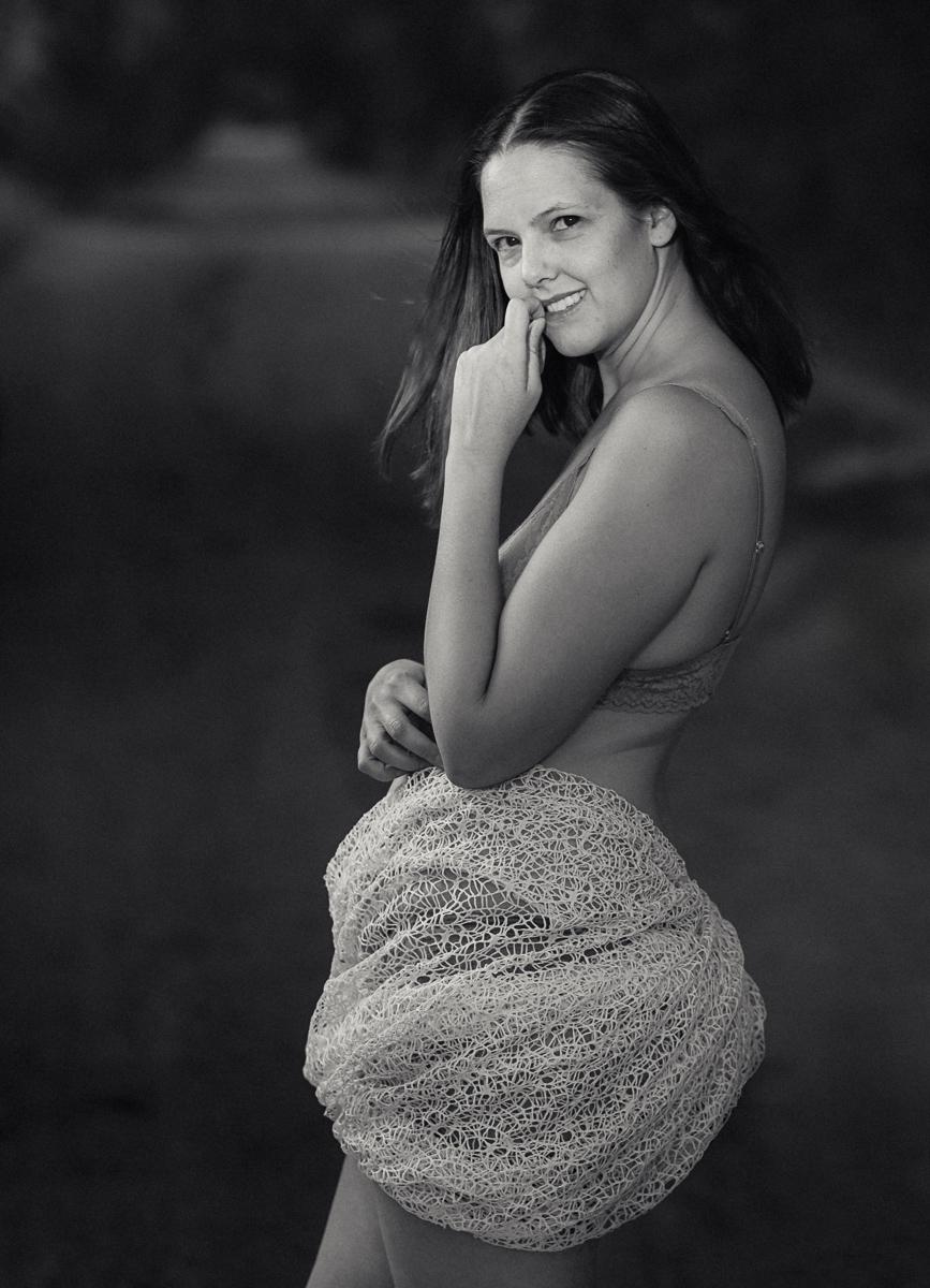
#2 feels thoughtful.
#3 feels safe.
The more experience I get, the less absolute I become about whether a photo is WRONG!!
I can always spot a ego driven feedback because its’ from people who think they know everything and the rule they read about once applies to your image 100% and if you don’t honor it, you are a bad photographer. I can always critique an image, and while there are “rules” (guidelines) like lines, lighting or an image needing a main subject,I’be found the more I learn the less know.
If you reject feedback because you know all your images are amazing you will hurt myself. But If you filter feedback because it seems ego driven, some someone with something to prove, someone with little demonstrated credibility or experience, that just means you have enough confidence and experience to also critique yourself. Just be careful with confidence because it’s a sharp sword!

Gavin, this is an excellent short blog write up. Yes, environmental portraits benefit from the environment. The CEO of a steel factory benefits from showing the steel mill behind him. We get way too caught up in wanting “likes” in social media on very small images glanced at on a phone screen. Yes, some images shine best when printed as large wall art.
Btw, that is, in my opinion, the best portrait that you have taken of your wife. The vertical one shown here.
Thanks again… and I love Silver Effects presets!
Leroy
Agreed Leroy, thanks for you comments
Gav
Very good commentary. I was intrigued by the image with the light stand and background. My eyes were drawn to the wonderful expression on the models face and although I gave the light stand a glance IMHO it didn’t detract from the model or the overall image.
I am not a professional photographer but a 72yo hobbyist who enjoys reliving the thoughts and emotion I capture in an image. Any comments and thoughts are accepted but at the end of the day I must derive personal pleasure from the image.
Thanks for the opportunity to let me ramble on
Thanks Peter, good stuff
Gav
Funny how ideas on the Internet stated by enough people suddenly become unbreakable rules. Then people view images and see those “rules” disregarded and they have to post their “opinions” which are really simply blinders they have put on based one things they were told. We all need to be careful that “ideas” don’t become prisons–prisons that keep us safe but constrict creativity.
Honestly, photography is a form of art and art is subjective by its very nature.
Personally, I find most photographers, myself included, tp be egotistical and arrogant about their work…at least on occasion. Let’s face it, no one likes to be told that their work looks like crap! For better or worse, the internet gives people the shield of anonymity that allows them to make the painfully honest, and even grossly disrespectful, comments that they would be unlikely to make in a face-to-face interaction.
When we are new to the world of photography, education is important as we learn how to use our gear and get an understanding of the basics of the art form. But there are no absolute rules too what an artist chooses to create. While we may call the Rule of Thirds a “rule”, nothing says that I can not put my subject in the center of m composition. While my light meter may provide the settings for a “proper” exposure, I have complete artistic license to over or under expose that image. There is guidance in Color Theory for what colors mean and what colors look good together…but what if I am trying to convey a garish feeling of conflict and angst? I may intentionally choose colors that clash harshly!
When we put our work out for others to see and opine about we need to have a thick skin and be aware that there will be some who will not like it. That’s perfectly okay!
In my observations, social media is rife with many beginner and intermediate photographers. The beginners are honestly trying to learn and get what they can in the form of a “free” education. However the intermediate level photographers are the group where I tend to see many hostile “experts”. These people have often completed a photography course or two and have gotten comfortable with enhancing their images in the digital darkroom and they think they have “arrived” and have it all figured out! They are constantly buying the latest gear and posting images of their boxes of stuff as though the rest of us should be in awe of them.
It’s important for the rest of us to remember that these people are NOT experts. They are simply photographers just like you and me but they have very fragile egos and have an enormous need to received accolades and recognition from others. As an artist it is important to remain aware that some people will love your work, some will hate your work and most people will simply not care one way or the other!
While even infamous photographers have work that may be acclaimed by other photographers, the truth is that most people in the world have no idea who they are!
Personally, I ditched Facebook a while back because of these very issues. I find true photography communities such as Flickr, 500px, ViewBug and others to be far more enjoyable and beneficial to me.
I may occasionally post an image on Facebook or Twitter, but it is being used to support the text I am posting…not simply for group feedback.
I know this was lengthy. I probably need my own blog, but this topic tends to really trigger some deep feelings in me.
Sorry about my diatribe Gav!
Gavin, I would have to agree. First off, check your records, I own virtually all your software, so this is not spam! Secondly, I realize you must love your wife. Other wise you would not continuously poster her all over your site. Over the many years I have been following you I have yet to see one photograph that was at all appealing of your wife. She just is not photogenic. I apologize, but if you are going to continueally bare her to internet criticism you have to put up with the negative comments.
Rick if the basis for your commentary is whether the model is pretty enough you have missed the point. Most of the world disagrees on your position about Sondra appearance, but I think you are the negative person who puts your emotional knee jerk before the art of beauty that others see and maybe you can learn from this post.
I find her beautiful.
The fact of the matter is that whether it is experts (photo specialists, award winning photographers or Photography mentors – especially those having commercial education shops) or amateurs, they all suck when it comes to judging others’ photographs. Experts especially will find fault unless the photographer is a student or a protege. In the case of their students or those in their “inner circle” they will invariably go overboard in praising their work even when it is so very ordinary. I have experienced this even with Magnum photographers what to talk of lesser photographers. As regards your “environmental portrait”, in my opinion the lighting is a little too overpowering. Makes the subject look dwarfed. Similarly, in the second portrait the cloth covering around the wist and hips makes the portrait unbalanced. Yes the pensive look and the hand do make you look at the face but the lower portion distracts.
Thanks PD
I like #2 the best. It’s got a lot more life to it than #3 (I know, so technical!) and I enjoy looking at it more. #1 isn’t my cup of tea, but I completely understand what you like about it. Before I read your article, I noticed my focus bouncing back and forth between the light and the girl, so it was an “a-ha!” moment when you said that’s what drew you to it. But that’s what I didn’t like! The tunnel of trees behind the subject in #1 is really nice, though. I can’t imagine anyone calling #1 bad, even if it may not be their favorite kind of image.
Good points Chris, thanks