It’s time for an honest talk with photographers because we keep forgetting to do this.
I seriously mean this….
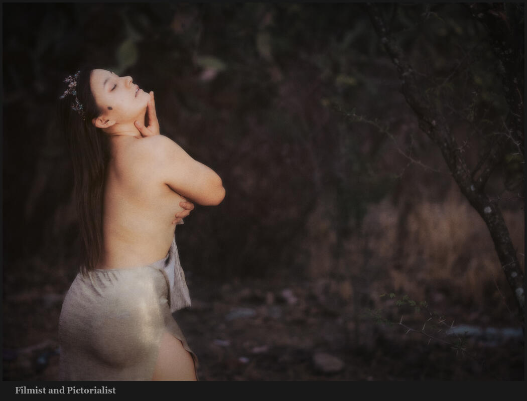
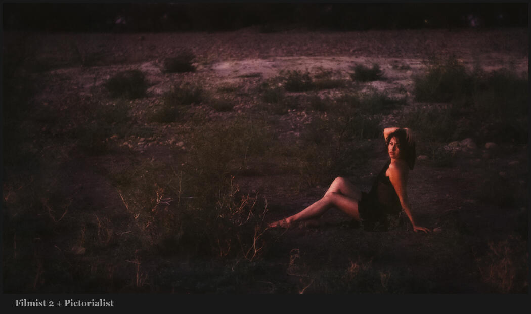
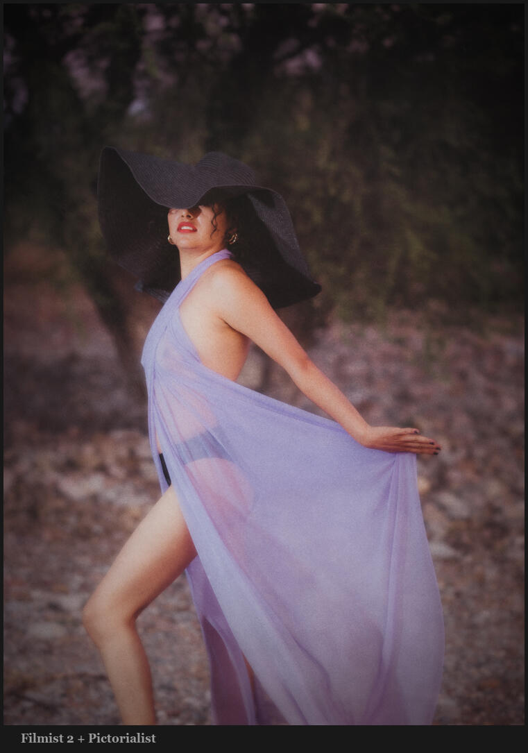
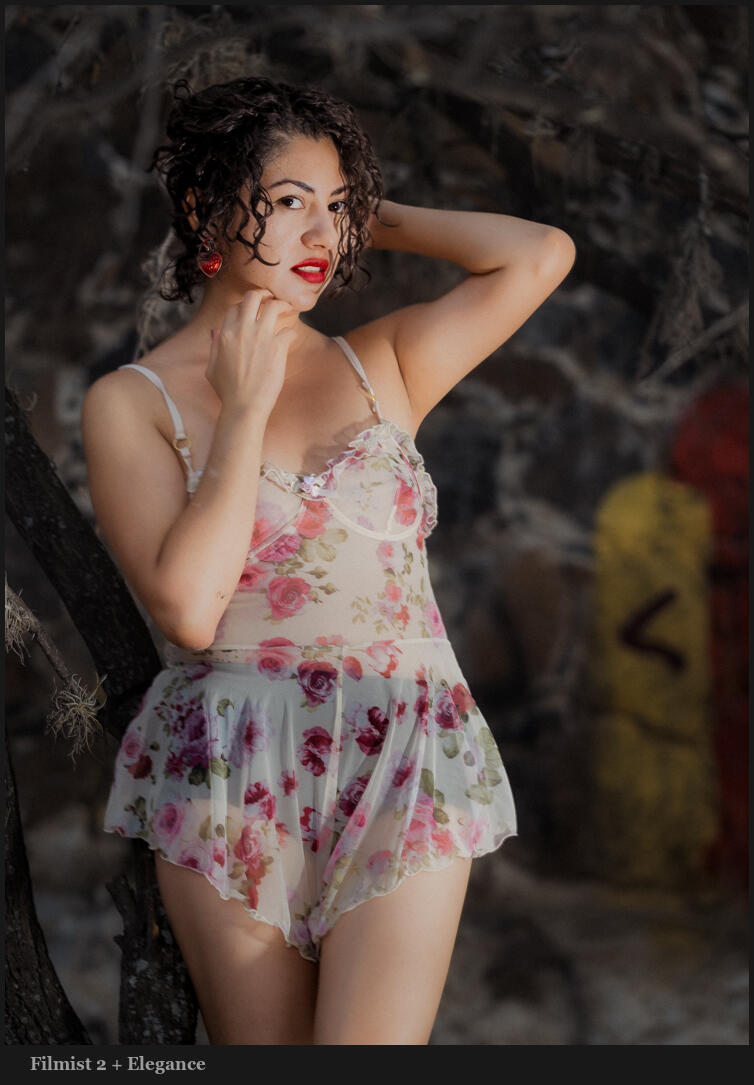
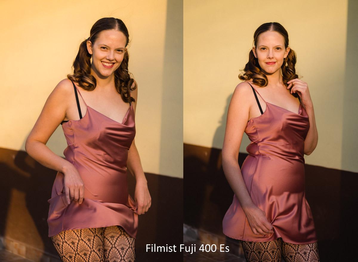
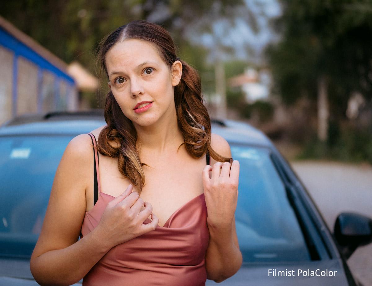
Good photos. Good edits. Sure, I get that clean, iconic look in my Photos by editing with tools like Filmist 2 or Pictorilaist. But what I’m talking about today is where great photos START!
In the war against being the same, creating more to achieve perfection, and Ai lawlessness. The photo with feeling is about stopping time, but not always at the perfect moment. I didn’t get my Master’s in photography by spraying and praying.
I’m not saying don’t take lots of photos of life. Of your kids, your dad or Grandma is at the wedding, and you’re working this weekend. I’m saying stop working in 20FPS and start compressing one single moment at a time.
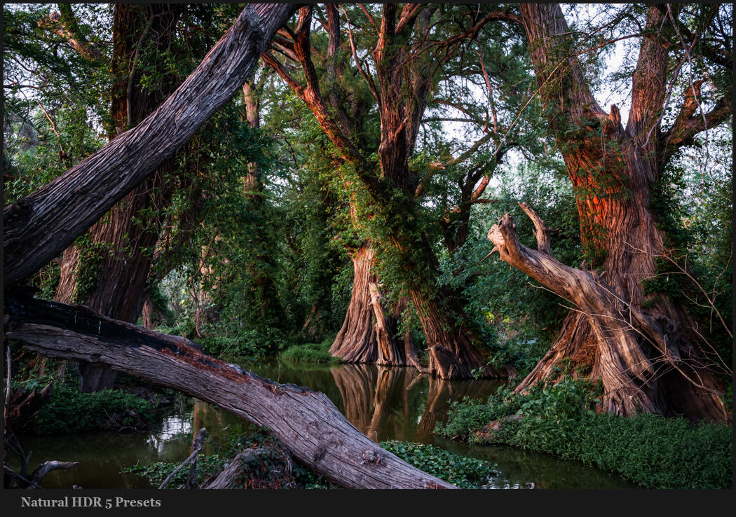
When I shoot fast, I think less. If I’m on this river shooting slow I think about where lines intersect and how tones lead the eye. IN fast mode, I can tell myself to think about details, but I quickly get distracted.
The art of compressing time…
I shoot a lot of video. In a video, you do the same thing, though. You don’t want a 3-hour video. You want a moment, even if it’s at 30FPS. So this idea of not trying to capture everything can even be applied to video.
The essence here is that when you see a moment or a scene and visualize it for real instead of just holding the shutter. You stop stressing the concept of your photo into a hundred ok photos and compress it into two or three great photos.
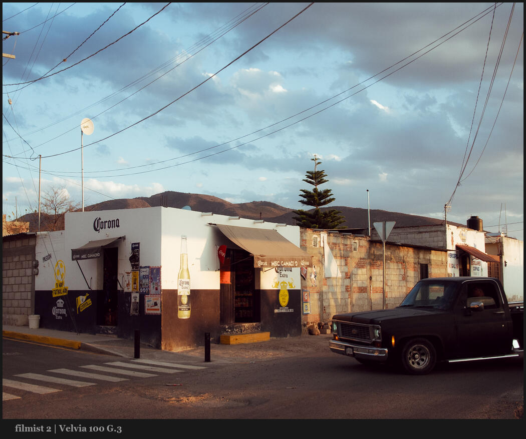
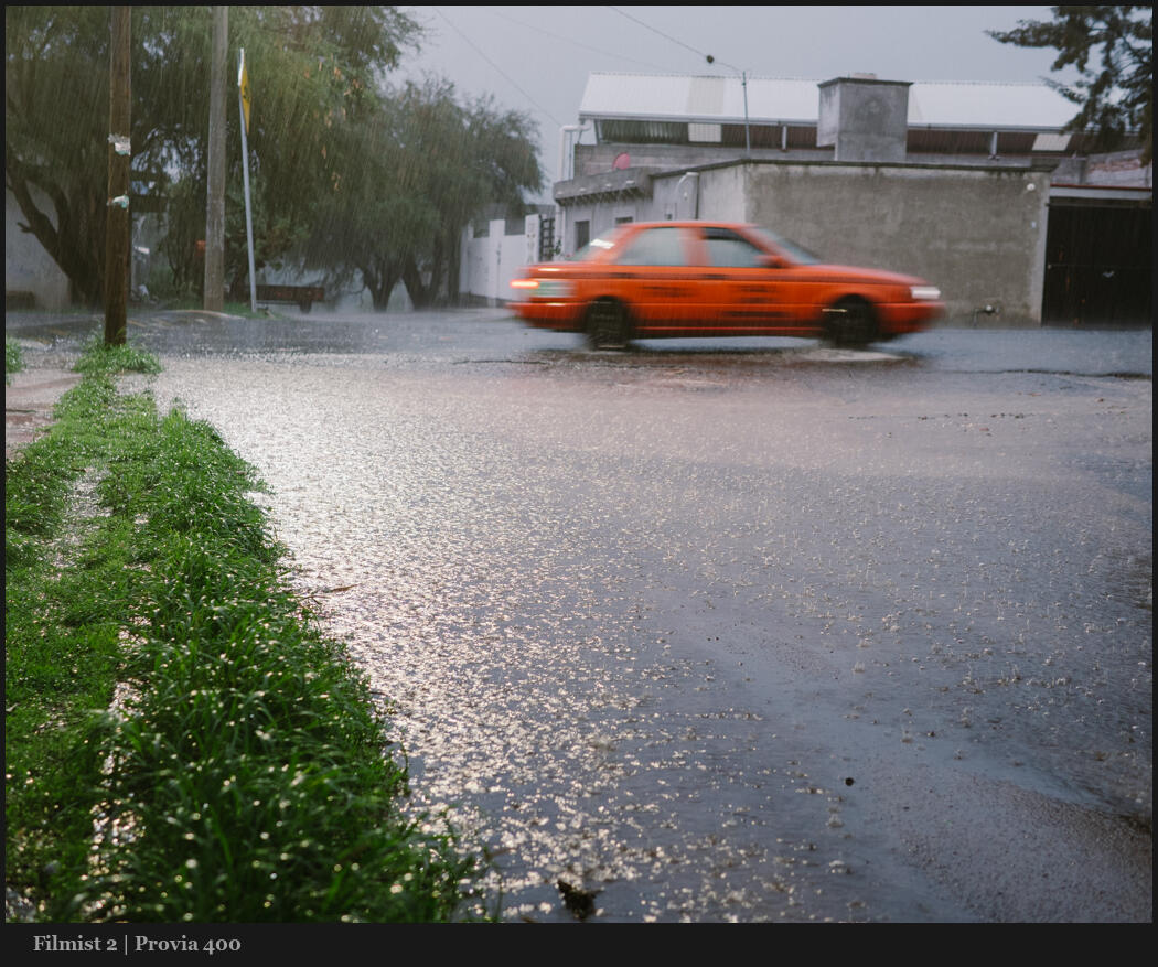
Let’s look at the photo below…
I stood in the rain watching cars go by. I lowered my shutter speed to 1/15th. I did not use continuous shooting and hope for the best. I did not track. I framed the scene, held, and waited for the car to arrive.
You may think this is a good photo or trash. But what matters to me is it’s the photo I saw in my head, and shooting fast would have taken my focus away from that.
Why single shot is usually the best shot?
Even though I may lose a photo now and then shooting single-shot mode. I always come back to it because the single shot gives me moments more real and thought out.
My goal here is not that there’s never a timer for faster frame rates. Only then, when the default mode is one photo at a time when you slow down, and when you truly THINK about every frame. Every photo you take gets better.
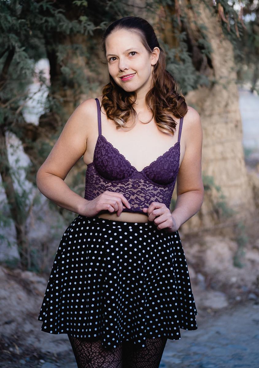
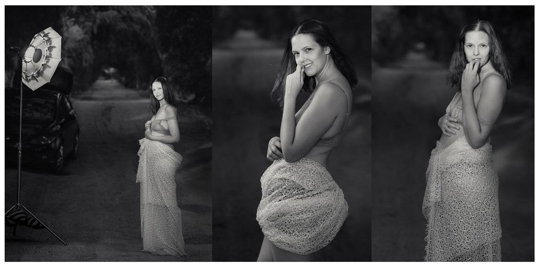
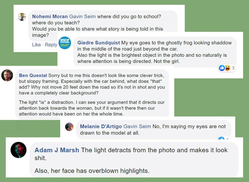
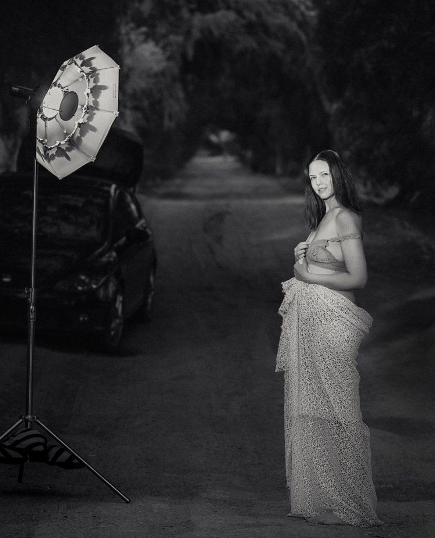
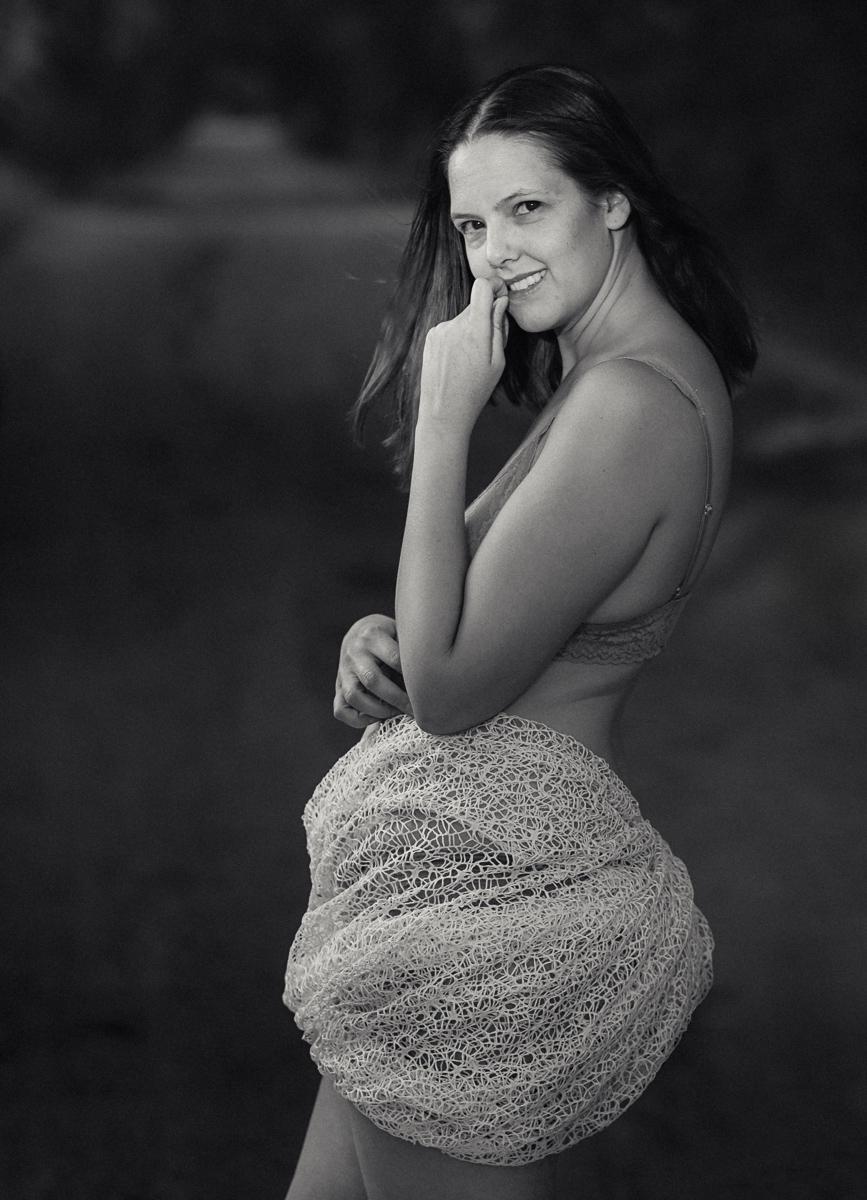
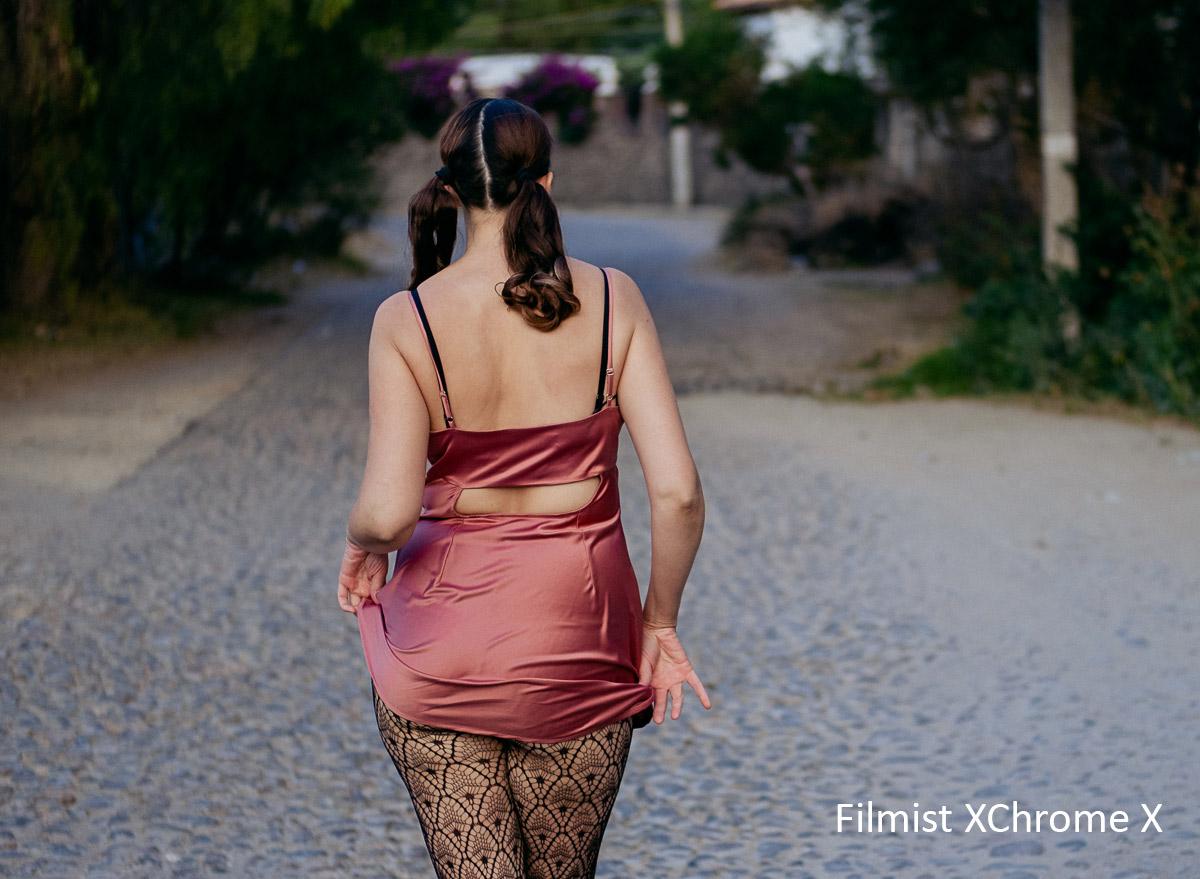
Even in the photos below. The portrait is dark with lots of outdoor space. But I went slow, I extended that into editing slowly and imperfectly. The street scene is a bit broken by the car entering, but because I wanted to, not because it was one of 20 frames.
When I take a photo, I want imperfection on my terms. Because that reminds us we are real.
Gavin Seim