September 7, 2012

by Gavin Seim: Adobe recently had a travel photo contest. The prize, a trip to Thailand with legendary photographer Steve McCurry. Yea, the guy who photographed Afghan Girl.

Matt Hardy once said – “Beauty can be seen in all things, seeing and composing the beauty is what separates the snapshot from the photograph.”

Adobe counted +Likes and gathered a panel of official judges to choose. The winner… this photo. You can see it larger here on Adobe’s page. There were many other entries, but this was chosen as the grand prize. I feel this is hurtful. Not only to the entrant, for it teaches them that quality does not matter. But to those who worked hard to enter quality work. It’s better to be honest with those that are learning, than to ignore a lack in quality. I would rather be improved by honest criticism than ruined by false praise.

How does the world’s largest professional photography software developer and it’s judges not know the difference between a photograph and a snapshot. As someone who has worked for fifteen years to understand photographics and light, I for one am not jealous; I am insulted and embarrassed.

For the record I did not enter this competition.  And the point here is not to insult the winner. I’m sure they will enjoy and learn from this trip. The point is that people need to understand a camera does not make you a photographer. People worked hard and entered quality work To award photo in this manner seems an insult to their efforts.

What’s Wrong With It:

Quite nearly everything. As a vacation snapshot, it’s perhaps acceptable. There is nothing wrong with a family snapshot. But we need to understand the difference between a snapshot and a photograph. This image won an international level competition. At that point it must be critiqued as such and compared to other entrants.

Great photos can be subjective. But that does not mean we ignore what makes them great. This photo has no subject, breaking the cardinal rule of a great image. A great photo has a subject. Usually just one. All other elements should be supporting cast. Is the subject little girl? The half cut off body taking the photo? Perhaps it’s the Oriental Pearl Tower, crooked in the frame. If we have to ask, the image has already failed.

When examined (something I have done over and over again) the picture feels of phone snap quality. It’s filled with artifacts and problems. The exposure is flat and dark and the sky is plain and boring. As journalism it lacks interest and as a street photo it lacks expression and spontaneity. Finally it fails at what is perhaps the hardest thing to put into words. It’s uninteresting and it does not tell a story.

Ansel Adams once said – “The sheer ease with which we can produce a superficial image often leads to creative disaster.”

While I don’t generally call out bad photos directly, I think this needs to be thought about. Everyone has cameras, but if in doing so, everyone becomes photographers, then the word photography no longer has meaning.

If we hold zero standards to the quality of art and use “art is subjective” as an excuse for everything, than the word art has no value – By calling everything art, by making everything great, we demean those who through effort and practice have mastered their skill.

NOTE: This is a news commentary. You are welcome to disagree and for obvious reasons I did not include the winners name. It’s not meant to be mean, but to raise awareness and get us thinking about quality and understanding the diffidence between a photo and a snapshot.

UPDATED: When this post was first made I had thought that looked like a phone photo. It is not. While the camera used makes little difference, some felt this should be disclosed. I have refined the post a bit to reflect this and things related to the ideas presented here.

So now that I’ve stirred the pot. Let the discussion begin.

Read More

August 18, 2012

Click To Listen>> Photography Podcast. PPS #86
Direct Podcast Feed
iTunesPodcast Alley

Today’s Panel... Gavin SeimBarry HowellDennis Zerwas Joseph Linaschke

This month we get back to basics. Discuss light, working with it and even have a few healthy debates as we look at how we all make images differently.

Brought to you by the EXposed workshop.
Check out the trailer – exposedworkshop.com

PPS #86 Forum Discussions. Share Your Opinions.

Main Time Indexes:

  • 00:00 Introductions.
  • 03:10 News. EOS M and More.
  • 21:30 Getting Back to our Roots. Film.
  • 39:15 Back to Basics. One Camera.
  • 46:30 What You Think When You Make An Image.
  • 1:09:30 What’s The Most Satisfying.
  • 1:24:00 Techniques For Light.
  • (1:24:40 Gavin Yodels)
  • 1:34:10 Picks and Stuff.
  • 1:54:30. More thoughts. Creative Cloud, Aperture etc.
  • 2:04:08 The After Show. Business and beyond.
  • 2:04:33. After Show

Links…

Creative Suite CS6.

Canon EOS M

Will epic images of the Colorado fires will go down in history.

Canon recalls 68,000 T4i’s.

MK2 lenses lenses falling off post.

Video, light panels.

PICKS…

Steve Jobs lost interview.

Adobe Creative Cloud.

“my life is so bright I don’t need a lighted toiled seat”. DZ
“The best image of any session, is the one the client loves the most” Barry Howel


Read More

August 15, 2012

It seems the months of work were worth it. It’s finished and the new EXPosed series is  now available as a download or a DVD. It’s like no workshop you’ve seen and it can take your photography to a whole new level. But rather than listen to us chatter on, just take a peek at the trailer. EXposed is as good as it looks and it’s finally available. Don’t forget to use code PPS when you pick up your copy. It will save you 15%.

EXposed – The Light Workshop

Read More

June 20, 2012

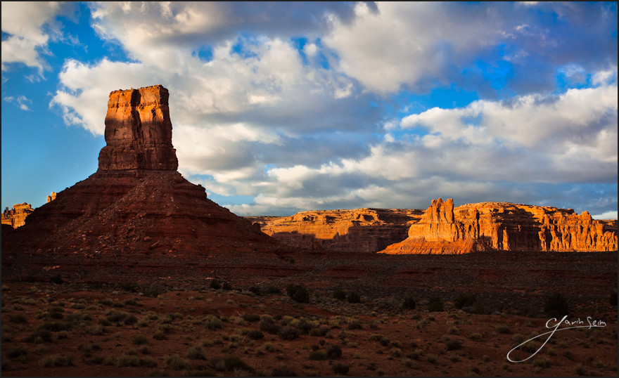
No not even this photo is free – King of the Valley – Valley of the gods Utah

 Click To Listen>> Photography Podcast. PPS #85
Direct Podcast Feed
iTunesPodcast Alley

Today’s Panel... Gavin SeimBarry HowellNina BeheimScott & Adina Hayne

This month the panel looks at a few news bits, understands that photos have value, reviews Photoshop CS6, our favorite lenses and more.

PPS #85 Forum Discussions Here. Share Your Opinions.

Main Time Indexes:

  • 00:00 Introductions.
  • 04:50 News and Chat.
  • 10:10 Free Photos for Alter Bridge?
  • 27:45 Photoshop CS6 Group Review.
  • 49:00 A larger format future.
  • 1:09:55 Lenses Lightning Round.
  • 1:32:55 Picks of the show.
  • 2:04:08 The After Show. Business and beyond.

Links…

LIghtroom 4.

Creative Suite CS6.

5DMK III is good. So is the Nikon D800. You decide. And check out the value of the D3200.

A pack of free LR develop presets for video.

Glif iPhone tripod mount.

The Brenizer Method. An stitched approach to the large format look (thanks to Vincent P for the link)

Bands don’t need to pay for your photos?

PICKS…


Read More

May 13, 2012

The Forest Pool - In this split, we see the base toneapped merge and the final edited burns, dodges and detail work side by side. Not all images are this extreme, but tone control used well will always give your image that finishing touch.

by: Gavin Seim. Tone mapping and image processing without tone control is like having a lens without focus. It’s nothing new. Good shadows & contrast make an image. Without them we often get what I call the Flickr HDR. And trust me, you don’t want that 😉

Leveraging tone to keep the subject the subject and the supporting cast, supporting, is critical. Good tone control is what separates the men from the boys in the world of imaging and we can’t talk about it too much. I think we sometimes get distracted with the latest techniques. But generally they’re not really that new. They’re just new ways of doing things people have done on film for decades. Take HDR. On film, every image you made was HDR if you managed your light and processing well.

So then HDR. It’s not a style and it’s not judged on how many images you use, or whether you tonemap in Photomatix or Nik. It’s simply the management of a high range of light. You can do that with film, layers, tonemapping, channel mixing, brushes or in the camera.

In this example of a three exposure tone mapped image, you can see how much work I had to do to reign in the tone values. A tonemapped merge shows this more than a single file would. It tends to push everything to mid tones. After which, those tones have to be managed. Either that or you have mid-tone chaos. This is one reason I often manage dynamic range manually with layers, rather than tonemapping, but both are fine as long as you have a plan.

What I’m getting at is that an image must have a subject. Just one. Everything else needs to support that and it doesn’t matter if you have a single RAW or a tonemappped HDR with loads of range. Tonal control helps the eye focus. Without that focus you’ll nearly always have an image failure.

I’ve studied tone for years now with the legendary Ken Whitmire and even more on my own. It’s taught me to see light. Not simply that there is light. But what it’s doing for me. I see a lot of potentially great images that fail without any tone control. It generally means no cohesive subject. No one is talking much about tone. But if you do it right, the viewers eye is lead right to the subject, every time, no matter how many elements are in the scene.

Using the Zone System really helps with this as it quickly teaches you to manage tones better and make things as good as they can be in camera. See this article. On the editing side often a burn & dodge, brushes, or layering of lighter and darker frames makes the diffence. The bottom line is that while there is no rule on how we control tone, it must be done if we want a focused image that draws the viewers eye and showcases our subject.

This is something I go into at great length in my Lights & Shadows workshop and my EXposed DVD. But the main thing is to keep working with it. Cameras, the latest software and the latest techniques are useful things to study. But tone control is timeless and is never superseded. Without it we can expect our images to fail or to be little more than snapshots. Every time.

Happy tones… Gavin Seim

King of the Valley - Valley of the gods Utah, Spring 2012. A gentle tone controlled single exposure. See more of Gavin's American Pictorials on f164.com

Read More