Today I’ll show you why. I’ll be using Lumist to show the lies of contrast and tone. But this will teach you more about tone and contrast in 30 minutes than most schools do in years of training.
You can check out Lumist 3 here and make sure you don’t miss the next LIVE Shadow Hackers. You can also de a TON with tone and LUma values using speed macks. Check out my Elegance mask videos for more on that.
Luma Masking, Tone, Zones, Contrast
What do all these mean, and do they even matter?
Honestly, these are all the same. Which is why I put it all under shadow hacking. Because that way we start seeing by the masking, masking for the light, and pulling the shadow for the contrast.
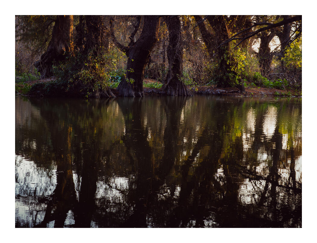
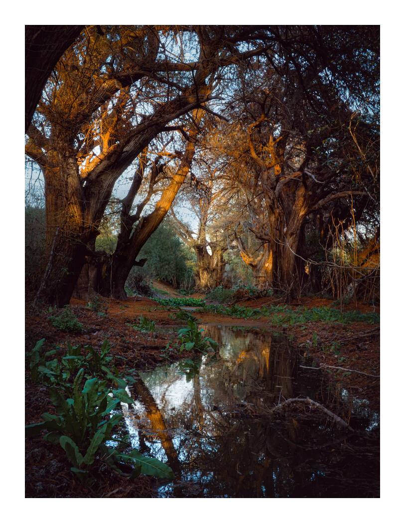
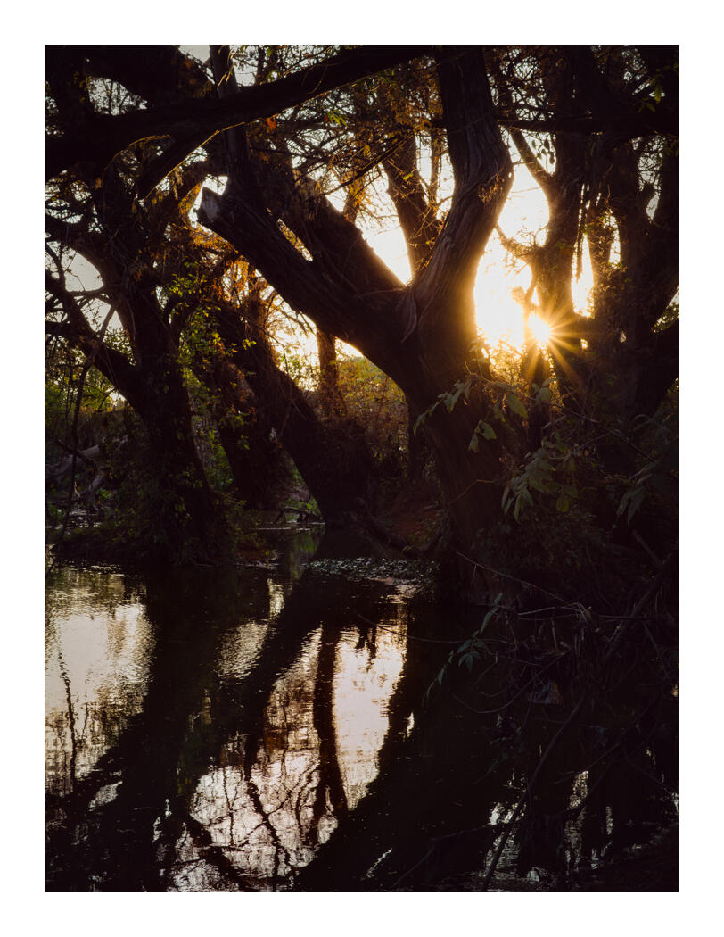
The depth of a photo…
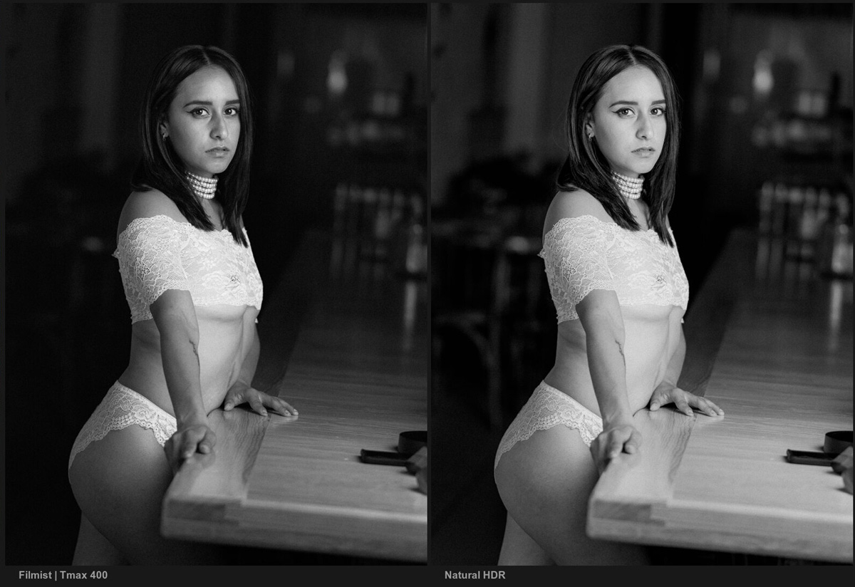
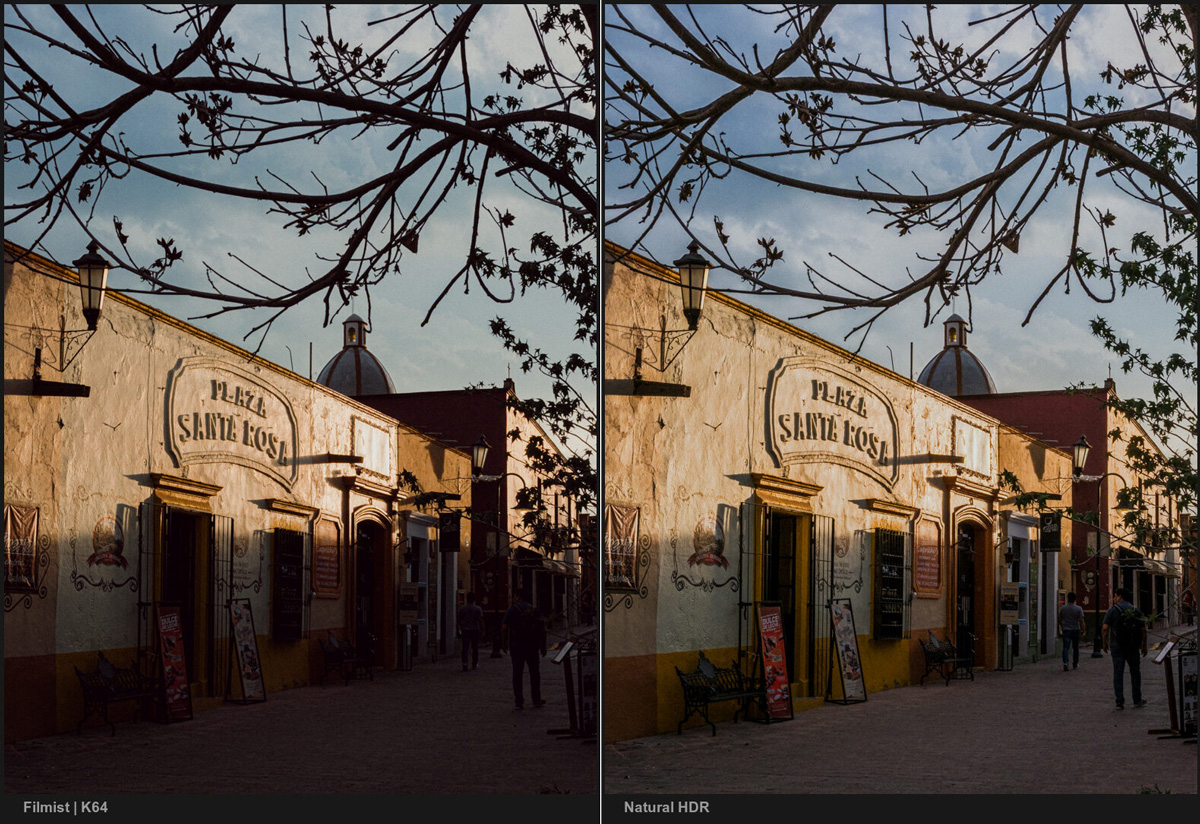
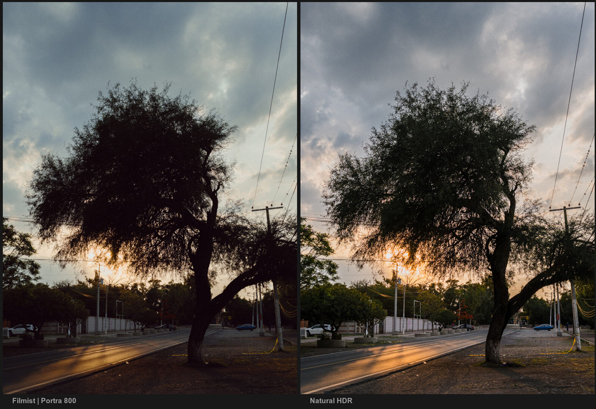
Making a photo come alive is the first amount of emotion and soul. But the method of that is to create depth using tone. One of the problems in photography is that we have a lot of ways to overcomplicate and edit tone, but few people who can really explain tone and how to use it.
So do this…
See the shadow first. How it relates to light is how you will truly see the tone. How the separation affects the way you see the image is the contrast.
But what is the subject, where does the viewer’s eye go, and how do you control it all? That’s where they all merge, and you need to practice leading the eye with tone until it’s second nature.
I won’t type too much today. It’s all more visual in the video.
Enjoy – Gavin Seim