Film and darkroom processes do make you think more about your photographer. But are they the right tools for improving especially for beginners? Probably not! But there’s a viable alternative.
I shoot film. But is it worth it for you?
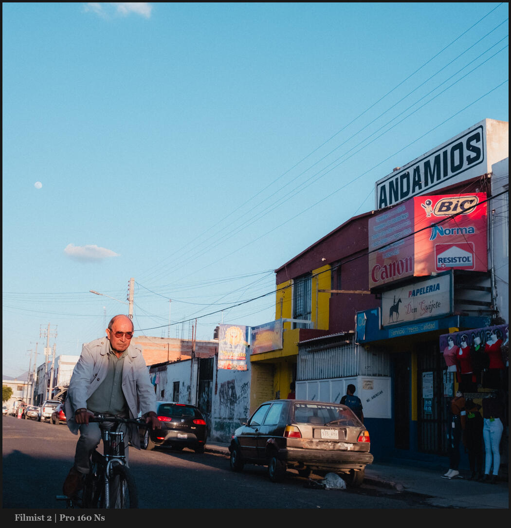
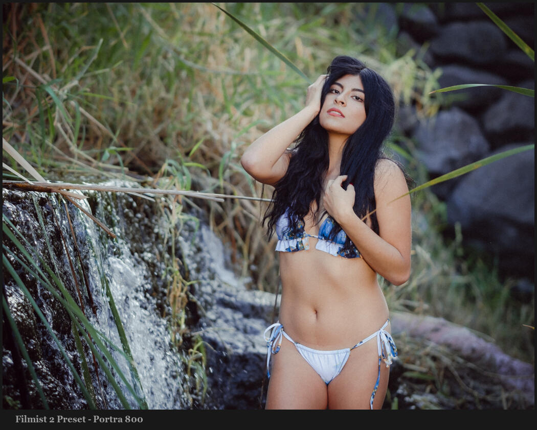
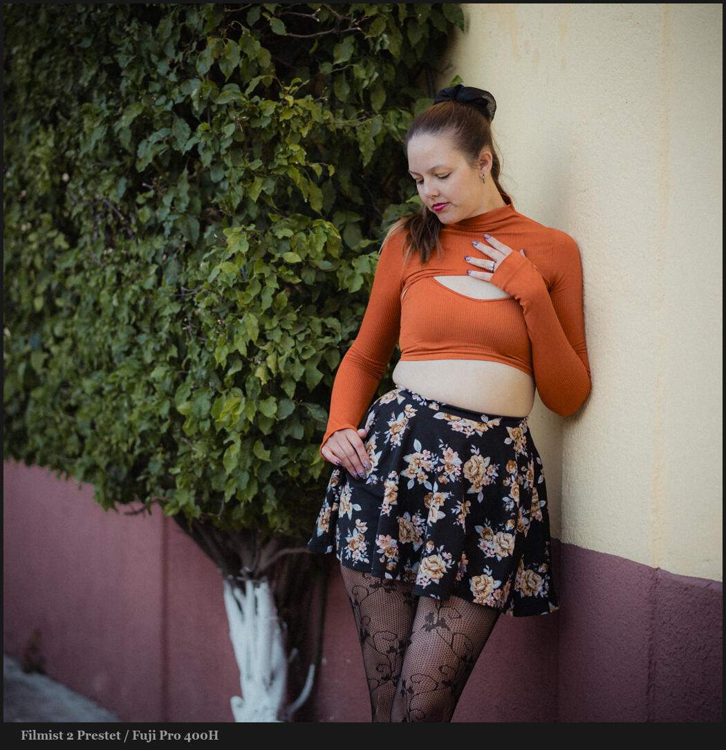
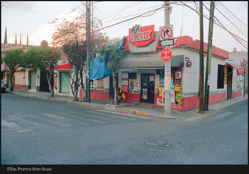
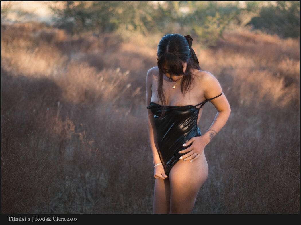
You can also get the free Filmist presets here to see real film tones in your edits. Also actions like Emulsion were created based on darkroom processes.
Yes, the film is worth it sometimes.
Film has made a big comeback in the past few years as people tire of fakery and Ai and want more organic real experiences. But it’s also very expensive.
Whether it’s the magic of Instax or POloroids or whether it’s the subtle shadow and color theories you understand better using film. It does pay off. I just don’t think it’s the secret sauce for newer photography for the reasons I mention in the video.
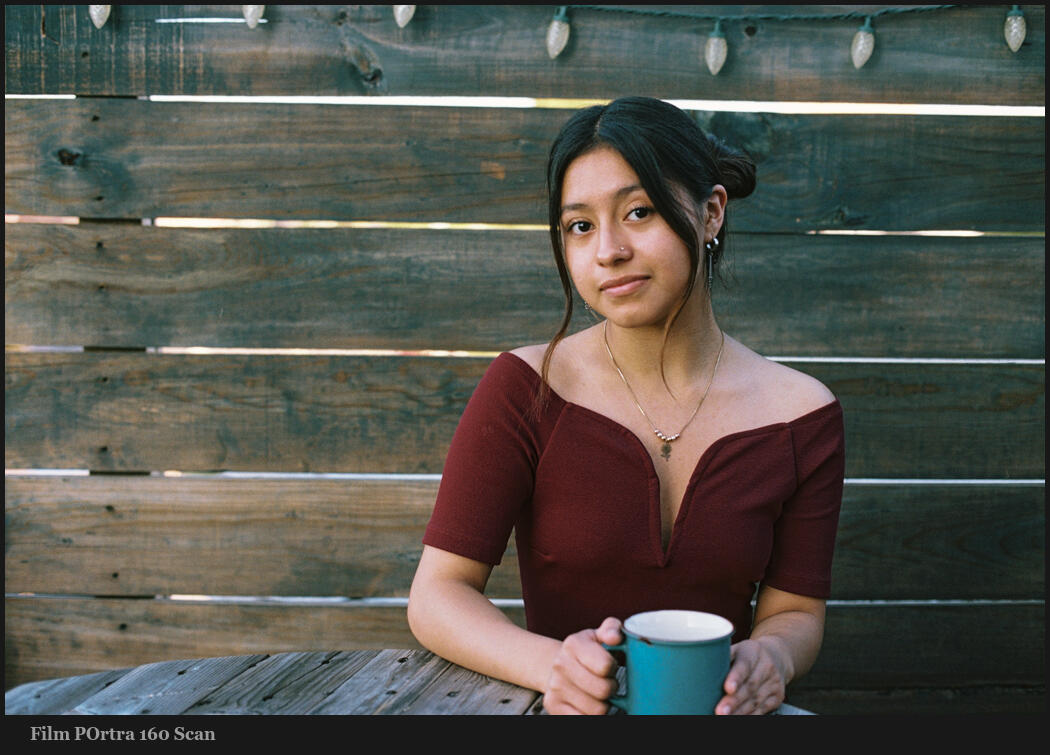
Look at how film affects your digital edits.
Someone recently told me they liked my LIghtroom presets because they were not gaudy and pointless. A lot of that is that I’ve been making pro-grade presets longer than anyone on the market. But what I immediately thought of is film.
My film and shadow hacking studies have shaped the way I create tools and it’s a big reason why they are different from the others on the market. The way film helps you understand subtlety and tone and color versus just pushing a slider increases the more you use it. If you spend any time on analog I think you’ll understand what I mean.
My conclusion.
If I plied film is not worth it that’s not what I mean. What I mean is that film is a tough tool to start on. It’s more something to work with once you are at that intermediate or advanced level where it’s nuance will mean more to you.
So yes, everyone. Get some vintage lenses. Shoot some film on the cameras that often come with them. But don’t think you need film to improve your photography. Slow down and let the shadow lead you.
Gavin Seim