Here s great sampler set from our Power Workflow 4 presets collection. This is a collection of presets that been about 7 years in the making. We’ve been producing Power Workflow every since Lightroom version 1. Now with LR5 and Power Workflow 4 we have more power than ever.
PW4 is a collection of more than 75 presets and it’s guaranteed or your money back, but if you want to get started without spending a dime we’ve compiled this collection of 9 premium presets from power Workflow 4. I think you’ll agree that they are some the the worlds most powerful presets. Let us know if you have questions.
These have been over 6 years in the making. Ever since Lightroom 1 I’ve been refining our ultimate presets collection. I could not be prouder of Power Workflow 4. It’s at a whole new level, taking advantage of the best Lightroom has to offer and putting more control at our fingertips. Power Workflow 3 served us well for 3 years but it’s time to move up. Behold, Power Workflow 4. It’s been a long time coming and you won’t be disappointed… Gav
ColorFlow has arrived. The most complete color presets toolkit available for Aperture users and a perfect complement to LightFlow for Aperture. You can learn more and watch the video here. Below is the official press details and media kit available for download.
___
Seim Effects Introduces ColorFlow – Offers More Than Sixty Color Effect Presets for Photographers Using Apple Aperture
Color Alchemy for Aperture – ColorFlow is a presets collection dedicated to flexible beautiful color. Designed to help photographers deliver outstanding work by allowing them to focus more on creativity and less on the science of color.
Soap Lake, WA (March 27, 2013) – Seim Effects Photo Tools has introduced ColorFlow, its newest creative preset collection engineered by Award-winning photographer Gavin Seim. These new color-only presets have been created specifically for photographers who use Apple® Aperture® software in their digital photography workflow.
For maximum flexibility, the ColorFlow presets collection organizes more than sixty presets across 5 categories of color tools: Essential Color, Color Story, Film Inspired, Hollywood Cinema and Color Toners. The ColorFlow collection allows photographers to deliver very subtle or bold image variations. For even greater control, users can mix and blend color effects for desired mood or visual theme, all while leveraging the power of Apple Aperture software.
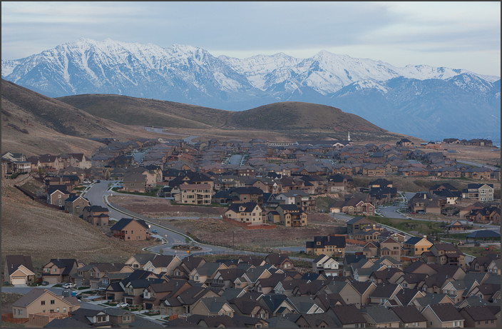
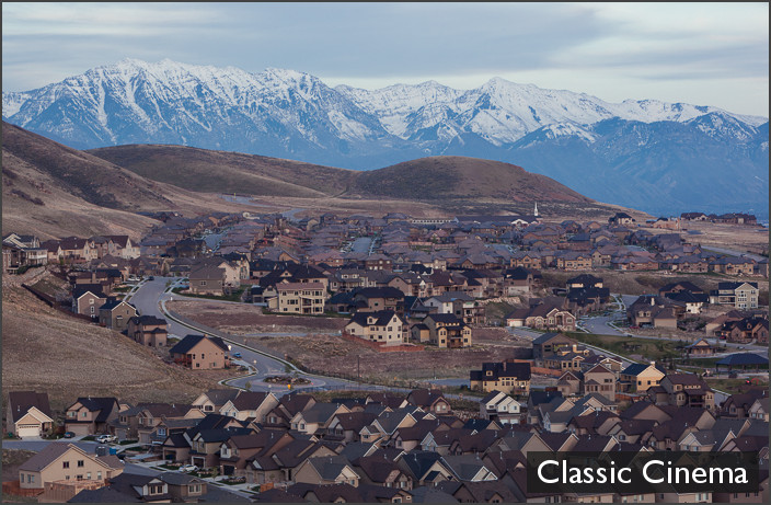
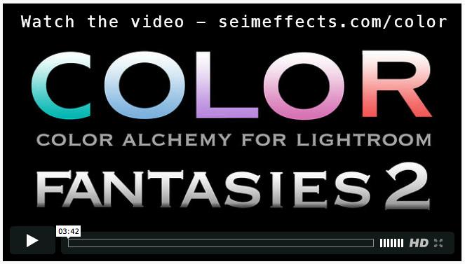
Recently we released Color Fantasies 2 here at Seim Effects – It’s a powerful collection of over 100 presets like you’ve never seen in Lightroom. It’s color alchemy at your fingertips, from Hollywood style color tones to film inspired simplicity. But we know that not everyone will be ready to jump in and buy a premium presets pack right off. That’s why we’re giving you free presets – Good ones too.
Below you can download 15 premium presets from Color Fantasies 2. No strings attached. Downloaded, install and start seeing what kind of color is possible within Lightroom. We hope you enjoy and when you see how powerful they are, you’ll check out the complete collection. If you have any questions or problems just get in touch – effects@seimstudios.com, or give us a phone call – 509 951 4860. We really are here to help.
I’m really proud of this one. It’s actually been in the works for over a year. No rushing here. Color Fantasies 2 is exactly what I had hope it would be. Check out all the details here including the Virtual Demo. Below is the official press information and a link to the Press Kit with the full release, sample images and more… Gav
____
Seim Effects Announces the Release of Color Fantasies 2
A system of over 100 presets for refining color images now available for use with Adobe Lightroom
Soap Lake, WA (January 3, 2013) – http://seimeffects.com/ announces today the release of powerful new color tools from Seim Effects and award-winning photographer Gavin Seim – Color Fantasies 2.
Color Fantasies 2 has been rebuilt from the ground up for stunning color nuances and control, better workflow and better mixing of effects. Every tool is either new or remastered and the result is a color toolkit that every photographer can utilize. Color Fantasies 2 allows photographers to leverage the subtleties of color in their own way, mixing, matching, and adjusting on their own terms.
“It’s like Color Alchemy for Lightroom – Built on years of development and refinement, Color Fantasies 2 is designed to help photographers create incredible color” said Gavin Seim, photographer, educator and owner of Seim Effects. “Color Fantasies 2 is all about taking the subtleties of color hues and tones and giving photographers of all genres the tools they need to quickly customize their vision and make their images sing.”