The Drop color method starts with orange and green. But it does not stop there. Color is so misunderstood because colors are overused. This does not mean your images need to be low saturation.
Always know what color you need. Start with DROP COLOR.
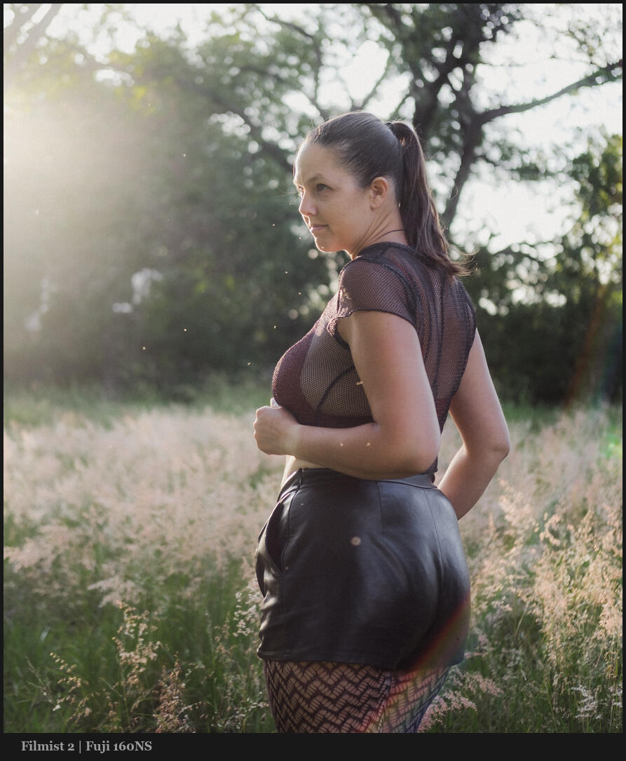
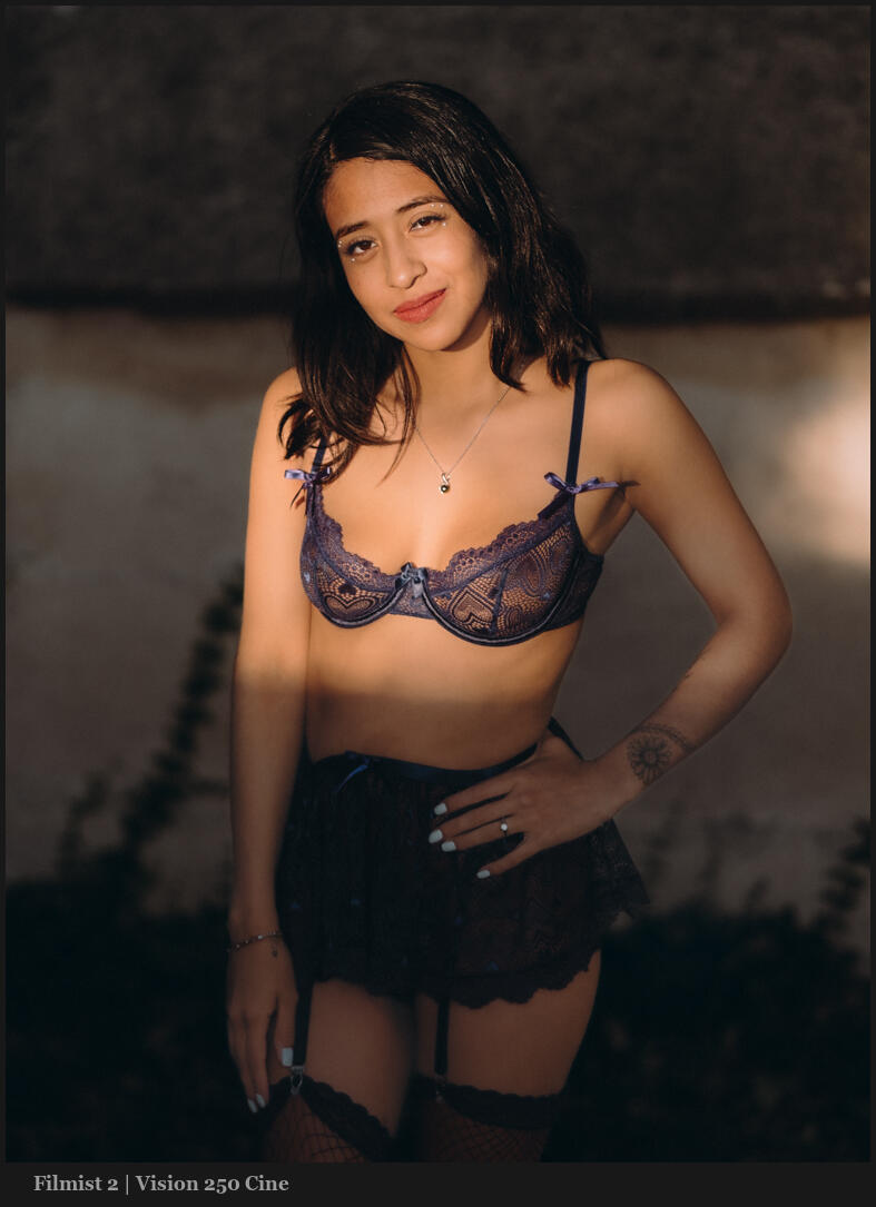
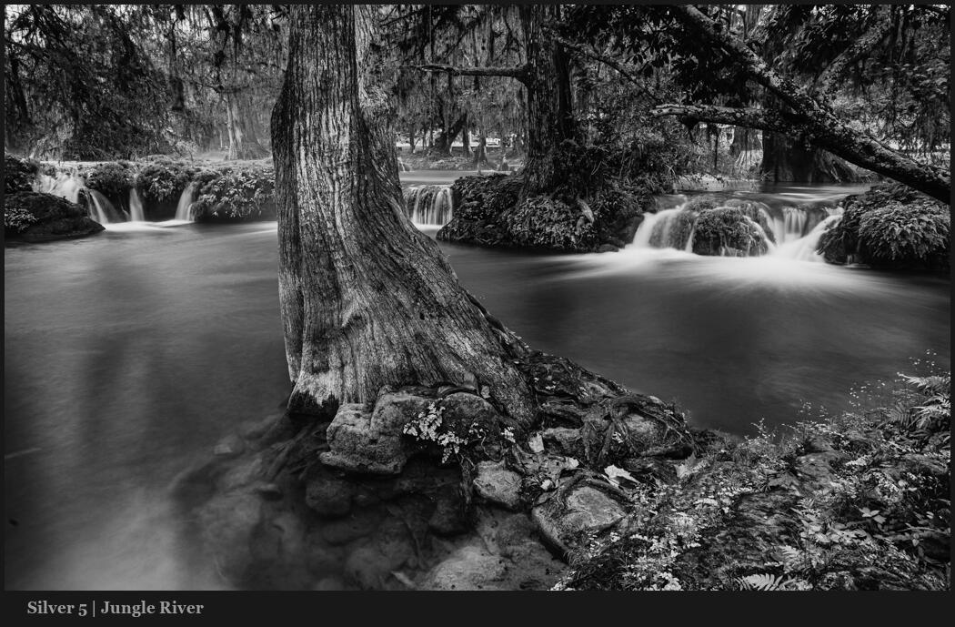
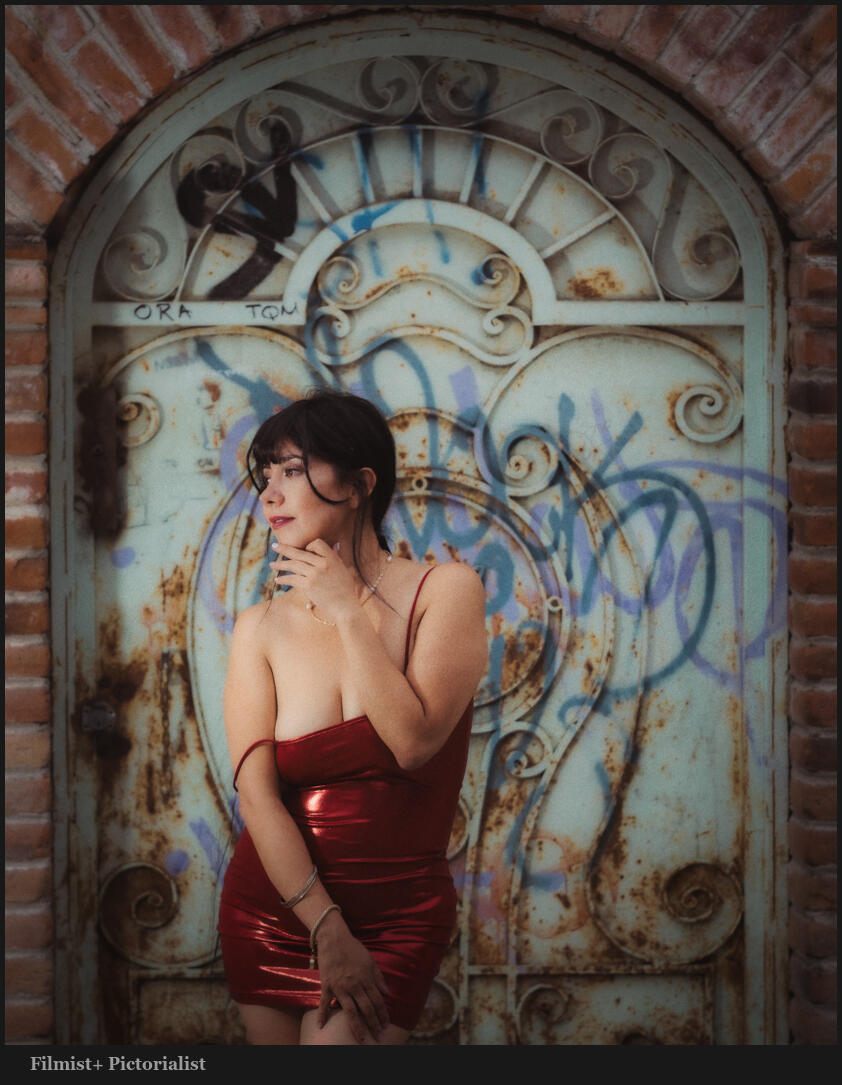
In these videos you’ll see me using presets like Filmist, Silver, Natural HDR and more. This lets me apply years of testing instantly. But everything I show you here can also be done manually.
Ove the past weeks I’ve made a series of videos on specific color channels and what they do for and against our photos. Most are being used wrong and with just a slight easy HDR color adjustment the change is amazing.
Look close at BLUE and how it’s messing photos up…
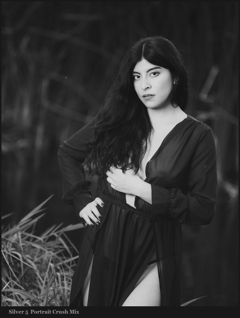
Yes, the color matters in Black And White also…
You may have seen one or more of these but this post brings the entire series into one place so you can really understand the power of Drop color and HSL channels in both color and black-and-white photography.
So last but not least. Here’s how drop color affects black and white and how you can instantly make more impactful black-and-white edits.
The blue channel in photos is powerful and most photographers are using it wrong.
The dirty secret of blues and how to fix them every time!
The video I did on drop color was a game changer for a lot of photographers because it transforms how you edit. But the color blue and the blue channel when editing your photos are nearly as powerful.
In the original drop color we looked at orange and green. So you would think that blues work the same. But they actually affect the image in a very different way.
You want to base your blue channel edits on the types of images and mix it with how you use white balance and other tools. But if you really want to know what blue is doping, use the fully down slider method I show and then move up from there.
A pattern of channels and light.
You may be seeing a pattern, Any one channel is pretty simple. But as you add another you start to get complex mixes that apply to any image. I showed this in my follow-up on the black and white color drop methods.
Yes, today’s blue color tips also apply to B&W photography as well. These are not about looking like film or any particular style. These are about controlling your color and knowing what color is important in each image.
Keep your results in a preset.
That said if you use my presets you’ll see these implemented in their correct form for each presets or style. Filmist looks may be more toned down, the Natural HDR looks may be stronger. But the methods are still being used.
You can download my free packs but even if you use nothing of mine when you get the right mix start saving your settings as presets for Lightroom or styles for Capture One and you’ll see they work across nearly any photo.
Most of us make black and white by converting color RAW files. That’s the best way. But even if you shoot monochrome digital or film, you must use these colors as filters.
Drop Color for black and white is just as magical as in color.
You’ve probably seen my video about Drop Color how 2 simple colors eliminate the ugly digital look and transform your process. It’s super easy but a game-changer. But what I didn’t tell you in that video is that this works amazingly in black and white with a slight twist. I’ll show you…
Like the drop color method of a color photo, the color channels on black and white conversion work the same on luminance values and help you create better black and white really fast.
This is the same concept as using the color filter on black-and-white film to limit the light of certain colors and create more contrast and tone. Only in digital do we have more control.
Don’t get locked into one slider direction.
So generally a drop color is pulling done the saturation, or in this case the brightness (luma) of a color channel in HSL. But you can always push a color like I show at the end of the video.
Remember that these methods give you control. But don’t get locked in. And if you pull one color, push another, and see what happens. Usually, blues are pulled for better skies, but sometimes you push them.
It’s the same with green and orange. I’ll show you a great example at the end of the video.
Use this to key your background!
Pay close attention to where I mention exposure. How all these sliders are essentially small bits of exposure but for example on a single color.
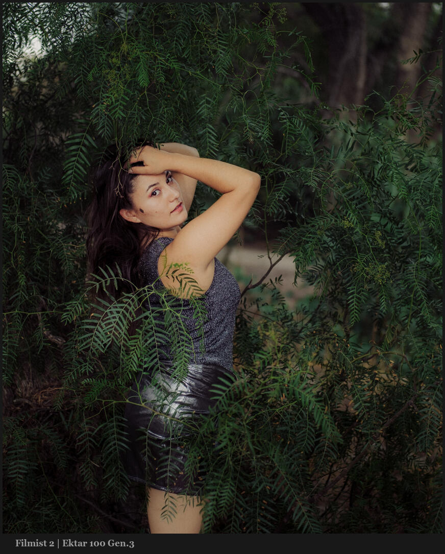
So look at the example I show you. By pushing up the skin tone like I did the image gets a little too bright for what I’m trying to do in the portrait. This is actually a good thing.
Because pushing the luminance values in my black and white makes the subject too bright I compensate with an overall minus exposure until the skin is in the Zone I want.
The magic is that it maintained the subject brightness while darkening or keying the background and creating a natural dramatic contrast.
Put the tips I showed you to work with drop color on your black and white photos and watch your edits transform overnight.
I’ve never seen anyone else talk about this, and it bears repeating. These two colors change everything in your digital photos. I’ll show you, and in this updated for 2026 post, give more examples.
The Two main colors that Digital gets wrong are…
To digital, most colors are pretty equal in value. It’s trying to be neutral. But when edited, they often get over-driven in post. In today’s video, I show a little-known fix for digital photos.
Green and Orange are where you start in this method. \
I know, right or wrong is relative to what you want to create. But the goal is always to bring focus to our main subject. Overcooked colors distract from that. Digital and cell phone photographs have gotten us used to this.
You can drop greens on luma and saturation. Drop the orange satisfaction also. But usually in Luma, I push it up as I show in the video.
Once you get this, your process will be simple, and you will control color separation. It’s easy, yes, but it took me years until the days I started comparing digital to film to create Filmist2, and I got it. But I’ve never seen anyone else talk about this.
Don’t overdrive both of these.
At times, you might want to push up a color. But it’s rarer than you think, even on a sunset. It’s even more rare that I push both. They nearly always COMPLETE with each other. Skin, foliage, etc.
I start with both a little subdued. Usually, I make this easy with a film preset like Portra 400 or Kodachrome 64. You’ll see that soon, your baseline edit is done, and you will see the details differently.
Even on landscapes, this method creates more balanced tones and beautiful roll-offs.
But it’s not all a film look thing. Even in tools like Natural HDR I am using it. In fact, HDR needs balance even more because there’s so much dynamic range. As tone pushes on digital, colors push up as well. Then things can start to compete. You’ve probably seen a lot of HDR that has greens or oranges that are just WAY too much.
Use DROP on other colors like BLUE.
Take this further by adjusting the settings and try the same on blues, purples etc. Green and Orange are often he most important to balanced edits, but the method can be extended.
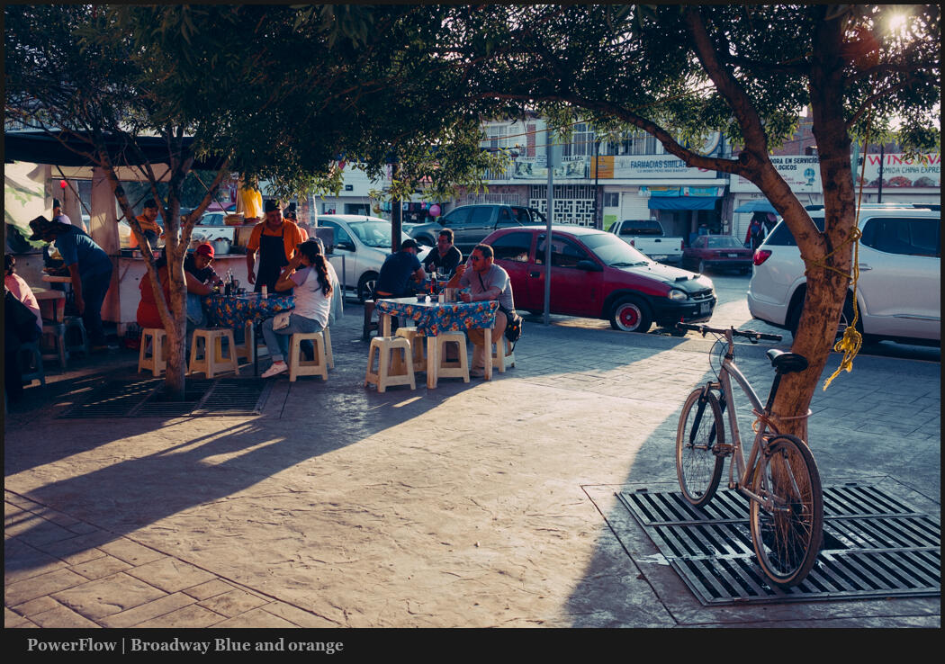
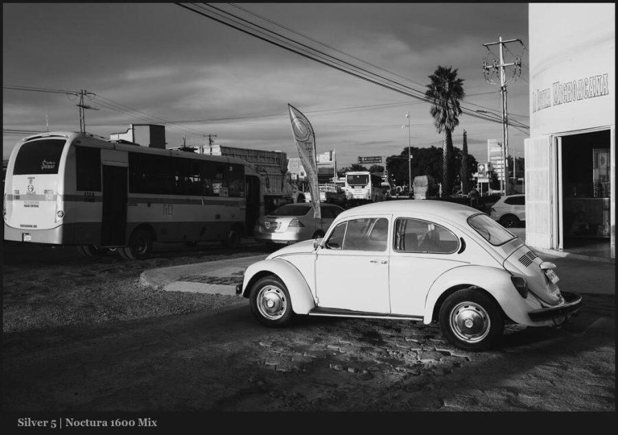
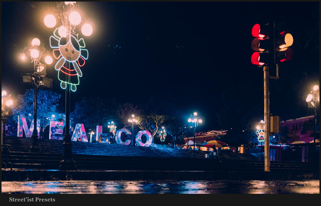
Digital drives colors hard because no chemicals are getting in the way. So once you start pushing, they all push too far. While the two primary colors should always be reviewed, you can see in this photo that moving colors like blue and red in a similar fashion as I edit this night scene with Street’ist styles.
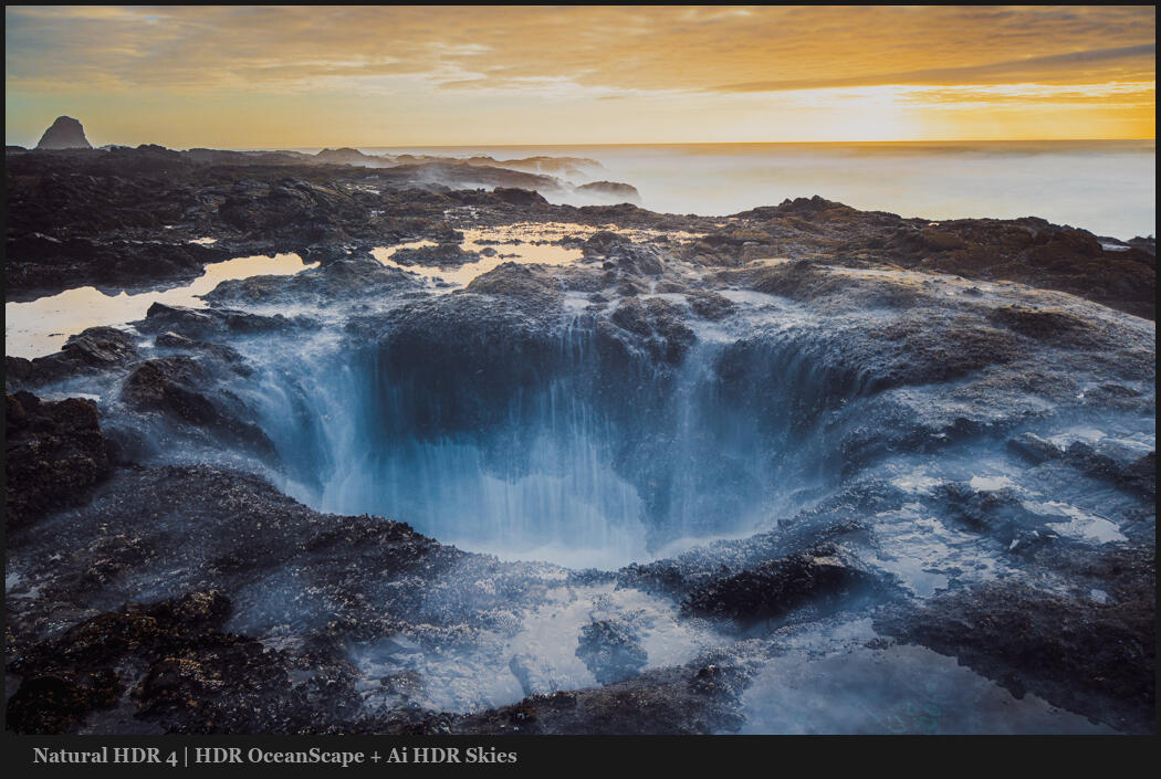
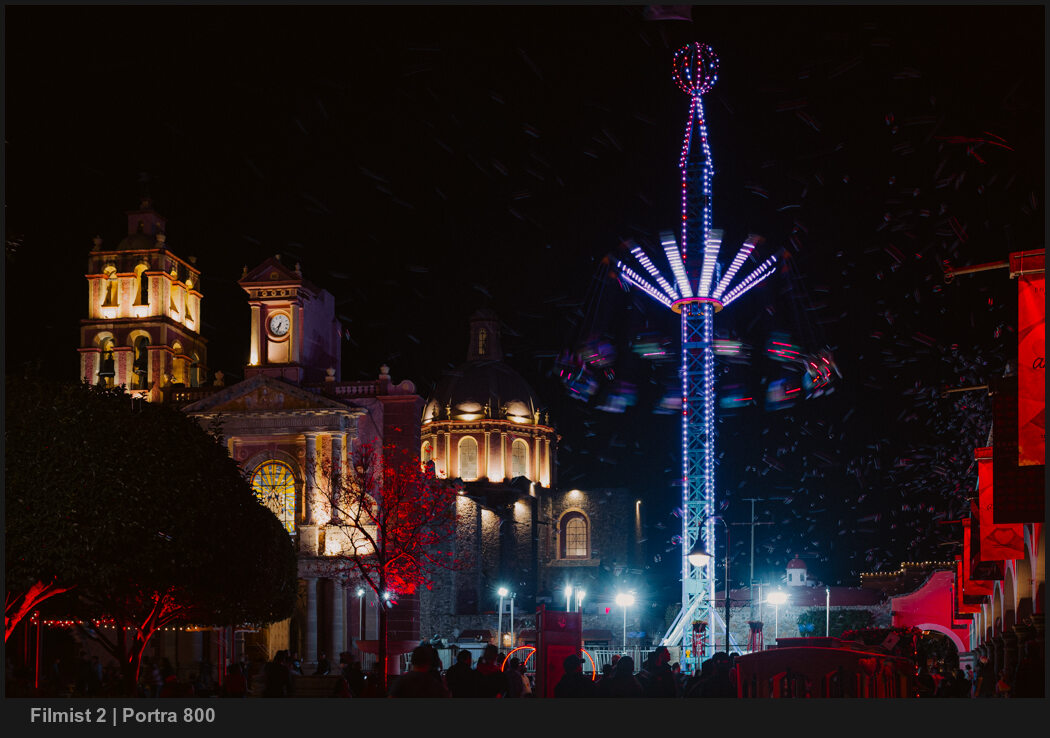
Above, the blue is strong. This can be a look of its own and worked here. But often it goes the other way. Look at the image below. Here, blues are dropped by -37 in LR. Not because blue is bad, but because the reds and warm colors are dominant here. Too much blue competes.
HSL is a tool you should always be using. Having a favorite preset or creating your own baseline with this will improve every edit and give you a starting point. But play around. Sometimes you want more, sometimes less. It’s knowing when and where that will be your superpower.
People are sick of subscriptions and hate Adobe right now (they really deserve it). Subscriptions were never for us. So today I compare Lightroom vs DXO Photo Lab.
LR vs DXO Photo – An alternative to Lightroom and C1?
Maybe, but it’s complicated. Quality tools like Capture One (that I reviewed here) are also turning against their users by going virtually subscription only. So I am going to start testing. Today we look at DXO Photo Lab vs Lightroom.
I mentioned Filmist which includes LUTS you can use right now in DXO! For my LR and C1 users, I used Silver 5, Natural HDR, and my Speed Masks.
Last year I compared Lightroom to Lumiar Neo.
It was not there at a pro level. Luminar Neo got a D in terms of pro-level ability in my review. Lets hope in improves but in the last year much has changed.
It’s a fun tool. But not a serious choice for a pro. We need better integrations and better process quality. But with Lightroom vs DXO Photo Lab 7, there’s a smaller gap.
Lightroom vs DXO Photo Lab – Speed
DXO also has some unique tools and it’s snappy. Something you can’t say for LIghtroom and barely for Capture One. Both are resource-intensive apps.
It’s DXO Photo Lab is not without faults.
The 20 minutes of the video is worth it because I’ll cover the important things that make a pro-level app usable for actual pros. Not just cool features that look good in a sponsored review.
Zero sponsors. This is my honest DXO Photo Lab Review
None of these apps sponsor me and I have no affiliate links here at this time. This is just an honest comparison from 20 years of professional experience doing real sessions. No shilling.
Rather than write the results of DXO nouse reduction vs Lightroom and extra tests like how it handles processing against Neo, Capture One, etc. It’s all in the video.
If you want more hard tests of these apps let me know and I will not hold back. DXO Photo Lab Vs Lightroom seems to be a real option. But with limitations that I hope they can improve.