March 9, 2009

Spring is nearly here and our sister site Seim Effects has just launched some great deals to kick things off. Check out the site for 20-25% any of their effects.

SE has lots of fans all over the world. Their Lightroom Presets and Photoshop actions work great and they have great service to go along with it.

If you’re not wanting to lay out the moolah, you should also check the freebies section of their site with all kinds of zero dollar goodies.

www.seimeffects.com

Read More

December 4, 2008

One of today’s big hurtles a good photographer must overcome is getting that amazing final edit. If you take your image straight out of the camera and leave it at that, you probably won’t get much notice. But if you over edit you may not either.

Standing out is about being excellent as well as being different. Being different however is more than it suggests. Just looking different isn’t good enough if it’s not attractive to your target audience. The post production details count and are a process of learning when and where to apply them. Today lets analyze a recent image and talk about it.
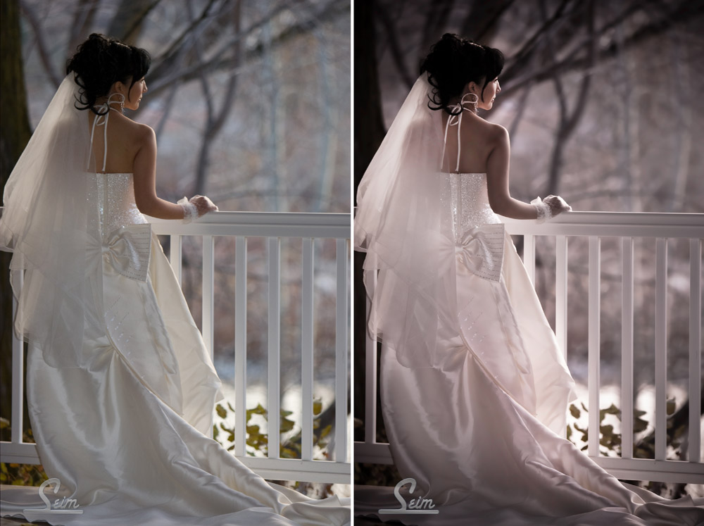
I call this shot The Gazebo. Though it’s a new favorite, it’s not an HDR or any other special acronym. It’s just a good foundation image, edited right. What I did to it was not so amazing, I just used the right effect at the right time.

The left side is straight out of camera. It’s good. I used my Canon 70-200 @ 150mm 1/125 at 2.8 ISO 320 with just a little fill flash. I  got nice compression and blur in the background. The evening light was coming from the right side and worked perfectly but was not really unusual.

I knew right away it had potential, so I started playing. Playing is the the keyword here. I use Lightroom presets and Photoshop actions not because it couldn’t be done manually, but because I want a great variety and I would not have that variety by doing it all manually every time. The effects I used were my own, that are sold here in Seim Effects, but this applies to whatever you happen to use. I started with a vintage preset from Power Workflow2. I tend to use the vintage looks sparingly, but it worked well with this simple scene.

Then it’s on to Photoshop. I used the Old Fashioned Love Song from Hollywood Effects. This helped me manipulate the light into something more interesting and glowing. Then thinking it needed a touch more I ran Simply Soft from Creative Essentials Actions. This is a skin softener. As I did this I used the masks to remove blur from areas of detail like the face.

Finally I finished up the way I normally do, by working with burn and dodge. This is a tool that most people overlook, and it’s one of those editing gems that’s right in front of us. I can draw the eye wherever I want it using burn and dodge. If you want to learn more about that see this post.

So there we have it. The finished product took only a few minutes and had that dreamy loving look to it. My point here is not that you need to use these specific effects to get your look. It’s that you need to do things other than just taking the picture if you want a portrait.

Set up your system so it’s easy to add effects, because otherwise you’ll avoid them. I have my favorite actions or Lightroom presets a click away, and when I’m working on a good shot I’m not afraid to try various looks because I can try ten different effects in the time I could do one of them manually. Also use direction. Just because you find an effect yon love don’t apply it to everything. balance is key and one of the most common mistake it to over do things. I often apply an effect and the fade it back so it’s very subtle, but makes my image more powerful.

What do you see in this image? How would you have done it differntly? Share your ideas in the comments… Gavin Seim

Read More

August 27, 2008

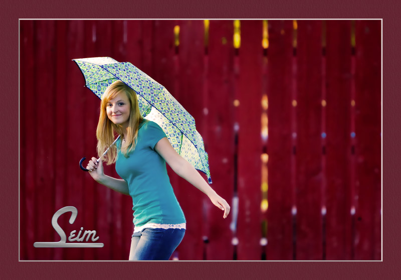
I’ve been on the run with seniors this part week, and loving some of the results. Between a great subject, the umbrella, and the cool fence this was exactly what I wanted. I’m humbled at God’s amazing world that we use as a backdrop, and often take for granted. Even a simple wood fence can give just the look needed. Simplicity is KEY to a great portrait.

On a technical note, I know her hand is positioned a bit odd. I like the feel though. I try to encourage hand movement and let things go naturally. I just presetted with Power Workflow, and them smooth with action. My latest fav it the Simply Soft series from Creative Essentials. It’s just simple, and soft. The border is done automatically with a color coordinating action I made.

I getting into what I call the three keys. The eye’s, the moth and the hands. I think the key to controlling all these is learning to direct your subject in such a way that it happens naturally.

See more from this session on my siteGavin Seim

Read More

August 20, 2008

Our Power Workflow lightroom presets are our most popular tool. Hundreds of photographers are using Lightroom with PW to keep their workflow going ultra fast. Our other presets, as well as the actions are also very popular, and we want your feedback.

I take Seim effects very seriously. I field test my presets and actions while under the gun, and I’m always looking for ways to make them better than before. I was just using some new Presets this weekend while at a wedding, and I’m pretty excited about what we’re working on.

So how could we improve our products. Organization, naming, categories, the way effects are applied. These are all things I try out and think about when working to make updates. What are your thoughts, and what would you like to see made to help us help you improve your editing??

Leave us a comment and let me know, or shoot me an email directly. A appreciate your feedback.

Also make sure in the S.E. club by being a a fan on Facebook. You’ll get updates, and most of all free goodies and effects to try out.

Gavin Seim

Read More

May 30, 2008

If you follow my photography blog, you probably saw my latest digital art work, that I call Road to the past. As promised here is the details of how I made it.

Animae effect with Road to the past

I recently saw the movie Speed Racer, and liked the smooth saturated Anime like feel. Not that it would work for every image, but it had a good feel. So I started to work an some actions. I frequently get visual ideas from movies, and movie posters, and though I’m sure this does not meet the official standard for Anime, it was inspired by that look.

I‘ve finally found a sweet spot with a few adjustable actions that give a saturated, Anime type look, without looking fake and foolish. Here’s a bit of what I did to get this image.

This is my original image. This was taken on a side road of HWY 12 in Washington. A cool shot, but not yet spectacular…

My first job in making this into digital art, was to clone out the things I didn’t want. The goal here was not to make an exact representation of this scene, but use it as the model for the piece I really wanted. I also added some clouds in place of the blank sky that was in the corner. Below is the cloned version.

So when all the cloning was done the rest was easy now that I had the action I needed. I ran the effect I’ve titled Anime II, and then spent some time doing final adjustments on the layers & masks. Lastly I added subtle beams of light (look far up the road) to add some dimension do the image. Basically this was dome by painting white lines on a new layer, blurring them, adding a little outer glow, and then setting that layer to overlay mode.

I‘m happy with the finished product, and it looks great in print. I feel the effect is not too over the top, and yet still has a good feel to it that offer something more than just a plain photo. It’s close to that line between painted, and photograph, yet without looking automated. I’m defiantly loving these actions

If you want to hurry me along making these actions available, or want to be added to the notification list just drop me a note… Gavin Seim

Animae effect with Road to the past

Read More