May 13, 2012

The Forest Pool - In this split, we see the base toneapped merge and the final edited burns, dodges and detail work side by side. Not all images are this extreme, but tone control used well will always give your image that finishing touch.

by: Gavin Seim. Tone mapping and image processing without tone control is like having a lens without focus. It’s nothing new. Good shadows & contrast make an image. Without them we often get what I call the Flickr HDR. And trust me, you don’t want that 😉

Leveraging tone to keep the subject the subject and the supporting cast, supporting, is critical. Good tone control is what separates the men from the boys in the world of imaging and we can’t talk about it too much. I think we sometimes get distracted with the latest techniques. But generally they’re not really that new. They’re just new ways of doing things people have done on film for decades. Take HDR. On film, every image you made was HDR if you managed your light and processing well.

So then HDR. It’s not a style and it’s not judged on how many images you use, or whether you tonemap in Photomatix or Nik. It’s simply the management of a high range of light. You can do that with film, layers, tonemapping, channel mixing, brushes or in the camera.

In this example of a three exposure tone mapped image, you can see how much work I had to do to reign in the tone values. A tonemapped merge shows this more than a single file would. It tends to push everything to mid tones. After which, those tones have to be managed. Either that or you have mid-tone chaos. This is one reason I often manage dynamic range manually with layers, rather than tonemapping, but both are fine as long as you have a plan.

What I’m getting at is that an image must have a subject. Just one. Everything else needs to support that and it doesn’t matter if you have a single RAW or a tonemappped HDR with loads of range. Tonal control helps the eye focus. Without that focus you’ll nearly always have an image failure.

I’ve studied tone for years now with the legendary Ken Whitmire and even more on my own. It’s taught me to see light. Not simply that there is light. But what it’s doing for me. I see a lot of potentially great images that fail without any tone control. It generally means no cohesive subject. No one is talking much about tone. But if you do it right, the viewers eye is lead right to the subject, every time, no matter how many elements are in the scene.

Using the Zone System really helps with this as it quickly teaches you to manage tones better and make things as good as they can be in camera. See this article. On the editing side often a burn & dodge, brushes, or layering of lighter and darker frames makes the diffence. The bottom line is that while there is no rule on how we control tone, it must be done if we want a focused image that draws the viewers eye and showcases our subject.

This is something I go into at great length in my Lights & Shadows workshop and my EXposed DVD. But the main thing is to keep working with it. Cameras, the latest software and the latest techniques are useful things to study. But tone control is timeless and is never superseded. Without it we can expect our images to fail or to be little more than snapshots. Every time.

Happy tones… Gavin Seim

King of the Valley - Valley of the gods Utah, Spring 2012. A gentle tone controlled single exposure. See more of Gavin's American Pictorials on f164.com

Read More

November 17, 2011

by Gavin Seim: I worked with Ken recently on a promo video for his Wall Portrait Conference (incredible workshop by the way).

So after shooting the clips for the promo, Ken just say down with me and chatted on various topics I prompted him on. I’ve pretty much removed myself from this video and what remains is about 17 minutes of gold, as this renowned portrait photographer talks about out craft and how he see’s it.

Ken’s a really neat guy with more photographic awards than you want to count. But he’s always eager to learn new things and share ideas. It’s really cool. You can also view the HD version HERE.

Note: This post was copy-edited and re-shared in MAy of 2018. Ken passed away in November of 2016, but I left the tense and language as it was when this was originally written.

Read More

July 9, 2011

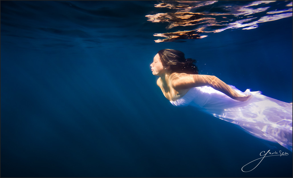
The Siren of Lake Chelan. Commissioned Portrait, Summer 2010 by Gavin Seim.

Water. Once we sink below the surface of its shimmering waves, we enter a foreign world of untold beauty. A silent land of bending light, murky depths, and unknown dangers…

Whew, did that sound enough like a nature show for you? Good, now let’s move on. Seriously, though, I working with water and I loved making portraits under it. I did it for the first–though probably not the last–time during a portrait commission for Jenaia. I learned a lot about working in the water, and we brought her home some beautiful images, but this is my favorite piece.

It took some trail and error, but my visualization was a calm ethereal portrait, and I think I managed it. I love the color hues and the way the light streams from the surface. We’re in a lake, not a pool, and it’s around 1500 feet deep, making the light fade into infinity. Just don’t drop anything that doesn’t float, or it’s gone for good. I lost a fin during the project, and once it was out of sight, there was no way I was going after it. It’s truly dark down there.

While my fin has joined the aforementioned murky depths, I’m very satisfied with this work. It taught me a lot and it helped make Jenaia’s portrait collection a real success.

For photographers. How it was made…

Read More

August 1, 2009

by Gavin Seim: Updated 04/2012:

Have you ever admired classical art hanging in a museum? Maybe Sargent, Bierstadt, Rembrandt? It’s from the painters that we inherited this profession and every photographer should take time to look closer at what they did. You owe it to yourself and your clients to start placing appropriate sized pieces on walls. Photographers have missed much of the furniture quality appeal of their craft. Part of the problem is that they think of themselves as photographers. As camera operators.

We are in a saturated industry that’s in a rut of low grade commodities. But it’s time to change that. Hemingway was not a typist, he was an author. Those that have the skill to make quality wall portraits are not camera operators. They are artisans. Anyone can take pictures, but being a master of photographics is no easier than being a master painter. The mindset we have effects the product we produce. I Am Not a Photographer (see article).

Now it’s not only the fault of digital or too many people with cameras. We’ve trained ourselves and our clients to think small. It’s something that goes back to the early days of the wet plates and small contact prints that we’ve never quite escaped. People walk through our doors thinking in 8×10’s, 5×7’s and wallets. And we encourage them. It’s helping make photography a cheap commodity and it’s time to start changing all that.

Why should an 11×14 hang on the wall? It probably shouldn’t. Chances are the wall is much larger than that. But we’ve fallen into a rut of thinking small is all people want and need. Some tell me that “people won’t want these in my area”. But I’ll be blunt.. If people aren’t buying wall art, it’s because you don’t know how to make and or sell said wall portraits. I live in small town America and have discovered for myself that people love personalized wall art. You simply need to show them the quality and value of a beautiful appropriately sized piece. But first you have to understand the value yourself. Lets look.

120×72 – Among the Sierra Nevada Mountains. Albert Bierstadt, 1866. Birstadt is one of my favorite Husdon River School pictorialist’s. Amazing work at stunning sizes. Click this one for a large version. It’s amazing.

When you walk into a furniture store are they afraid to show you the larger dining set that fits your room? Do they act like it’s a stupid to buy the Italian leather instead of the cheap import? No. The only reason clients are asking for 8×10’s is because we’ve trained them to. Try showing them a thirty inch framed canvas of their beautiful family and see how they respond. If we do it well, we’re moving towards fine furnishings.

It’s been about 5 years since I first attended Wall Portrait Conference to really learn about all this. I know it can work, because nearly every client I have purchases at least a 24 inch heirloom quality print for their wall (I charge around $600 for those). That’s my smallest wall portrait size. I’ve sold up to 70 inch pieces using these same principles. Not because I’m a hard sell, but because I’m making and showing quality pieces that myself and my clients can really be proud to show.

But rather than simply making my own case, allow history to help. Below are some classical works, listed with their original sizes. We think of these as classics now, but when made, they were often commissions meant to hang on someones wall just like our photographs. Take a few moments to really look at them, then I’ll be back. And if you want to and get inspired in print form, check out some books like Sargent’s Portraits Of The 1890’s, Frederick Church, or J.W. Waterhouse. Or for the lover of pictorials like myself, here’s a stunning book on the Hudson River School era of painting.

46×34, Portrait of Nicolaes Ruts. Rembrandt, 1631. It seems that even 300+ years ago, a wall portrait was a thing of note. Look at the quality of this work. Click for a larger version. Even the catch lights look perfect.
Waterhouse-gather_ye_rosebud_39x32
38″x32″ – Gather Rosebuds While Ye May by Waterhouse 1909
The Voyage Of Life, Manhood
80″x52″ The Voyage Of Life, Manhood by Thomas Cole, 1842

Read More

June 28, 2009

This has been in the works for a long time and I think you’ll find it’s been worth the wait. I’m proud to announce the immediate availability of Hollywood Effects version 2. Hollywood Effects has been a popular set for photographers who wanted to add something special to their best images after basic corrections. Version 2 it taking it to a whole new level.

V2 completely replaces Hollywood Effects 1, with many new effects and improvement to many classic effects for easier customization and better results. V2 is setting a new standard. This is killer set of actions with some AMAZING new effects.

Portraitist: HE2 has something for everyone and especially for portrait photographers. HE2 includes the full version of the brand new Portraitist Series actions. Change the way you work with skin by automatically smoothing skin and masking out critical areas like eyes, making a portrait that’s ready out of the gate. Similar to effects done with plugins that cost far more, now in a simple one click action.

For current owners of Hollywood Effects there’s a discount upgrade program.  For those that have purchased Hollywood Effects V1 in the past 60 days (after May 30th 2009) we’ll be sending you a FREE upgrade to V2. If you have not received your discount/upgrade email soon, please contact us and we’ll hook you up.

You can learn, see samples, watch the video and purchase Hollywood Effects2 right here.

Enjoy… Gavin Seim

Read More