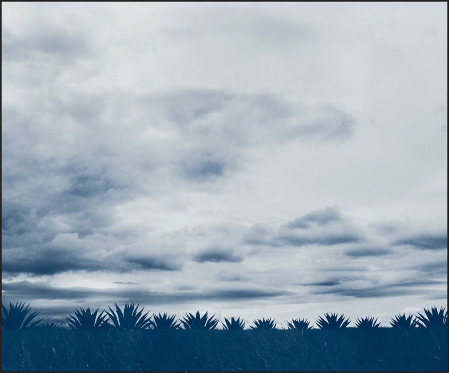
We’re always talking about high dynamic range. But today’s videos are a keystone much like our = STOP using contrast from the last Masters Made Easy video. LoFi photography is actually fundamental to understanding your photos.
No LoFi Photography is not just a lomo camera or a filter on Instagram. It’s just as important to shadow hunting as the High Dynamic Range techniques as I explained in my recent video.
Many photographers no longer edit Low Dynamic Range.
LoFi Photography goes way deeper than people think.
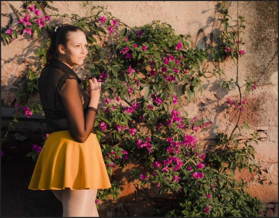
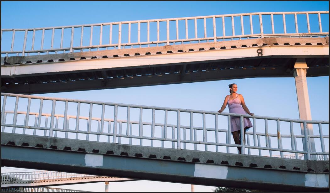
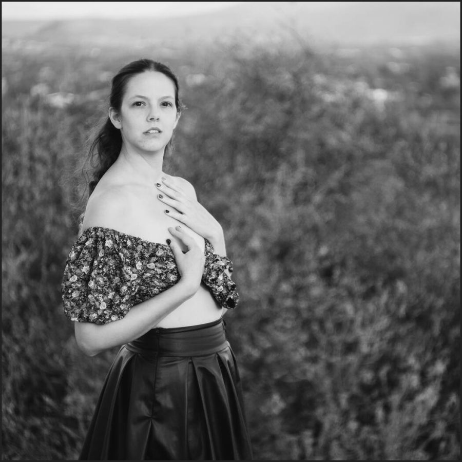
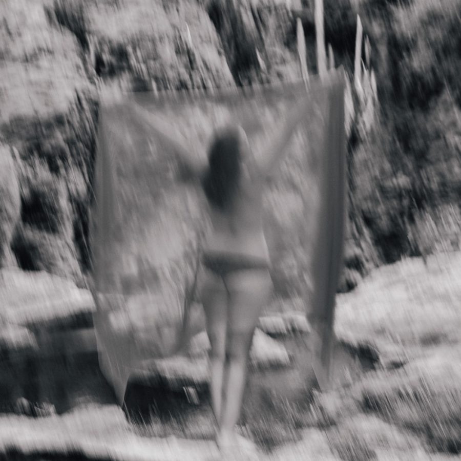
LoFi Photography is often played as low quality, pinhole camera, etc. While those can be included, it’s a really low dynamic range technique and it’s important when you plan a shoot.
I know I say it all the time but this LoFi photography fits in with Shadow Hacking 101 so make sure you come to a Shadow Hackers online photo workshop.
LoFi photos take what everyone else throwing out and it often creates better photos. You don’t need to do all LoFi or all HDR. A lot of photos fall in between. But don’t be afraid to push the methods I show in the video to refine your style.
Reverse the things they teach you in LoFi photography
We’re almost universally taught to push sliders right in the digital world. A more is more kind of approach. That’s why most photos look so bad and even good photographers are ediuting to death. We went deeper into this in my post about how to ground your edits by using filmic presets.
I’ve been doing this since the start of digital. I’ve watched the influencers and experts nearly always selling the same ideas and repeating ourselves because they came from film and all the digital stuff was new and like candy. Candy sometimes lacks perspective.
Slowly that’s changing as digital matures and photographers realize that we still have a lot to learn from the past.
Stop speaking in just digitally.
We live in an analog world. The advent of Ai photography is reminding us just how fake everything has become and that the real world is often more magical. LoFi photography is not every part of the puzzle. But you nee to know it.
You can still do amazing complex edits. But by knowing all the tools in your box you have control. Yes, your capture can be HDR and your final LDR, or vice versa. When you know to hunt shadows and look for the atmosphere and life in photos everything starts to change. There’s not just one way and you need to know them all to master this. The good news is, it’s not that complex.
Stay tuned for more in the Masters Made Easy series.
Grounding is having a starting point. Filmic Lightroom presets and styles help a lot. But your style can still be whatever you want. I’ll show you why in today’s video.
Why do most in-camera profiles look bad? Why do I come back to an edit I liked and it seems gross? It’s because digital edits lack a reference point.
You lacked a baseline and went too far. It happens to all of us. Filmic Lightroom presets and styles are not just a hipster fad, and if you’re still not using them you are missing out. So first we’re going to base our edits as close to real analog film as possible. Don’t worry you don’t have to stay there.
Much like Shadow Hacking, which brings you back to in-camera thinking. Filmic Lightroom Presets presets and styles seem simple but are not. I was a skeptic. But today Filmic Lightroom presets are my go-to for every session and for the past 5 years I’ve been developing better film and filmic presets to improve this process.
There is a shadow atmosphere happening here even though the EKtar 100-like. A level 2 film preset in Filmist is not super intense it constantly works and is a grounding development process.
2. Reset your editing brain.
You might be thinking… Nothing new here. But the more you use this process in your edits. Level 2’s especially. The more you realize that these film stocks lasted decades for a reason. They seem simple at first you soon you realize well they are grounded and complicated.
Apply a film you like to every photo. Do your quick exposure adjustments and get the session looking balanced. When you edit with film-like presets and filmic styles you get perspective.
Street air is a preset from Street’ist. This level one filmic preset has a lot of color and nuance like a chemical film, but does not try to be any specific film.
Look how I came back and re-edited the session with Portra 160-like film preset and a few mods. Each pose is slightly different, but they all have a constant feel. I like them gentle like this but my old self would want to add more mods, saturation, etc. That’s fine, as long as you have grounding to keep you on point.
Soon you’ll find yourself going back to old edits and now they seem strange and overcooked. You reboot your brain in terms of editing. It does not mean other filters and edits are not important anymore. I still use Natural HDR or Bella 2 which are not specifically filmic.
A re-edit of a session a more refined film edit and a good grounding from analog.
In this AI World, real things are gaining value.
And so we relate to and believe in analog things. Especially in this new AI-driven world where sometimes everything feels fake. This level of photography is going to become more important every year and Filmic Lightroom Presets help me stay focused.
Yes, there’s a level 3. Shooting digital side by side with the real film and using that as your grouping for shadow, color, and editing. I do this to practice and further refine Filmist for example but it gives you even more grounding and perspective.
Even the way we adjust exposure changes with analog. Pushing the exposure slider is not the same as pushing film and as I’ve become more advanced in my Film presets, even the mod presets, curves, and exposure settings have improved.
The creamy shadows of this Delta 3200-like. You can mod or turn these presets up to enhance the effect. But I start simple and natural to get a good grounding.
3. Edit grounded. Then move outward.
The grounding keeps you constant even when you’re not doing the filmic style.
So for example I will go to Filmist and use Potra Ektar-like film lightroom presets. Maybe Fuji 400h. I know these analog looks withstood the test of time and that our minds relate to them.
I don’t have to stop there and I may not even stay with a film look. Grounding your edits sounds boring, but it actually makes you flexible and creative and keeps you out of a rut. So even when I go to HDR, that grounding is affecting my edit.
It does not always stop at a preset. Sometimes I take go further into Photoshop and use chemical-based edits like this cyan plate platinum mix from Emulsion 4 actions. Analog just keeps giving.
So I look at the mood and shadows of my shoot. I may decide to veer from film and use other effects, actions, edits, or presets. But now can really feel where I am in the edit better.
It’s about rebooting the brain to see past the temporary creative blindness that the ever-changing sliders and tools can give us so that we use those tools better with each unique photo session.
At least grab the free Filmic Lightroom presets, film styles, and LUTS I linked above and try them for a while. If they seem not intense enough that’s normal. Your editing brain will soon reboot and you will open up a totally new horizon.
This is a Level 1 Filmic Lightroom preset from Natural HDR. That is it’s using film tone and color inspiration but not trying to be a specific film. I use these liberally but not as my grounding point.
So Let’s Recap…
Ground the baseline of your edits with edits as close to real analog film as possible. Use Filmic Lightroom presets and film styles, or even create your own.
Edit photos with favorite films and use that as your grounded starting point. I will often start with Portra 400 or Ektar as my baseline because these films work on anything and I can apply them to an entire session.
You can expand out with mods, other filters, presets, actions etc., and the final look for your project. Use your first edits as a reference to not edit too far. Staying with the film is also fine. I often stay with the film look/
I hope this helps you refine your edit process as much as it did for me. Let me know in the comments and if needed I’ll do more videos on this. Gavin Seim
With Filmic Lightroom Presets like Portra 400-like, you almost can’t fail. Styles like Velvia 100 like let you stay colorful and still know you’re on point and not over-cooked.
Merry Christmas. I started creating presets 15 years ago before the rest existed. I always gave you free preset samplers from packs Like Filmist and Natural HDR. So today I’ve made you a perfect starter pack of free black and white presets from the new Silver 5 presets.
This free black and white presets pack includes 5 hand-picked B&W styles for Lightroom, Capture One and RAW
I also added a few mod’s from the brand-new Mod-Kit that’s included in the complete version to show you how fast it will make you. I even included one of the AI mod tools in the LR version!
There are 3 key elements that create better black and white. Watch this video and I’ll show you them as well as how to use these black and white presets to level up your black-and-white.
I, the video, my secrets to using black and white presets to edit!
Take special note of how each Silver preset takes a different approach in how it mixes your tone using the 3 keys for a perfect black-and-white recipe. Once you have the complete pack, you’ll see this extended much further but just as simple and easy to apply.
Some are perfect for portraits, others for rich streets of the landscape. That’s the key to mixing the tools and completing your vision!
Natural screens often benefit from a more crushed dark black and white and you’ll see great examples of that even in the free presets of Silver 5
You’ll quickly see what I showed you in this Silver 5 training video from my channel. How when you have advanced formulas you are more creative with your edits than any purist who tried to create a recipe from scratch every time. They simply never get this deep in their edits. That’s why presets are essential.
I hope you enjoy this free black and white presets pack.
Please let me know in the comments. See just how much time a good black and white presets system will save you and take a look at the complete Silver 5 pack as well because this free presets sampler pack is just the beginning.
Gavin Seim
Good portrait presets tend to focus on softer tones and the skin color channels are very important.Download the free Black and white presets from Silver 5 and try all these elements in your photos.
Photography has seen many transitions. Glass plates to film, black and white to color. One of the biggest was the film to the digital which saw many photographers unable to transition.
Will we photographers be needed in a world of Ai?
I’ve shown you in recent videos how the Lightroom Ai with tools like Elegance Speed mask presets makes advanced retouching of portraits unreal. Watch that video here. But while we can’t do this in Capture One yet, it’s perhaps not as big a deal as it looks. I’ll show you why…
I’ve always started edits with presets like Filmist or Natural HDR. These work across LR and C1. Then I would go into Photoshop and use Alchemist or BlackRoom and others to refine. I still do all of this, but the new Ai tools make me do more in Lightroom.
We need to stay ahead of the curve but we don’t need to let every new tool change our look. Artificial intelligence is the buzzword. But tools like the Lightroom Ai masks are still not really that intelligent. They do however bring a sign of what’s to come.
For now, things like Lightroom Ai are about saving time. But do we really need the Ai, Is Lightroom really better than Capture One because of it? Is it the best way to edit or should we still use a little Photoshop or Affinity to refine our photos?
It’s pretty amazing what the Ai masks can do. This transformation was virtually instant using my Elegance Speed-Masks which define the parameters and stack the LR Ai masks in one click. But as we see in the video, other methods might take a tad longer but can yield nearly the same result.
In the end, it’s what we create in the camera that defines our photos. Let’s not get blind-sighted. But I also think software can be overhyped. A focus on creating with emotion and soul comes before the edit. The shadow hunt. I think those things are still king.
Don’t miss my next live Shadow hackers workshop so we can talk more about this. Also, leave a comment to share what you think about all these Ai tools such as Lightroom Ai.
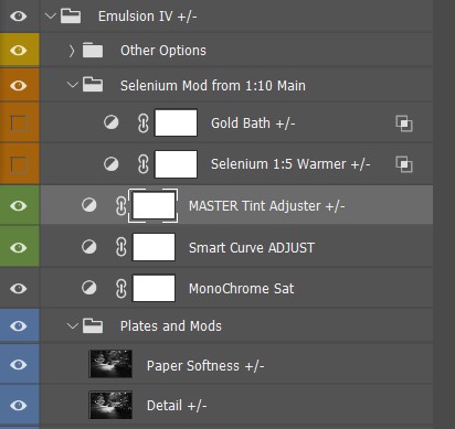
Selenium toning was an important part of the darkroom that nearly every photographer had used. It also translates well to digital and that’s what I’ll show you today. It’s great because it’s easy to make understated. So I created it as part of Emulsion 4, next to Platinum, Wet, and Cyanotype.
Even if you don’t use my Emulsion actions you can recreate this yourself using tone layers. First let’s talk about you should discover this magical chemical. I’ll add a bonus Emulsion 4 video at the bottom of this post to show more about how I’m doing these advanced tones that shift with tone value as they did in the darkroom.
Selenium was one of the most popular chemical baths for a darkroom. But it’s little known to the digital world.
Unlike early-era processes, such as Collodion Wet Plate or Platinum. Darkroom Selenium toning is a little more subtle. Of course, you can push it harder. But in a low state, it tends to make black-and-white photos seem more black-and-white with a natural coolness that feels less like an effect and like like a perfect print.
When to use Selenium on digital
In Selenium Toning you bathe a black and white print in a Selenium bath after the main print is made to balance color casts and make it richer. A chemical print often has a slight cast depending on how it’s processed. That’s often balanced out with Selenium.
Yes, we can use true neutral monochrome prints on digital prints. But adding light selenium can actually make your digital prints feel more like a darkroom print because it’s such a classic look from the darkroom.
Selenium works great in artsy kind of projects as well as in classic clean black and white prints. This is a mild application with a slight warm shift selected from the options in the Emulsion 4 easy layer stack.
Make your own selenium look.
My Emulsion actions make an easy-to-mix layer stack that makes it easy, But you can make your own too. Study what color tones you want to use like I did in my actions and use a tone-limited layer or a gradient map so you are getting a gradual application of color tints that changes acres your tonal range like it did in the darkroom.
Bear in mind that the color grading tools of a raw processor like Lightroom can get this general look. I included a Selenium tone for example in my Silver 5 presets. But what I’m showing you here with layers in Photoshop gives a more refined and rich result.
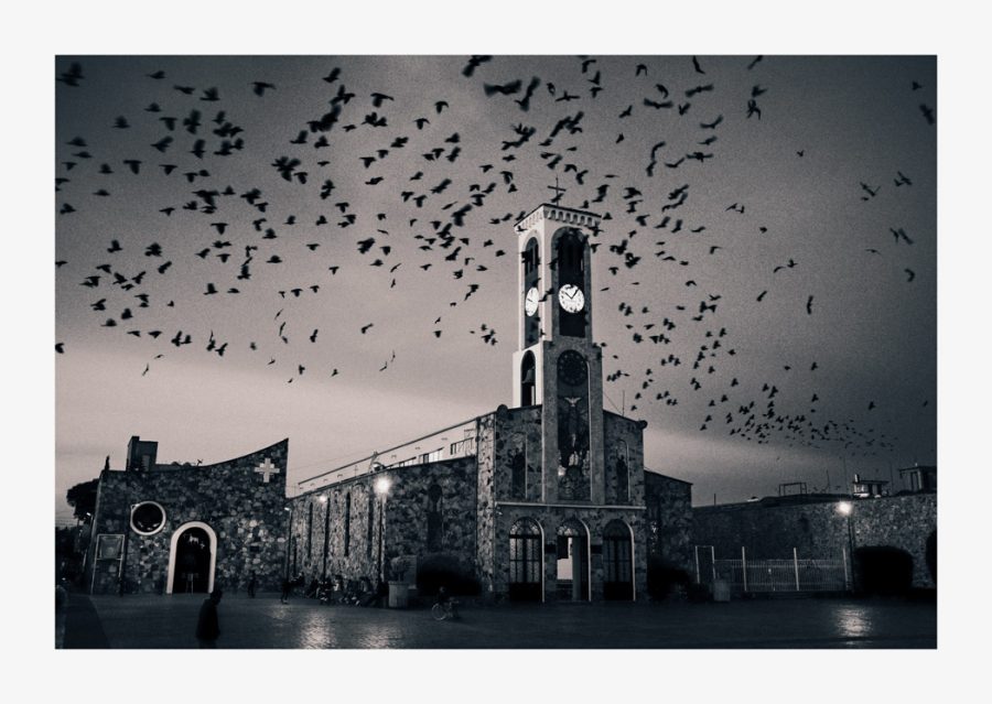
I’ll show you various examples here of harder and softer applications of selenium toning on digital files. Don’t be afraid to add your tones AFTER you add the border, as I did above in the bird’s photo. Since we print on pure white paper most of the time, this can add a more authentic, classic feel to the final image as in the darkroom bath the entire paper is involved.
Here I pushed harder in the master tint, with the Gold Bath option is added to simulate adding real gold to the process in the darkroom.
These photos can be silent or bold depending on you!
What’s cool is that the tone from it can be so light that it may not even be seen as a color effect, like in the photo below. You know it’s there only because it’s side by side. Selenium can be used as a color effect, or as a simple final process like this that still feels like a monochrome process.
Cooler, warmer, neutral. It’s all there with Selenium.
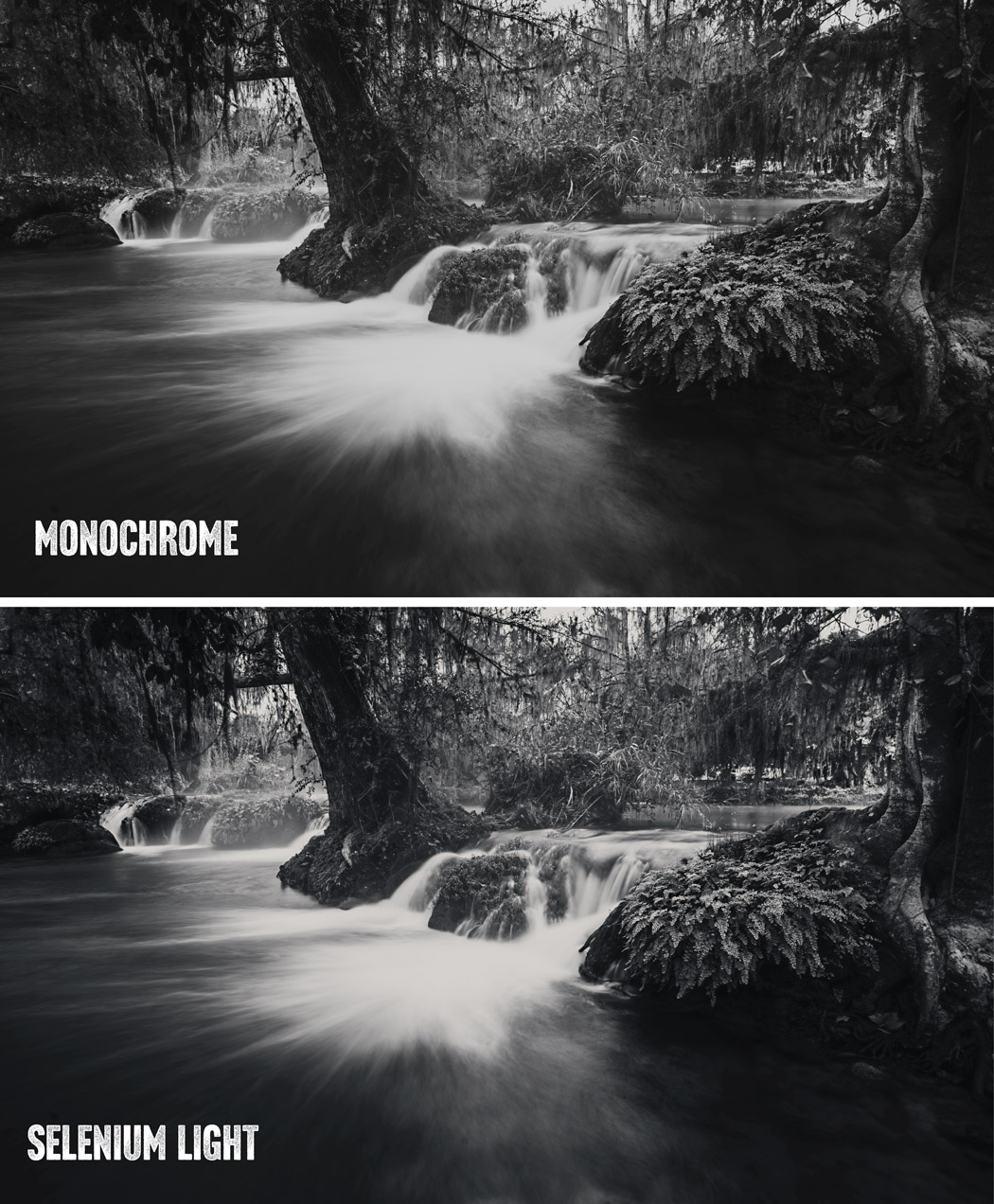
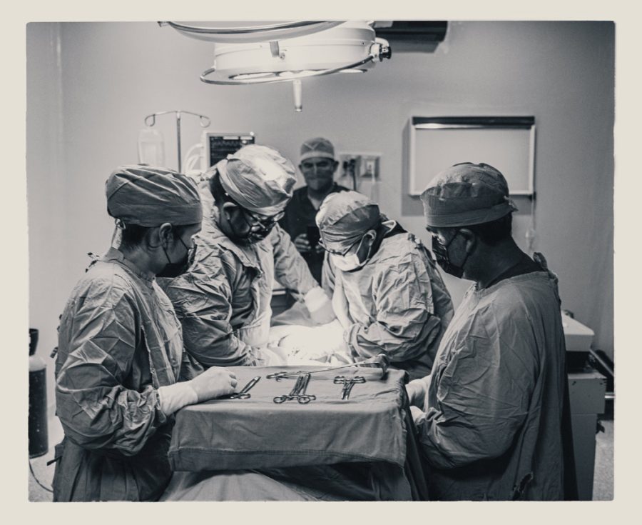
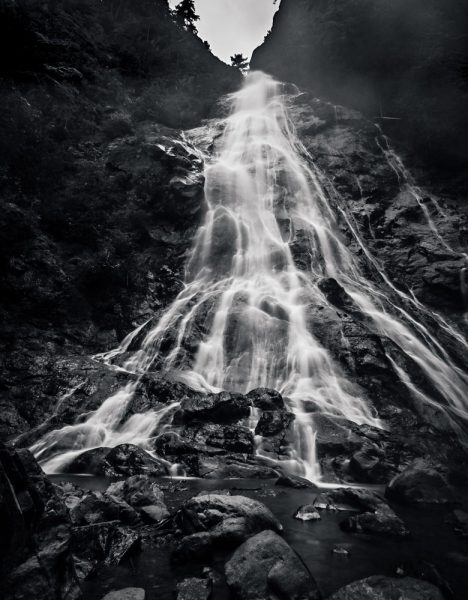
The top image seems slightly toned, but it is monochrome. The bottom is a light application of Selenium tone from Emulsion 4 emulating around a 1:20 bath ratio. The slight natural blue almost makes it feel more like a true B&W.Surgery room, Mexico. The warmer selenium 1:5 option provides a more noticeable tint without being overpowering. You can see here I added the tint after the border was applied from Naked Darkroom
It can make your black and white feel more real.
Some darkroom photographers use Selenium on every print as aside from its toning benefits it gives longevity to the print when used in the darkroom. It’s common in the darkroom, so when you see a Selenium black and white print, it might feel more like a real black and white because for many years it’s been a staple in the finishing process.
At a glance, the bath in Emulsion 4 may just seem like a light blue tone. In reality, it goes much deeper. That’s why I thought it deserved its own post here. I wanted to show why the Selenium bath is so useful to improve your black-and-white photography.
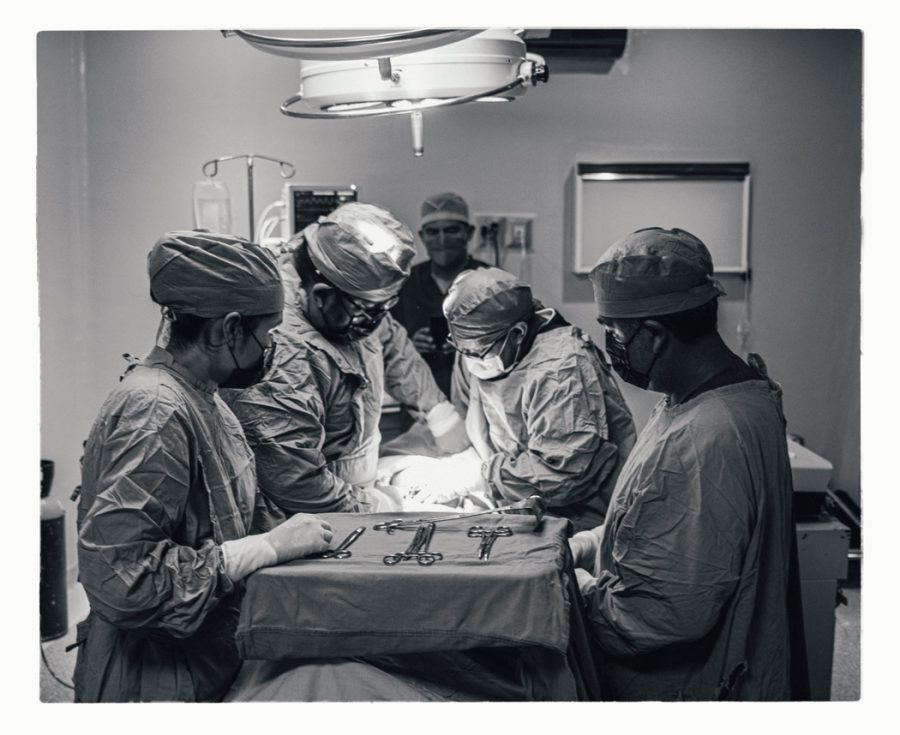
The same photo from the Surgery but with a classic process that does not warm. It’s just there and you don’t really think about why.
How I do Selenium tone edits with Emulsion like I show in the video.
The ability to print a true monochrome from a digital file is great. It can also be a little sterile. So when I had users of my products asking about Selenium Toning in Emulsion, I did my research to get it right for Version 4. It’s a process that changes based on the type of bath, and the ratio, and that has options often used in the darkroom like mixing the Selenium with other chemicals to get different hues and looks.
Selenium affects the shadows first and less in the highlights but these things can vary depending on how you process the print. So in Emulsion 4, I tried to stay true to that. The ability to quickly alter settings of the Selenium digital effect allows us to replicate that look and adjust it as low or high as we need using the master tinting tool in Emulsion 4 actions.
Here I used the 1:5% ratio mod. You see this brings tones more into highlights as it represents a stronger bath. I added a natural border from the Naked Darkroom texture to finish the presentation.A light clean bath in this portrait with the main tone layer at about 40% and the paper softness option turned up a little giving a natural Selenium tone that still feels black and white. Many love Selenium for this reason.
Selenium toning can also be a tinting effect in its own right.
Selenium is also popular in adding contrast. In EMuslion 4 actions you can even add a tone thinner which adds contrast and pushed highlights more as we get in a darkroom.
The layers in the main Selenium effect of Emulsion 4
Using the tone tool can quickly adjust the layers to like in other effects make the Selenium process lighter or heavier, emulating darkroom mixes and times. Paper softness lets me emulate a more matte vs contrasty process to infer an older paper.
I can also run the texture action to get paper-type looks. Of course, I can disable these for a more neutral print and retain a pure tone if I want to use a specific digital pepper for a certain look.
At times Selenium effects can be almost imperceptible, only used for the smallest tone or to add contrast while maintaining a pure black-and-white feel. Like in the darkroom, you can push in up or down using the options and mods in Emilsuon 3 and quickly get anything from a tiny adjustment to a bold Selenium that’s bluer or even mixed with other hues that replicate for example a stronger ratio or even gold mixed with the print during the process.
Don’t skip the toning that most people don’t even know is there.
Another light process of the base tone. It just looks black and white but the natural cool tone brings out the contrast.
As always the goal of Emulsion 4 actions is not to forget about the rich darkroom processes but to learn from them in how we create digital prints and images and honor the legacy that we have from the darkroom.
I hope you enjoy the new Selenium process and please let me know if you think it’s lacking in any way. Like all the looks in Emulsion from Platinum to Wet plate, I am always improving the tool. There’s a good article on Darkroom selenium tone prints and some of their variations here.
However you apply selenium whether it’s the slightest touch or a heavier warm tone, I think you’ll find this addiction to be not only authentic but very versatile for our black-and-white photography.
Keep making stuff and here’s another video of how I use Emulsion 4 to get various platinum and darkroom chemical looks. You can get my Emulsion pack here for Photoshop.