February 22, 2025

In my recent Filmist 2.4 update I improved various Lightroom presets and Capture One styles. But one of the biggest was the Velvia 100. Here’s what I found and what we can learn from Velvia 100.

The other films in my latest Filmist Update may have been overshadowed a bit by the new Kodachrome 64 update and the video I did on it that you can watch here.

If you missed last week’s in-depth video on Kodachrome 64 go check it out.

But I want to do a follow-up because I did a lot of Velvia testing and thought we should compare these Kodak and Fuji positive films. Because Velvia is the contrast beast.

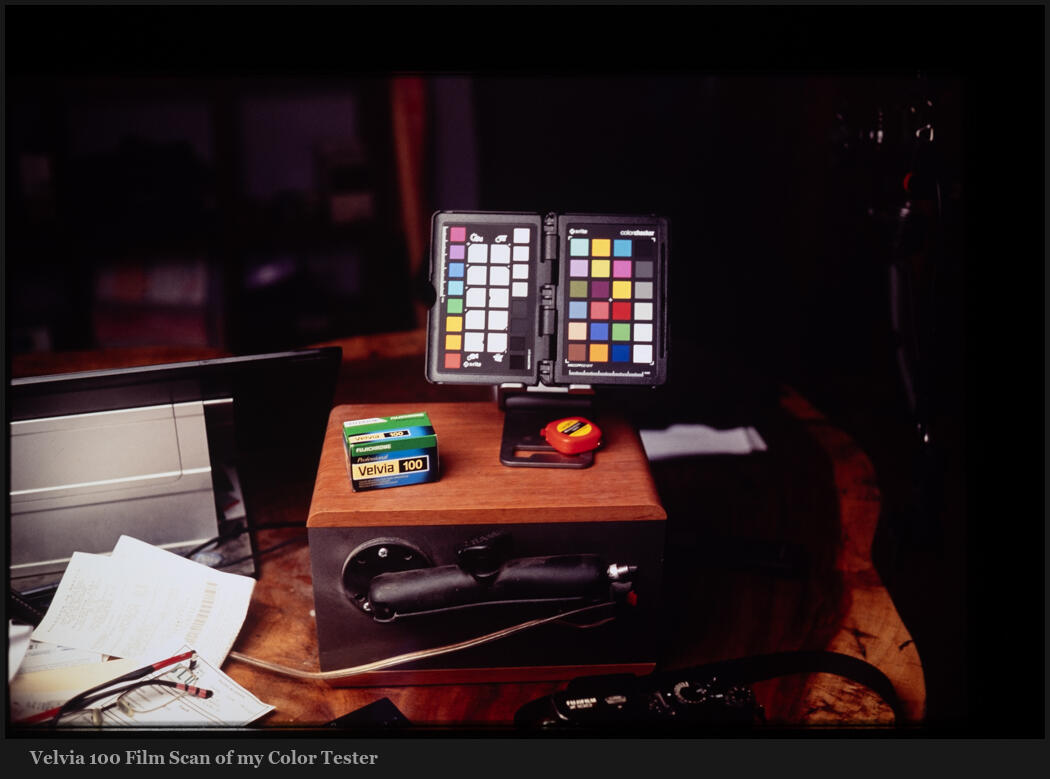
If film presets that are true to the film have a subtlety that can help us understand tone and color. Kodachrome 64 and Velvia are both color-positive films but each is unique. And while you can’t get Kodachrome anymore you can still get Velvia 100, in fact, I just shot a roll!

There had to be a lot of work on the red mix curve and midtones here. But they should not be as red as people imagine them. When you see really red in fil;m. It’s often because it was processed wrong.

In the same way in digital; when a process feels a little too magenta or yellow. Often a simple White Balance hack with fill it. See my recent video about color science.

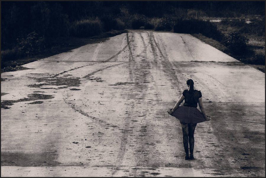
Velvia 50 is more red, but in Velvia 100 there’s more yellow and green. People also think Velvia is extra saturated. But in truth, it’s not that crazy. It does have a lot of contrast, however.

Real contrast is the most important thing we can learn from Velvia. That it’s not always about pushing shadows and having “dynamic range”. This film blows out easily and while it’s not ideal, it makes you think a lot about tonality. This contrast idea is talked about in my video, Stop Using Contrast.

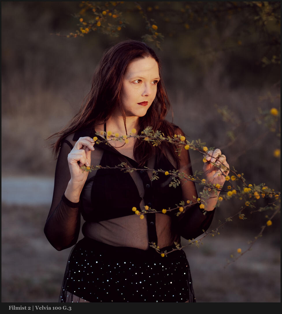
Velvia is the opposite of edits like I made in Natural HDR or even negative films. Notice how it’s more contrasty with popping blacks and whites. This is true to the filmstrips I got back from the lab. That does not mean it’s not stunning for portraits or anything else.

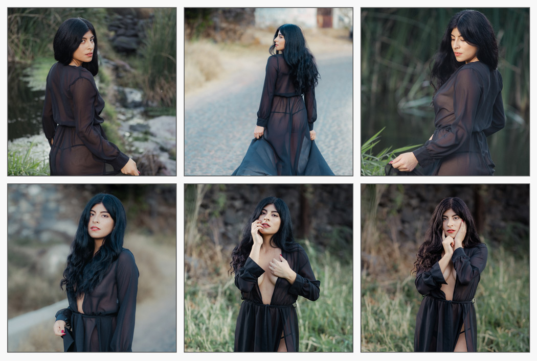
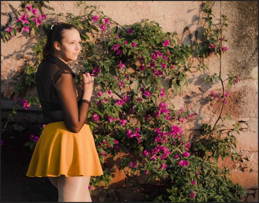
Look at how the Velvia 100 preset stacks up against the Portra 400 preset. This file was shot on Micro Four Thirds and both of these presets are solid to the look of their respective films.

Next to Portra 400 Velvia feels a bit Red. But it’s mostly because they are side by. Portra is warm,. Velvia is contrasty and punchy. Velvia 100 is pretty versatile but not so versatile Portra 400. No surprise.

You don’t always want HDR or even film negative level dynamic range. They can be amawszing but in essence, are lower contrast.

In Filmist we can of course increase the dynamic range by adding ChemKit mods or pushing slider. But remember low dynamic range means punchy contrast and often it’s amazing.

Velvia is famous for its rich colors and while it may seem subdued by today’s oversaturated digital norms, it’s more versatile than people think.

If you’ve ever used most so-called Velvia presets they have way overdone color on digital because most film presets are not at all like the film. There just is the name and go all kinds of crazy things.

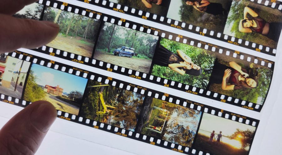
If you look at the actual strips and scans you see this contrast. You also see this reddish undertone but the greens and yellow from the film curve stand out more. It’s the way this combines that makes the film so punchy.

I use Fuji cameras also, though I don’t worry about color profiles and just add the presets after. In fact my Classic Neg preset which is free in the Filmist sampler pack is very popular because many want that Classic Neg look on non-Fuji files.

But sometimes people use Velvia on their Fuji camera and then my Velvia preset and they are nothing alike. I noticed this in the excellent review of Filmist and NHDR5 from Matt at the Turning Gate.

The truth is the Fuji Velvia profile is nothing like Velvia. They just made a highly saturated profile that name that is more loosey inspired by how people feel about Velvia. There’s nothing wrong with that profile (though I rarely want that much saturation) but understand that it has no relation to the film as we see here.

Whatever i am editing. I’ll start with a film look. Even if I end up on Natural HDR, Silver 5 etc. This is because the real color of films is a baseline you can always come back to and each time you get more confident in your process because you have that baseline.

I immediately know what’s up with a file when lets say I use Portra, Ahfa or Velvia or Kodachrome. These are iconic standards and in using them I can quickly see the way colors and light are responding and guide where I need to go from there.

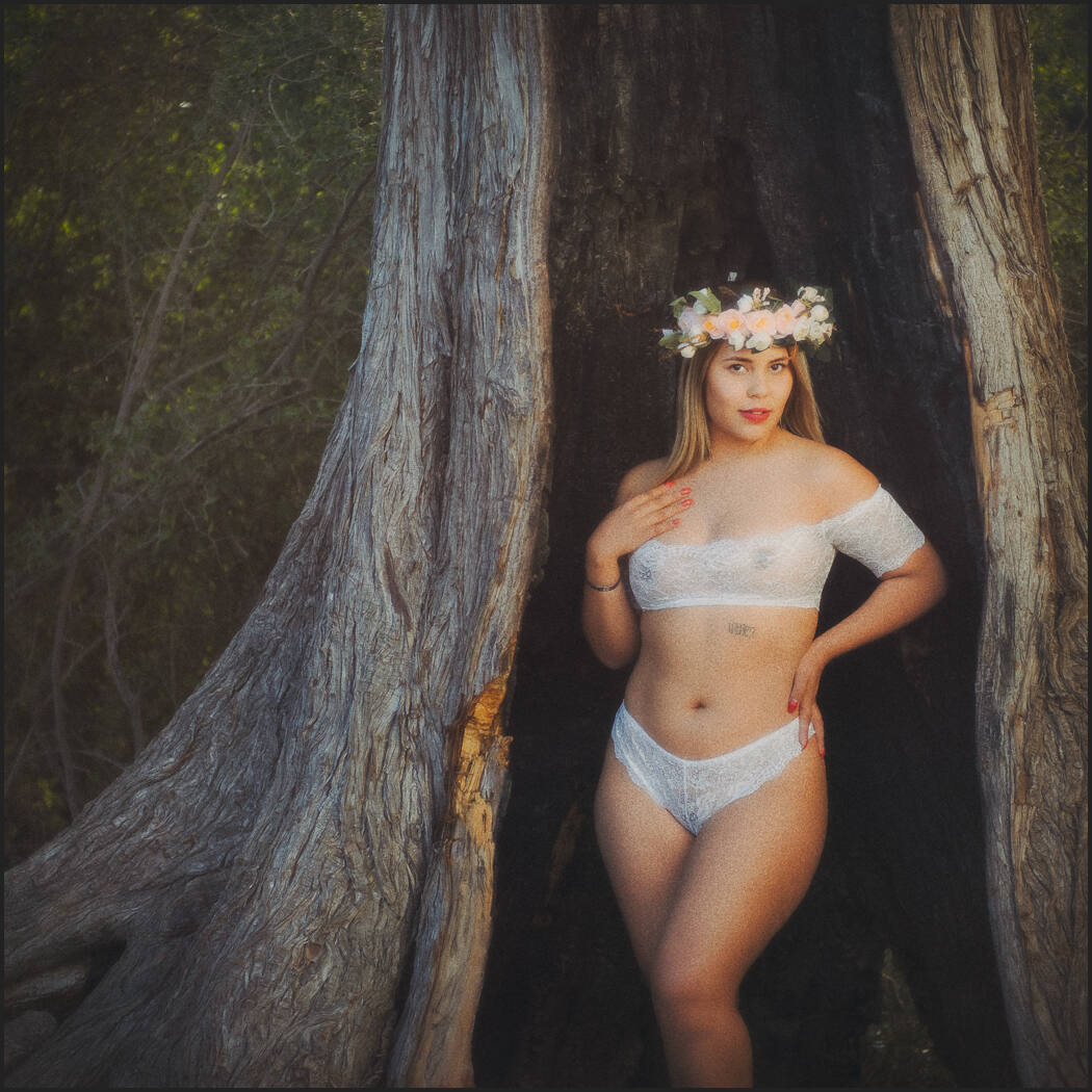
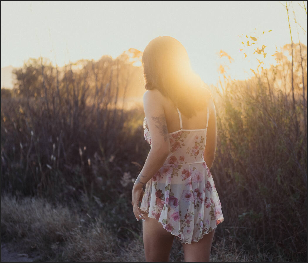
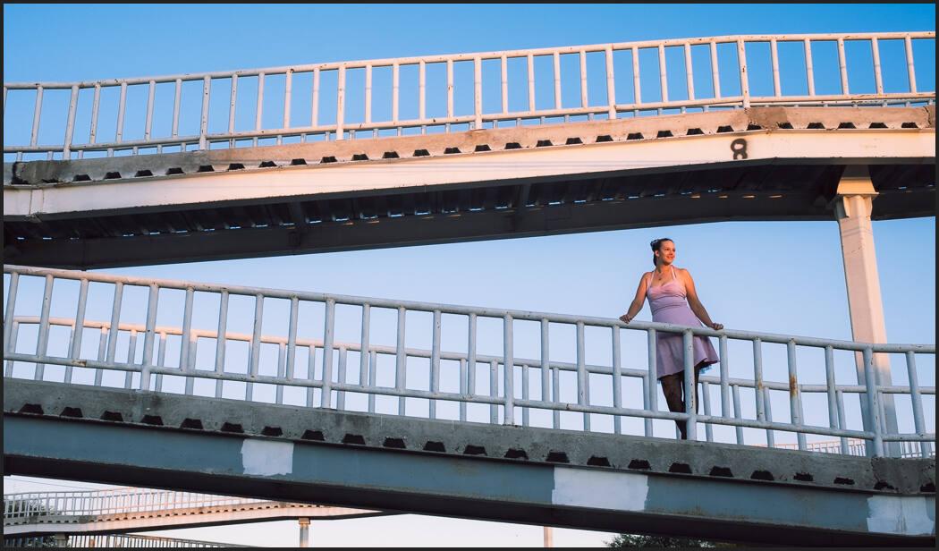
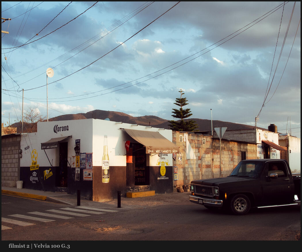
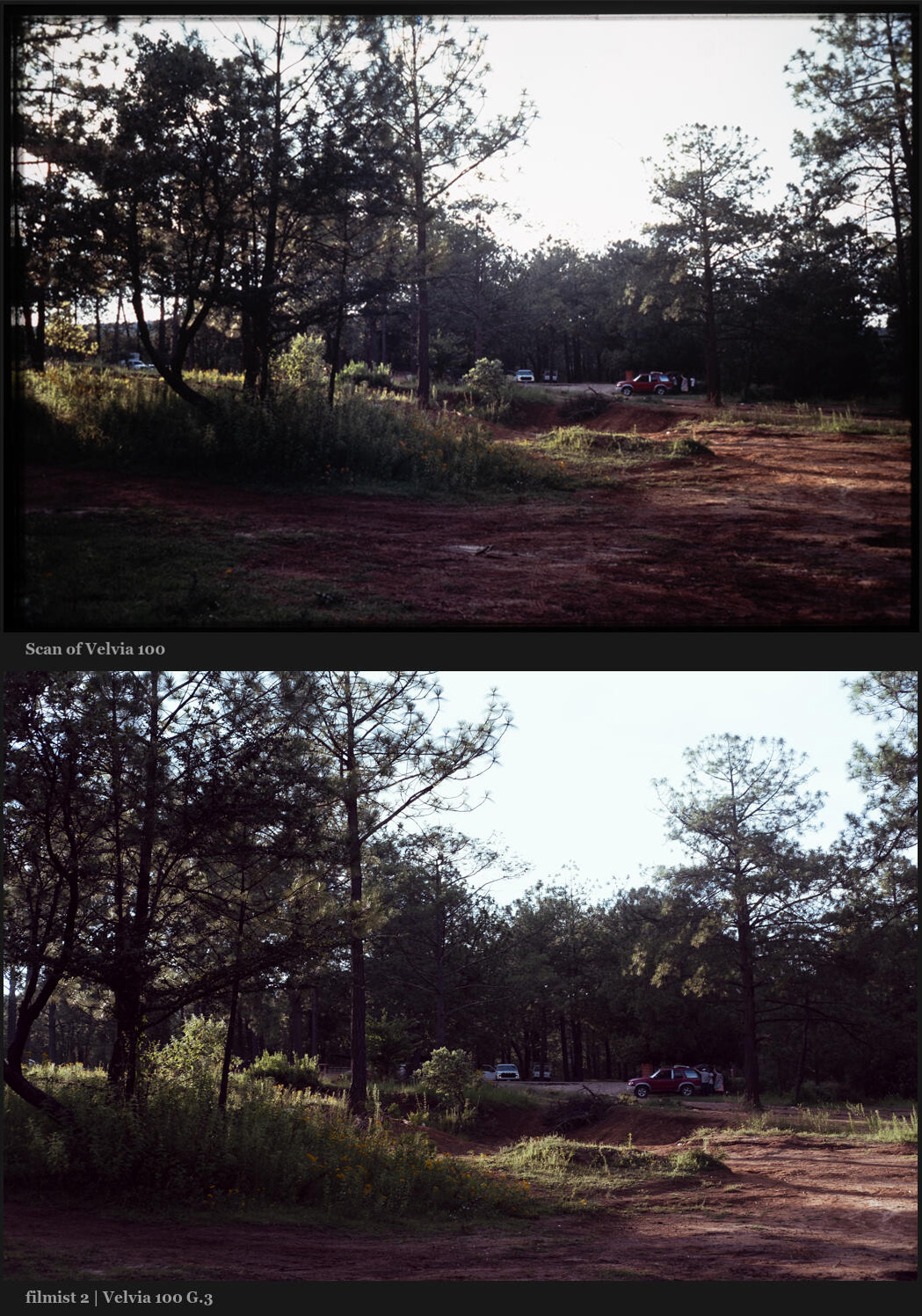
You can see in my recent photo on Velvia below that the preset was applied to a Fuji RAW file. There are differences, especially in the film’s shadow range. I maintained that punch but you still still see that Velvia film falls off faster on 35mm.

Editing with film real film looks makes all my other editing better and more grounded. It helps prevent me from over editing and it lets me find more creative ideas faster.

I hope you’ll play around with the new pack and even if you don’t have Filmist 2 you can grab the free sampler and get started with film-grade edits. You can get the Velvia 100 in Filmist 2,4 right here.

The takeaway here is that we can use tone and contrast naturally in camera and in post. Like we talk about in my Shadow Hackers class. Today we push a slider for contrast. But when you start being guided by the organic nature of things, you start to see your contrast in a new light.

Have fun and try this yourself – Gavin Seim

Read More

February 15, 2025

This film is long gone but it was the true legend of color films and one of the hardest to reproduce digitally. So I spend years refining it to this this new KodaChrome 64 preset.

You can get Kodachrome 64 Gen.3 the new Velvia 100 and more in Filmist 2.4 complete. If you have Filmist 2 go to the update tab. I’ll also show you my settings during the video.

If you watched my recent video on color science in your camera or on How to use White Balance better, you know that a little cast can easily be correction with a quick slide right or left.

But the iconic look of Kodachrome 64 is something more. As what is considered the most iconic Kodachrome by most, Kodachrome was the defining look of legends like Steve McCurry.

One of the patterns I found and something especially hard to defeat on digital is that is always has this rich coffee chocolate sort of brown. This is not as simple as a white balance slider. It goes against what most digital camera produce.

If you’ve ever held up a strip of film you know it’s not all roses. As light changes the color shifts and most digital cameras fix this on the go with auto white balance.

Because of this and many other factors there s no one single look that is Kodachrome, Velvia etc. When I design film presets (and this is especially true in Kodachrome) i looked at hundreds of tests to find the balance. What did this film look like in it’s best moments.

But camera sensors also vary. So if you apply this and it feels a little red leaning or too cool. That’s where the white balance comes in. You don’t need to rework the curves or the color of the recipe itself in the presets. Just nudge that white balance a little bit and that cocoa undertone shines thru. That is Kodachrome 64.

I’m not sure there’s any such thing as a perfect recipe. I’ve never found any Kodachrome recipe that gets this close. It’s rich look works digitally on portraits , streets weddings and anything else.

There are many you make recipes in camera. The problem is that these are very limited. If you see how I made this recipe it’s with complex color controls and a lot of detail. Detail you can’t get in camera. For in camera profiles I don’t usually recommend trying to really emulate a film. If you really want a film look, shoot RAW and add presets or styles after the fact.

Also As a positive film it did not have the dynamic range we have today. That can be good. It give you those rich shadows I teach you about in Shadow Hackers. Don’t push setting up just because you can.

That said. I often use the chem kit mods in Filmist 2 to add a little more range while still retaining the rich color. Nothing wrong with mixing it up. But the preset itself trues to remain as true as possible to Kodachrome 64

Read More

January 11, 2024

I’m on a mission to change that and I want my first video of the year to do that. Most photographers don’t realize that photographic tone is the secret skill that makes them understand every shot. Today we learn it…

But videos like this did not exist when I was starting out. These are the 3 keys of tone in photography so you can master them fast regardless of your experience level. And they will change how you create photos.

Step it up… Join my next Shadow Hackers LIVE workshop. Also in the video, I mentioned Filmist film presets, Silver 5, Natural HDR, and Lumist Actions.

The unabashed flaring of the sun gives a natural haze to this morning street that can’t be done with a single slider. It was processed gold using GoldChrome

The photographic tone is the foundation of great photos. But the tone is a wide-ranging one that comes from the painters and the way they learned to understand shadow and contrast long before cameras.

This is the lost skill in Photography that I go on deeper in my workshops and today I’m sharing the keys to unlock this door in the simplest way I know how. IN consists of 3 elements that lead us to what tone does for us and why it is important.

  1. Shadows create contrast
  2. Contrast reveals tone
  3. Tone creates atmosphere

These 1,2,3 lists mean little to your photographic tone without context. So in the video, we’re comparing different photos to see how not only edits but how shadow contrast and ambiance in each will define our result.

IN another Xpan style crop we see light creating bloom and reducing contrast. The net result is that tone is more subtle and more contrast is created in the overall image. Edited with Street’ist.

In my Exposed Master class, we learn everything about exposure and zones. Those are the technical aspects. But if you’ve been to Shadow Hackers or seen the Photo Perfect workshop you know that combining those with the artist’s aesthetic is what makes a great photo.

In the end, the tone is pretty simple and yet subjective. But if you constantly remind yourself of the three factors. Shadow, contrast, and tone, which is the combination of all the light and dark and mist and color. All of them combined create a tone in your own style.

We see the contrast between the burned tree and the tone of the model. Then edited with a David Hamilton-inspired process to create softness with contrast and balanced photographic tone.
We see the contrast between the burned tree and the tone of the model. Then edited with a David Hamilton-inspired process to create softness with contrast and a balanced photographic tone.

As much as I use sliders and settings and layers inside and out in my tool packs. Tone-like shadow is not created by the slider it’s just moved around.

When we use contrast to just create hard lines we lose tonal nuance and atmosphere. In the end, the contrast of the overall scenes is less, and viewers don’t see the nuance you wanted to show.

If you missed my video on why you should STOP using contrast sliders go check it out and also read my post about how to use the Zone system in digital to hack shadows. You’ll find more on my channel.

As I keep building these free resources and simplifying the process of understanding tone I help myself learn more and hopefully, you as I realize a dream that’s spanned 20 years to make a simple process for those of us who want to truly master our style in photography.

We compare two of these in the video. Note how the tone of this one is softened but less distracting than what might be called the contrast image.
We compare two of these in the video. Note how the tone of this one is softened but less distracting than what might be called the contrast image. Edited with Filmist.
Read More

December 21, 2023

There are lots of free Lightroom presets around my site like Silver and Natural HDR. But my most popular ones are my free film presets and I’ve updated them today for Filmist V2.

Download this free presets pack HERE on the Filmist 2 page

In the FIlmist free film presets and styles pack you get the next-gen Portra 160, Fuji Classic Negative, and Agfa RSX 100 film styles.

Just using these film presets will give you edits that feel true to the film. Photographers are learning that real photos are what matters in this new Ai world. For more on this check out my post and grounding your edits with film styles.

Below is a hands-on video from my channel on how to use Filmist 2. If you need help installing the free LIghtroom presets or Capture One Styles, check out the videos on the help page.

The latest refinements of these film styles are like true film. I’ve shot more film, done more side-by-side testing, and made every film recipe in Filmist 2 better.

I hope you love these and buy the entire Filmist film presets pack. It’s years of work and it is the best lightroom and capture one film presets I know of. But for now, at least grab my free film presets pack and enjoy.

Oh, and you also get free film LUTS in the free and complete pack so you can get the true film look in video editors like Premiere Pro, Resolve, and other photo apps like OnOne and Luminar.

Portra 160 free lightroom film preset. The latest version is included in the Filmst 3 free film styles pack
Portra 160 free film preset is a classic and the latest Gen3 version is even more refined. Portra 400 and 800 are also included in Filmist Complete.

I’ve been making high-grade Lightroom presets and free Capture One styles for many years. So why am I obsessed with getting perfect film looks? It comes back to maintaining that natural real look that the film created and that I’ve managed to duplicate in Filmist 2.

I use the balance I learn in creating film presets to improve my other presets. That’s why they all play together well.

Some photos need a different look. I normally use films as a starting point. But depending on my photo I’ll also use Natural HDR, Streetist, and my other packs.

Each of these packs also has mods. So while I love the ChemKit2 mods in Filmist I don’t hesitate to go to ModKit from Silver 5 black and white presets or maybe GoldChrome for a rich color warm look.

The new fuji classic negative free preset from Filmist 2
The Classic negative look is inspired by Superia 200. One of my most requested presets and the new Filmist 2 version is even better and more accurate than what you get on a Fuji camera.

The thing with film presets is that you won’t edit this way manually. Digital sliders are designed to let us push hard and the nuance of good film styles can take weeks to refine.

In a real darkroom, we could manipulate how we develop and print. So I put a ton of time into the ChemKit2 mods in Filmist. They let you use a film look and then adjust it instantly with darkroom-inspired processes. I included of of these for tone in the free pack. Turn it up and down and see what happens.

The beauty of using Lightroom presets and Capture One style packs is that with well-made film styles, you get edits that take hours in seconds. Once you get used to the milder grounding look of film it becomes a go-to. But if you have a photo that is not working with film, don’t hesitate to branch out.

A bonus free film preset. The Agfa film styles are amazing.
Agfa series films are rare as digital film styles very much but they will soon be one of your favorites. I included Afga RSX 100 with stunning color and fine grain in the free film presets pack.

I hope you enjoy the Filmist 2 free film Lightroom presets and styles pack and that these filmic styles let you see digital in a new light and use the rest of your presets, actions, and tools better.

I’m here to help if you have questions.

Gavin Seim

Read More

September 15, 2023

Grounding is having a starting point. Filmic Lightroom presets and styles help a lot. But your style can still be whatever you want. I’ll show you why in today’s video.

1. Grounding works because we exist in analog!

Why do most in-camera profiles look bad? Why do I come back to an edit I liked and it seems gross? It’s because digital edits lack a reference point.

You lacked a baseline and went too far. It happens to all of us. Filmic Lightroom presets and styles are not just a hipster fad, and if you’re still not using them you are missing out. So first we’re going to base our edits as close to real analog film as possible. Don’t worry you don’t have to stay there.

Much like Shadow Hacking, which brings you back to in-camera thinking. Filmic Lightroom Presets presets and styles seem simple but are not. I was a skeptic. But today Filmic Lightroom presets are my go-to for every session and for the past 5 years I’ve been developing better film and filmic presets to improve this process.

Level 2 filmic lightroom presets. This film style is the Ektar 100 like and
There is a shadow atmosphere happening here even though the EKtar 100-like. A level 2 film preset in Filmist is not super intense it constantly works and is a grounding development process.

2. Reset your editing brain.

You might be thinking… Nothing new here. But the more you use this process in your edits. Level 2’s especially. The more you realize that these film stocks lasted decades for a reason. They seem simple at first you soon you realize well they are grounded and complicated.

Apply a film you like to every photo. Do your quick exposure adjustments and get the session looking balanced. When you edit with film-like presets and filmic styles you get perspective.

Street photography with level 1 filmic lightroom presets and styles
Street air is a preset from Street’ist. This level one filmic preset has a lot of color and nuance like a chemical film, but does not try to be any specific film.

Look how I came back and re-edited the session with Portra 160-like film preset and a few mods. Each pose is slightly different, but they all have a constant feel. I like them gentle like this but my old self would want to add more mods, saturation, etc. That’s fine, as long as you have grounding to keep you on point.

Soon you’ll find yourself going back to old edits and now they seem strange and overcooked. You reboot your brain in terms of editing. It does not mean other filters and edits are not important anymore. I still use Natural HDR or Bella 2 which are not specifically filmic.

A re-edit of a session a more refined film edit and a good grounding from analog.

In this AI World, real things are gaining value.

And so we relate to and believe in analog things. Especially in this new AI-driven world where sometimes everything feels fake. This level of photography is going to become more important every year and Filmic Lightroom Presets help me stay focused.

Yes, there’s a level 3. Shooting digital side by side with the real film and using that as your grouping for shadow, color, and editing. I do this to practice and further refine Filmist for example but it gives you even more grounding and perspective.

Even the way we adjust exposure changes with analog. Pushing the exposure slider is not the same as pushing film and as I’ve become more advanced in my Film presets, even the mod presets, curves, and exposure settings have improved.

The creamy shadows of this Delta 3200-like. You can mod or turn these presets up to enhance the effect. But I start simple and natural to get a good grounding.

3. Edit grounded. Then move outward.

The grounding keeps you constant even when you’re not doing the filmic style.

So for example I will go to Filmist and use Potra Ektar-like film lightroom presets. Maybe Fuji 400h. I know these analog looks withstood the test of time and that our minds relate to them.

I don’t have to stop there and I may not even stay with a film look. Grounding your edits sounds boring, but it actually makes you flexible and creative and keeps you out of a rut. So even when I go to HDR, that grounding is affecting my edit.

filmic styles and wet plate platinum in photoshop
It does not always stop at a preset. Sometimes I take go further into Photoshop and use chemical-based edits like this cyan plate platinum mix from Emulsion 4 actions. Analog just keeps giving.

So I look at the mood and shadows of my shoot. I may decide to veer from film and use other effects, actions, edits, or presets. But now can really feel where I am in the edit better.

It’s about rebooting the brain to see past the temporary creative blindness that the ever-changing sliders and tools can give us so that we use those tools better with each unique photo session.

At least grab the free Filmic Lightroom presets, film styles, and LUTS I linked above and try them for a while. If they seem not intense enough that’s normal. Your editing brain will soon reboot and you will open up a totally new horizon.

This is a Level 1 Filmic Lightroom preset from Natural HDR. That is it’s using film tone and color inspiration but not trying to be a specific film. I use these liberally but not as my grounding point.

So Let’s Recap…

  1. Ground the baseline of your edits with edits as close to real analog film as possible. Use Filmic Lightroom presets and film styles, or even create your own.
  2. Edit photos with favorite films and use that as your grounded starting point. I will often start with Portra 400 or Ektar as my baseline because these films work on anything and I can apply them to an entire session.
  3. You can expand out with mods, other filters, presets, actions etc., and the final look for your project. Use your first edits as a reference to not edit too far. Staying with the film is also fine. I often stay with the film look/

I hope this helps you refine your edit process as much as it did for me. Let me know in the comments and if needed I’ll do more videos on this. Gavin Seim

portra 400 as a filmic style is amazing and changes how you see tone rolloff on digital
With Filmic Lightroom Presets like Portra 400-like, you almost can’t fail.
Styles like Velvia 100 like let you stay colorful and still know you’re on point and not over-cooked.

Read More