December 23, 2009

by Gavin Seim: I find myself fascinated with film of late. I don’t use it anymore, but I realize that some are pretty passionate about it. I posted on Pro Photo Show recently with a few thoughts and a poll on the topic. Quite a few still use film it seems. Why? Is it the texture,  grain, color, or is it just the reminiscence of really old photographers? Kidding, not that old. I used film when I started out. By the time I started getting good however I had moved to digital, so those romantic feelings some have towards film are not strong in me.

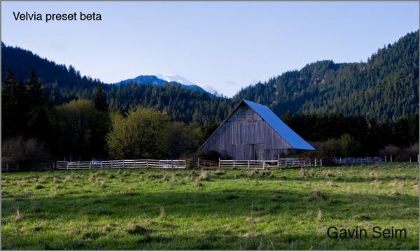
I’ve been taking notice though. Thinking about how film looks and how we edit these days. Don’t get me wrong I love a well processed photo, but I’ve started experimenting a little. Making effects that use classic tones and film inspiration. Here’s an article I found where Travis Easton compared a MK2 digital file to a Velvia image. What’s remarkable to me, is how even without editing it the film image looks great. Here’s another look at film vs digital over on Luminous landscape.

Now I don’t intend to start shooting film, I just don’t think it makes sense. But understanding what makes a great image is my livelihood. I want to know what it is about film and use that knowledge to make my photography and my effects better. We should always learn from the past, even if it’s grainy.

As a test I decided to try for the Velvia look, so I spent awhile very subtly tweaking a LR preset. If you mouse over you’ll see the before/after of what I’ve come up with so far. You’re also likely to see more in future updates of my effects. Bottom line though. I think what we’ll see over time are the good things from both mediums converging and becoming a better digital than ever. Neither film or digital will be the same as the other, but I think the future of digital will look and feel great. What say you?

Read More

September 20, 2009

Power Workflow 2 is our biggest seller here at Seim effects and for good reason. All our products are very effective and many users have the complete collection of products, but PW2 is at the core of the super fast yet creative editing workflow that we’re all about. Thank you all for spreading the word and making the Seim Effects such a popular product line.

Version 2.5 has made PW2 that much better with some great new presets and refinements to current ones. This new version something you’ll want in your kit.

It’s a FREE update for current Power Workflow2 owners. If you didn’t get the automatic upgrade email contact me and I’ll get you taken care of. If you’re still using the old V1 of Power Workflow you”re missing out. V1 users are still eligible for an upgrade discount so contact me if you need a code…. Gavin

Read More

August 29, 2009

by Gavin Seim: I’m a Lightroom fanatic, but with my recent expansion into projecting proofs to sell larger prints and increase my sales, I started looking at software for projecting scaled images using my digital projector. The choices were limited. Whats being using now, is expensive software like Prism Projector, or Pro Select. These are good for some, but cost hundreds of dollars and have a bigger problem in that it throws a curve ball into a well planned workflow. They make us entirely leave Lightroom for the sales presentation. Not cool.

At first I couldn’t find a way, but I kept experimenting and finally I figured it out. I found I could make special print templates in Lightroom that could be scaled to the screen size and project images to size without ever leaving Lightroom. I call them Projectics.
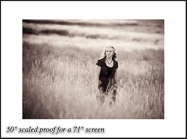
projectics-sales-presentation1

I can’t tell you how excited I am about this. I’m now actively using Lightroom for my proof sessions with great results and no need for external software. No it does not have all the gimmicks and frills that some other sales apps do, but I for one don’t need those.  I just need to project various images and sizes easily and effectively and that’s what LR can do. Using the scaled presets I can change sizes instantly. Then since I’m still in LR I can pick favorites, add things to collections, and even do edits without every leaving my workflow.

In the past I’ve written about using a separate Catalog for each job. There’s no rule you have to do things this way, but it makes more sense all the time. Since I’m sometimes in the studio and sometimes taking my Canon LV7370 on location, it keeps things really simple. I can simply copy the entire catalog for the session onto a portable drive and off I go.

projectics banner Home

Yes, I’ve made a collection of these presets to sell. Hey it’s what I do. You could make some yourself, but if that does not sound fun, I’ve done the math and tedious stuff and made a simple set that just works and will continue to be updated. Either way Lightroom is a powerful sales tool and I need no other sales software to proof, project and sell large prints.  Oh and if you want to learn more about the sales concepts of all this, check out this article about selling large Wall Portraits.

Whether you get my presets or not I suggest you head over to the Projectics page and watch the video because it will show you how it all works and how I’ve integrated it into my workflow. The power of Lightroom keeps growing and I thrilled. Time is money, and projecting proofs is a key element in great prints sales and placing beautiful prints on your clients walls… Gav

Read More

June 12, 2009

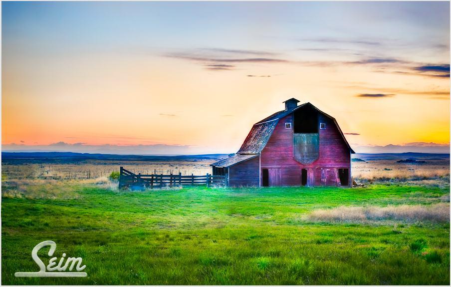
wispering-barn-wa

Around New Years I make a pack of goodies to send out to fans and customers of Seim Effects throughout the year. I sent these in the SE newsletter, but have not posted it officially.

Inside you’ll find a few cool Photoshop actions and a couple great presets for Lightroom. Bold and clear is the order of this year and included in the actions you’ll find Visual Razor X, the 4th generation of my vivid sharp action.

If you need help installing presets see here, and to learn how to manage actions see here. To stay more up to date on the latest freebies you can join the Seim Effects club on Facebook. Enjoy… Gavin

– Download 2009 Free Effects Pack –

Read More

May 17, 2009

by Gavin Seim: Today I’m going to kick off the new analyze inspiration series I promised a few weeks ago. In a nutshell, I take an image that get’s me thinking in some way. I talk about what I see (or don’t see) in it and invite readers to chime in with their own ideas and inspiration.

Pretty straightforward random thoughts about what was done and why it’s good, or bad. Here’s today’s photograph. Let’s start by just looking at it…

seim-photo-1

I was experimenting with composition and lighting yesterday in the park when I took this. I actually had my face and camera down in the grass giving me this soft foreground perspective that covered a big area of the frame. I shot it on my 5D MK2 at 1/125, f11, ISO400, 58mm and I think I had a little off camera flash on the foreground grass. I did some quick post in Lightroom using the Nature Boy preset from my PW2 collection and darkened the foreground a little using a gradient.

  • Good: The composition is different which draws in my eye.
  • Bad: There’s no main focal point. The grass may lead me in but then I don’t know which element I’m supposed to be seeing.
  • Good: It feel like there’s something hidden here. My eye scans wanting to solve the mystery.
  • Bad: It feels a bit crooked which annoys me.
  • Good: I like the bold greens.
  • Bad: I don’t want it on my wall.

In my opinion this shot only gets 64/100. That’s a FAIL and I would not hang it on my wall. The fact that it lacks a MAIN subject pretty much kills it. That doesn’t mean it’s useless however. The reality is that I was not expecting a great shot. I was exercising my skills by trying things.

Below I approached it differently. Same image, but in LR I applied a warm infrared from Monochromatix. This changes the whole mood. I also like it this way. In many ways it’s more simple, but the key problem remains. I don’t have a main subject and without one, this shot does not fulfill my eye’s desires to fin something amazing at it scans.

Thinking out loud. I got something from this shot even though it’s not great. It has me thiking about perspective, lighting and patterns. What if there was a HUGE bull Elk in walking between those two tree’s just right of center. That would change everything. If I’m ever laying in the grass watching a huge elf, you can bet this exercise will come to mind.

This was fun. I’ve got myself thinking about new ideas by looking close at this image and talking about it. I think I’m going to like this series. This is the kind of thing KungFu Photo is all about. Now I’m ready for your thoughts and ideas.

infrared-vintage-park

Read More