Should stop buying Canon cameras, or is this fine?
Canon just pissed a lot of customers off. I don’t think it will make them more money in the end. We have a lot of Canon uses here and I was a huge Canon guy for years. But we have a problem and I want you to tell me what you think.
Companies may be able to make products that “prevent” customers. Like by killing lenses such as the Viltrox 85mm. But ignoring your customer can be a fatal mistake.
That’s what Kodak learned before they went bankrupt in 2012!
A lot of you know me for Lightroom presets, Photoshop actions, and Capture One styles. But you may not know that long before that I had the photo podcast and even now I do a lot of non LR/PS videos on my YouTube channel.
Kodak is perhaps one of the greatest marketing lessons in modern history. They were KING of moments for a century. They invented the digital Camera. Then tried to snuff it. By being out of touch with their market, Kodak fell from nearly 150,000 employees in the 80s and 16 BILLION in sales in 1996, to Bankrupcyin 2012..So how does that relate to Canon?
I’m going to talk about that AND show you why the expensive lens is not always the one you need in today’s video.
Imagine how the course Photoshop would have been different if they has locked of us creators, plugin developers, and third-party partners in the name of the intellectual property. You would not even be coming here for my Lightroom presets.
Since I’ve commented on Canon for many years and seen this arc. The truth is Canon is no longer king and they are lashing out! So I thought I would make a video and share of a few of those stories and what has led us to this Canon fiasco. I hope you’ll share your thoughts in the comments here or on my channel.
Respecting customers is first.
I don’t have a Viltrox lens myself as of writing this. But if you use my products you know that despite being a one-man band, I work hard to make sure customers are happy. Because without customers your intellectual property, your marketing. your tech is pretty much useless.
There’s nothing wrong with Canon cameras. or third-party lenses What’s wrong is Canon! Now Canon is about to find out if their customers will allow themselves to be treated this way.
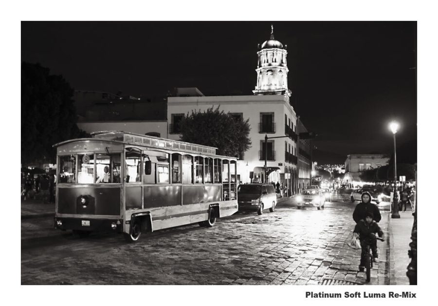
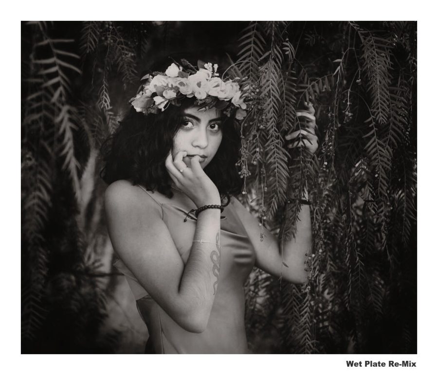
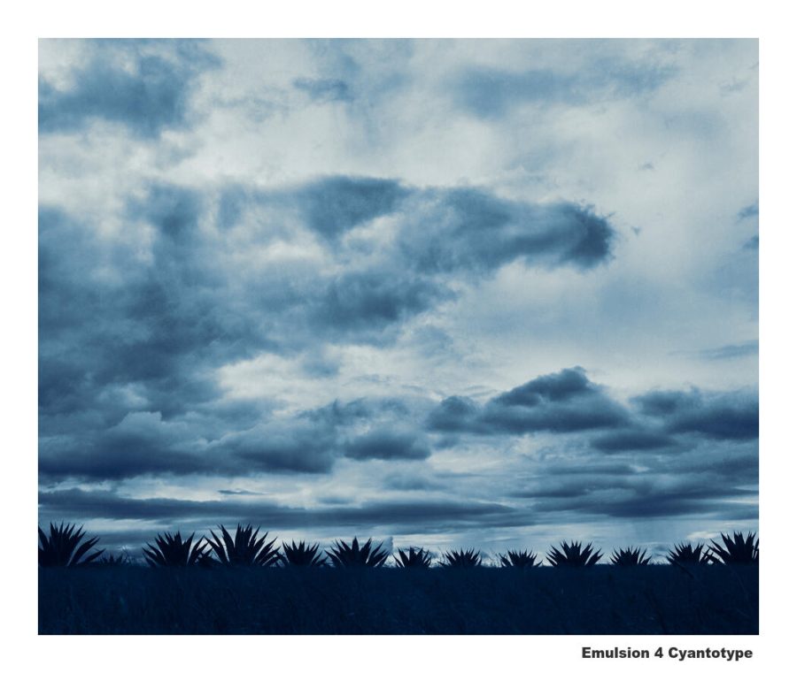
Platinum, Cyanotype, Colldoain, and Seleneum are all inside the Emulsion 4 darkroom actions pack.
Emulsion 4 has been out for a week making dakroom actions easier than ever. Now I made a complete series on how it works and how to create amazing effects with them. And I finished the Emulsion 4.1 update which brought even more refinements including my new favorite Platinum mix based on very finely made soft platinum prints from the darkroom.
A lot of people avoid actions because they don’t want to use Photoshop even though they have it. There missing out because there is no easier way to use Photoshop. The experienced user is more creative and saves countless hours while the new user gets advanced effects simply and learns more along the way.
Emulsion takes completed layer mixes in Photoshop and makes them easy regardless of Photoshop experience level. But I’ve been listening. People have been saying, Gavin, we want more detailed videos So for Emulsion 4, I just finished a complete training series and uploaded it as a playlist on YouTube.
There are videos on installing Emulsion 4 all the way to advanced user guides that show you how I like to each use of the chemical emulsion in the action pack.
There is a separate video for how to create Cyanotype, how to manage all the PLatainum Palldidum effects, how to use Selenium toning for digital, and how the Wet Colldoain effects can be mixed in many ways.
The main thing to remember as you use EMulsion or any of my other actions like Blackroom, Lumist, Naked Darkroom etc. Is that I develop these to make complex tasks easy, not take away control like so often happening in plugins.
After every action, you have all the layers and all the control. If you are not very experienced in Photoshop it’s fine, just use the look as you see it and gradually start playing with layers. If you are experienced, the sky is the limit and you can tinker more. Either way, you’ll save a ton of time because Emulsion 4 is doing the hard work for us.
Please leave a comment and tell me what you think of Emulsion and this training format. Or tell me what videos I need to make to add to this playlist. Either way I’m here tp help you with Emulsion 4 so you can creat amazing chemical tones photographs.
Presets, photo editing software, and gear. We have the tools in 2022. But I want to change how you think about your photos.
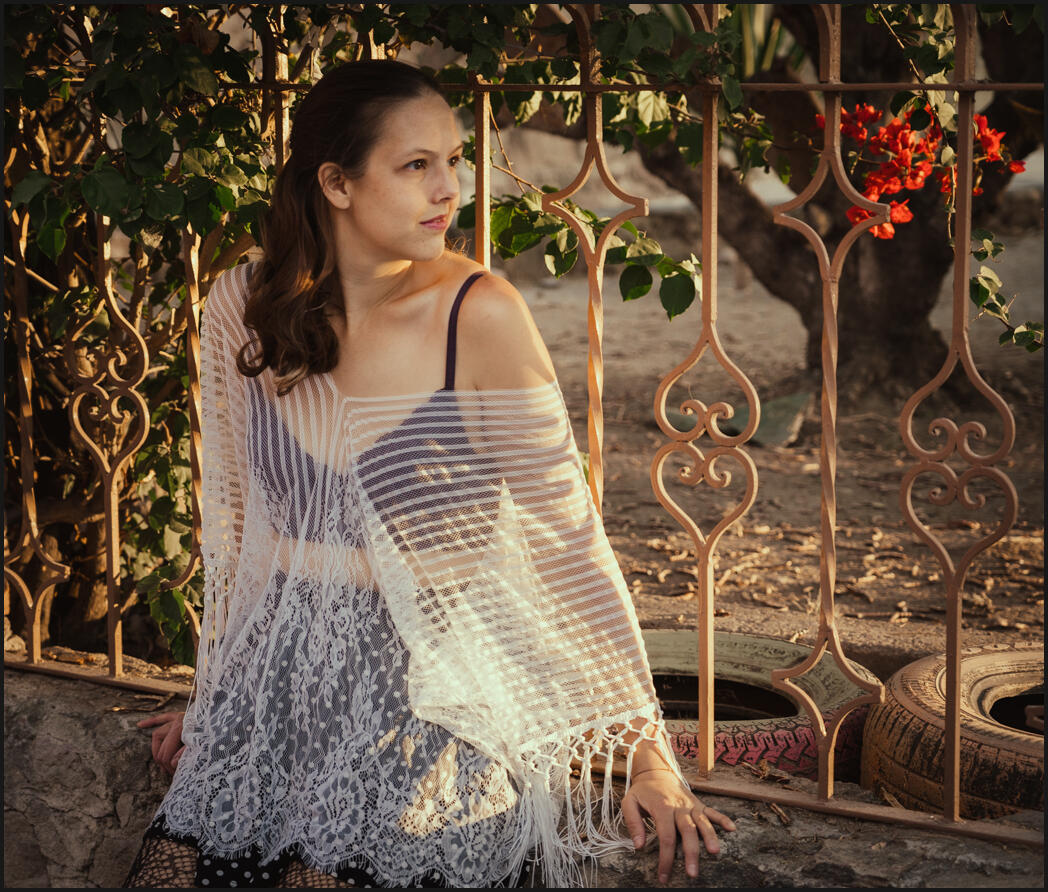
I’ve been a photographer for over 20 years. I watched digital be born and the entire industry change. I’ve run the gamut in everything from street and wedding photography to fashion photography of Models in Mexico and fashion photography.
I saw photography go from a technical creative art to something mostly driven by internet marketers and “Ai” tools. But I always see the same mistakes that make photos ordinary no matter how good the software gets.
I don’t need to second guess. People either like my photon or not. A clean Natural HDR 4 process made it look good and that’s a wrap.
Sometimes digital is so easy, that we lose an opportunity. Trends come and go, but in the end, photography will always be about emotion, inspiration, and creativity. If you learn to discover shadows and souls with confidence, your photography will always get better regardless of the tools you use.
Confidence is not always easy. I’ve learned a lot as a street photographer. You can have all the software. You have the best camera, and download the best Lightroom presets (yes I have those for you) But what you need is to see as no one else sees. That’s what I want to show you today.
You’ll find the presets I use here on the site – They do matter because they make completing your vision easier. You can get my free lightroom presets and film styles like Filmist and Natural HDR.
Most photographers edit wrong, but not for the reasons they think!
In this video, we’re going head to head with the mistake that nearly every photographer has made, and may are doing every day. If you can get past this, it changes more than just how you edit. It’s going to change your photography mentality.
As I showed in the video. The perfect capture and the perfect edit are a myth. That’s what makes photography so amazing. There’s always something we can improve that will affect the emotion of your photo, or the lack of it.
Knowing how to edit, starts with knowing what you want. Presets and styles are invaluable because they help me find my look without wasting brain cells.
Black and white, color, contrasty, soft. Deciding does not have to be hard. here I used Filmist and Elegance 4 to give more depth and that’s it. You can get my free lightroom presets and film styles on the FIlmist page.
I usually start with Filmist because it works so well. But there’s something more important than what you edit with! That’s knowing what you want to create with your edit. An actual vision.
Ansel Adams taught this way back with visualization techniques and using Zones in our exposures. Something we studied at length in my Exposed Master Class and in Photo Perfect.
IN the end making the craft of your photography second nature, finding your confidence, even if you know it won’t be perfect. That is what will transform your photography. The tools you use just, are just things to help you get there.
I’ll explain it all in detail in the video. You can also watch it directly on my photography channel here
Enjoy and we’ll see you next time – Gavin Seim
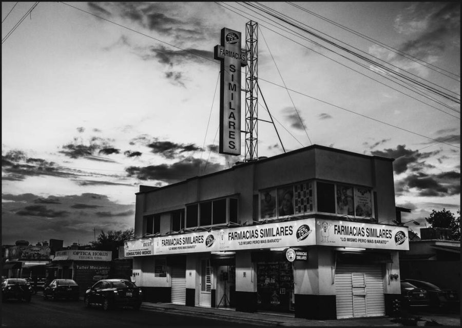
I like capturing things people don’t even think about like the corner drug store because in 20 years everything will change and then simple photos like this will matter. But here it was easy, this was all about shadows and sunset. Using Silver 4 and Blackroom was a no-brainer.The full gold chrome look that I talked about in this blog post. Decide your look hand and commit to it. It will change your perfective on every image you publish.
There’s a story here. But the real gold nugget is how to use GOLD tones with color photos. Here’s what I’ve learned…
My grandpa was always buying and selling antiques and taught me when I was young how to separate the value from the junk. At least he tried to teach me.
I remember him talking about the Curtis gold-tone prints long before digital was a thing. Little did I know that 3o years later I would still be obsessed with gold tones in the back of my mind as I developed my recipes. Maybe because they are so hard to get just right.
But today we’re in color, not re-creating early-era gold tones. Enter the Gold-Chrome.
As far as I know, there was never a Gold-Chrome film. But maybe there should have been. Now even if you’re wanting to create other tones and mixes, the tips I’m going to share today will work.
Once we know the settings we create, but sometimes we use the slider in a very basic way. Decades later I still find myself discovering formulas. The sliders are a lot like chemicals. While it may be less messy and costly, those curves and up and downs are not any less subtle.
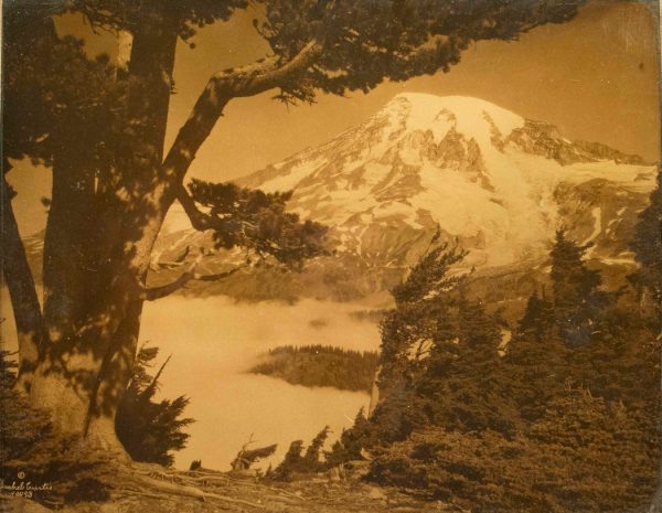
Mount Rainier by Asahel Curtis – Gold Orotype
Since the early days of photography, it seems people noticed the magic in a gold image. From the Platinum pallidum to the Curtis gold tones that were actually processed with real gold. The Orotone!
Maybe it’s the romance that early black and white created with its impure and often tinted results. Maybe it’s just because we love warm tones. It’s a color emotion thing. It’s why in cinema styles there are a lot of looks with orange and blue hues. Being opposite each other on a color wheel, they pair well.
So I recreated the early era darkroom and platinum looks in my Emulsions actions. They take that toning and make it easy to manage in layers. The platinum has a warm tone, not always Gold, but sometimes it actually feels gold.. In the future, I might add an authentic Orotone recipe into Emulsion actions as they can do more complex things than we create with presets and styles.
Here’s our goal…
Create dynamic gold tones that are not monochrome.
Try to maintain a gold that feels natural with other colors.
Make the gold tones versatile across many image types.
The perfect COLOR-Gold formula is NOT Selective color.
Rather than tinted black and white, these are created by how color is mixed and by the natural light in a scene. So if you have a backlit sunset, gold warmth comes more naturally and feels more at home. Don’t confuse this with ugly 90’s selective color.
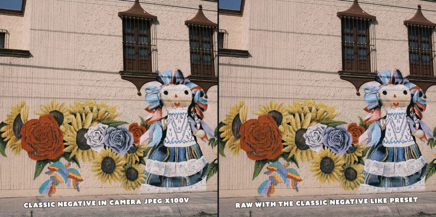
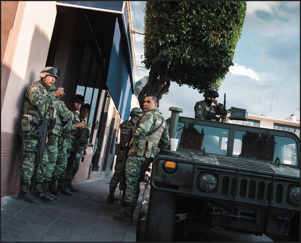
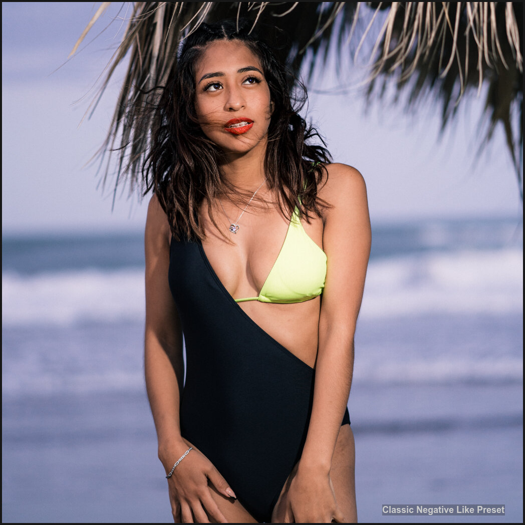
You may have used the popular Classic Negative if you use Fuji X cameras. This is based on Superia 200 film, but it’s actually a very low saturation looks, while still retaining colors. I have a preset of Classic Negative that also you can download for free here. that I made to use on any field, like this Fuji XE3 street photo, since this model did not include that profile in the camera.
Not gold – Street workers, Filmist Classic Negative look on a Fuji XE3 RAW file.
You’ve seen this approach used in golden warm sunset photos but may not have even known it. These are not selective colors or black and white. They are shot and developed to focus on the golden warmth, but the color still remains.
I have tinkered with getting this look for over a decade in Lightroom, going all the way back to the first version of Power Workflow. More recently I had a great portrait-focused gold effect in the Muse preset pack called Gold Dust!
UPDATE – Get my Gold recipes as presets for Lightroom and Capture One with my finished Gold-Chrome pack.
Level 1 Gold toning Warm like a sunset but maintains rich color.
Gold Dust – tone from the Muse presets pack. Sony FIle.
We want that look you see in iconic street photos or magazines. It always starts with light in the camera, but if you develop well, that gold can even be added to less warm images and still feel perfect.
Level 1 is gentle. It could almost be mistaken for White Balance but it’s much richer. Complicating matters more, each camera is different. Fuji tones lean redder, Sony more green etc.
We live in a world of internet marketers selling tools that leave people unhappy. I deal with the fallout of that, which is why I always guarantee my products. I am passionate and often obsessed with this kind of recipe. It cannot just work on one photo, it has to work on most of them.
In the Filmist pack I might spend an entire week focused on a single recipe to get it just right. Today I’ll show you progressively more intense gold recipes I’ve developed.
Don’t do this with White Balance!
Yes, it’s fine to warm or cool a photo a little with WB. It’s one of the secrets of making any6 color formula work for YOUR camera. But you can’t get a proper golden tone with a WB cast adjustment. White balance is often used for this, but incorrectly. Toning needs to come from the more subtle color channel and wheels.
Why? First, no WB setting will work in a Lightroom preset or styles for Capture One. They vary on a per-image basis. Second, you want more depth. When you use the color wheel and even more curves, you have dynamic toning that moves with the shadows and highlights.
Take all the colors away, then start from zero.
TIP: If you’re trying to make a color tone, go to the HSL colors and desaturate every channel.
This working in reverse will really well to help you find the goal. Pull them all down… Now start moving color back in a little at a time.
Next, you mix those with color wheels in mids, shadows, and highlights, then tones. As you progress you will see your effect come to life.
I kept thinking about how to explain more simply how to use advanced color features in Lightroom and Capture One. I’ll be making a channel a video and I’ll post it here in the future when I have
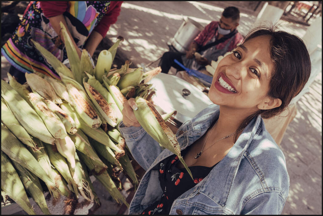
Elote Girl – Cine Soft Brown mi.
On the lighter gold side, we’re talking about a warm overtone that has hints of gold. Another level 1 like we see right here with the elotes girl happy over her corn. Yes, they love their Elotes in Mexico and they are always buying them on the street covered in mayonnaise and chili.
This gets more complex as we go to curves. You can do amazing things with the individual color channels in curves. But you can make a mess very fast. The adjustment in the color cruces, whether in Lightroom, Capture One, or Photoshop, is very finite but very powerful.
Level 2 Gold Toning Softer color and more expansive warm tones.
But let’s go to level 2 gold. This is not about a vintage look. It’s about feeling good. I did these with what I call my El Dorado process. This pushes other colors down a bit more and focuses on the gold tones and color wheels. But it’s still a full-color photo.
El dorado process
A Gold-Chrome has colors from every channel.
We’re trying to empathize with a tone and feel of a scene that complements the real-world light. Even at level 2, we have a full-color spectrum, but golden warmth is all over the frame here. Level 2 done right, is actually very versatile.
This works great in atmospheric street scenes. But also fashion portraits and beyond. What we’re doing is using color to extend the existing emotions but in a way that doe snot feel like a fake color. If all color is equal, the image looks rather boring.
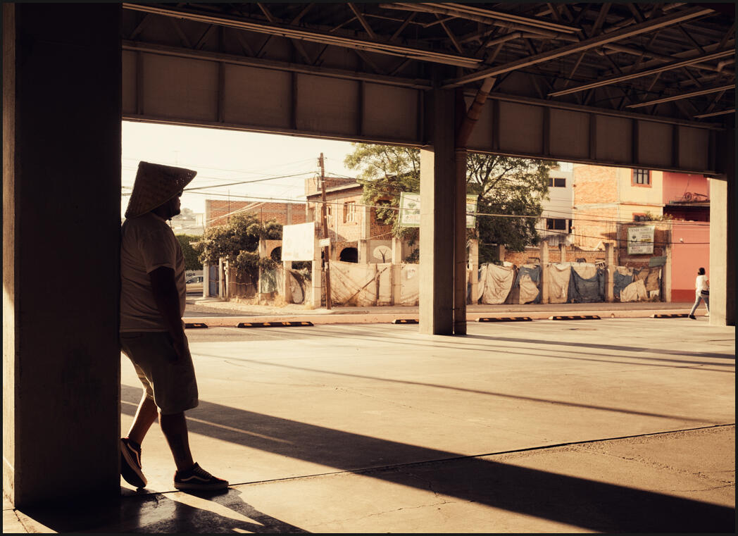
The parking garage, San Juan Del Rio Mexico -El Dorado tone
Now it’s starting to go GOLD!
By separating color and focusing on a specific range, we control the hues of a scene. In the case of Gold, it tends to give a warm sunset romantic vibe
IN going further we’re going to take a queue from the Curtis Gold tone. Because gold was part of the chemical process, it results in highlights being ultra gold. We’re still working in color, but let’s curve down those highlights and go further.
El Doroado gold chrome process. Level 2 still retains color well.
Going to level 3 – Ultra gold chrome color
What we’ve done is push curves and colors and how they respond more and more without selectively reducing any one color. The sensation of color is soft, leaving you with gold and warm rays. But the influence of the color is still there.
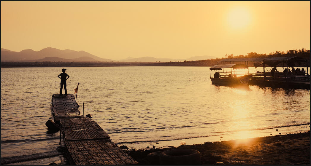
The boy on the dock. Ultra Gold tone. The color is there but the gold is more intense. In some photos, it feels perfectly natural.
In this photo on the lakeshore where it;’s clear sunset, it feels almost natural, but looking at the original file, you see just how much gold we added. I think with any process this should be the goal. Adding your recipe, while maintaining a feel that does not distract and feels right.
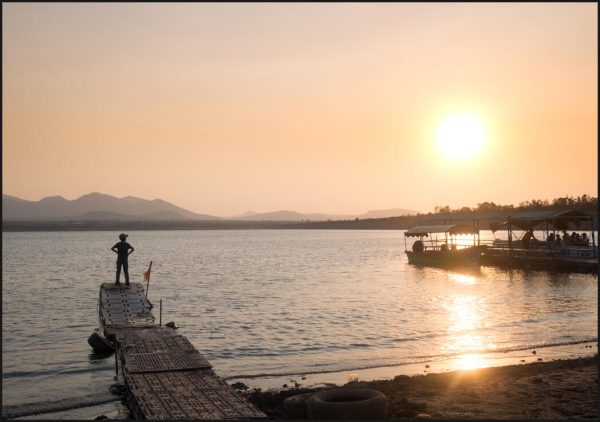
Original RAW file from a Fuji X100V
And yet we’ve all seen an image like this. Radiant golden rays that are intense, but feel natural. Like they convey an emotion that we might have felt in the real place. That’s the goal of photography. We have to convey that shadow, the sensation and to me, that’s what a great color formula is about.
A good Gold process is such that you don’t think about it being processed, yOU think about the feel and the story of this boy standing at the end of a dock waiting for his ship to come in. Or maybe something else.
Yes, Use RAW files and presets!
With any of the deep edits, you want RAw whenever possible. It’s especially popular amount street shooters to shoot JPEGs. The Fuji camera for example has great in-camera profiles. But you throw so much away in JPEG and if you want to deep deep recipes like this, you will be glad you have a RAW file to start from. Take a look at my video… Raw vs JPEG 2022.
It’s also important to have these as presets. We talking about adjustments that take hours. Especially when you refine them. So whether you buy presets like mine or make your own. Save at each step so you can use and compare easily later.
Ultra Gold color in a night street scene. Highlights are deeply affected giving this scene a vintage vibe.
Don’t be afraid to level up and do more.
By being progressively bolder, we’ve created a look that can be intense and still feel right. This post was about creating color gold tones. But it’s also about pushing developing settings.
I admit usually start with a presets or action to help kick me in the right direction.
If I see ten variants of a photo, it’s like adding visualizations to my brain and those adapt to create new ideas that I otherwise would have not discovered.
The level 3 process tends to look natural in photos where there is already a natural gold glow on the boy on the dock. Note the extremes in the highlights where level 3 pulls the upper curve down and fills it with warmth. This can work in other scenes like the night shot above, but it tends to bring a vintage vibe that is clearly a color effect. That’s not good to bad, just be aware.
My Gold Chrome Conclusion.
I like this look, which is why I have chased it for so long. How to edit and tone an image is a very personal choice and often there are many approaches that will look good. But if we become less timid, will draw out shadows and tones in new ways.
This has perhaps been an overly intensive look at gold chrome toning. But I’ve been chasing these tones for over a decade, and really ever since my grandpa talked with reverence about early ere Curtis Gold-Tone prints.
As these formulas are refined enough to work in most scenes, you may see them come out in my presets packs. The first level 1 Gold Dust tone is also part of my Muse Collection so if you have them play around and make your own variants.
20 years later I feel like I am starting to understand what needs to be done to make gold work. I have failed many times to get it right. A really good process is one you will come back to. If I am not there yet, I am on the way and I wanted to share with you and I hope you will share what you have found in the comments below.
Gavin Seim
L3 Gold Chrome church in the square. This takes extreme measures on highlights to give a very darkroom-like gold flavor.
With the Fuji Xpro 3 came the Classic Negative look. It’s based on Superia 200. But older cameras and other brands don’t have this film style. As part of the Filmist Project, I started creating classic Fuji-like presets for Lightroom and Capture One. This is my Classic negative film simulation!
So I made Classic Negative Like, a Free Lightroom Preset, Capture One Style and LUT that’s like shooting it in the camera, only better.
Getting film presets to work on any camera takes time. The classic negative-like simulation was no exception. I don’t like camera-specific color profiles that limit you. I use a preset like this Classic Negative preset. I also made a Classic Chrome preset, and you can read about that here.
In action… Classic Negative film recipe, Preset and Capture One Style.
My Classic Negative presets is free inside the my FIlmist presets Sampler Pack.
The improved Gen.2classic neg film simulation in inside includes Classic Negative as a Lightroom preset as a Capture One Style a LUT for video, PLUS a couple other film presets from Filmist.
For years, I’ve been expanding my Film presets project, creating presets such as Porta, Fuji 400, Fujifilm black and white, and others. So I created a mini-free pack from my complete Film presets collection You can get the Seim Classic Negative look for free.
I’ll add the link above so you can get my latest version of the Classic Neg-like look and try it out. Feedback has been great on this, and the new version is even more dialed in.
In-Camera JPEG beside my 2023 Classic Negative, Like Gen.2 presets for Lightroom and Capture. This new version of my classic neg film simulation is better than ever.
Film-inspired recipes and presets bring out the magic.
Film is a secret weapon most photographers don’t realize. It brings a nuance and atmosphere. It helps us balance shadows in a digital slider world that is often overcooked. See my post… Filmic Lightroom presets and styles ground your edits.
That’s why Fuji is the only camera brand people love for its color profiles. They are inspired by film, and they have years of understanding how shadows and colors alter our senses.
Fuji Classic Negative look was inspired by Fujifilm Superia, a negative film from the 1990s. There are zero technical reasons to make color profiles work only on the latest cameras, it’s just a marketing trick. That’s why I set to work and made filmic presets/styles and Luts for this process.
Classic negative Like applied to a RAW file.
Don’t stop at the Classic Negative film presets.
People can get stuck on these Fuji colors. They are good, but they are just film-inspired looks. I’ve included a few more film presets for Lightroom and Capture One in the Filmist Sampler download, like Portra 160, start extending out and trying the films, and the more you do the more control you will have over the tone and atmosphere of your photos.
My free classic neg preset works for Capture One, Lightroom CC, Lightroom Classic, and Lightroom Mobile, and has a preset for older versions like Lightroom 6. Go here if you need help installing presets.
I hope you enjoy this Fuji Classic Negative look. Please let me know what you think or if you have questions. You can also subscribe to my YouTube photography channel.
Gavin Seim
Classic Netagive like on a Sony RAW file brings the same look to my non-Fuji files.