Making a preset and calling it a film is easy. But making a digital film look like film is really hard. It’s not something you do manually and most film presets don’t get very close. In today’s video, we solve that.
You can get Filmist presets complete or the FREE film styles sampler.
If you own FIlmist 2 Login here to update to the latets version.
The Filmist 2.1 Update Notes.
This update brings a lot of small refines and bug fixes to mods and film looks. You’ll find updated presets marked 2.1. With any color, tone and mod improvements across the film styles including subtle tweaks to make films like Portra and Ektar even more accurate to film. Also, the new Digital orange fixer shown in this training video is in 2.1 and very useful.
I love film. But it’s expensive so I need film recipes that work.
So when I went to work on Filmist 2 it was after 5 years of refining Filmist V1 and sending our many free updates. I wanted more though and that’s where the idea of True-Film was born.
I also wanted a cleaner pack of presets and better darkroom-inspired mods like push and pull tools that emulated the way contrast changes when you push and pull your ISO in the camera.
It meant shooting film and digital side by side with the same light and settings. In fact, in film tests, I use the same aperture, shutter speed, and often the same vintage lenses to get the exact result.
Still, that’s not enough. Many films are long gone and even films I can use vary by batch, how people scan etc. So I have to test not only my scans but also look at how other people are using that film and what its result should look like.
In case you missed the launch video it gives a lot of quick examples.
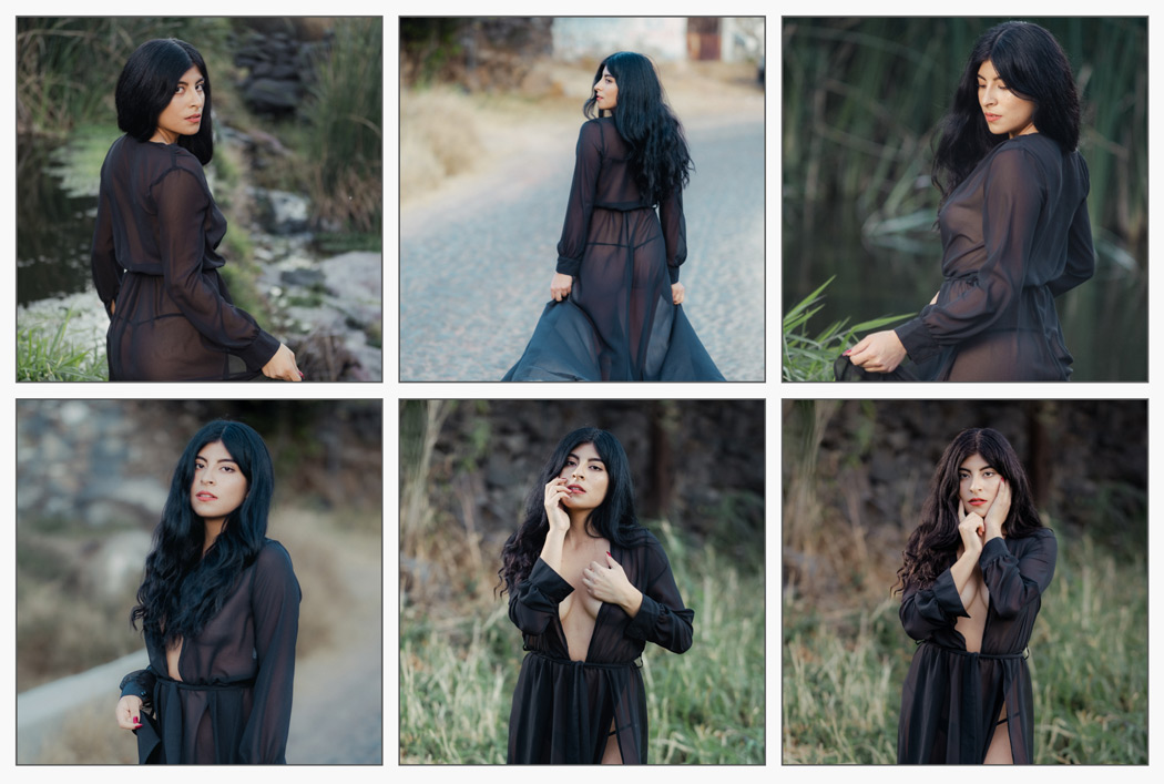
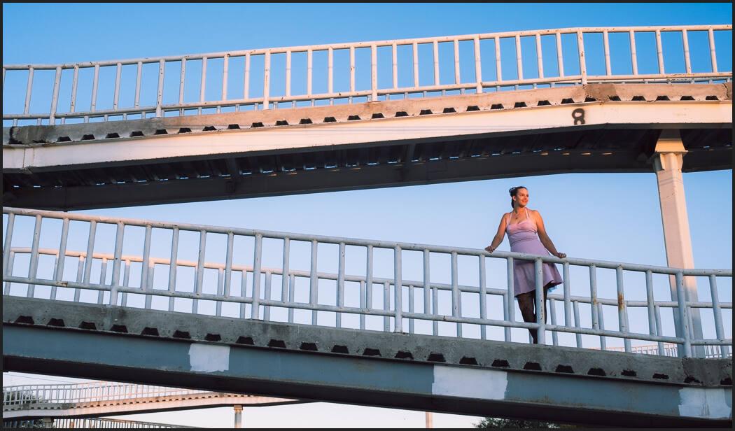
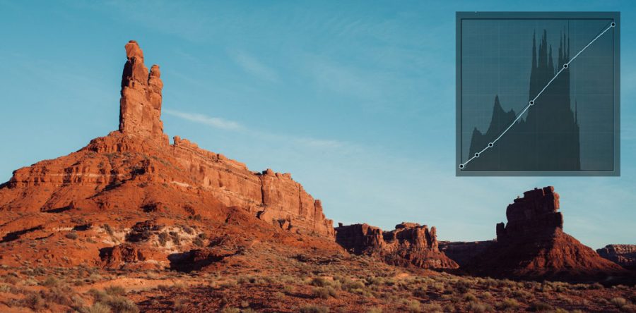
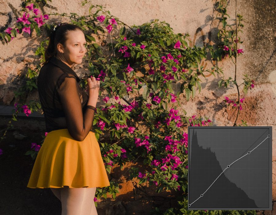
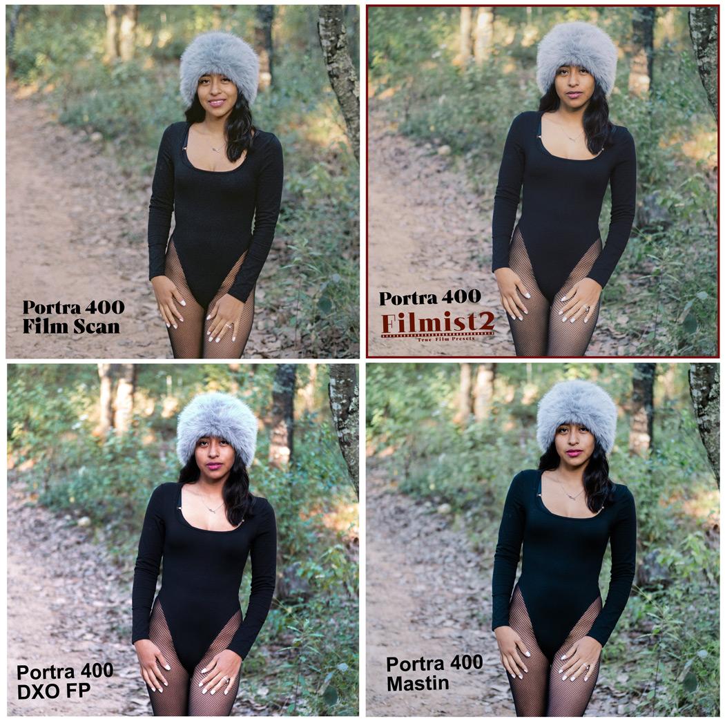
For example the new Gen2 Porta 400 Film preset.
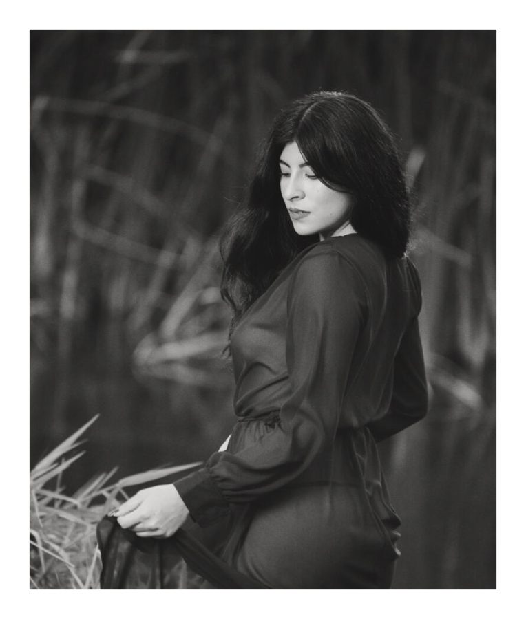
This is tough because this film is all about skin tones. You would think with the endless digital tools in Lightroom Capture etc that nailing out is easy. But getting a perfect film skin tone is super hard. I spend hours adjusting curves by one point and then another.
Sometimes I doubt myself and then I compare it to other products and presets to create a film that looks digital and realizes it’s working. It’s not that these are not good products, it’s that getting the film right is that hard, and in FIlmist it’s the entire focus.
Does that film feel boring or flat?
I’ve made videos about basing edits with film presets and how it stops you from pushing sliders too far. We’re used to extremes. From giant movie exposition to over-saturated photos. And it’s OK to push up your saturation. But start natural!
When people first try film presets sometimes they think it’s not enough of a change. It’s too flat or plain. This is because we’ve been conditioned by digital to over edit and it makes photos that seem fake and unnatural.
I think that’s why many film tools don’t look like the films. They are over-edited to try and please a before-after sample and make it look intense. But it’s not true to the film.

2024 is a year where natural things win.
People are jaded by fakery. In an AI world, professional photographers need to take away the disbelief people have started feeling. real photos are becoming more valuable than ever.
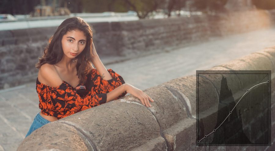
I designed these presets to be adjusted. So you can push op the intensity or add a mod like the Push contrast mod that mimics how film contracts increase when you push in the darkroom.
The result of these true-film ideas is film looks that are true to the film as much as we are possible but that also can be manualized to your needs and still have natural real-world feelings contrast and details.

The future of making these presets more True-Film.
With a mission of vitality and accuracy, I have a lot of free updates planned for my FIlmist users. My shelf is full of film right now that I’m doing more tests on. I watch countless videos old and new to try and refine films that are gone from shelves. These need to be preserved.
I’m working now on doing darkroom prints to further refine recipes because even scans are not always the same. Every scanner and software converts things differently. So I’ll be doing darkroom prints to reference and refine the recipes.