November 3, 2019

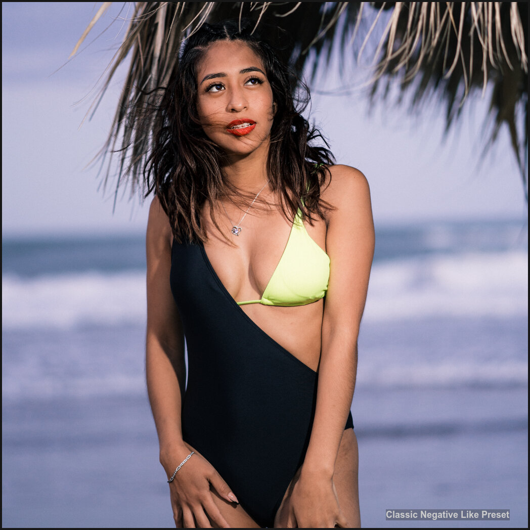
With the Fuji Xpro 3 came the Classic Negative look. It’s based on Superia 200. But older cameras and other brands don’t have this film style. As part of the Filmist Project, I started creating classic Fuji-like presets for Lightroom and Capture One. This is my Classic negative film simulation!

So I made Classic Negative Like, a Free Lightroom Preset, and Capture One Style that’s like shooting it in the camera, but better.

Getting film presets to work on any camera takes time. The classic negative-like simulation was no exception. I don’t like camera-specific color profiles that limit you. I use a preset like this “Classic Negative”-like preset. I also made a Classic Chrome preset and you can read about that here.

In action… Classic Negative film recipe Preset and Capture One Style.

– DOWNLOAD my new 2024 V2 Fuji Classic Negative preset FREE.

The improved Gen.2 2024 classic neg film simulation in my free pack on the Filmist 3 film presets page. It includes Classic Negative as a Lightroom preset as a Capture One Style a LUT for video, PLUS a couple other presets from Filmist.

For years, I’ve been expanding my Film presets project, creating presets such as Porta, Fuji 400, Fujifilm black and white, and others. So I created a mini-free pack from my complete Film presets collection You can get the Seim Classic Negative look for free.

I’ll add the link above so you can get my latest version of the Classic Neg-like look and try it out. Feedback has been great on this and the new 2023 version is even more dialed in,
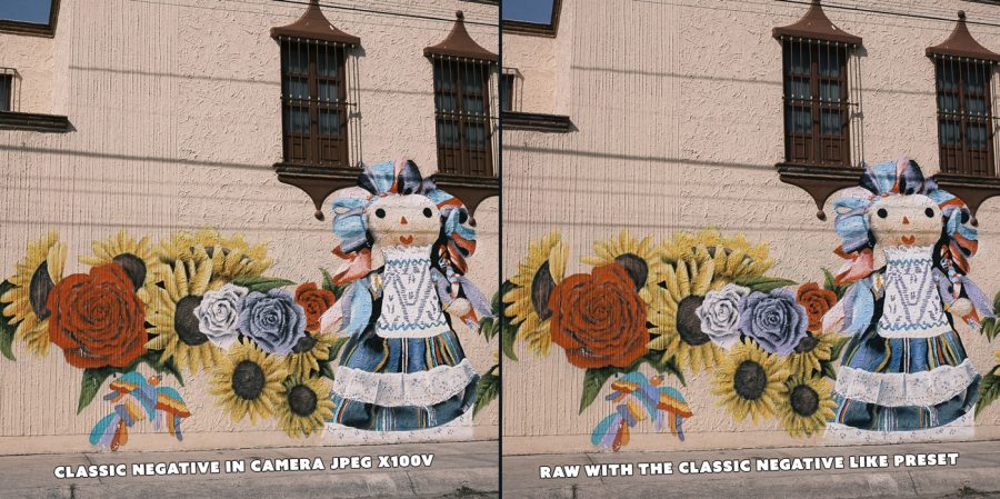
Fuji Classic Negative Like Lightroom Presets and Capture One Style
In-Camera JPEG beside my 2023 Classic Negative, Like Gen.2 presets for Lightroom and Capture. This new version of my classic neg film simulation is better than ever.

Film-inspired recipes and presets bring out the magic.

Film is a secret weapon most photographers don’t realize. It brings a nuance and atmosphere. It helps us balance shadows in a digital slider world that is often overcooked. See my post… Filmic Lightroom presets and styles ground your edits.

That’s why Fuji is the only camera brand people love for its color profiles. They are inspired by film and they have years of understanding how shadows and colors alter our senses.

Fuji Classic Negative look was inspired by Fujifilm Superia, a negative film from the 1990s. There are zero technical reasons to make color profiles work only on the latest cameras, it’s just a marketing trick. That’s why I set to work and made filmic presets/styles and Luts for this process.

Fuji Classic Negative lightroom preset
Classic negative Like applied to a RAW file.

Don’t stop at the Classic Negative film presets.

People can get stuck on these Fuji colors. They are good, but they are just film-inspired looks. I’ve included a few more film presets for Lightroom and Capture One in the Filmist Sampler download, like Portra 160, start extending out and trying the films, and the more you do the more control you will have over the tone and atmosphere of your photos.

My free classic neg preset works for Capture One, Lightroom CC, Lightroom Classic, and Lightroom Mobile, and has a preset for older versions like Lightroom 6. Go here if you need help installing presets.

I hope you enjoy this Fuji Classic Negative look. Please let me know what you think or if you have questions. You can also subscribe to my YouTube photography channel.

Gavin Seim
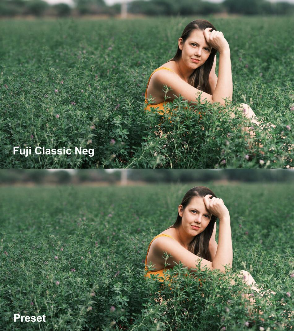
Fuji Classic Negative Preset and Style from Gavin Seim
Classic negative look recipe on Sony and other cameras
Classic Netagive like on a Sony RAW file brings the same look to my non-Fuji files.
Read More

October 25, 2018

It’s too busy, it’s too flat and that’s not the color I saw!

Light does not always work the way we expect, especially in the season of color. In today’s video, we head to the autumn woods of Washington and talk about how to get better images of fall color.

In the end, knowing the tactics of good light like we talk about in Exposed and taking the time to just experiment and study your scene will make all the difference. Then comes the processing. If you crave great color don’t miss this month’s Photo Kit workshop on fall color science that’s coming out in a few days. If you’re not a member you can join for free here.

Also check out my new Harvest presets for amazing color mixes in LR and if you enjoyed this sub my YouTube channel here. Enjoy — Gav

Read More

December 31, 2017

I’m here in the jungles of epic central Mexico near Tamasopo and there’s line and light everywhere.

I filmed this  video to share my experience about where the frame begins and ends because it’s critically important to getting perfect composition. We’ll talk more about this location and it’s lines in the Dec Photo Kit and you can get the first month free here. In the meantime watch this and let me know how you judge your frame stop. — Gav

Read More

October 31, 2017

[poll id=”3″]

[poll id=”4″]

Does video work?

We study marketing a lot over here and put a lot of work into it, especially our promo videos. Most companies don’t make a promos everything but I’ve always felt it’s important. I thought we could  share and maybe learn something about how to reach our customers better.

Does it matter, do people watch the videos or do they just read the copy? Honestly we agonize over promos here. Everything from the soundtrack to the humor. For example we started including outtakes because some people thought I was a bit too intense and artsy. It’s fun, but it’s something we use for balance.

We decided we to make two promo videos for the new Nitty Gritty collection. So first, which video is better? Second, do product videos effect how you buy? After that, let’s talk. Comment and tell us more. Do you make promo videos of your work? How would you do things differently? Let’s share some ideas that we can all use.

Tun into our Facebook page next week and I’ll share results on what worked here and why we did it.

Thanks for taking part. As a bonus we extended the $50 off deal on Nitty Gritty for another day. Get them here.

Promo Video 1:


Promo Video 2:

Read More

April 26, 2017

As photographers, we learn fast that harsh Sunny light is… hard!

But ultra flat light can be hard too so if you had to choose, which would you pick?

The perspective we have of “beautiful” light is often too narrow; soft sunsets or giant glowing softboxes from the heavens. Those are amazing. But to really master light I think we need to learn to value every type of light and find the unique beauty we can shape from it.

Flat light can be hard with landscapes and environmental scenes and if I’m struggling with that I’ll often try longer exposures to add interest and then do a bit of burn and dodge in post to bring out more subtle contrast points. With portraits, flat light is usually nice. But too flat light is reiterating and feels dull. Remember there’s always a direction with light, so you can use that on the face for a nice soft portrait. But if you need some extra pop juts add little artificial fill light in on the same side as the natural light, adding a bit more lighting ratio on your subject.

In this video, we go out and find some flat light, take some images and then head back to finish up with some post-production to see what we can do with it.

If you enjoy also sub my YouTube channel. — Gav

Read More